VIZ MEDIA Previews New TOKYO GHOUL, NARUTO & GANGSTA Publishing Acquisitions

VIZ Media, LLC (VIZ Media), the largest publisher, distributor and licensor of manga and anime in North America, expands its novel and manga publishing roster with the addition of several noteworthy new title acquisitions set for release beginning later this year. Fans of the best-selling TOKYO GHOUL manga series will not want to miss the Fall debut of the first of three new original prose novels. Each novel will focus on lead characters from the popular horror manga series and feature original illustrations and cover art by series creator, Sui Ishida. VIZ Media continues to expand its collection of NARUTO original prose novels with the release of a trio of books focusing on the Uchiha brothers, Itachi and Sasuke.

VIZ Media also adds a new manga publishing acquisition to its library as it announces the debut this Winter of GANGSTA.: CURSED, a  spin-off series based on the stylish manga crime thriller GANGSTA. A prequel to the original series featuring the backstory of the character Marco Adriano, GANGSTA.: CURSED is written by Kohske and illustrated by Syuhei Kamo.

Tokyo Ghoul Vol. 1New TOKYO GHOUL Publishing Acquisitions

TOKYO GHOUL: DAYS, Vol. 1 · Debuts Fall 2016

TOKYO GHOUL: VOID, Vol. 2 · Debuts Early 2017

TOKYO GHOUL: PAST, Vol. 3 · Forthcoming

MSRP: $12.99 U.S. ea / $14.99 CAN ea 

TOKYO GHOUL: DAYS (Vol. 1) chronicles six all-new stories from the TOKYO GHOUL universe. TOKYO GHOUL: VOID (Vol. 2) depicts the aftermath six months after a major event in the TOKYO GHOUL manga. In the TOKYO GHOUL manga series, Ghouls live among us, the same as normal people in every way—except their craving for human flesh. Ken Kaneki is an ordinary college student until a violent encounter turns him into the first half-human half-ghoul hybrid. Trapped between two worlds, he must survive Ghoul turf wars, learn more about Ghoul society and master his new powers.

New NARUTO Publishing Acquisitions

NARUTO: ITACHI’S STORY – DAYLIGHT, Vol. 1 · Debuts Fall 2016

NARUTO: ITACHI’S STORY – MIDNIGHT, Vol. 2 · Debuts Winter 2016

NARUTO: SASUKE’S STORY – SUNRISE · Debuts Spring 2017

MSRP: $10.99 U.S. ea / $12.99 CAN ea

Three new NARUTO novels focusing on the Uchiha brothers, Itachi and Sasuke! Features original cover art by NARUTO creator Masashi Kishimoto.

Also catch other NARUTO original prose novels available now including NARUTO: KAKASHI’S STORY and NARUTO: SHIKAMARU’S STORY.

Additional New Manga Publishing Acquisitions

GANGSTA.: CURSED, Vol. 1 · Rated ‘M’ for Mature Readers ·

MSRP: $12.99 U.S. / $14.99 CAN · Debuts Winter 2016

A new series depicting prequel stories for several of the main characters featured in the original GANGSTA. manga series. In GANGSTA.: CURSED, the man named Marco Adriano is a loyal and beloved member of the Cristiano Family, helping them protect the persecuted Twilight population in the city of Ergastulum. But he was once a boy codenamed “Spas,” raised as a Hunter and assigned to the Destroyers Second Group for a single purpose: to track down and kill Twilights.

For more information on titles available from VIZ Media, please visit www.VIZ.com.


'The Final Days of Superman' Have Begun

Death waits for no man—not even a Superman. The devastating effects of Apokolips’ fire pits in JUSTICE LEAGUE: DARKSEID WAR, the A.R.G.U.S. Kryptonite chamber from “Savage Dawn” in SUPERMAN, and his battle with the would-be god Rao in JUSTICE LEAGUE OF AMERICA all combine in a perfect storm of death for the Man of Steel. Determined to protect humanity, despite his impending death, Superman embarks on a quest to seek heroes from across the DC Universe to continue his role as humanity’s protector.

DC Entertainment proudly presents “The Final Days of Superman.” Writer Peter J. Tomasi architects this epic saga, encompassing all four Super-titles in April and May.

SUPERMAN #51 AND #52 (Art by Mikel Janin)

BATMAN/SUPERMAN #31 AND #32 (Issue #31 art by Doug Mahnke and Jaime Mendoza issue #32 art by Doug Mahnke, Jaime Mendoza & Christian Alamy)

ACTION COMICS #51 AND #52 (Issue #51 art by Paul Pelletier, issue #52 art by Scot Eaton and Dale Eaglesham)

SUPERMAN/WONDER WOMAN #28 AND #29 (Art by Jorge Jimenez)

The Final Days of Superman” saga sets the stage for the DC UNIVERSE: REBIRTH launch beginning on May 25, which will result in new identities, new costumes and…even more Supermen?!

SUPERMAN #51 debuts Part One of the eight-part epic, “This Mortal Coil.” Superman seeks out his closest friends, including Lana Lang and Lois Lane, to let them know his end is drawing near. Meanwhile, at a secret installation in China’s Shanxi Province, the mysterious Dr. Omen performs strange experiments in order to create China’s very own Super-Man. While in Metropolis, an on-the-run parolee falls victim to a strange accident giving him incredible powers, and now he’s calling himself Superman! Check out the debut of this incredible story at your local comics retailer now!

Part Two continues in BATMAN/SUPERMAN #31’s “Dark Discovery,” available now. Superman invades Gotham City to inform Batman that he’s dying—and to enlist the help of the World’s Greatest Detective in locating his cousin Supergirl, who’s mysteriously gone missing. In the process, the World’s Finest heroes must defeat the monsters of the Chinese Zodiac.

Check out this sneak preview of ACTION COMICS #51 featuring “Dazed and Confused,” the third chapter in this explosive arc, available Wednesday, April 20. With Batman’s help, Superman is on his cousin’s trail—but he can’t believe where it’s led him or who she’s teamed with in the Man of Steel’s absence! Dr. Omen reveals more secrets of her experiments as she receives a crucial component—Superman’s blood!

AC_Cv51_ds AC_Cv52_R1 BMSM_Cv31_ds BMSM_Cv32_ns SM_51_1 SM_Cv51_ds SMWW_Cv28_ds SMWW_Cv29 SUPERMAN-52-Mikel-Janin

Dark Horse Releases "I am a Hero" Trailer

A mentally unhinged manga artist witnesses the beginning of a zombie outbreak in Tokyo, and he’s certain of only two things: he’s destined to be the city’s hero, and he possesses something quite rare in Japan—an actual firearm! The Shogakukan Manga Award winner comes to Dark Horse! Contains I Am a Hero Japanese volumes 1 and 2. I Am Hero

Creators For Creators Non-Profit Official Launches

On Wednesday, April 6, at Image Expo, David Brothers, Nick Dragotta, Rick Remender, Jonathan Hickman, Joe Keatinge, and Leila Del Duca took the stage to announce a newly formed 501(c)(3) non-profit organization called CREATORS FOR CREATORS, aimed at fostering—both financially and through mentorship—new creative voices in the comics industry and bringing new works by those voices into being for the first time. "Following in the footsteps of invaluable initiatives like the Xeric Grant, we'd like to introduce the Creators for Creators Grant. The goal of the grant is to help pave the way for the next generation of original comics creators by supporting their work financially and through mentorship, and providing opportunities for their creations to reach a wide audience," said Dragotta.

Submission guidelines will be provided on May 1st, the same date submissions will open. Both single cartoonists and writer/artist duos will be eligible for the Creators for Creators grant. Applicants must be eighteen years of age or older.

The Creators for Creators award will consist of $30,000 of financial backing for the project and mentorship from a wide variety of experienced professionals from all corners of the comics industry. The goal is to not just educate the recipient, but to increase the body of knowledge available to new creators in the industry as a whole and easing entry for everyone.

Recipients of the Creators for Creators grant are free to choose how and where they publish their new comic, with Image Comics and Iron Circus Comics both offering optional publishing deals for the grant's recipient, but the recipient will be free to choose how and where they publish their work.

"We're on the cusp of great change in the comics industry, and it's important we meet that change head-on, instead of letting it catch us by surprise, or worse, ignoring it entirely," said Brothers. "The comics community is capable of great things, and the Creators for Creators grant is a good step in the right direction."

The Creators for Creators grant was founded by Charlie Adlard, Jordie Bellaire, David Brothers, Kelly Sue DeConnick, Nick Dragotta, Leila del Duca, Matt Fraction, Kieron Gillen, Jonathan Hickman, Joe Keatinge, Robert Kirkman, Jamie McKelvie, Rick Remender, Declan Shalvey, Fiona Staples, Eric Stephenson, C. Spike Trotman, and Brian K. Vaughan.

For more information, or to find out how to support the non-profit as a creator or publisher, please visit http://creatorsforcreators.org.

VIZ Media Announces Limited Edition Takeshi Obata Art Book - BLANC et NOIR

VIZ Media, LLC (VIZ Media), the largest publisher, distributor and licensor of manga and anime in North America, offers something very special for pop culture, pop art and manga fans as it proudly announces the release of BLANC ET NOIR: TAKESHI OBATA ILLUSTRATIONS, a limited edition art book collecting the work of renowned manga artist Takeshi Obata. BLANC ET NOIR: TAKESHI OBATA ILLUSTRATIONS will debut on May 3rd in an oversized slipcase hardcover edition under the Art of Shonen Jump imprint. This limited edition art book will be released in a print run of only 10,000 copies. BLANC ET NOIR: TAKESHI OBATA ILLUSTRATIONS will carry an MSRP of $99.99 U.S. / $119.99 CAN.

TakeshiObata-Artbook-BlancEtNoir-3DExperience a masterful presentation of legendary artist Takeshi Obata’s works from 2001–2006, including definitive illustrations from smash-hit series DEATH NOTE and HIKARU NO GO, as well as surprises (video game design!), original works created for this art book and rare novel illustrations. This gorgeous oversized art book is encased in a silver-stamped slipcase and is stuffed with 132 pages of full-color art, several massive foldout posters, deluxe paper stock and 12 pages of artist commentary, including a “how to draw” section. The edition also includes three large double-sided laminated posters.

“BLANC ET NOIR: TAKESHI OBATA ILLUSTRATIONS is an extraordinary art book with a beautiful, high-end treatment befitting its limited edition run. It will be a wonderful addition to any ardent DEATH NOTE fan’s personal collection,” says Hope Donovan, Managing Editor. “Takeshi Obata is one of Japan’s foremost manga artists and is internationally acclaimed for his elegantly designed characters and crisp style. We invite fans and collectors to savor this special release!”

Manga artist and illustrator Takeshi Obata first achieved international recognition as the artist of the wildly popular Weekly Shonen Jump title, HIKARU NO GO (also published by VIZ Media), which won the 2003 Tezuka Osamu Cultural Prize: Shinsei "New Hope" Award and the 2000 Shogakukan Manga Award. He went on to illustrate the smash hit supernatural crime thriller, DEATH NOTE, as well as the hugely successful manga series BAKUMANand ALL YOU NEED IS KILL. All three of these titles are published in print and digital editions by VIZ Media.

For additional information on Takeshi Obata and manga titles published by VIZ Media, please visit www.VIZ.com.

Review: The Autumnlands #10

Kurt Busiek knows how to write a compelling story. What started, to me, as another anthropomorphic fantasy tale has come a long, long way. As Dusty and Learoyd continue their journey into the depths of the Autumnlands, this comic’s plot just keeps getting weirder (in the best way possible). Autumnlands #10 brings together elements of pulpy fantasy and sci-fi and combines them effortlessly in a way that only Busiek and Dewey can make work. Dusty and Learoyd's journey has brought them to the mountains, searching for the cause of the plague that was spreading through the countryside. During their hike, a diseased goat tries to attack Dusty, only to be dispatched by Learoyd without a second thought. Somehow being this close to the mountains has given Dusty's magic a significant boost and he is able to heal the goat's disease. Together the three of the them travel deeper into the forest and closer to the heart of the mountain. The goat reveals to them that his village has been afflicted as well, and was in search of a cure himself when he encountered the two adventurers. Without warning one of the mountains explodes, sending all three of them to the ground. A shockwave rips apart the forest, and all of the wildlife stampedes in an attempt to escape. The issue ends with a giant mutated mountain goat starring the heroes down, leaving us eager for next month's issue. The Autumnlands hide many secrets, and there are so many questions that need to be answered. Busiek is taking his time, and revealing only tiny details, which only adds to my curiosity, but also to the mythic quality of this world. The answers are close though, and I hang onto every mention of mythos, clinging to the pieces, trying to figure out what the Autumnlands truly is.

Autumnlands-#10-1Every story is a quest of some sort, some admittedly more exciting than others. For me though, a story hits its stride in the middle of a quest, when the heroes are still seeking something. Fellowship of the Ring is my favorite because none of the characters are tied up in the future political entanglements in the later installments. It is simply get from point A to point B, with a lot of action in between. Autumnlands, I believe is about to hit that stride. This comic was already fantastic, but ten issues in the story is really beginning to unfold. The Autumnlands themselves have been shown to us in pieces, we are as ignorant as the privileged wizards in their floating cities. And until Dusty's city crashes to the ground, we know nothing of the outside world. Busiek's greatest tool is his use of mystery and suspense. Sure, he has created this beautifully fleshed out world of wizards and heroes, and for some writers that alone would be an achievement, for Busiek though it isn't enough. He takes a perfectly entertaining fantasy story and adds deeper elements to it, tossing a human protagonist into an unlikely world, and adding sci-fi rumblings to a magical universe. The wires are being crossed in the best way possible, and when things finally explode, well, it'll be some of the best comic writing all year.

I find this comic increasingly difficult to describe to those who have never picked up an issue. For me it originally wasn't Busiek's name that got me to read issue #1, but rather Benjamin Dewey's art, which is remarkably unique, yet comfortably familiar. It's one of those comics that you kind of want to flip through first just to gaze at the art before you even read the story. After ten issues, I can confidently tell people that Autumnlands is like a 70s pulp Redwall with magic, some crazy weird sci-fi elements, and an R rating. So yeah, if you aren't reading it yet, and you like those things, do yourself a favor and pick up the first trade.


[button btn_url="" btn_color="teal" btn_size="large" btn_style="default" btn_outlined="no" link_target="blank" link_rel="" icon_left="" icon_right=""]Score: 4/5[/button]


The Autumnlands #10 Writer: Kurt Busiek Artist: Benjamin Dewey Publisher: Image Comics Price: $2.99 Release Date: 4/13/16 Format: Ongoing; Print/Digital

Review: Shutter #20

It's no surprise that Shutter #20 channels Herge's Tintin from start to finish because author Joe Keatinge has been doing just that from the very beginning. Keatinge stated early on that he wanted Shutter to be an adventure comic that possessed some qualities of the old classics. Corto Maltese and Tintin are only two of the influences that helped create Kate Kristopher and the rest of Shutter's colorful cast. Artist Leila Del Duca uses a claire ligne style, as an homage to Tintin. Drawing parallels through flashback, between Kate's father and Tintin himself. The glaring difference is that Tintin was never a part of an Illuminati conspiracy... or was he? Nah, he wasn’t. As Kate and her newfound siblings prepare to wage war on Prospero (the aforementioned Illuminati-esque cabal that currently runs the world), she returns to meet with The General (her childhood nanny) at her lakeside mansion. Here The General reveals information regarding one of Kate's missing siblings, one who was never dragged into the life that she currently leads. Ultimately Kate decides to not reveal to her long lost sister who she is, and leaves her out of this conflict. This issue focuses more on Kate's father, much like issue #19, giving us a little more background regarding his past. During his training with The General, Christopher fell in love with a girl who lived across the lake. They had a child, but Christopher couldn't stay, so the child was raised never knowing him, and Kate made sure things stayed that way.

Shutter-#20-1Shutter has always been an interesting comic, Keatinge and Del Duca's world is just so fantastic that it works. Nothing is ever fully explained as to why animals, robots, aliens, humans, and whatever else exists in this crazy fantasy world co-exist, but after the first few issues you learn to accept that. That's part of the charm of the comic, learning to accept certain truths as fact. Just as Kate tried to run from her past, she too learns to cope with it, and learn from it. After twenty issues the comic is beginning to get bogged down by darker and deeper plot, which is only natural. I'll be the first to admit that it isn't as fun as the wacky adventure comic that was the first five issues, but the added emotional heft was necessary to allow the characters room to grow. I feel like I always complain about comics after the story gets too heavy, and it's true, I like my comics light and entertaining (most of the time). Shutter's story strikes a nice balance between heavy emotional weight and light fantasy fare. Maybe that's why I've stuck with it for so long. Kate is a great protagonist, one whose story is fun to follow. Maybe I'm just afraid of the end, so I am reluctant to read on, worried that it will all fall apart.

Regardless, twenty issues deep Shutter remains a very solid comic. Del Duca's art is always a treat, especially with the added Tintin homage in this issue (big Herge fan here). And Keatinge's writing continually gets better and better. Sure, I’ll say that I enjoyed the wild and weird debut issue more than this one, and that's just me. But the truth is, this comic packs an emotional punch if you really follow the characters. It gets pretty sad, seeing Kate confess her love to Huckleberry after a series of vignettes depicting the rise and fall of their relationship a couple of issues ago. It's moments like that that really take you by surprise, and crush you. I look forward to those moments in comics, the moments when I need to put the book down and think about what I just read, and somehow tie it into my own life experience. Shutter can do that to you, all while having a gun-toting cat robot stabbing a cyber-lion with a machete. It's a weird comic to be sure, but one that I am very happy exists.


[button btn_url="" btn_color="pink" btn_size="large" btn_style="default" btn_outlined="no" link_target="blank" link_rel="" icon_left="" icon_right=""]Score: 3/5[/button]


Shutter #20 Written by: Joe Keatinge Art by: Leila Del Duca Publisher: Image Comics Price: Print: $3.99 Release Date: 4/13/16 Format: Ongoing; Print/Digital

Review: Black Road #1

In the tumultuous time during the arrival of the Christian religion into the Norse lands, many battled the new faith and it’s violent imposition over the old ways of Odinism. But to some who saw nothing but despair from their gods, one true loving god could have been the answer, they were ready to trade Valhalla for Heaven instead. Magnus has buried his wife, Christianity is all around him, conversion is inevitable wherever he looks. He takes on a job to escort a Cardinal through the northern road to the Hammaruskk coast. The Cardinal calls it the northern road, but Magnus and everyone who’s been through it knows that it’s The Black Road. Black-Road-#1-1There are many moments of reflection in this issue. A lot of self exploration on the part of Magnus, he continues to reflect on his role in the conversion, what it means for him., and how terrible the old gods have been to him. Although it is an effective way to give exposition, it took away from his brooding nature. There are times where I think silence would have been more effective than being able to see his actual thoughts. There is a point where Magnus asks the Cardinal about baptism, and about being able to go to Heaven when one dies. This would have carried more weight if silent panels had led up to it. It was still effective, but more in a Gladiator way than a Valhalla Rising one, and given the similarities with the second film I mentioned, sometimes it’s more to show than tell.

Gary Brown makes great uses of inks in this book, almost never showing Magnus’ face without shadows covering it, continuously angry and jaded, even in his moment of outspoken curiosity, and perfectly lighting the battle scenes, going back to the opening sequence of Valhalla Rising, Brown is able to tell so much from all the elements he has working in the wide panels, the constant panoramic view, and the rain and the moments that make this comic more and more of an interesting read than I originally thought. Dave McCaig’s colors shine through complimenting Brown’s inks. Churches burning always pulls at my black metalhead decaying heartstrings and he is able to show the lack of hope in a vast land, that although it’s undergoing many changes, very few of them represent opportunities for some.

Black Road is a great norse title for those who read and enjoyed Northlanders and were aching for more.


[button btn_url="" btn_color="teal" btn_size="large" btn_style="default" btn_outlined="no" link_target="blank" link_rel="" icon_left="" icon_right=""]Score: 4/5[/button]


Black Road #1 Writer: Brian Wood Artist: Gary Brown Colorist: Dave McCaig Publisher: Image Comics Price: $3.99 Release Date: 4/13/16 Format: Print/Digital

Review: Monstress #5

The bond between two people who have been through something terrible is special. They trust each other. Montress #5 explores the notion of trust on all sides. Maika, Kippa, the cat are now joined by Sir Corvin Doro, a high member of the Dusk Court, who had gone silent and possibly recluse since the end of the war. He invites them to follow her into safety and promises protection for the rest of their path, which Maika has a hard time trusting, even the monster inside her wants nothing to do with this Arcanic. Meanwhile back in the Cumaea city, Sophia slowly recovers while Atena tends to her and makes sure the people know who their real enemy is.

Monstress-#5-1It’s a game of trust in this issue. Everything goes around that. Who can Maika trust? Has her good (only) friend Tuya betray her? Can the monster inside her actually prove useful? Marjorie Liu successfully poises all these questions without fully providing an answer right away and allowing the story to organically come to that, even then some of those answers bring out more mystery than clarification and move the story along wonderfully. The dialogues and the narration flow is one of the best traits of this issue, another one being Maika’s character and her helplessness to be able to trust people or to take leaps of faith with someone, contrasted to Kippa who is able to put her faith in others so easily, because she has no other choice. It’s two characters with similar stories who have taken opposite reactions to it.
Sana Takeda’s art continues to be gorgeous, dark, and of the kind of beauty you can’t be completely comfortable with, because party of the story, and because of her ability to become twisted, gory, and shockingly horrifying at moments’ notice. This issue has that firing on all cylinders. From Kippa’s incredible cheerfulness which has become one of my favorite things, to the lies and deceits inside the Cumaean cities which mirrors the politics played in Game of Thrones. Monstress #5 dives deeper into the abyss of uncomfort, this time digging into the sentiment of mistrust and letting the reader feel it with every character and at the turn of every page.


[button btn_url="" btn_color="primary" btn_size="large" btn_style="default" btn_outlined="no" link_target="blank" link_rel="" icon_left="" icon_right=""]Score: 5/5[/button]


Monstress #5 Writer: Marjorie Liu Artist: Sana Takeda Publisher: Image Comics Price: $3.99 Release Date: 4/13/16 Format: Ongoing; Print/Digital

All-New Torchwood Comics Kick-Off With Exclusive John Barrowman & Carole E. Barrowman-Penned Adventure

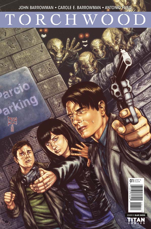
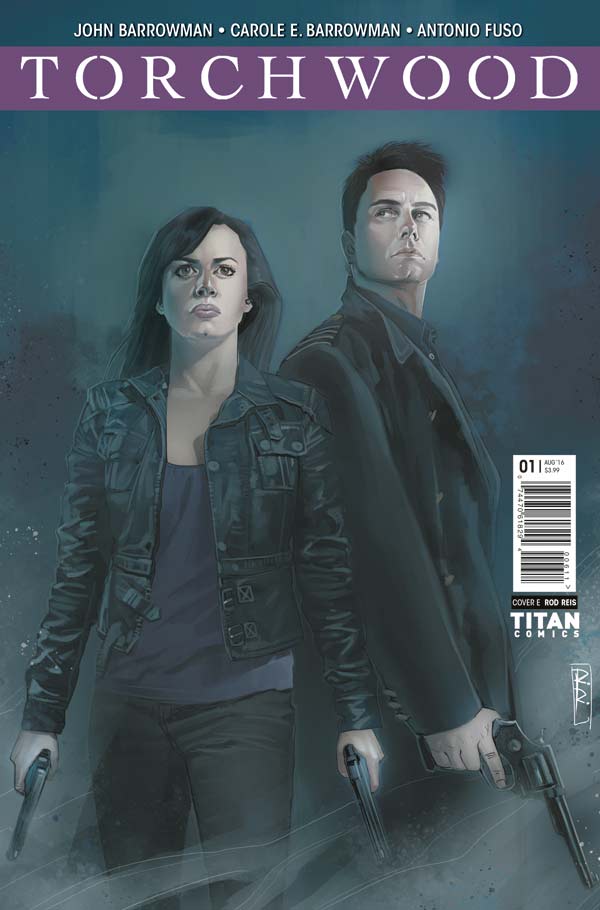
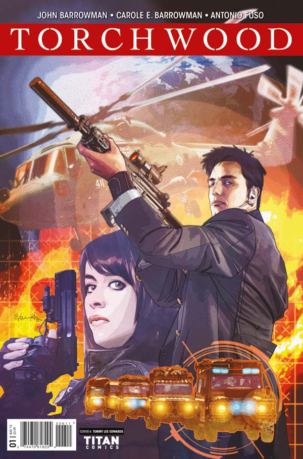
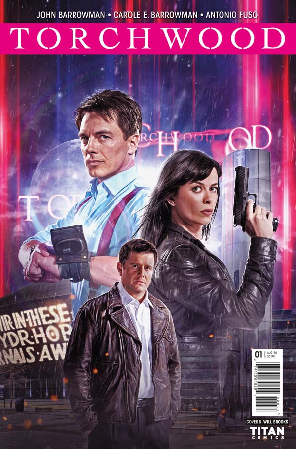
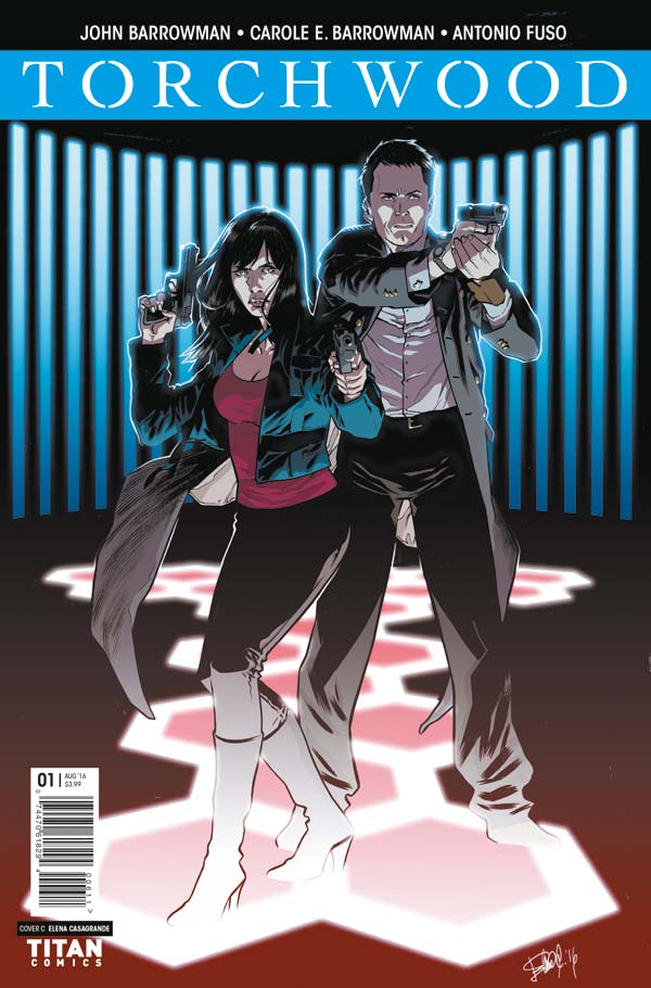
Titan Comics is excited to announce that Doctor Who TV spinoff Torchwood is back, in an all-new ongoing comic series starring the daring Captain Jack Harkness and Gwen Cooper. Written by Captain Jack himself – John Barrowman – and Carole E. Barrowman, and with issues illustrated by Antonio Fuso (Drive, The Girl Who Kicked the Hornet’s Nest) and Pasquale Qualano (Batman ’66, She Hulk, Harley Quinn), this spectacular original ongoing series is not to be missed.

In continuity with the new hit Torchwood audio dramas from Big Finish, as part of the official continuation of the Torchwood saga, the comic arrives in stores on July 6 – the week of Titan’s third annual Doctor Who Comics Day event –Saturday, July 9 2016.

The BAFTA-winning cult science-fiction drama by Doctor Who showrunner Russell T Davies, which aired for four successful seasons from 2006 to 2011, follows the exploits of Captain Jack, Gwen (Eve Myles - Broadchurch), and their team as they investigate the unusual, the strange, and the extraterrestrial.

The hotly anticipated Torchwood comic sees Captain Jack return to Cardiff to engage the help of the last person who expected to see him again, Gwen Cooper! A dark technology from a forgotten species has been claimed by a conspiratorial power… and in this collision between an ancient civilization and an all-new evil, the Earth itself may be forfeit! Only Jack, Gwen, and their allies from what remains of Torchwood hold the key to stopping a cataclysmic wave of destruction… On the road, on the run, and under fire – can Jack and Gwen put aside their differences and rebuild the heart of Torchwood… before its flame is stamped out forever?!

The debut issue comes with variant covers to collect from Doctor Who superstar artists including Tommy Lee Edwards (Tenth Doctor, Turf), Elena Casagrande (Tenth Doctor, The X-Files), Blair Shedd (Ninth Doctor), and Rod Reis(Doctor Who, C.O.W.L.)!

Retailers can order Torchwood #1 from the May edition of PREVIEWS.  This new series is a must for Torchwood fans, who can find their nearest comic store at ComicShopLocator.com.

To keep up to date with news about Torchwood comic, follow Titan Comics on Twitter, Facebook and Tumblr.

Torchwood_001_Cover_A Torchwood_001_Cover_B Torchwood_001_Cover_C Torchwood_001_Cover_D Torchwood_001_Cover_E

Review: Aloha, Hawaiian Dick #1

On its own Aloha, Hawaiian Dick #1 doesn't leave much of an impression. Aloha,-Hawiian-Dick-#1-1It’s very by the numbers. As a piece of comic noir, the series will almost certainly build upon itself over time. It has to. And looking back with knowledge from future issues will likely result in a greater appreciation of this installment. But we’re not there yet. I find myself searching for the hook, looking for the ways in which the book will differentiate itself. And I find nothing.

Other than the gorgeous illustrations, there isn't much to recommend this issue. The prominent brushstrokes in the background lend an unsettling sense of constant movement. Meanwhile figures are very clear but full of textured line work that grants a small amount of personality to stock characters. Every panel frames moments like snapshots from some sleepless vacation. Any illustration from Aloha, Hawaiian Dick could pass for grainy magazine art from the era the book apes.

There's a lot of reverence for mid-century crime fiction here. But that reverence never parts to reveal a unique identity. None of the rote dialog translates to insight nor does it earn any interest on the part of the reader.


Score: 2/5


Aloha, Hawaiian Dick #1 Writer: B. Clay Moore Artist: Jacob Wyatt Publisher: Image Comics Price: $3.99 Release Date: 4/20/16 Format: Ongoing; Print/Digital

Review: Interceptor #4

“This is from last week!” Yeah I know. I missed out last week, but I would be damned if I didn’t talk about the fourth issue of Interceptor which I will describe as “Vintage Cates.”

Interceptor-#4-1What I mean by that is that while Donny Cates doesn’t write like 99% of other comic book writers (that 1% is just in case I’m wrong), he does have a formula of his own that he follows. If you read Buzzkill or The Ghost Fleet (no, you didn’t because otherwise we’d all still be reading it!) then this issue will feel familiar. It’s the issue in which Cates tugs at those heart strings and takes a break for super witty dialogue and instead builds one of the main characters up in a way that they haven’t been yet.

The entire issue has a narration by Poli running throughout it. It reminds me of something Bendis did on Ultimate Spider-Man when Venom was introduced, but I’m way more emotionally invested in these characters because they’re a new IP and I don’t care about old IP’s anymore. The narration is charming and shows a lot of personality from Poli. It’s the heart of the comic while Dylan Burnett’s art is a mixture between amazing action and fear. Because Poli’s narration is leading us to believe that she’s not going to make it out of this scenario with her life and it’s that counterbalance between the narration and the art that wraps everything together to make it a touching and wonderful set up leading into the final issue.

That’s it. That’s all I have to say about this comic. It’s been great from the jump and it continues to be great with each issue. Hopefully after this arc we’ll see more from this series since it’s clearly an idea that’s rich enough to keep going, but we’ll see. Support this title, it’s absolutely worth all your monies and continues to be a personal favorite of mine. It has a strong lead for best mini-series of the year, that much is for sure.


[button btn_url="" btn_color="primary" btn_size="large" btn_style="default" btn_outlined="no" link_target="blank" link_rel="" icon_left="" icon_right=""]Score: 5/5[/button]


Interceptor #4 Writer: Donny Cates Artist: Dylan Burnett Colorist: Dee Cunniffe Publisher: Heavy Metal Price: $3.99 Release Date: 4/6/16 Format: Mini-Series; Print/Digital

Review: Harley Quinn and Her Gang of Harleys #1

Harley Quinn is a severely mentally ill, tragically codependent abuse victim who frequently fails to escape her abuser. So of course she gets a spin-off wherein she has wacky adventures with what amounts to a crime-fighting youth group. Having finally -- and perhaps permanently -- shaken off the Joker's influence, Harley has begun providing her services as a hero for hire. What's more, Harley has subcontracted to a somewhat diverse gang of wayward young toughs. One of my major concerns going into this book was the continued fetishizing of Harley. In her many portrayals she's frequently infantilized, sexualized, and reduced to a joke. By contrast Joker gets to be terrifying, a genuine threat. Whether or not you find him sexy, he's undeniably a monster. In Harley Quinn and Her Gang of Harleys DC seems to be positioning Quinn as their equivalent to Marvel's Deadpool. Deadpool has gone from crummy villain to sympathetic ne'er-do-well to somewhat overexposed zombie murder clown. And Harley has the capacity to represent a similar -- though hopefully more consistently good -- arc. Here she is testing her new independence by redefining her purpose. In Joker's shadow, she was isolated from others. Now, as a hero, she has built her own little family.

HQGH_Cv1_dsBy being put in a leadership position, Harley is pressured to consider someone else's well being. It is a job where her skills can be tested and applied for ostensibly selfish purposes. In reality, she has created a safe space where otherwise at-risk people can channel their efforts toward something not entirely destructive. The Harley's are only nominally superheroes. They like to get into fights and they hope to cause some good in the world as a byproduct of their violence. Beating up a gang of hipster bullies, for example, seems like a good enough deed and it's an act of violence no one will complain about. Don't know who is paying the Harley’s for that one. Don't know if the Harleys really care. In that sense, the characters are going to need a little more motivation in the future. They don't seem to want anything so much as they simply seem to enjoy carnage. Maybe, at this stage, the book doesn’t take itself seriously enough. Some readers are going to be turned off by the near constant flippancy.

I've never been fond of any Harley Quinn redesigns. They inevitably focus on failing to convince me clowns are hot. Mauricet’s art emphasizes the silliness of the book’s writing. While Quinn's cheesy sexuality is downplayed, it is still present in a playful, less icky capacity. The playful tone is helped greatly by truly brilliant, energetic artwork. And when the tone shifts, the art keeps up with a bit of shocking brutality.

Really, the only big weakness in Harley Quinn and Her Gang of Harleys is the gang itself. They have distinct personalities that are certainly each given time to shine. However, they come across as little more than a handful of character traits and costume choices. The first issue's ending suggests we'll be getting deeper explorations of the gang's personal lives and motivations. Honestly, though, I don't know how one would write a better introduction here. Issue one might have been able to ditch its lead a little earlier to allow the gang more spotlight. But that would leave you with a bunch of unfamiliar faces competing for your attention. Issue two seems like it will better showcase the gang and their interpersonal relationships. And that's something the book needs more of.

A good start.


[button btn_url="" btn_color="pink" btn_size="large" btn_style="default" btn_outlined="no" link_target="blank" link_rel="" icon_left="" icon_right=""]Score: 3/5[/button]


Harley Quinn and Her Gang of Harleys #1 Writers: Frank Tieri, Jimmy Palmiotti Artist: Mauricet Colorist: Hi-Fi Publisher: DC Comics Price: $3.99 Release Date: 4/13/16 Format: Mini-series; Print/Digital

Review: Voracious #3

Voracious is a title that, indeed like a fossil, gets more and more interesting with age. At the same time, it’s a book that I’ve felt has been chasing its own potential, being armed with such an interesting concept, but also laden with bouts of overwriting and a visual style that didn’t always work well enough to accentuate its positives while downplaying its negatives. However, in this, its third issue, Voracious has realized its promise and has become the book I’ve been waiting for all this time. Markisan Naso balances his story this issue expertly between a t-rex hunting excursion and the more metaphorically bloodthirsty pursuit of a town’s sheriff for the truth behind the funding and overnight success story of our main protagonist Nate’s new restaurant...which is, of course, preparing and selling the aforementioned t-rex meat, amongst other ill-gotten dinosaur fare.

And that’s really just the tip of the iceberg with this story so far. It also has a foul-mouthed-yet-prophetic Native American grandmother whose hallucinogenic portents of the future are becoming at once more hopeful and foreboding, as well as the looming threat of a love triangle being brought to bear in its small own setting.

Varacious #3Of course, Voracious really is all about the dinosaurs - mostly the killing and eating of same -  and Naso again works well in building his story up this issue in what will almost assuredly be a fall, with some interesting plans sure to hatch in forthcoming issues. But perhaps his greatest achievement this time wasn’t that foreshadowing, but his natural dialogue, which, while already a series highlight, felt much more distilled and keenly focused this time.

The relationships he highlights this issue could easily become exercises in maudlin storytelling in lesser hands, but Naso handles both their gravity, and especially their levity, in equally impressive measure. His only misstep is small, but one I mentioned as a massive pet peeve previously: Nobody, as far as I know, actually calls his or her sister “sis.”

That is a phrase reserved almost exclusively for bad sitcoms and as a cheap expository device in comic books. I admit it’s a tiny, even petulant thing to harp on about, but it bugs me to no end, especially because Naso is better than that; he doesn’t need that kind of storytelling crutch. To a lesser but similat extent, I’m pretty sure nobody in New York actually calls it “The Big Apple” out loud. But I digress...

The art, too, is more competent this time than it has been previously. The backgrounds are still sparse portraits, but Jason Muhr seems to be taking more time and care with his figure work than earlier issues; though his facial acting continues to be impressively on-point. His dinosaur illustrations also remain hot as hell. Seriously, somebody put this guy on a Devil Dinosaur book, stat.

Muhr’s page landscaping still feels to be fairly by-the-numbers stuff, but there were one or two pages where it was clear that he was having some fun experimenting. It’s in these where he finds the most success as a visual conductor, and it would be great to see him take that kind of chance, and charge, more often.

Given the trajectory of this book so far, it’s almost a sure bet that we’ll see his evolution, as well as Naso’s as a writer, happen as it occurs, which I’m looking forward to quite a bit. In fact, after reading this issue, I have to say I’m the most excited I’ve been about Voracious since hearing its name and reading its solicits. This is a fantastic example of a creative team picking up its ball and running like hell with it. Great work, all around.


[button btn_url="" btn_color="teal" btn_size="large" btn_style="default" btn_outlined="no" link_target="blank" link_rel="" icon_left="" icon_right=""]Score: 4/5[/button]


Voracious #3 Writer: Markisan Naso Artist/Letterer: Jason Muhr Colorist: Andrei Tabacaru Publisher: Action Lab: Danger Zone Price: $3.99 Release Date: 4/13/16 Format: Mini-Series; Print/Digital

Review: Resurrect #1

Resurrect walks a fine line between familiar and new. It’s hard to say definitively that it’s “like this” or “like that” when it could be like anything dealing with dreams and people coming to get you via said dreams. I mean a lot of stories start that way. The Matrix basically starts that way so there’s no clean comparison to any other story, but rather a shared idea of a character tapping a higher level of being that involves a dreamscape of sorts. The character we follow is Jacob. He’s living off his dead wife’s insurance money because he misses her and feels guilt since she died while he was cheating on her. Now he gets drunk and sleeps all day and hey… I don’t blame him. No one blames him.

The problem is he’s having some really strange dreams. One of which is disturbed by someone knocking at his door. The dude tells him that he’s aware of him and if he needs help to call him. It’s very strange and abrupt, but Jacob brushes it off and goes back to sleep and dreams of his dead wife. He ends up sleeping with her in the dream, but that’s when things get weird and she turns into some strange looking creature. Jacob freaks out and calls the dude and things get weirder as the creature is actually on Jacob’s side and ends up helping him unlock some kind of dormant power. Too bad there’s now two dudes trying to kill him and the creature… that he just slept with, let’s not forget that.

Resurrect-#1-1Really once Jacob calls the dude back, who got all of ten feet away from his apartment by the way, that’s when the issue picks up. I liked it after that. The opening was stale and reminded me of a dream sequence from an anime in which something similar will likely happen later in the story.

The part with the random dude showing up was jarring to say the least. The story may have picked up at this point, but it was still an inexcusable story device. Why anyone would call someone that basically showed up and said, “let me know if things get weird” is beyond me. That’s not what you do. You call the cops, you call a friend, you call a cab, you do not call a stranger that showed up randomly and foreshadowed what was going to happen to you. Why? Because how can you trust that? You can’t and Jacob was dumb for doing so.

The writing struggles. The opening really feels like filler because it doesn’t do anything but tease where the story is going. Which would be fine if this was a few issues later, but I don’t know what’s happening in this world and that made me more confused when the rest of the story was nothing like it. The dialogue is pretty cheesy when it’s not exposition. I think the creator would have benefitted from hearing how it sounded out loud because it’s pretty goofy when you read it that way.

The art doesn’t really illustrate a lot. We mostly see Jacob and his apartment and a lot of white or black backgrounds with some occasionally “disturbing” images. Really the only thing that’s mature about the story is the weird sex scene, but even then it’s not that mature. The art isn’t bad per say, there’s a lot of room for improvement, but it does have some skill. It’s just not a style that I’m particularly fond of. There’s some grey scale used with the issue which seems out of place with the rest of the art, especially on the pages with white backgrounds.

It’s readable. I know that sounds mean, but I’ve read a lot of indie comics lately and some of them I couldn’t make it past the first few pages because of how bad it was. Resurrect isn’t that bad, but it needs a lot of work. I get what the story is about, but the structure of the story leaves something to be desired. If you enjoy stories that deal with dreamscape and has a slight Darkness element to it, then give it a shot.


Score: 2/5


Resurrect #1 Creator: M.A. del Rosario Publisher: Pen & Paper Drawing Studios Price: $1.99 Format: Ongoing; Digital

[button btn_url="https://www.comixology.com/Resurrect-1/digital-comic/331442?ref=c2VyaWVzL3ZpZXcvZGVza3RvcC9ncmlkTGlzdC9Jc3N1ZXM" btn_color="darkblue" btn_size="large" btn_style="default" btn_outlined="no" link_target="blank" link_rel="" icon_left="" icon_right=""]LINK TO BUY[/button]

Review: Rebirth of the Gangster #1

The first issue of any comic can be difficult. Everyone has so many demands and expectations for what they like to read that I imagine it’s very difficult for creators to figure out what to include, what to change and what will continue to set them apart. For instance, some people hate origin stories, while others enjoy them. Some want a mystery to be built up and teased, others want a cliffhanger every issue and so on and so forth. Much like a TV pilot, we should all get in the habit of expecting nothing from a first issue. A story is never about how it starts, but rather how it ends and is built between those two points. I have read many great beginnings only to be disappointed by the end. Really the only expectation you should have is that the issue will entice you enough to come back for the next. At the of the day that should be every creators goal.

More and more I find myself asking that question when I review anything, would I come back for more? Let’s hold on to that for a minute while we talk about the issue.

Rebirth-of-the-Gangster-#1-1Rebirth of the Gangster follows Marcus; the story line is even called “Meet the Family” with the chapter title being “Marcus.” It’s safe to say that we’ll probably follow different characters from the family. He’s giving a speech about his father for some fancy event or benefit. He leaves after talking to his mom because he doesn’t want to be there and plays his role and leaves with a friend. On the street a bum asks them for money and for some reason this conversation goes on and on until the bum says something that triggers Marcus’ memory.

The problem with this is that we’re still learning how the comic is telling its story and since there’s not a big difference between present Marcus and past Marcus, it took me a while to figure out that it was a flashback. The art doesn’t help with this either as it doesn’t present any visual cues and there’s no caption to help either. What’s worse is that it flashes to a different point in the future, then back to the flashback and then back to the present. To be clear it goes present, flashback, flash-forward but still back, flashback, present, cliffhanger.

The cliffhanger didn’t really work for me either. It’s a picture and it reveals something about the story to us. That part I get, I just don’t know why the person would have it queued up and ready to go after committing a crime. Seems like a bad idea to have identifying elements on your person when trying to conceal your identity while committing crimes. If it wasn’t for that break in logic it would have been better. Hell, having another flashback would have been better.

The story struggles with its structure and pacing. The entire opening seems pointless. It doesn’t establish anything about the plot and really just introduces the parents. If say the next issue opens at the same scene and reveals something else, then that’s cool, but otherwise it doesn’t do anything for the story by being there. Obviously I address the confusion in the timeline and bouncing back and forth too much. It really got confusing until I read it a second time and pieced it all together.

While the art is detailed and fairly clean in its presentation, its missing a lot of personality. The reason I couldn’t tell that Marcus was younger is because he was wearing the same “who cares” expression on his face. There just needed to be more of a visual cue that something had significantly changed. As for fixing the personality of the art, I don’t know. It felt like it was there, but not participating. It wasn’t adding anything to the story but rather providing the figure for the world to be placed next to. It’s good art, but it’s not doing anything for this story.

Now were at the point in which I ask myself that question above every review. With Rebirth of the Gangster I just don’t know. There’s problems with this issue and I don’t necessarily thing they’ll all be fixed with the next chapter. At the same time, I’m kind of curious to see what the second issue will actually do because there’s not much of a setup to show us that. This issue, in a lot of ways stands alone. The other kicker is that I didn’t find this issue it found me. Ultimately, I think I would give it another shot, but that second issue better do something to keep me.


[button btn_url="" btn_color="violet" btn_size="large" btn_style="default" btn_outlined="no" link_target="blank" link_rel="" icon_left="" icon_right=""]Score: 2/5[/button]


Rebirth of the Gangster #1 Writer/Letterer: CJ Standal Artist: Juan Romera Self-Published Price: $1.99 Format: Digital

[button btn_url="http://www.amazon.com/Rebirth-Gangster-Meet-Family-Marcus-ebook/dp/B01DCQNDNO?ie=UTF8&keywords=rebirth%20of%20the%20gangster&qid=1458833641&ref_=sr_1_1&sr=8-1" btn_color="darkblue" btn_size="large" btn_style="default" btn_outlined="no" link_target="blank" link_rel="" icon_left="" icon_right=""]WEBSITE[/button]

Review: Aliens: Defiance #1

I wonder what the life insurance policy is for a Weyland-Yutani employee? The characters are definitely going to need it in the newest installment of the Alien comic book line. Aliens: Defiance takes place sometime after the movie Aliens. Instead of our favorite icon Ellen Ripley this story follows Zula Hendricks, a Private in the Colonial Marines. Within the first pages it became clear that no prior knowledge of the Alien universe is necessary to pick up this book. In this case that’s a good thing.

Aliens-Defiance-#1-1Zula is by the Weyland-Yuntani Corporation to investigate a deserted spaceship which contains... aliens. Not much of surprise there. I’ve always found the Alien to be like a zombie outbreak. They’re a dangerous obstacle. The threat of the Alien is the same here as it has been throughout the franchise. We know what they do. We know how they look. It works in this issue because you know what you’re going to get and there’s more of a focus on character. What I was surprised by was how interested I was in Private Zula Hendricks as a character. Being an astronaut is just another boring day at the office for her until things pick up. Her narrations give insight into what makes her tick and how it would be to experience a zenomorph encounter in real-time. Flashbacks reveal that Zula is also dealing with recovery from a traumatic spinal injury. The cause of this injury isn’t revealed but we do we see the conflict for her to be a committed soldier but restricted by her injury.

There are a decent amount of Easter eggs for true Alien fans. I was surprised by an appearance by a special character that has a unique presence in the franchise. You’ll have to read and see it for yourself!

The artwork is as dark and eerie as the movies. The pacing of the page layouts works like the unfolding of a movie and include close-ups that are very well detailed. Space plays a huge factor in creating the atmosphere of this book. The way they are drawn and the perspectives that artist, Tristan Jones uses give a feeling of isolation.

Aliens: Defiance stays true to the franchise by having a strong female protagonist. I’m rooting for Zula to take down the Alien or take it with her like (SPOILER ALERT) Ripley did in Alien 3 which depressed me a lot as a kid.


[button btn_url="" btn_color="teal" btn_size="large" btn_style="default" btn_outlined="no" link_target="blank" link_rel="" icon_left="" icon_right=""]Score: 4/5[/button]


Aliens: Defiance #1 Writer: Brian Wood Artist: Tristan Jones Publisher: Dark Horse Comics Price: $3.99 Release Date: 4/27/16 Format: Mini-Series; Print/Digital

Review: Elasticator #1

I’ve been sitting on this review for about a week because it’s taken me that long to really digest how I feel about it. It’s a solid first issue, but it plays it moderately safe with its execution. At times it was funny and the rest of the time it’s trying to be funny. We meet Mikey as he’s arrested in Brooklyn, in costume and taken into a police station. He’s narrating the entire time and it’s all pretty general until he starts talking about how he ended up in Brooklyn. Basically his dad lost his job and they had to move specifically to Brooklyn. He’s pissed because he had to leave friends behind and now the family is bleh instead of happy. All of this is being narrated to us which is fine. It’s an origin story and even though we’re getting a lot of really pointless info, it’s not a deal breaker. During all this though we saw Mikey in the present being brought to an interrogation room. We see this room again when the cop tells Mikey to get to point already… yeah. He’s narrating this to everyone… believability for the character suddenly drops.

Elasticator-#1-1The rest of the issue we see Mikey basically take up with a gang run by a kid not much older than him. I couldn’t tell you why. I guess Mikey is really just that mad about having to move which seems entirely blow out of proportion. We don’t get to Mikey’s powers and the last quarter of the issue is dedicated to introducing not one, but two potential threats/rival gangs.

I will definitely read more of this because I liked it enough to do so, but it’s far from perfect. The narration is thick, much too thick and a lot of it didn’t serve the origin or the story. None of this backstory paints us a picture of how Mikey is because he’s defined by how angry he is at his father. That’s it. There’s nothing else to him and present Mikey has the same attitude, but amplified. He has a chip on his shoulder and it doesn’t leave. The dialogue isn’t terrible, but there are definitely more than a few scenes that have bad or cheesy dialogue.

The art is good. It’s not perfect and the artist still has a way to go before being a great visual storyteller, but there’s talent there. Part of it is the structure of the story. Because there’s an excess of scenes that fill the book, the art is left doing the same. The gore isn’t over the top nor is the blood. The action in general is the best part of the book, especially the drive by shooting which is probably the best I’ve ever seen done in a comic. The art definitely helps elevate the story, but it’s also handcuffed by it as well. The writer needs to put more trust in the art.

This is an independent superhero comic book. Which there are plenty of. You’ll basically be able to decide if you want to read more superhero books or not. If you are, then this one has a maturity to it that a lot of other superhero books don’t. That’s not to say that it’s maturity is just violence, because it’s not. It’s the narration and the overall presentation of the world that makes it mature in addition to the artwork. If you’re reading superhero comics then check this one out, if you’re not then you weren’t going to read this one anyway.


Score: 3/5


Elasticator #1 Writer: A.C. Medina Artist: Kevin Shah Publisher: Scout Comics Price: $3.99 Release Date: Format: Print

[button btn_url="http://www.scoutcomics.com/" btn_color="darkblue" btn_size="large" btn_style="default" btn_outlined="no" link_target="blank" link_rel="" icon_left="" icon_right=""]WEBSITE[/button]

Review: Hot Damn #1

When I began typing this review, I accidentally referred to the issue as 'Hot Mess #1' instead of 'Hot Damn #1'--a Freudian slip if I've ever heard one.  "Hot Damn #1" is a book that I can't legitimately imagine anyone liking. Don't get me wrong, taste varies a lot, and no doubt many will feel warmer towards Ferrier and Ramon's hellish, in more ways than one, story than I did, but I can't see anyone claiming it as a legitimately good comic. It's a muddled, messy, distasteful read, that drags a lot more than anything at 24 pages should. Ryan Ferrier and Valentin Ramon had a surprise hit last year with their robot/midlife crisis comedy "D4VE" which managed to spin a sequel and a print run out of its digital only release. It's perhaps unsurprising than that "Hot Damn" borrows liberally from "D4VE"s formula. Once again Ferrier's story is set in a fantastic world, this time Hell, which contrasts to the aggressively mundane lives of the inhabitants. The demons/angels use cellphones, throw modern slang around (albeit painfully exaggerated and absurd modern slang), and generally act like the miserable employees of a large bureaucracy. It's all very familiar, and not particularly fresh after having just seen it in "D4VE" which was a hell of a lot better.

You'll notice I have yet to mention much of a plot in Hot Damn #1, and that's because, as far as I can see, there is none. Don't get me wrong, we have a main character in the form of the recently-dead Teddy Graham, but he doesn't have any notable motivations.  Things do happen in the issue, including an illegal demon possession and a meeting with a mythic figure, but in general the book simply meanders with the literally and figuratively lifeless Teddy from gross-out moment to gross-out moment, never bothering to build any momentum. The world that Ferrier has set up is not interesting enough to sustain this sort of pointless exploration, and the book feels bloated with its mass of random events and images.

HotDamn01-CoverAdding to the problems, are a couple of moments of philosophical ramblings that feel like Ferrier cribbed some notes on religion from Garth Ennis' Preacher and mixed them with, of course, D4VE. It turns out God is pretty much a business owner who is simply trying to peddle his goods and services (a point driven home by heaven appearing as mass of advertizing). It's a plot point that likely seeks to aim some barbs at organized religion but is too generic and nonsensical to have much edge to it. I'm rarely a fan of God showing up as a character, since he tends to be merely a stand in for a writer’s feelings about religion or a literal Deus ex Machina, and his appearance here is more than a little annoying.
In a word, Ferrier's work here is messy, and his extremely talented partner on art can't save things. Colored in the dull grey-green of sewer water, Valentin Ramon's hell is a mass of shapeless buildings crawling with decayed, wounded, and monstrous denizens. Ramon's linework is still incredibly sharp, but when the script calls for constant hideousness and sequences of vomit, this is not necessarily a plus.  Every character, the main ones included, are ugly to look at in a way that makes them hard to sympathize... even for hell-damned sinners and satanic demons. Ramon's colors are perhaps the most off-putting element here, as random elements are drawn in bright colors, contrasting horribly with the color-scheme of everything else. In one scene that has the character drinking at a dive bar, Ramon colors their noses such a bright shade of red, that they could likely put Rudolph out of a job.

I'd normally qualify this negative of a review with some suggestion that one issue is too little to judge, and perhaps things will improve with time, but I can't do that here. I knew well before I reached the end of "Hot Damn #1" that I would not be back for more.  And as it turns out, the only time I felt like the title was really appropriate was when I realized nothing was compelling me to read more. Hot damn!


[button btn_url="" btn_color="blue" btn_size="large" btn_style="default" btn_outlined="no" link_target="blank" link_rel="" icon_left="" icon_right=""]Score: 1/5[/button]


Hot Damn #1 Writer: Ryan Ferrier Artist: Valentin Ramon Publisher:  IDW Publishing Price: $3.99 Release Date: 4/13/16 Format: Mini-Series; Print/Digital

Review: Goldie Vance #1

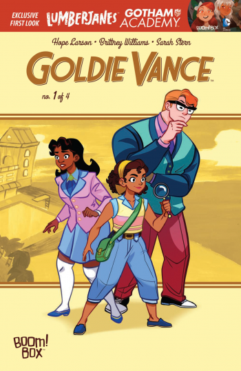
If I had kids, this is the book I would want them to read. So often all-ages books are dumbed down for a younger audience and alienate the adults who like to read fun stories just as much. Goldie Vance #1 has the perfect balance of kid-friendly fun and intelligent humor. The titular character is a young girl who works part-time at the Florida resort that her parents manage. In between work shifts she solves mysteries for the resort guests. The whole feel of Goldie Vance is similar to Archie. It follows young people dealing with everyday issues in a fun way. There’s also a colorful cast of characters. Goldie works with her best friend Cheryl and assists her friend Walt, who is the official detective for the hotel. This issue deals with Goldie trying to locate the missing watch of a guest. It takes a lot of interesting and unexpected turns and by the end of the issue I felt like the journey paid off.

Goldie-Vance-#1-1Goldie herself is a character that young girls can look up to. She’s intelligent, enthusiastic and a hard worker. She doesn’t rely on other people to fix her problems. She takes a proactive approach and that’s what makes her a great detective. Goldie does have the flaws that a typical teenager has such as thinking she knows it all and being impulsive, but she seems to stay focused on the bigger picture and the goals that really important to her.

The artwork is handled by Brittany Williams; whose style you may recognize from another great book Marvel’s Patsy Walker: Hellcat. The bright colors on every page instantly give you a feel-good tone. The character designs are diverse both in style and in ethnicity of the characters. Being a detective book there is a lot to pay attention to in the pages and small details can be pointed out among the rest of the main action.

It’s bittersweet knowing that Goldie Vance will only be a four issue mini-series. I think there’s potential for way more storylines beyond four issues but if every issue is as rich with story and fun as this one than I’ll gladly take what I can get.

[su_box title="Score: 5/5" style="glass" box_color="#8955ab" radius="6"]

Goldie Vance #1
Writer: Hope Larson
Artist: Brittney Williams
Colorist: Sarah Stern
Publisher: BOOM!/BOOM Box
Price: $3.99
Release Date: 4/13/16
Format: Mini-Series; Print/Digital

[/su_box]