Kuroko's Basketball Gets A 2-in-1 Omnibus from Viz

As much as I like the sports genre in manga and anime, I have never checked this one out. Maybe it's time. From Viz Media:

VIZ Media, LLC (VIZ Media), a premier company in the field of publishing, animation distribution, and global entertainment licensing, delivers the smash hit manga series KUROKO’S BASKETBALL with the launch of Volume 1 on August 2nd.

The series was created by Tadatoshi Fujimaki and has become a global sensation. KUROKO’S BASKETBALL is rated ‘T’ for Teens and will debut in 2-in-1 omnibus editions under the Shonen Jump imprint with a print MSRP of $16.99 U.S. / $19.99 CAN. KUROKO’S BASKETBALL also launches digitally on August 2nd on VIZManga.com and will be available via the VIZ Manga App, as well as the Nook, Kobo, Kindle, iBooks, comiXology, and Google Play stores. Future omnibus editions of the ongoing series will be published in English on a bi-monthly basis.

KurokosBasketball-Omni01-3D
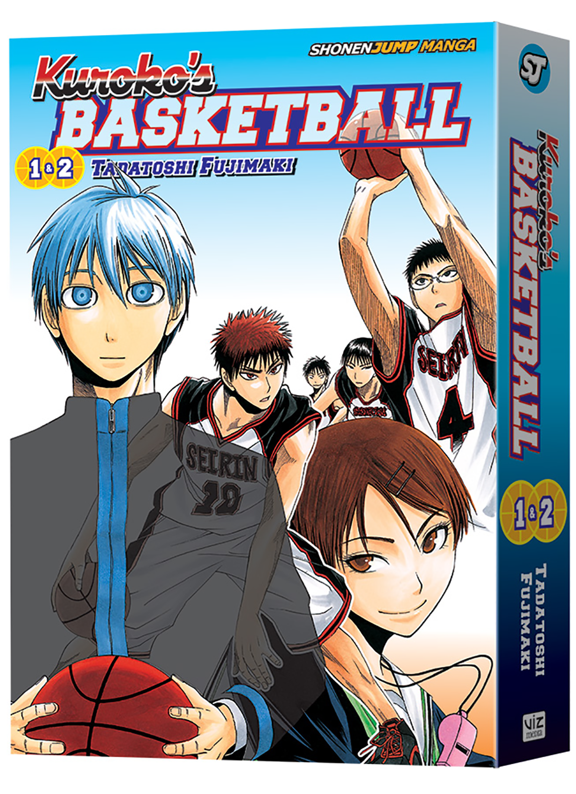
In KUROKO’S BASKETBALL, when incoming first-year student Taiga Kagami joins the Seirin High basketball team, he meets Tetsuya Kuroko, a mysterious boy who's plain beyond words. But Kagami's in for the shock of his life when he learns that the practically invisible Kuroko was once a member of “The Miracle Generation” – the undefeated, legendary team – and he wants Kagami's help taking down each of his old teammates!

“KUROKO’S BASKETBALL has been really popular in Japan, having sold more than 30 million copies, and overseas fans have been clamoring for it for quite some time now,” says John Bae, Editor. “There will be no time-outs taken while working on this series with 2-in-1 omnibus volumes released every two months. Look out for the excitement hitting streets this summer!”

Manga creator Tadatoshi Fujimaki made his debut in 2007 in Akamaru Jump with KUROKO’S BASKETBALL, which was later serialized in Weekly Shonen Jump. It quickly gained popularity and was also adapted into an anime series in 2012.

For additional information on KUROKO’S BASKETBALL and other manga titles published in-print and digitally by VIZ Media, please visit www.VIZ.com.

Do Want: Haikyu!! Vol. 1 from Viz

I love the hell out of the Haikyu!! anime so I'm all about checking out this manga. I don't know if I'll like it because the anime has movement, but I'm hoping that it's good. There's several volumes that need to be published to catch up the anime though so hopefully the wait isn't too long on them. From Viz Media

VIZ Media, LLC (VIZ Media), a premier company in the field of publishing, animation distribution, and global entertainment licensing, brings the riveting sports manga HAIKYU!! to English readers with the print and digital launch of the series on July 5th.

Created by Haruichi Furudate, HAIKYU!! depicts the on- and off-the-court drama of a driven young volleyball player. The series is rated ‘T’ for Teens and will be released under the Shonen Jump imprint with a print MSRP of $9.99 U.S. / $12.99 U.S. HAIKYU!! launches digitally on July 5th on VIZManga.com and also will be available via the VIZ Manga App, as well as from the Nook, Kobo, Kindle, iBooks, comiXology, and Google Play stores. Future editions of the ongoing series will be published in English on a monthly basis until it catches up with its Japanese counterpart.

Haikyu-GN01-3DEver since he saw the legendary player known as “the Little Giant” compete at the national volleyball finals, Shoyo Hinata has been aiming to be the best volleyball player ever! Who says you need to be tall to play volleyball when you can jump higher than anyone else?

In the opening volume, after losing his first and last volleyball match of his middle school career against Tobio Kageyama, "the King of the Court," Shoyo Hinata swears to become his rival. But what happens when the guy he wants to defeat ends up being his teammate?!

“HAIKYU!! is extremely popular in Japan, where it won the 2015 Shogakukan Manga Award in the Shonen category and continues to sit alongside other top popular series in Japan’s Weekly Shonen Jump magazine,” says Marlene First, Editor. “HAIKYU!! is one of the most requested series by fans and we are very excited to announce its official debut. With its captivating underdog story and high-energy, fast-paced storytelling, HAIKYU!! will keep manga fans on the edge of their seats this summer!"

Manga creator Haruichi Furudate began his manga career when he was just 25 years-old with the one-shot Ousama Kid (King Kid), which won an honorable mention for the 14th Jump Treasure Newcomer Manga Prize. His first dedicated series, Kiben Gakuha, Yotsuya Sensei no Kaidan (Philosophy School, Yotsuya Sensei’s Ghost Stories), was serialized in Japan in 2010 in Weekly Shonen Jump. In 2012, he began serializing HAIKYU!! in Weekly Shonen Jump, where it has become his most successful work to date. HAIKYU!! also has been adapted into a very popular anime series whose 3rd season is set to debut in Japan later this year.

For additional information on HAIKYU!! and other manga titles published in-print and digitally by VIZ Media, please visit www.VIZ.com.

Surprise! Midnighter is Back and He's Bringing Apollo

This is mostly just for Steve since he was pissed this book was ending. He should have known that DC was just straight up jacking a page from the Marvel handbook. You know the page, constant reboots until the industry collapses. Look DC even reused the cover and photoshopped Apollo in there. I miss WildStorm... Thanks Jim Lee. From DC Comics:

From their days as founding members of The Authority, the heroes Midnighter and Apollo have been forever linked, both professionally and romantically. On October 5th, they’ll be back, badder than ever, in Midnighter and Apollo, a six-issue miniseries written by breakout star Steve Orlando, with art by Fernando Blanco, colors by Romulo Fajardo Jr. and covers by ACO.

MIDNIGHTER&APOLLO-#1-cover-art-by-ACO-and-Romulo-Fajardo-JrSpinning out of the hit series Midnighter, this new miniseries continues the story that launched writer Steve Orlando to notoriety over the past year. Midnighter received critical acclaim in both comic and mainstream press; most notably recognized with a 2016 GLAAD nomination in the “Outstanding Comic Book” category. Together again, in the series opener Midnighter and Apollo will take on subway pirates in Los Angeles and demons in Opal City, but their reunion will take a shocking turn and send them both on an epic journey beyond all belief!

“Midnighter and Apollo have spent time apart—figuring out who they were when defined on their own instead of by their relationship,“ said Orlando. “They have a firmer idea of who they are and they've become stronger and more confident together. Midnighter and Apollo are back to remind the world that it truly is a bad time to be bastards. This is the World's Finest Couple—kicking back and making each other better than they are on their own.”

MIDNIGHTER AND APOLLO #1, written by Steve Orlando with art by Fernando Blanco, colors by Romulo Fajardo Jr. and cover by ACO, debuts October 5th, 2016.

Image/Skybound Announces Max Landis' 'Green Valley'

I'll check it out. I mean I'm not in love with Landis, but I'm curious to see what he can do when he's not doing Superman. From Image Comics:

Beloved screenwriter and creator Max Landis (Chronicle, American Ultra, Superman: American Alien) teams up with penciler Giuseppe Camuncoli (Amazing Spider-Man), inker Cliff Rathburn, colorist Jean-Francois Beaulieu, and letterer Pat Brosseau for an all-new miniseries from Image/Skybound Entertainment called GREEN VALLEY. It will launch this October.

The knights of Kelodia are the finest in the land, but they’ve never faced a power like the one that resides in GREEN VALLEY. This new nine-issue miniseries will welcome readers into a world where nothing is as it seems. 

“Green Valley was an idea I had when I was a very little kid,” said Landis. “As I got older, most of my ideas from when I was small sounded stupider and stupider. ButGreen Valley persisted in my mind, and grew. I'm glad to see it finally come to life so beautifully.”

GREEN VALLEY #1 will hit comic book stores on Wednesday, October 5th. The final order cutoff deadline for comic book retailers is Monday, September 12th

[su_custom_gallery source="media: 136734,136730,136731,136732,136733" link="lightbox" width="230" height="340"]

Love and Rockets Returns As An Ongoing Comic Series This Fall

Fantagraphics Books is proud to announce that Gilbert and Jaime Hernandez’s belovedLove and Rockets will return this fall in the same magazine format that fans fell in love with during its original 50 issue run from 1982-1996. Love and Rockets has been Fantagraphics’ flagship publication since its initial magazine debut in 1982, and the new series (Vol. IV, for those keeping track) will launch on the eve of the title’s 35th anniversary in September 2016 and continue every four months thereafter. The new format and schedule comes after a decade of the Love and Rockets: New Stories annual. STL016197The Love and Rockets stories by brothers Gilbert and Jaime Hernandez continue to hold a firm grasp on the imaginations of several generations of comic book fans, garnering multiple Eisner and Ignatz Awards in recent years for their work on New Stories. Meanwhile, the collected Love and Rockets trade paperbacks continue to be perennial best sellers for Fantagraphics, with 11 volumes to date.

The new Love and Rockets marks Gilbert and Jaime’s return to the “floppy” format for the first time in a decade and will measure 8 ½” x 10 ¾”, with at least 32 pages per issue, retailing at $4.99.

“Over the past few years, Gilbert and Jaime had each casually mentioned more than once that it might be fun to try their hand at a regular comic book series again after a decade of creating the new annual every year,” said Fantagraphics Associate Publisher Eric Reynolds. “Gilbert joked at one point that he would simply love to be able to draw more covers — with he and Jaime trading covers, he was only creating one new L&R cover every two unnamedyears! We agreed that something needed to be done about this, and we’re very excited to return L&R to its comic book roots.”


The new format will play to the strengths of master cartoonists Gilbert and Jaime Hernandez, focusing on their diverse cast of characters and the rich milieus they have established over the past three-and-a-half decades: from Jaime’s Maggie and Hopey to Gilbert’s Luba and Fritz, old and new fans alike will be able to enjoy two of the great bodies of work in comics history, under one cover.

Gilbert Hernandez shared "This decision to return to the magazine format is the logical step, I think. For some, it'll be a nostalgic experience to read it that way again and for newer readers it'll be a new way to enjoy our comics. And enjoy it I hope they do!"

The all-new Love and Rockets Vol. IV #1 appears in the July Diamond Previews catalog for September shipping products.

Udon Announces Street Fighter Swimsuit Special

Say what you will, but I like cheesy things like this. I think a lot of 90s comic readers do. Hopefully since it's 2016 there will be something for the ladies as well, but we'll see! From Udon:

This September, the lovely ladies of Street Fighter take a break from fist fights and tournaments to hit up the world’s hottest beaches, pools and volleyball courts! Everyone from Chun-li to Laura to Juri shows off their favorite swimwear in this comic-sized one-shot pin-up special!

Bringing this gallery of fun and flirtatious artwork to life are top UDON artists like Genzoman, Edwin Huang, Rob Porter, Jeffrey Cruz, Steven Cummings, and Long Vo. Plus the UDON crew is joined by a bevy of guest artists like Gisèle Lagacé (Ménage à 3), Xa (Wakfu), Vincenzo Cucca (Pandamonia), and more!

This issue features two standard covers by artists Ecchi-Star(CVR A) and Aki Lee(CVR B), as well as a special Blank Sketch Cover(CVR C). Plus, artist Nei Ruffino provides a retailer incentive homage variant which calls back to the 90s origins of comic book pin-up specials. Ask your local retailer about obtaining this rare incentive cover.

Comic book specialty retailers everywhere are now taking pre-orders for STREET FIGHTER™ SWIMSUIT SPECIAL #1. Head in to your local comics shop to reserve your copy now.

DETAILS: 32pg, Full Color, $3.99 USD RELEASE DATE: SEPTEMBER 2016 DIAMOND COMICS ORDER CODES: JUL162012 STREET FIGHTER SWIMSUIT SPECIAL CVR A (Ecchi-Star) JUL162013 STREET FIGHTER SWIMSUIT SPECIAL CVR B (Aki Lee) JUL162014 STREET FIGHTER SWIMSUIT SPECIAL CVR C (Blank Sketch) JUL162015 STREET FIGHTER SWIMSUIT SPECIAL CVR D (Incentive – Homage variant)

[su_custom_gallery source="media: 136718,136719,136720" link="lightbox" width="230" height="340"]

Unboxing: Loot Anime - June 2016

By Dustin Cabeal

We have another Loot Anime unboxing from Loot Crate. This is the June box in which they teamed up with Crunchyroll to curate the box if you will. Now that you've watched the video I'll give you my honest thoughts... it's an okay box. The thing is, I'm not into either anime that was featured so it's kind of meh. That and I don't need any more Nintendo items thank you very much Loot Crate. I get that Nintendo is easy to work with and they merchandise like crazy, but I've gotten something Nintendo related every month, sometimes twice since starting this experiment. I will likely never wear the shirt, but I will read the manga. That was the best thing provided in the box. Here's some pictures to round out my review.

Read More

Review: Killbox #1

High concept stories always seem to have the roughest first issues. The reason being is that there’s so much to set up in the world that exposition and narration become heavy crutches. Killbox is like a video game deathmatch brought to life. Contestants are picked for the game and then told to say in a specific area known as the “Killbox.” Their goal… kill the other contestants and don’t get caught. Instantly you’re asking yourself if this is worth it. Don’t get caught while you murder 19 other people in cold blood? Oh, and don’t get killed, too. Well obviously it’s worth it otherwise we wouldn’t have a story. The issue is spent half with the people running the game as the pit boss of sorts lays everything out for us. He narrates every detail of the game and the rules so that we are in the know. We shouldn’t need to visit them again after this issue and that’s a good thing. The other part of the issue is spent getting to know a few of the contestants and seeing who is killing who.

Killbox #1In this issue we only meet a handful of contestants and we’re given backstories on three of them. This is probably the most interesting part because you see what their motivation is and how casual they are about taking place in the game. Then during the game, you see how none of these people were killers to begin with. Well, maybe one of them and his character development is still very different than what’s presented in his backstory.

Putting aside the narration/exposition, this story is well told and paced just right. The action is spread out, but it still feels like it’s being kept at a frantic pace. You don’t get the impression that these characters are just hanging out, but instead running to the finish line. The exposition isn’t bad. Thankfully it’s all kept to the narration, it’s just kind of strange that we’re in this dude’s head and he’s explaining everything to us. We need it though. I don’t know how else we would get this level of information otherwise.

The art is black & white and grayscale. It works for the story and has a distinct look. I liked it, but it’s not perfect. The women tend to have weird posture and all of the clothes are painted on the characters. It’s believable to a degree, but it’s like a skinny jeans convention at the same time. One of the female characters was wearing a full jump suit… I think. It’s really hard to tell, but that’s what it looks like and I don’t believe for a second that someone playing a kill game in real life would wear a onsie. You would stand out instantly to your targets and the police.

The end of the issue was a bit flat, but I was already hooked on reading more. It was just a clumsy set up for the second issue and a bit of convenient writing to prolong one character’s life over another. I’ll be back for more and if you’re interested in a Battle Royale situation happening in the streets of modern L.A., then you should check out Killbox.

[su_box title="Score: 3/5" style="glass" box_color="#8955ab" radius="6"]

Killbox #1
Writer: Tom Riordan
Artist: Nathan Gooden
Publisher: American Gothic Press
Price: $3.99
Format: Mini-Series; Print/Digital

[/su_box]


Review: Violent Skate Bulldogs

This is honestly going to be a hard book for me to review. I’ve enjoyed Lukasz Kowalczuk’s past work on Vreckless Vrestlers and some of his other short story comics. Violent Skate Bulldogs should be for me because it’s a little big Ninja Turtles and a lot of Punk rock. The thing is… we’ve had plenty of versions of the Ninja Turtles. Hell, there’s been things like Biker Mice from Mars and countless others that have followed the TMNT formula to varying degrees of success. In that regard, it’s no longer enough to just follow the formula and add your own spice. It’s a stew that’s had too much added, but you remember what it tastes like so you tell yourself it’s okay.

Violent BulldogThe gist of the story is that these three mutated bulldogs are going to save the city/world. I don’t know why they have to specifically because the story doesn’t tell us. We mostly see them fight with cops and occasionally other people… via a moshpit. That’s really all there is to the story.

There’s entertaining elements of the story for sure and I enjoyed those parts. The story, or rather the collection of short stories, don’t blend together as a whole. There is and isn’t a larger story being created here and that’s frustrating because in the end, it’s just TMNT with Punk rock and nothing else. There’s no real sense of the world and the characters are one-dimensional.

Kowalczuk’s artwork is always very strong. It’s not a style that everyone is going to love that’s for sure, but I enjoy it. There’s a free flowing feel to the art and often times it looks like a band poster. The action isn’t given enough panels making for huge leaps of visuals, but other than that, it gives the story all of its personality.

It’s not that I disliked the book, it’s that it didn’t go deep enough. It didn’t offer the genre anything new. It relied on shock and awe and having read a lot of comics, I felt neither. It might be more enjoyable for someone else, but like I said, just using the TMNT formula isn’t enough anymore.

[su_box title="Score: 2/5" style="glass" box_color="#8955ab" radius="6"]

Violent Skate Bulldogs Complete
Creator: Lukasz Kowalczuk
Publisher: Bloody Gore Comix
Price: $4.99
Format: One-Shot; Print

[/su_box]

[su_button url="http://bloodygorecomix.com/books/violent-skate-bulldogs/" target="blank" style="soft" background="#000000" color="#ffffff" size="7" center="yes" icon="icon: external-link" icon_color="#ffffff" rel="nofollow"]WEBSITE[/su_button]

Review: Chainmail Bikini

I think a lot about geek culture. From being a critic here, to a creator there, to some of my ventures in my personal life, how people have built a world of self-creation and expression out of consuming genre media is a big part of what I have focused my life on. It's no small thing to have something come along that significantly alters my fundamental understanding of something I feel I've lived as a part of for most of my life, but Chainmail Bikini can make that claim. At a time when female gamers and geeks are defining a new environment for expression in a culture that marginalized or ignored them, Chainmail Bikini is an anthology that personifies that voice. Not the voice of one person, perspective, or struggle, but a landscape of unique experiences that never feel the need to tell one story. This is the voice of female gamers and at times it's a humbling experience to receive. Chainmail BikiniClocking in at a little under 200 pages, Chainmail Bikini is an anthology that collects the works of 40 female gamer creators, involving their passion for the medium of fantasy play. Not just video games, the comics also extensively cover table top RPGs and LARPing, both in autobiographical stories as well as fiction. The personal identities covered are also broadly diverse, lesbian and trans creators alongside straight and CIS stories. Some comics pointedly address feminist issues while others tell stories as simple as recounting childhood memories. Technical polish of the art also varies, with some art being industry tested and others featuring a rougher but still personal touch. While this may sound all over the map, I can say having read many anthologies (we're an indie comic review site, you have no idea how many we get) this is one of the best curated ones I've read. It feels balanced and diverse, opening its doors to so many perspectives yet never feeling like a madhouse of whatever is out there. Not every comic may hit you the same way, and you may come across stories whose perspective you don't identify or agree with, but this anthology builds an ideal feminist platform for female creators, one that doesn't pick one voice to represent women, but rather a human chorus. I didn't enjoy each comic equally, but I believe every comic included here is worth reading to fully experience the entire picture of what it has to offer.

Where the book particularly affected me was finding the common themes between the otherwise unrelated stories. One that stood out in particular was how many women, either by addressing the subject directly or building it into their stories, communicated how gaming often serves as a means for shaping personal identity in ways they feel denied by flesh and blood society. Participating in pocket realities where the rules are defined as an act of personal creation resurfaces as a key experience again and again in the book, showing how these fantasies helped define (and in at least one case, hinder) a sense of identity, a message reinforced with the humor and heartache these stories bring with them. Besides the pleasure of reading artfully crafted comics, this was my defining takeaway from Chainmail Bikini, and what I carry with me having finished it.

At a time when the game culture debate is still as hotly contested and hyperbolic as ever, I don't think it is too bold to say that Chainmail Bikini is required reading for participants in said debate. This anthology creates a tapestry of experience interwoven in with its passionately defended politics that invites the reader into empathy with the women who find their passions and pastimes the target of controversy. This isn't the be-all-end-all of female gamers discussing the medium, but for male readers it can be a deeply felt and personal primer on the female gamer experience, in a wealth of its forms, while for some female readers it might strike a resonant chord of relateability. It has great art, it has meaningful writing, and a steady hand organizing it all into a thoroughly readable package. And who knows, maybe something it inside will shift the very ground under your feet.

[su_box title="Score: 5/5" style="glass" box_color="#8955ab" radius="6"]

Chainmail Bikini
Writers: Various
Artists: Various
Publisher: Alternative Comics
Price:
Release Date:
Format: Anthology; Print/Digital

[/su_box]

Review: The Immaculate Abortion of Dina Leigh

One of the worst video games I’ve ever played was Heavy Rain on the PS3. I have two memories of that game: one is a part in which a character calls for his son and you can make him do this over and over and over. For some reason the voice acting makes it sound like a computer and so now whenever I hear the name “Jason” I will imitate this scene from the game. The other memory is of the P.I. character that you’re forced to play as. He sucked. He was the worst characterization of a private eye I have seen and so now whenever I see anything that’s similar to that character, I kind of sigh and roll my eyes. This story is based off of a characters from a novel that I will never read. Mostly because this story isn’t very good, interesting, and is populated by characters I couldn’t even fake caring about. One of those characters is a disgraced journalist that reminds me 150% of the character I roll my eyes at.

Dina-Leigh-1The story is that a woman wakes up in a bathtub having some back alley surgery done to her. She finds this dude named Kelsey somehow and he tells her that the kidney thief thing is a myth because blah, blah, real medical reason here. He blows her off and then some people use a baseball bat to beat in his hotel door to… I don’t know, tell him to leave her alone after he already did that one his own?

Now he’s involved. That was the deus ex machina to make him get involved and it sucked. By the by, the guy runs away after a gun is pulled on him, but only after Kelsey somehow fumbles the gun. Then the dude is hit by a car… to keep the secret… or something.

There’s a mystery of sorts going on about what’s inside the woman: who are these people that want it and so forth? The problem being that we’re really not given much in the way of details and what we are is of course through exposition. Exposition. Exposition.

The ending of the story was particularly unrewarding as the most logical thing possible happens. There was no guess work needed. This is a one-shot of sorts, I actually have two more from the same publisher, but I don’t know if they’re based off the same work and if they connect to this story. I kind of doubt it which just makes this a strange ass one-shot that accomplishes very little.

Due to the way I paced this review, I’m going to leave you on the art. It’s okay. It’s not great. I believe it’s water colored, but there’s a lot of inconsistencies in the coloring. Some scenes are just too dark and then you turn the page and they’re too muddy and bright. There’s not a good balance for the coloring, which is needed for water coloring to really work in a comic. The action is clunky and there’s too many extra lines that really clutter up the page. This was an experience for sure, but like Heavy Rain, it’s not one that I wish to repeat.

[su_box title="Score: 2/5" style="glass" box_color="#8955ab" radius="6"]

The Immaculate Abortion of Dina Leigh
Based on characters from Fallen Heroes by Barry Nugent
Writer: Cy Dethan
Artist: Valia Kapadai
Publisher: Unseen Shadows
Price: $2.99
Format: One-Shot; Digital

[/su_box]

Review: Weekly Shonen Jump #30

Viz has finally overhauled the Weekly Shonen Jump homepage and it looks like the start of some very good things. I've been reading Weekly Shonen Jump as an official subscriber (hey you, stop reading illegal scans: 50 cents a week for all this content is worth paying for) for two years.  I didn't read the English-language version of the magazine that was available when I was a kid, but by the time I became interested in manga, it was no longer serialized, and WSJ wasn't available as a digital service yet.  I was mad when I found out about it because I felt it could have been advertised a lot better, and instead it was just sort of in a corner of Viz Media's webpage.

But things have come along in the last two years.  Digital manga bundles are now on sale very often from Viz's site, and they effectively use WSJ as a platform for promoting those sales.  I personally still like owning manga in hard copy whenever I can (tankobons might be my favorite trade format, despite the small art), but if you like owning digital comics, Viz has come a long way in making its properties available.  One of my favorite additions came last year with the Naruto app which serializes a rotating sequence of Naruto chapters.  Now, on the main site, it looks like they've taken that idea and applied it across a bevy of their popular titles.  Even if it's not quite as sequential as the Naruto app, making these chapters available for free encourages people to give the best English version of the product a try legally, in vicinity of mouse-clicks where they can purchase more.

wsj30coverSorry to go on about such business-leaning minutiae; but, the more time you spend in the comics world, the more you realize that an integral part of watching these publishers is watching them make... weird decisions, often underselling what they have.  And I can't think of another product on par with WSJ in the amount of and quality of the work that they have to put out every single week.

Ok fine, I'll talk about the words and pictures.

The beginning of what looks to be Bleach's final fight started a little slow.  Kubo has quickly racheted things up to the nth degree, as he has been prone to do in these final fights, and the last couple of chapters (this one in particular) are visually and thematically some of his best in recent memory.  Kubo has quickly and definitively positioned Yhwach as being Ichigo's better, juxtaposing his powers with all of Ichigo's accomplishments.  Visually, Yhwach dominates pages.  Normally, the precise contrast of black and white defines Kubo's best pages.  Yhwach completely blows this out of the water by spilling black across the pages haphazardly, whether it be with his movement or his mere presence.

Black Clover is at another milestone, as Noelle looks to finally awaken the true power we've been waiting to see.  What I love about this development is how natural Tabata made it feel.  Week-in and week-out I point out the typical shonen stuff that unfolds itself in these pages, but I'm always more interested in exploring how a particular creator fit that into their story in a unique way.  Here, Tabata places Noelle's ascension in a fight that feels decidedly not about Noelle in particular.  When Yami told Asta to surpass his limits in the previous fight with the Eye of the Midnight Sun, it was a much more straightforward type of development, one where Tabata was using Yami to crudely reach through to the reader and say, "SEE, Asta's leveling up guys!"  Of course, this did fit Yami's crude characterization, but Noelle's moment will allow her to shine in a much more interesting way.

Things in One Piece are nuts right now: I can't believe how quickly things escalated after the amount of time they took to set up this arc.  As Jimbei prepares to leave Big Mom and join Luffy's crew (I can't even believe I'm saying that already), Luffy and his Rescue Sanji squad are descending on Big Mom's home island.  Even though we're not even at whatever big story moment is about to go down, the resulting chapter is one of Oda's best in awhile.  Despite his imagination being constantly on display, I wouldn't say he's had a particularly visually interesting chapter in a couple of months at least, since each one was kind of the same conversational setup.  Despite this chapter being conversation-heavy as well, the character designs on display were bold and full of life.  The Sun Pirates are all very rich character designs (I love Aladdin's design in particular) and the whole chapter just felt like it got a little more love than the last few.

Food Wars has built the foundation of its next big arc by sending the students off to pass tests in Hokkaido, the northernmost major island of Japan.  I couldn't be more excited about this: any time there are tests, this series brings out the best in its culinary exploration and in its character work.  I'm especially excited to learn a bunch of oddly specific things about Hokkaido cuisine.

[su_box title="Score: 5/5" style="glass" box_color="#8955ab" radius="6"]

Weekly Shonen Jump #30
Writers: Various
Artists: Various
Publisher: Viz Media
Price: $0.99
Format: Anthology; Digital
[/su_box]

Review: Jem and the Holograms #16

It's an ending. But what kind of ending are you looking for? There have been several threads waving in the winds of the constantly moving Dark Jem story arc. A few of them come together satisfactorily. Others are left to annoyingly remain in motion, waving around in the corners of your vision. That might be a problem for you, if you’re looking for a sense of completeness. Honestly, if you've followed the arc thus far, you have to finish it.  And the Thompson/Campbell team gives you reason enough to stick around. You just might not appreciate how neatly the main plot resolves itself. Jem16_cvrAMusic is hard to pull off in an inherently visual medium. Campbell crafts exquisite (and thankfully brief) pages of explosive energy that mostly succeed at conveying a spectacular performance. But it still isn’t enough to make the central battle feel like any kind of struggle. It feels effortless for our super group. It’s hard to celebrate an inevitable victory (of course they‘re going to win) when the process feels about as difficult as turning a page. So in the end... it all feels a bit too easy. There’s an inspirational huddle, a quick song, and it's over. We spend all our time with the Holograms and Misfits, but little time dealing with Silica and her cronies. The stakes aren’t given enough weight. The cost of Silica’s triumph isn’t established as enough of a threat. When the Dark Jem menace starts to fade, I feel a little sad for the villain. But the book isn't as interested in her fate as I am, I guess. So, the moment passes with little meaning. The climactic concert is framed as an event on par with a superhero battle. However, for an ultimate battle against evil -- or, at least, a fracas against malevolence -- issue sixteen comes across as a whimper and a shrug when it should have more impact.

The highlight of issue sixteen is the quick and easy to miss turn in Jerrica's relationship to her Jem persona. This issue seems to set up a handful of other future plots and character progress. And I'm sure the journey will be entertaining. I hope, however, that the series can make better use of both the limitations and breathing room of the trade paperback structure.

As stated before, the climax of this issue won't appeal to every reader. Naturally. But, after following the Dark Jem arc from start to finish, I find myself slightly under whelmed by how it resolves.

[su_box title="Score: 3/5" style="glass" box_color="#8955ab" radius="6"]

Jem and the Holograms #16 Writer: Kelly Thompson Artist: Sophie Campbell Colorist: M. Victoria Robado Publisher: IDW Publishing Price: $3.99 Format: Ongoing; Print/Digital

[/su_box]

Review: TMNT: Rocksteady & Bebop Destroy Everything #5

Donatello and Raphael have an early exchange that sums up the whole Rocksteady/Bebop relationship. Essentially, they agree that at the core of these hateful monstrosities, there's a genuinely touching pairing. I'm not into shipping, so I don't think there's any romantic subtext to be built upon. No, Bebop and Rocksteady have the same kind of love shared among the TMNT quartet. It's a rarely explored aspect of villainous groups. They are people, after all. Kind of. So why shouldn't they -- even in the midst of a caper -- be motivated by their emotional entanglements? The pull of fidelity that keeps tethering these two together seems to be woven into the fabric of time. That they are separated across time and physical space, only to be reunited, speaks volumes about their need for one another. TMNT_B&R05_cvrThis issue continues to shove a lot of explanation through the narrow aperture of the script's actual capacity to give a damn about causality. Characters frantically shout warnings and concerns regarding the damage being done to time while Renet and the turtles keep seemingly making the dire situation worse. Our title characters don't get a lot of on-panel time in this issue. Their roles are as props to be moved about by the typically front-and-center turtles. Their dialog isn’t especially insightful this time around, so I understand why the script is better served by focusing on the turtles and Renet.

There's a pleasant sense of closure that doesn't negate the possibility of future consequence and adventure. This mini succeeds as a mini because it pulls elements of the past into a complete story that looks to the future. I don't expect this to be a crucial read for fans obsessed with canon. But as a supplement to the turtle-focused adventures you're most accustomed to, Destroy Everything gets the job done. It’s funny and surprisingly touching when you consider it’s about a pair of dangerous, time-displaced lunatic freaks.

[su_box title="Score: 4/5" style="glass" box_color="#8955ab" radius="6"]

TMNT: Rocksteady & Bebop Destroy Everything #5 Writer: Ben Bates, Dustin Weaver Artist: Ryan Browne, Sophie Campbell, Dustin Weaver, Ben Bates Colorist: Bill Crabtree Publisher: IDW Publishing Price: $3.99 Format:  Mini-Series; Print/Digital

[/su_box]

Review: 4 Kids Walk Into A Bank #2

Four nerds met some evil adults. Such adults won’t leave them alone, it’s time to make them. If they can (sort of) take on their stupid bullies, they can go against a convicted criminal or four. 4 Kids Walk Into A Bank #2 has the Paige, Berger, Stretch, and Walter orbiting back into the lives of horrible people they can’t seem to get rid of by conventional means.

Tyler is in full command of his craft with this book, he seems to be aware of every corner of his panels and use them to fully express what happens page to page. His style allows me to stop on every one of the panels rather than having one immediately transition into the next one, with conventional layouts of paneling for the most part, this comic would run the risk of becoming stoic from page to page. Instead, Boss shows the quality of his craft and finds the perfect moment that can be depicted on each panel to make each stop most enjoyable. A kid trying to mess with Paige and 4 Kids Walk Into A Bank 2her gang gets exactly what he’s been asking for and Boss’ clear joy to depict that is transmitted through the page only to be accentuated by Rosenberg’s clear understanding of the dialogs from each character.

Rosenberg’s command of characters has been put to the test for two issues now. Reading issue #1, I was scared of the two pages filled with talking heads, fearing that he might just go into a full Bendis territory with a lot of words and little to say. Instead, it proved to be a delightful read resulting in audible laughter in public places. Every line serves the purpose to further the story or accentuate a character and grow the attachment to them. He charmed his way into my heart the same way watching The Sandlot or Stand By Me did in their time.

Boss’ design chops are also showcased in this issue as well. The changes in layouts for some sequences that serve as a tell for a well studied person on the likes of Chris Ware and shifting for other into more cartoon-like influences for other. This is an artist who’s shown up to serve the story.

4 Kids Walk Into A Bank #2 has a very unique charm that’s uncommon in comics of recent, thus becoming another assured hit from Black Mask Studios as one of the best singles this week, and one of their best series overall.

Note: I personally know both Tyler Boss and Matthew Rosemberg.

[su_box title="Score: 5/5" style="glass" box_color="#8955ab" radius="6"]

4 Kids Walk Into A Bank #2
Writer: Matthew Rosenberg
Artist: Tyler Boss
Publisher: Black Mask Studios
Price: $3.99
Format: Mini-Series; Print

[/su_box]

Review: The Twilight Children

Magical realism is a tough genre for me to wrap my head around. I'd like to claim an understanding of the artistic goals and ultimate importance of stories in which the characters accept the inexplicable and ask for no explanations (because none will be given), I can't. To me, stories where otherworldly events simply happen and are accepted without comment, still feel strange and mostly pointless. I tend to think though, that if you are going to fill a story with legitimately strange, unexplained events, you have to at least have a strong backbone of human emotion to keep things from dipping into the absurd or incomprehensible. For example, novelist and comic writer Joe Hill wrote a delightful short story about a boy who befriends a classmate made of inflatable balloons by depicting a very real story of friendship and discrimination. So I can recognize good storytelling within the framework of magical realism even if I don't quite understand the function being served. I say all this so as not to seem unreflective when I say that Twilight Children didn't quite work for me. I recognize some masterful storytelling in placed (specifically through the wonderful art) and grant a certain atmospheric charm, but I was disappointed by the constantly shifting series of unexplained supernatural occurrences. The four issue Vertigo book is far too carefully crafted for me to suggest that the lack of coherence is anything but purposeful--this is not Lost in miniature where a too liberal sprinkling of intrigue backed the writers into a corner. No, Twilight Children, with each strange twist and ethereal image, knows exactly what it's doing, even if I find it a little hard to appreciate.

The-Twilight-Children-TPBThe plot, such as it is, starts very simply. The denizens of a small village in South America including a beautiful flirt, her husband, her lover, the local sheriff, the local drunk, and three children are going about their lives as usual when strange supernatural events begin to change the fabric of their town. Giant glowing orbs appear and disappear, a strange white haired woman wanders the town, memories shift at random, and children are struck blind. This is only a small portion of the oddness that afflicts the town, but it all begins to run together after a little while. As close as we come to a point of view character is an American scientist named Felix who arrives to investigate the orb and is sucked into the strange world of the town.

From the first issue onward, I was well aware this would not be a book where anything was explained. This isn't necessarily a problem and the book never pretends to have explanations in the offing, but the various emotional arcs, which begin engrossingly, slowly get lost in the unspooling of the craziness which takes up most of the page count. By the end, when something akin to a climax is reached, I'm not entirely sure I understand where any of the characters end up (or how they have changed). In other words, there's not much of a story.

On the other hand, the late Darwyn Cooke puts in some of the best work of his career which makes many images and sequences seem more important and resonant than they have any business being. Cooke's charming, animation-esque character designs are widely known to be phenomenal, but until reading Twilight Children, I had never noticed just what a master he was at rendering atmospheric and powerful scenes with a hugely efficient number of lines. A scene of the town drunk reminiscing sadly about his long-departed family, is drawn simply, with close-ups of his face against a black night sky, but becomes powerful and emotional through a mixture of body language and lighting. Similarly, the strange, faintly ridiculous magical orbs seems creepy and otherworldly when Cooke renders them like fallen magical planets.

In the final count, I have a huge amount of respect for Twilight Children with it's often sharp, sparse writing and beautiful art, but it didn't in the end add up to much of anything. Perhaps some will find satisfying emotional closure in the final, strange sequence, but I ended up being left wanting something more.

[su_box title="Score: 3/5" style="glass" box_color="#8955ab" radius="6"]

The Twilight Children TPB
Writer: Gilbert Hernandez
Artist:  Darwyn Cooke
Publisher:  Vertigo Comics
Price: $14.99
Format: TPB; Print/Digital

[/su_box]

Review:  Deus Ex Universe: Children’s Crusade #5

Machines DO bleed… By now you’re probably all familiar with the niche video game series Deus Ex but for those uninitiated few, it focuses on the ever so slightly disturbing (but quite awesome) concept of body augmentation through cybernetic enhancement and its implications on the world.  Titan Comics thought they would take this rather promising idea...one with the potential for deep, compelling storytelling and milk it for all it’s worth through bland, cartoonish artwork and dialogue so dull and lazy I almost fell asleep (and that was during the action scenes).

I just don’t know what Alex Irvine was trying to do here. He projects no depth into this world, it feels lifeless, staid and boring.  There is no nuance or subtlety to the character dialogue as we watch our special forces team wade into a hackneyed hostage situation, which serves as the focus of our story.  Their mission is to rescue the man leading the charge against augmentation, if they can only save him from the clutches of his augmented and quite ridiculously insane son, of course.  There are sections of this book that need to be seen to be believed and I do not mean that in a good way...

DEUS_5_COVER_A“But James, what about the art?”

“The covers look fantastic!  They almost leap off the page!”

Indeed!  What about that art?!  For all the promise of a dystopian, cyberpunk future on the cover, we turn the page onto drab, cartoonish panels with little action and no originality.  The occasional rendering of Jensen, our cybernetic hero, looks pretty good but the rest just look too silky smooth, there’s no texture, no grit!  It doesn’t bring this sci-fi world to life.

I’m honestly so frustrated with this book I could cry. I’ve always been fascinated by the Deus Ex universe. Not only has it been the focus of many successful video games, it has inspired a whole host of YouTube creators to produce some excellent fan videos in its honour.  Unfortunately, that same passion and enthusiasm doesn’t seem to be on these pages.

There is no satisfying conclusion to this five-part story and the final cliffhanger (if you can call it that) is just not that interesting or original.  And if the characters just don’t feel real, how can we empathise with them?  How can we take the next steps into the unknown with them as their story unfolds?

I’m no naysayer, I wanted to like this book, I really did, but honestly I just couldn’t find much to enjoy here.  Actually, that’s a lie. I did quite like the dystopian propaganda posters at the end of the book, they were fun…

I would save your money on this issue and put it towards a sweet augmentation of your own some day instead, it might be a better investment...

[su_box title="Score: 1/5" style="glass" box_color="#8955ab" radius="6"]

Deus Ex Universe: Children’s Crusade #5
Writer: Alex Irvine
Artist: John Aggs Colorist: Marco Lesko
Publisher:  Titan Comics
Price: $3.99
Format: Mini-Series; Print/Digital

[/su_box]

Review: East of West #27

There's a point, near the middle of East of West #27, where an issue that looks like it will entirely exposition and talking heads is interrupted abruptly by a cowboy shooting a pistol and spouting the rare religion-themed one-liner. Up until that point, I had felt like both the script and the art were feeling a little tired: Hickman was doing his wordy, pseudo philosophy rant thing and Dragotta's art was a little more contained than usual. But all in a sudden I was reminded just how much control these creators have over their story as that contained, inevitable quality of the book's first half is turned to their advantage by making the latter half that much more surprising and propulsive. It's frankly hard to read 27 issues of a book, even one I like as much as East of West, without feeling a little fatigue, but Hickman and Dragotta are anxious to remind you that things are only just getting interesting. Eschewing the book's segmented approach, issue 27 presents, in its entirety, the meeting of the new chosen. The ever crazier prophet Orion lays out his plans (i.e. demands) to the gathered East-of-West-#27fighters, politicians, and royalty, using hundreds of violent religious pilgrims as a threat should things not turn his way. Ezra is convinced that he knows not only what the future holds but what each gathered individual's place is in it, and he expects, as he puts it, that they worship him and "fall in line." But over the last twenty some issues, we've gotten to see the lives of these characters develop and be fleshed out to an extent that we know instinctively, that the prophet is overplaying his hand. No matter where the group falls politically or ideologically, each individual has motivations and loyalties that go far beyond what Orion can control.

The external forces of the end times may be bigger than any one character, but Ezra's message of bowing to the darkness and taking your fated place is not what anyone wants. As Chamberlain puts it "I am many things, but one of them is not being a foregone conclusion."  It remains to be seen what the series thesis on hope and inevitability will be, but for the moment, it's clear that things are not going to be simple or predictable. As I mentioned above, some unexpected violence propels the story into an action scene that is surprising and thoroughly engrossing. As Ezra calls his true believers to attack like a horde of Amish-themed zombies, we get what is the best on screen action scene since the fifth issue.  Dragotta is as ever at the top of his game when he's drawing fights and the individual action beats of the extended battle are thrilling. Credit also to Hickman for coming up with action beats that function as extensions of each person's character and style.

The lead criticism with East of West has been a lack of forward momentum, which is a fair but not very nuanced view. Each issue has set things up and gotten pieces into place at a careful measured pace. There have, however, been places where the story has dragged a little, needing some big event to mark where the story is heading.  This issue ends with just such a moment as a longtime character faces death in what is a stunning piece of spectacle and storytelling (I don't want to spoil it, but the final three pages by Dragotta are some of his most indelible work to date). To put it simply, I'm not worried about East of West anymore, it's in good hands.

[su_box title="Score: 4/5" style="glass" box_color="#8955ab" radius="6"]

East of West #27
Writer: Jonathan Hickman
Artist: Nick Dragotta
Publisher: Image Comics
Price: $3.50
Format: Ongoing; Print/Digital

[/su_box]

Review: Jacked Vol. 1

High concept is one of the quickest wells to go to for story creation. "What would happen if...." is easy and it works. It gives you a hook right out the bat for your story, prepackaging your elevator pitch into the very first act of writing. It also can help with ensuring what you come up with hasn't been done before, as the whole goal with high concept is smashing ideas that already exist together to create something new, familiar enough to connect with your audience, but crazy enough to get them in the door. What if you went back in time and met your parents before they dated? What if superheroes were real but didn't have superpowers? Flashy, dramatic, marketable.

The problem with high-concept is the story almost always starts from the pitch and develops characters to fit the idea later. Another problem is said character often has to be a pretty generic every-man, relatable and broad enough that the audience can live the wacky drama hijinks through them, interrogating themselves on how they think they'd handle the situation. It's not to say characters in high-concept fiction are always mostly forgettable, but even in great films it usually takes till the sequel to give their character definition away from simply being a placeholder avatar for the action that revolves around them. Sarah Connor from The Terminator to T2. Luke from New Hope to Empire. While by no means a maxim to navigate by, the harder it is to describe your central premise, the richer the characters will have to be since they will be doing the heavy lifting for the story.

Jacked Vol 1If I had to hazard a guess as to when Jacked was written and illustrated, I'd have to say the very late 90's to very early 2000's. In reality, this book came out between this and last year. This isn't a dig, as I didn't hate Jacked, but it does serve as an example of when leaning on a stale high-concept pitch can weaken the legs on your story to near collapse. In Jacked, a generic sad sack recently unemployed middle-aged white male is recommended a pill that gives him very basic superpowers. Where do you think the story goes from there? Chances are, you nailed it, because you've heard this one before. His kid suddenly respects him, his wife is happy to fuck him again, and he gets to thumb his nose at the beefy jock who constantly emasculates him. Then he gets in over his head with 'only in the movies' drug dealers and has to fight to survive. It's Kick Ass, Limitless, and Fight Club all rolled up into one very, very familiar package about 10 to 15 years too late.

But it doesn't really suck. The story is simple but comprehensible and with little moments of faint creativity that made it pretty readable. The art is old-fashioned feeling, feeling very turn of the millennium from the inking to the color work, but very much in a good way as it is the standout part of the book, detailed, gory, and energetic. Superficially, the book's sense of humor is pretty weak, a lot of fill in the blank apathetic white male neurotic self-pity and try-hard attempts to be Ennis edgy. If anything, I'm actually surprised I didn't mind it as much as I did, looking back.

But the overwhelming weakness in the end is that Jacked is a good example of a pretty quality piece of comic work that is undercut by prioritizing a high-concept over characters with complexity or a story we could really invest in. You know how this ends. Kick Ass and the first arc of Luther Strode told the same story, and with more panache. The sole interesting idea comes when we have an issue that changes the narration from our protagonist to his emotionally estranged wife, mirroring a lot of his internal doubts and frustrations with her own, a surprisingly humane touch most stories of this nature never think to include, often using the wife simply as a barometer of masculine success. Almost as soon as this idea is introduced however, it unceremoniously disappears, back to the vaguely Millar/Ennis soup of graphic violence and pseudo-graphic sexual deviancy.

Overall, I won't remember Jacked at the end of the year but didn't hate reading it. It's a quality production from a professional standpoint, and to read something with artwork that doesn't look like a teenagers DeviantArt gallery was somewhat refreshing. You could do worse. The problem is, with so much else out there, so many stories with memorable humanized characters, witty comedy, and explorative storytelling I couldn't see why you'd want to settle for less.

[su_box title="Score: 3/5" style="glass" box_color="#8955ab" radius="6"]

Jacked Vol. 1
Writer: Eric Kripke
Artist: John Higgins
Publisher: Vertigo Comics
Price: $14.99
Format: TPB; Print/Digital

[/su_box]