
Monster kicks things off with a dental update. Spoiler alert: he's still not at 100%. Wine discusses the children that frolic in her apartment building's parking lot and how they're getting a little too comfortable with their surroundings. Parents, we encourage you to teach your children boundaries. Monster's all-time-favorite band...
Read MoreCBMFP 232: Shitting Everywhere
Today we're going to do some more Loot Crating and fear not Steve is going to disgust you with his very own Loot idea. Then we move on to the Comic Book Toolbox! That's right Steve is going to take a crack at Inhumans while I'll be tackling Vampirella! Books covered on this episode:
- Karnak
- Renato Jones and the One % #1
- Smosh #1
- Mae #1
 Previously on the CBMFP...
Review: Assassin’s Creed: Templars #2
I love when a new series takes everything that was good in a first issue and improves on it going forward. Assassin’s Creed: Templars #2 succeeds at making a good thing better with strong storytelling and striking images. Continuing where the last issue left off, the young newcomer to the Templar Order, Darius Gift has been sent to Shanghai to make a delivery: A box that is kind of like the briefcase in Pulp Fiction. Last issue it was stolen from his possession by a beautiful female stranger. In this issue he runs into the shadowy agent of the Templars known as the Black Cross. The two join forces to find the box and uncover the source of the betrayal among the Templar Order.
The two characters are total opposites and they play off of each other well. Darrius is as awkward as ever in the cutthroat world of assassination. He’s still a fish out of water. The Black Cross is still a mysterious avenger. We still don’t learn a lot more about him but his actions in the book made me a fan. Black Cross is similar to Zorro or Rorschach. He speaks very little and is very violent against those who he believes have it coming. What makes Black Cross different from these vigilantes is his blind loyalty to the Templar Order.
 We meet many of the members of the Shanghai rite of the Templars. These scenes were filled with political jargon that might be hard to falling or even boring if you’re not interested in learning background info. I feel like it serves the story because I’m a fan of the conspiracy aspect of Assassin’s Creed. Luckily these slower scenes are few and far between. The buildup is paced strategically, leading to an exciting cliffhanger that left me drooling for more. Let’s just say things go from bad to horrible.
The beautiful artwork of Dennis Calero is even more successful at setting the moody spirit of the Assassin’s Creed universe. His coloring causes characters to pop out and background scenery to fade like they’re all part of a memory. Echoes of The Dark Knight Rises are seen in the pages featuring the Black Cross. There’s an overall strong balance of light and darkness on each page. It gives a haunting feeling throughout the book.
Overall Assassin’s Creed: Templar #2 stands on its own rather than because it’s part of franchise. The complex writing and stunning artwork make this book rise above other video game tie-ins. My one hope as a fan of the Assassin’s Creed games is that Black Cross might make an appearance in a future title. His presence throughout this issue made me a huge fan and I can’t wait to see what he does next!
[su_box title="Score: 4/5" style="glass" box_color="#8955ab" radius="6"]
Assassin’s Creed: Templar #2 Writer: Fred Van Lente Artist: Dennis Calero Publisher: Titan Comics Price: $3.99 Release Date: 4/27/16 Format: Mini-Series; Print/Digital
[/su_box]
Review: The Creators Vol. 1
By Ben Boruff
Imagination and art have power, and some people fear that power. Author and artist Michael S Bracco explores this concept in The Creators, a comic about several teenagers with matter-creating imaginations. Like mystic versions of Dr. Frankenstein, these gifted individuals mold bits of imaginative thought into real-life creatures, most of which are odd, Cronenberg-style monstrosities. Art is a reflection of reality, and the often tortured manifestations of the Creators reflect the troubled minds of those who create them. The Creators begs readers to recognize the innocent intentions of those who use imagination to seal unpleasant cracks in reality. Many panels of Michael S Bracco’s comic are dedicated to disturbing images of violence and emotional instability, and these depictions of harsh realities encourage readers to respect the escapist power of the creative process. The Creators reads like Roald Dalh's Matilda if Matilda had the ability of imagination-guided manifestation instead of telekinesis—and if most everyone in the world was a copy of Miss Trunchbull. The Creators are persecuted for their powers, much like the X-Men. The Bureau of Creative Enforcement, an evil version of the Ghostbusters, violently hunts the Creators and mocks their creations. Agents of the B.C.E. growl insults at the creations—“ink stain” and “doodles”—and the rest of the world seems to echo the Bureau’s jeers. The Creators are misunderstood.
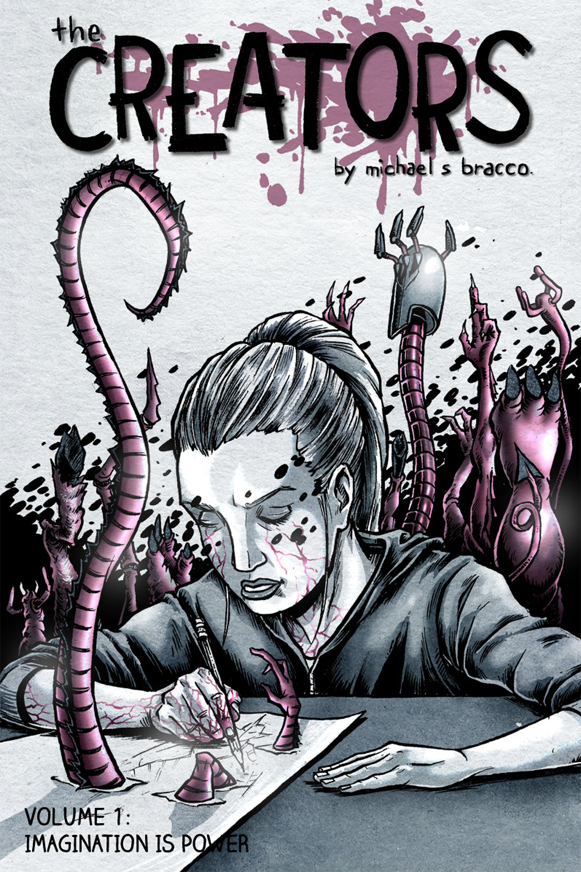
Like a purple-tinted blend of Donnie Darko and Pan's Labyrinth, The Creators exposes a dark world filled with gritty, unwelcome images. The artwork reminds readers that imagination—especially imagination used as a means of escape—can be messy, and imaginative thought (which, by nature, is often critical, progressive thought) can become a target. Bigotry plagues the Creators, just as it plagues visionary artists in real life. The original Creators were met with Trump-like propaganda—"Art kills" and "God is the only Creator"—and all Creators struggle to juggle the slippery, awkward balls of adolescent emotions, social pressures, and potent creativity. Like Sphere, 1998’s underwater sci-fi tale starring Dustin Hoffman and Sharon Stone, The Creators acknowledges the dangers of imagination but stops short of vilifying it.
Though they are intriguing, the comic’s ideas are not new. Nickelodeon's ChalkZone features an entire dimension of zoetic brainchildren, and Georges Méliès artistically captured the power of imagination on film in 1902 with A Trip to the Moon (which recently experienced a revival in the form of Scorsese’s Oscar-nominated Hugo). Bracco assigns a Batman-esque origin story to one of the Creators, and the comic’s portrayal of collective skepticism toward superpowered beings tastes particularly stale in today’s congested market of films like Captain America: Civil War and Batman v Superman: Dawn of Justice. At times, the comic seems like a mildly strange Green Lantern origin story. One of the comic’s characters even mocks the hackneyed nature of the comic’s lack-of-understanding-breeds-fear theme: “We’ve all been told that a thousand times.” Then again, maybe cliché themes are cliché because we appreciate their simple honesty. As Community’s Jeff Winger says, “The biggest truths aren't original. The truth is ketchup. It's Jim Belushi. Its job isn't to blow our minds.”
Some of the comic’s approaches to imagination lack imagination, but the comic as a whole offers a few fresh takes on creative thought. First, The Creators attempts the dicey task of providing readers with a logical, faux-scientific explanation of imagination-based superpowers. Instead of claiming that imagination is magic, this comic explains the process of creation, and the explanations are impressively detailed. Second, like Daniel Greaves’s Manipulation, Bracco’s comic evokes true sympathy for the Creator’s creations, which helps the reader connect with themes like the marginalization of uniqueness. Third, the first volume of The Creatures flows seamlessly and features some goosebump-worthy moments of narrative and visual stimulation.
In the end, the most profound portrayal of the comic’s moral comes from its coloring: though the Creators’ purple creations can be dangerous, the rest of the world is dull and gray.
Score: 4/5
The Creators, Volume 1
Writer/Artist: Michael S Bracco
Self-published
And head over to Kickstarter to support the print version of The Creators!
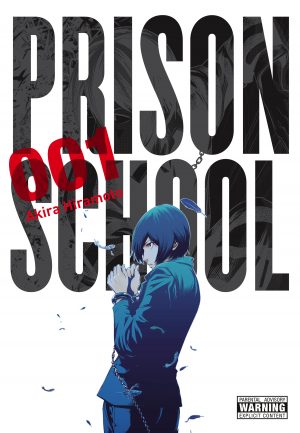
Review: Prison School – Vol. 1
I will fully admit that when it comes to reading manga and watching anime that I find myself comparing the two in reviews. It’s an annoying habit that I hope to break with this review, but for the record Prison School the anime was one of if not the best anime from 2015. If you have no interest in reading, than you can stop now and go watch it. If you have interest in reading then good, you've come to the right place. The biggest twist about Prison School is the title. After all, this is a manga and its Japan the very country that brought us Battle Royale so it would seem like with a title like that it could be a very serious and dark story. And that is the absolute charm of Prison School, because it’s not dark and serious rather it’s hilarious and perverted. Unlike other comedies though, the characters are serious and unaware that their life is hilarious. Instead it’s just a really accurate look at the psyche of a teenage boys, among other things.
The setting is a school that has recently opened enrollment to male students for the first time in fifteen years (or longer I don’t remember exactly and it’s a thick volume to hunt for such a small detail). We follow the only five male students in the school Kiyoshi, Shingo, Gackt, Joe and Andre. They learn the hard way on the first day that none of the girls will or want to talk to them. We as the reader are given extra info as something called the “Shadow Student Council” has posted notices informing the girls not to talk to the boys or they will be sent to prison. The boys on the other hand are completely unaware of this detail.
 Eventually one of the girls breaks and talks to Kiyoshi who is our main character. They bond over Sumo and she asks if he’ll go to a college Sumo event in a few weeks which thrills him beyond belief, even though he’s actually not that into Sumo. He doesn’t share this with the other four boys though because they’ve given up on relationships and decided to just catch glimpses of boobs and underwear… until the evening when they decide to go peeping in the showers.
Events do not unfold the way they would want, well they kind of do for Kiyoshi, but the results are the shame. They’re all publicly shamed in front of the girls and then locked up in prison. The rules are laid out for them, do your time and return to class. If you don’t want to be in prison call your parents and tell them you’re being expelled for peeping. The Shadow Student Council is put in charge of the five boys which introduces us to Meiko, Hana and Mari. The boys still attend class via monitor and they have work detail after class. In this particular volume Kiyoshi becomes adamant about escaping for his date. At that point it’s a prison break plot-line… in high school.
Again, it’s the fact that the characters and story always takes the situation seriously that makes something like a prison break story-line really funny. It’s also intense because you do wonder if Kiyoshi is going to get caught or if the other boys will find out and rat him out. To put it frankly, all of the tropes and jokes about prison are in this story at some point. Creator Akira Hiramoto just manages to flip them on their head due to the high school element and that’s what makes them humorous.
The story is masterfully told and while there’s a bit of a slow burn feeling to the story, it’s actually paced wonderfully. The characters all manage to feel unique and have their own voice. None of them come across as a well-worn archetype, but really unique and authentic characters. I don’t really think anyone will relate with the characters given their extreme circumstances, but maybe you can find some surface level emotions to relate to… but that's not really the point of the story. You feel for their situation, but you have to remember that they're responsible for being in that situation.
There’s a decent amount of fan service in the book. “Fan Service” if you’re unfamiliar with the term can be equated to what we call “cheesecake” in American comics. It’s sexually charged artwork that for the most part has nothing to do with the story, but is there for the reader to enjoy. And it is enjoyable. It might seem like it serves no purpose to the story, but this is teenage boys and having been one myself there is no other time in a boy’s life that he thinks about nudity more. That’s just fact, sad fact, but fact none the less. What I'm getting at is that it does actually serve the story, but if that's not your thing then that's cool too. I have no problem with occasional fan service/cheesecake, especially when the story is as good as it is in Prison School.
The art is amazing. It’s extremely detailed and photo-realistic. It also has wonderful scenes in which it’s grotesquely realistic. There’s photo-realistic and then there’s absolute realism in which everyone doesn’t look beautiful, but rather kind of ugly. This is used for the humor in the story and it is remarkable. The change is so dynamic and yet as I said twice before, very serious which is exactly what makes the visual gag so funny.
Hiramoto's character designs have a range from really strange and unique to seemingly average. With Hiramoto’s designs it’s all about presenting real looking students. Average even. And he does just that because they can’t all be good-looking and beautiful. Sure the women are, but even they have an average quality to them. Characters like Gackt and Andre stand out in the extreme at times, but they still fit the realism of the world.
This is a thick book. If you’re used to a normal manga, then picture two of them combined and that's about the size of this volume. It’s a monster, but the biggest complement that I can give it is that it was easy to read and didn’t feel like a chore. The other compliment I can give it, is that I wanted to pick up the second volume instantly and read it as well and that's a lot of reading.
There are some familiar elements to this story. Things that you’ll kind of brush off as not being new or that unique, which is fine because it’s the entire product that stands out as being fantastic. But even with those familiar elements this really does show just how far behind American comics are because there’s nothing this damn good being published on the market. If you love comics then you owe it to yourself to read Prison School, it’s not just manga or just a comic it’s masterful storytelling in a medium that frankly needs more like this. Even if it’s just a fraction of this.
[su_box title="Score: 5/5" style="glass" box_color="#8955ab" radius="6"]
Prison School – Vol. 1 Creator: Akira Hiramoto Publisher: Yen Press Price: $20.00 Release Date: 7/21/16 Format: TPB; Print/Digital
[/su_box]
Review: The Spirit of the Shadows
By Ben Boruff
I appreciate Guillermo del Toro. 2004’s Hellboy revitalized Mike Mignola’s fallen hero, and Pan's Labyrinth is a masterpiece. But Crimson Peak fell short. The 2015 fantasy-drama suffered from an awkward lack of subtlety. The film’s protagonist, a novelist played by Mia Wasikowska, tells us repeatedly that her novel—and, by extension, Crimson Peak—is “not a ghost story: it’s a story with ghosts in it.” The movie is a beautiful jumble of forced dialogue, prolonged glances, and orchestral flourishes, all seemingly designed to smack the audience in the face with cinderblock-sized themes and motifs. Like Crimson Peak, writer Daniel Zeigler’s The Spirit of the Shadows lacks narrative finesse. The Spirit of the Shadows is too gaudy, too melodramatic, and too cliché—but it still entertains. The story focuses on the life and death of Erik, a musician and coal miner who falls in love with the daughter of the owner of the coal mines. The two star-crossed lovers, Erik and Katrina, enjoy a brief romance before bigotry and egotism abruptly end the relationship. Then a possibly schizophrenic doctor named Hyde Perkins meets Katrina’s ambitious father, and all hell breaks loose—figuratively and literally.
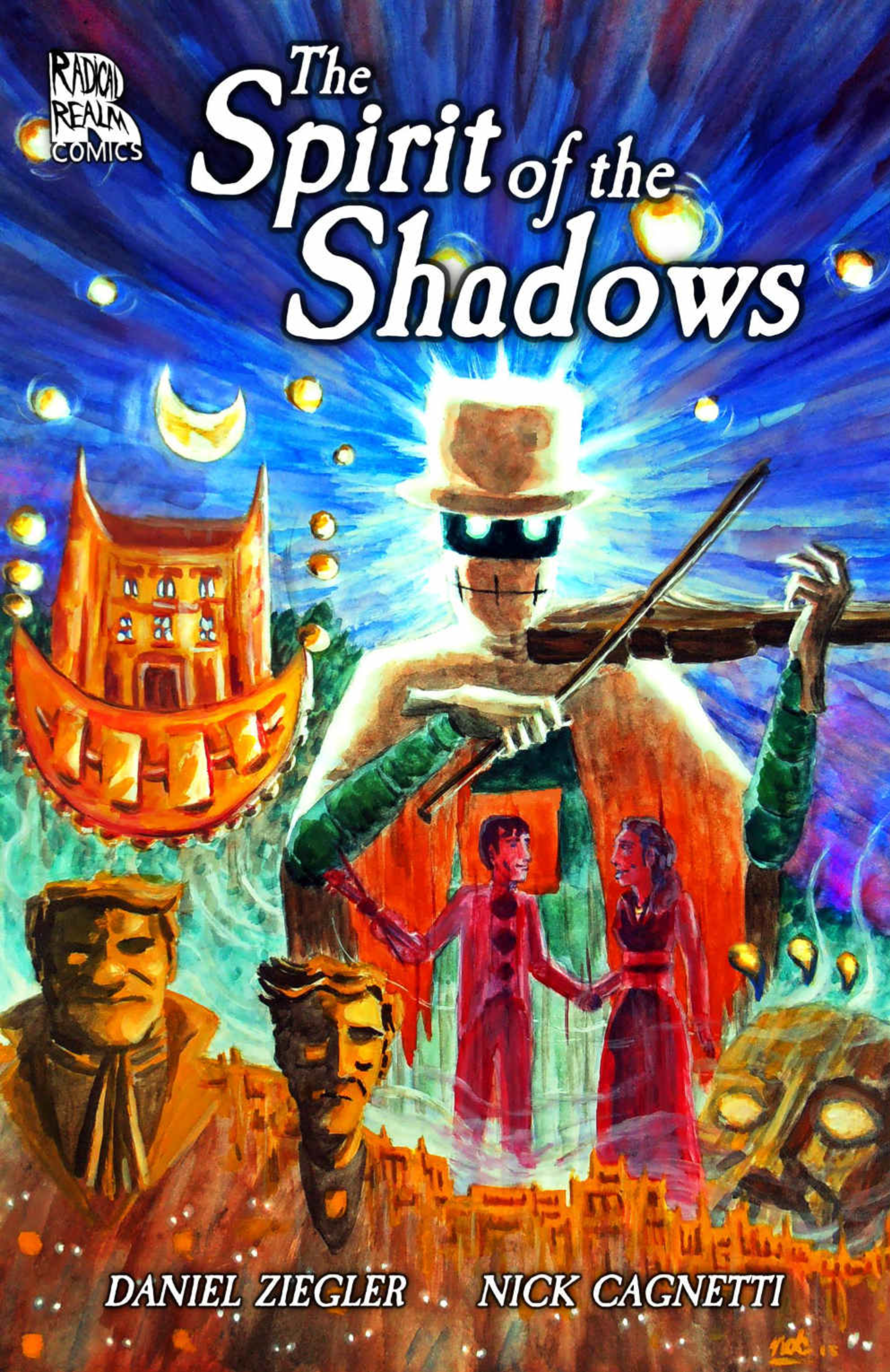
Nick Cagnetti’s artwork feels like a dream, and it keeps the narrative’s tension intact. Cagnetti spills misty shadows onto the pages, weaving them through the lives of the characters. The Spirit of the Shadows, the comic’s undead protagonist, seems to glide through the panels like a fog—steady and overpowering. Given the shaky black-and-white nature of the artwork, many of the comic’s pages seem messy, but the untidy haziness of the panels offers readers a glimpse into the troubled mind of the Spirit of the Shadows, a confused being filled with longing and regret.
The comic is sigh-worthy at times—the dialogue is peppered with garish words like “zounderkite,” “taradiddle,” and “tommyrot”—but, as one of the characters notes, the story is reminiscent of Mary Shelley’s Frankenstein, the classic horror novel that championed the themes of Romanticism. Some of those themes—individualism, majesty of nature, and appreciation of beauty—exist in The Spirit of the Shadows, and Daniel Zeigler offers an intriguing (though not entirely original) portrayal of each.
The graphic novel is split into three parts: 1) “What makes a man?” 2) “What makes a murderer?” and 3) “What makes a monster?” Though many of the comic’s pages throw their morals at the reader like steroid-enhanced MLB pitchers, The Spirit of the Shadows is kind enough to leave readers alone with these questions. They are open-ended, and they operate like street signs, helping readers navigate the emotional trials of the protagonist. Though some of the story is over-the-top, Zeigler handles the last question—“What makes a monster?”—with true sensitivity. Only longing and mist fill the last panel, which occupies an entire page. The last question is complicated, and maybe the comic does not provide an answer because, in the end, we do not want one.
Score: 3/5
The Spirit of the Shadows
Writer: Daniel Ziegler
Artist: Nick Cagnetti
Publisher: Radical Realm Comics

Review: The Nameless City
By Dustin Cabeal
In comics, we tend to be spoiled by the monthly releases from our favorite creators. We forget that those few pages we hold in our hand are the results of months of work that were done months ago just so that we could hold it in our hand on time. It’s why I continue to lean more and more towards trades and graphic novels because you don’t see as many dips on the story or the art. The point of bringing that up is because it feels like ages since we last saw anything from creator Faith Erin Hicks, but in reality, it hasn’t been that long and while we didn’t see a one-shot or a mini from, she was creating an entire books series for us to enjoy. But that rages against our “what have you done for me lately” comic reading mentality, doesn’t it? Clearly, she wasn’t taking a break, but the out of sight out of mind nature of our monthly books probably made more than a few of you forget all about her tremendous work.
Read MoreReview: Hellboy and the B.P.R.D. 1953: Beyond the Fences #3
The last issue in Beyond The Fences wraps things up nicely. Hellboy gets to beat up the mutant giant dog, the town gets wrecked, and some new villains are introduced. Mignola can’t ever seem to just let things lie, and we are left wanting more, as always.
After a brutal, and well-drawn battle with the dog mutant, the quiet California town slowly resumes normalcy. Hellboy and the other BPRD agents take samples, and try to clean things up a bit before leaving for their next mission. Agent Xiang has another vision, this time of things that presumably have not yet come to pass. Whatever mutated the dog has something to do with the stone chemical called enkeladite. Its presence affects Xiang and causes her visions. As Hellboy and crew prepare to leave, we cut to a woman entering a hotel room. Turns out she is a Russian agent who  was trying to obtain the enkeladite for herself, but failed. She is greeted by the man who we can assume killed Dr. Boucq earlier in the arc. Loose ends are wrapped up, but in classic Mignola fashion, many more questions have arisen.
Seeing Hellboy in the 50s has been a fun ride. Mignola and his collaborators get to play off of their favorite pulp influences and tropes, and it shows. This miniseries definitely brings a little bit of color to a sometimes dark comic. Hellboy is yet to be weighed down by all of the tragedies that befall him, and these early cases don’t hold as much consequence. Like I said last month, without all of the baggage from the past series, the writers are granted a little bit more freedom.
Mingola loves to tie everything together, so we get some flashbacks to past Hellboy events. It’s cool, though, because the web of events, characters, and places that make up the Mignola-verse are super fun to map out. It’s crazy to find out that Edward Gray is somehow connected to Abe Sapien. Hellboy thrives in the tiny details, the small minutiae that make up a great fictional mythology. But it’s a series that also loves the big picture, and isn’t afraid to inject some action when it's needed. Creepy, action packed, and fun: Beyond The Fences #3 concludes a great addition to the Hellboy canon.
[su_box title="Score: 4/5" style="glass" box_color="#8955ab" radius="6"]
Hellboy and the B.P.R.D.: Beyond the Fences #3 Writers: Mike Mignola, Chris Roberson Artist: Paolo Rivera Publisher: Dark Horse Comics Price: $3.50 Release Date: 04/27/16 Format: Mini-Series; Print/Digital
[/su_box]
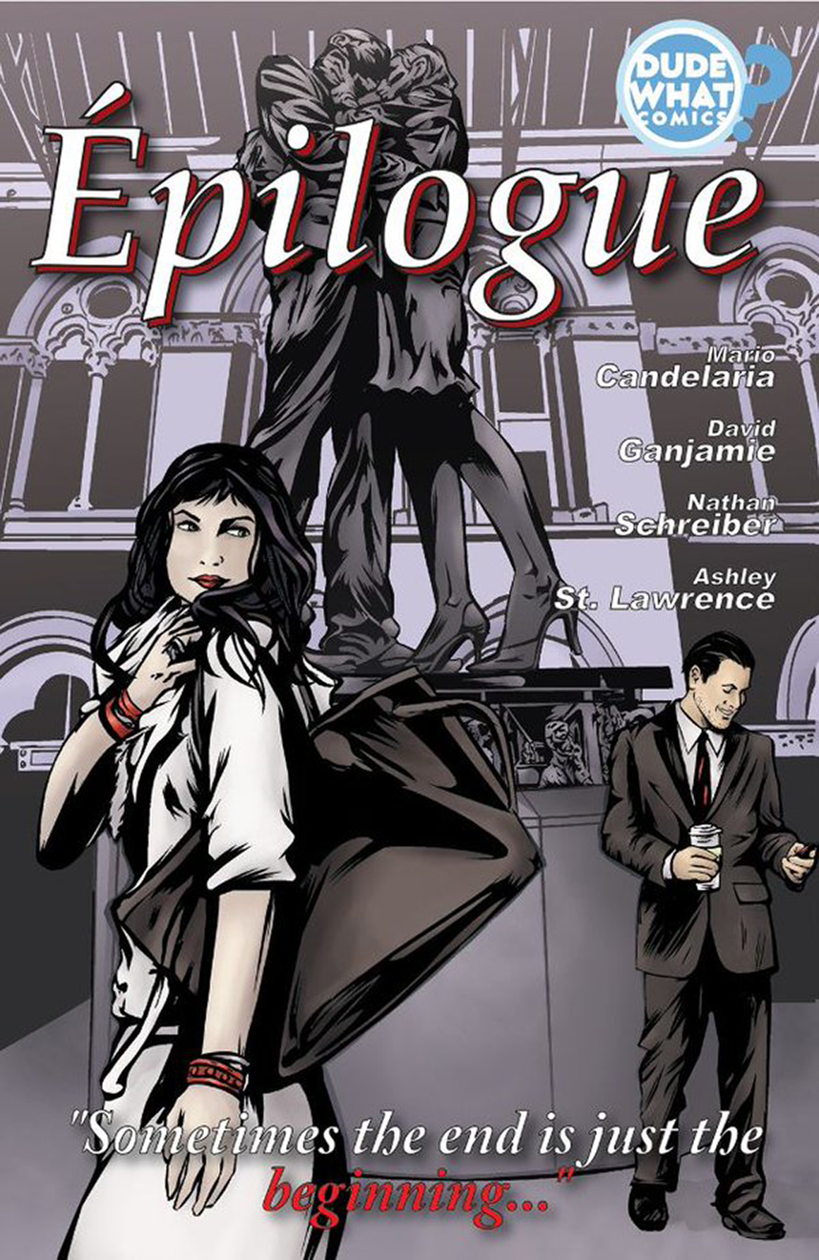
5 Questions and A Review of Épilogue
Disclaimer: I know and have worked with the writer of this comic in other projects. He is a good friend as well as a fellow wrestling fan. You’re waiting for the train at the busy subway platform where multiple trains run, a train arrives that isn’t yours and you move out of the way for all the people who are leaving the subway car, and there she or he is. That person you had an incredible relationship with many years back. Épilogue tells that moment between former lovers Natalie and Garan, that small capsule in time where they meet again, all their old feelings come rushing back and clash with the current events in their respective lives.
The story in Épilogue and takes place over two issues, just called Garan and Natalie, each one of them follows their perspective and inner thoughts throughout their encounter. As well as flashback to their relationship from their point of view, how they met, their cherished moments, and their fallout. Both issues are written by Mario Candelaria and the main story illustrated by David Ganjamie.
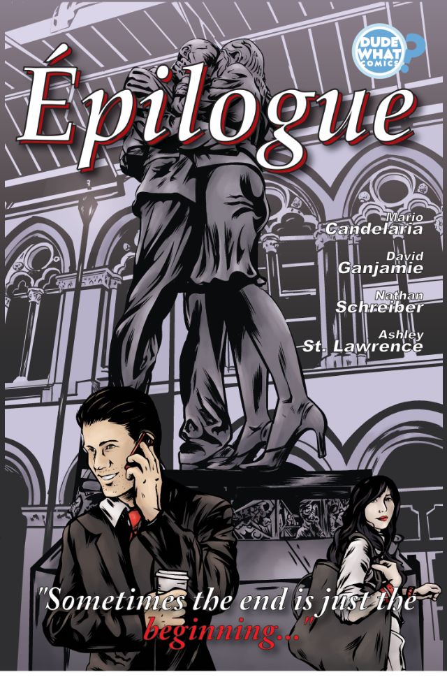 The Garan flashbacks by Nathan Schreiber truly portray the feeling of young love. The young adults who aren’t sure what they want with their lives yet but they want to be with each other regardless. With young love comes the unfortunate lack of preparedness to deal with troubles in the relationship. Natalie’s flashbacks are done by cover artist Ashley St. Lawrence, and like the cover, it portrays a contrasting view of her recollection of their love. She remembers more details, the feeling the art carries is more mature and reflective rather than Garan’s reactionary flashbacks. Both of them putting together parts of a whole story that carries realism and the reflexion of our own past loves.
I’d like to have seen what a colorist could have done with a story like this to accentuate the tone, but the grey tones on it does not take away from the story at all, the flashbacks carry an aura to them and each artist was able to stamp their very own signature tone to the overall story while maintaining the characters well defined.
I was able to talk to Mario and ask him some questions about Épilogue below. If you’re in the New York City area, him along with artists Ashley St. Lawrence, Nathan Schreiber, David Ganjamie will be at Forbidden Planet NYC signing from 6 to 8pm and will also be bringing me snacks. Right? Right.
Pablo Arriaga: Épilogue seems like a fairly personal story. How did it come to be?
Mario Candelaria: As I’ve gotten older, I’ve started reflecting more and more on my past. All the moments, good or bad, are now just bricks that paved the way to where I am today. That is what ÉPILOGUE at its center. I wanted to capture that feeling when you see a familiar face that was once so important to you and all these emotions just erupt.
PA: How was it working with several artists in one single project?
 MC: It was awesome! I felt like Brian Bendis! But seriously, I designed it this way so we can give the present tense scene a different look from the past, but also make it so Natalie’s recollections looked completely different than Garan’s as a subtle nod to how my memories might be different from yours.
PA: What would be the main draw to Epilogue for people?
MC: I will be honest and say that ÉPILOGUE is a very mature story that features a very experimental storytelling method. I’d say that if you’re into dramatic human pieces or if you like to support different types of comics, especially independent ones, then you might be satisfied with this story. But be warned! If you’ve ever gone through some type of heartbreak then this story will bring those emotions forward. I’m like some sort of comic book Adele.
PA: You were able to recruit Heather Antos, who’s a great Marvel editor.
MC: Heather is great! She took the rough piece of clay that was my script and helped guide me to sculpting what we see today. I actually had her on this long before she started at Marvel (some may or may not go as far as to say *I* helped get her the job), but with how self financed indie comics works we are just now seeing ÉPILOGUE get out there into the world long after she’d established herself in the House of M̶o̶u̶s̶e̶ Ideas.
PA: Team Iron Man or Team Cap?
MC: Team Iron Man for sure! I might look like a rebel, but I’m all about having accountability. Besides, Cap is a hundred year old dude who does steroids. He’s a walking, talking version of a certain pop-up ad I see on “mature” websites telling me I can get ripped.
[su_box title="Score: 4/5" style="glass" box_color="#8955ab" radius="6"]
Épilogue Writer: Mario Candelaria Artists: David Ganjamie, Ashley St. Lawrence, and Nathan Schreiber Letterer: Zakk Saam Editor: Heather Antos Publisher: Dude, What? Comics Price: $0.99 Each Release Date: 4/27/16 Format: Mini-Series; Digital
[/su_box]
[su_button url="https://www.comixology.com/Eacute-pilogue/comics-series/52919?ref=cHVibGlzaGVyL3ZpZXcvZGVza3RvcC9saXN0L3Nlcmllc0xpc3Q" target="blank" style="soft" background="#000000" color="#ffffff" size="7" center="yes" icon="icon: dollar" icon_color="#ffffff" rel="nofollow"]BUY HERE[/su_button]
Review: Irwin Allen's Lost in Space: The Lost Adventures #2
This issue quickly settles into an atmosphere of decaying hope. Will Robinson, his father John, Robot, and Major West have lost their way as the mysterious observers from issue one lay on more pressure. Our heroes are inexplicably and increasingly lost in dire, inhospitable wastes. And the planet seems to be changing to keep them trapped. You might expect that this is where the men turn against each other. But that would be unnecessary, predictable, and cheap. Issue two is thankfully devoid of forced conflict. Maybe it's a sign of the television show's time. Maybe things were politer then. West and Dr. Robinson, the only two adults trapped with young Will, disagree in regard to how to fix their precarious situation. But, being intelligent men, they address each other with respect and logic. Even as the inescapable nature of their predicament dawns on all three wanderers they are all focused and reasonable. Isn’t it kind of unfortunate that reason needs special mention?
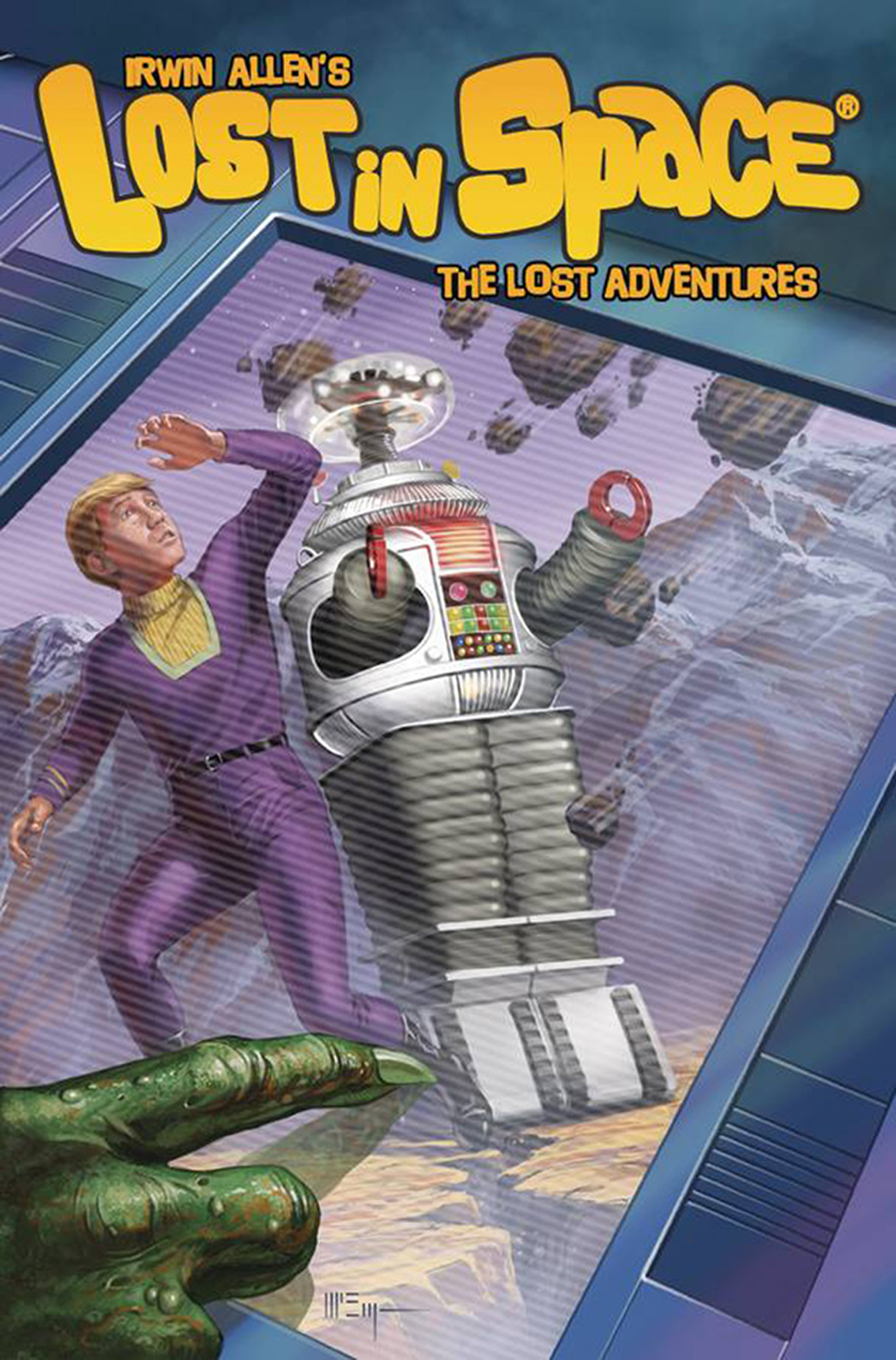 Though inconsistent across the entire issue, the art has improved. Faces are softer and more natural than in the first issue. The more dramatic tone helps bring out illustrator Kostas Pantoulas’ strengths. In particular, his creature art is excellently creepy.
The material has yet to do much with the other half of its cast of characters. Doctor Smith and the three remaining Robinsons haven’t impacted the story at all. Smith was, along with the Robot, a major appeal for the television series, so his absence is notable. Similarly, the ladies show up to remind you they exist. And just as quickly they disappear.
On one hand I want to give the script the benefit of the doubt because of its roots as a show from the Sixties. On the other hand, I expect and hope the writing will make better use of its remaining characters. As of issue two they just sort of wait around and fret over the men folk. It isn't particularly interesting to watch, especially in an issue devoted to people standing confusedly in front of a rock wall. Hopefully things will pick up in that regard.
A slight improvement on an already solid series.
[su_box title="Score: 3/5" style="glass" box_color="#8955ab" radius="6"]
Irwin Allen's Lost in Space: The Lost Adventures #2 Writer: Carey Wilber and Holly Interlandi Artist: Kostas Pantoulas Colorist: Patrick McEvoy Publisher: American Gothic Press Price: $3.99 Release Date: 4/27/16 Format: Mini-Series; Print/Digital
[/su_box]
Review: Haretrigger: Tales of the Bounty Hunter Bunny #1
Have you ever wondered what it would be like if a cuddly bunny became a hardcore bounty hunter? Your wish has been granted in Haretrigger #1. Haretrigger is a new comic from indie publisher Sapphire Dragoness Productions. In this issue our heroine, Lilo the bunny bounty hunter, is sent to capture a mysterious masked target which isn’t really her thing. Lilo is more used to killing her targets then bringing them in alive. Eventually she encounters her target and all hell breaks loose.
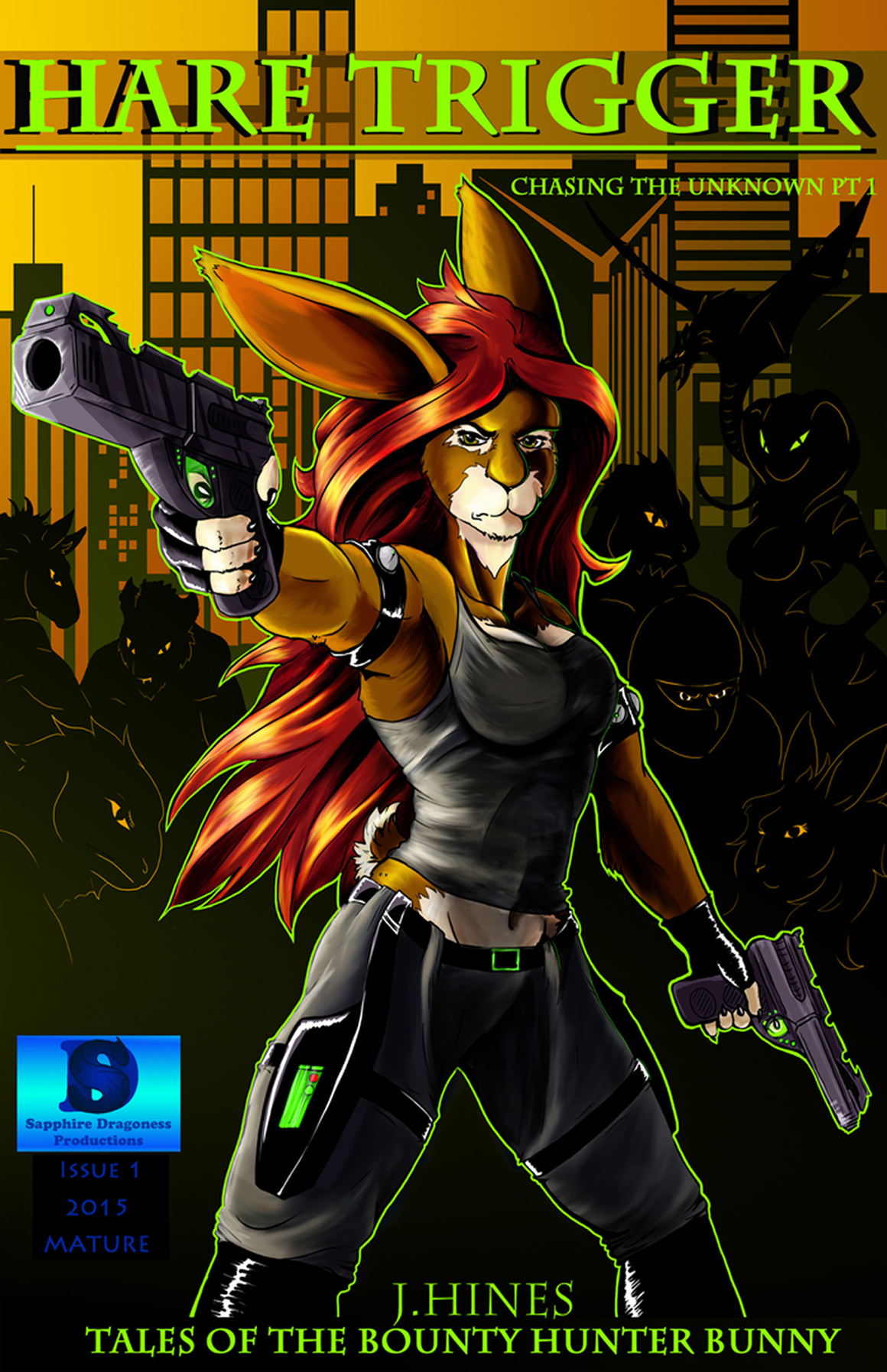 The action panels are drawn beautifully with a quick and precise pace that doesn’t feel rushed. By the end of the book I wanted to know more about Lilo. I appreciate that the style of these characters is uniquely executed. The many details added to the clothing worn by the anthropomorphic animals helps bring them to life. These aren’t cute little Disney talking animals. They’re ass kicking, karate talking rough-necks and that immediately sets the tone for an strong adult book. The colors are beautifully rendered and lovely to look at as well.
Overall I think Haretrigger #1 opens the door to an interesting world and I’m looking forward to seeing a lot more come from writer/artist Josephine Hines. Check out http://www.bhbharetrigger.com to read issue 1 for free!
[su_box title="Score: 4/5" style="glass" box_color="#8955ab" radius="6"]
Haretrigger: Tales of the Bounty Hunter Bunny #1 Writer/Artist: Josephine Hines Publisher: Sapphire Dragoness Productions Price: Free (online) 5.00 (Print) Format: Ongoing; Print/Digital
[/su_box]
[su_button url="http://www.bhbharetrigger.com/the-comic.html" target="blank" style="soft" background="#000000" color="#ffffff" size="7" center="yes" icon="icon: dollar" icon_color="#ffffff" rel="nofollow"]WEBSITE[/su_button]
Review: Hyper Force Neo #1
Hyper Force Neo suffers from the visual equivalent of cacophony. I suppose the charitable way of describing it is "lively". Look, "hyper" is right there in the title; I get it. And there's something admirable about the overactive geyser of imagination spewing out of writer/illustrator Jarrett Williams' brain. But it doesn't always quite come together. Let's diagnose the problem. The downside of that great imaginative fervor is that this book is a visual mess. In particular, the action scenes struggle to gain coherence in a swirling vortex of seemingly endless line work. And, as the art rarely stands still, the action doesn't stand out. Everything is always in motion, drawn in a way to insist a kind of explosive energy all the time. The balance of imagery really isn’t conducive to comfortable reading. The eye isn’t pulled across the page smoothly. Instead, you are looking all over the place at one. The stylized nature of everything in the world makes it difficult to pick up any subtlety. You've got store front signs fighting for your attention, chaotic architecture swallowing people and vehicles, and Family Circus-esque path indicators, marking where our protagonists are located in frequently crowded images. The world feels big. But that just makes it easier for the art to lose its way. Everything blends together like a mouthful of partially chewed Skittles. Very colorful and pretty. But where does one element begin and another end?
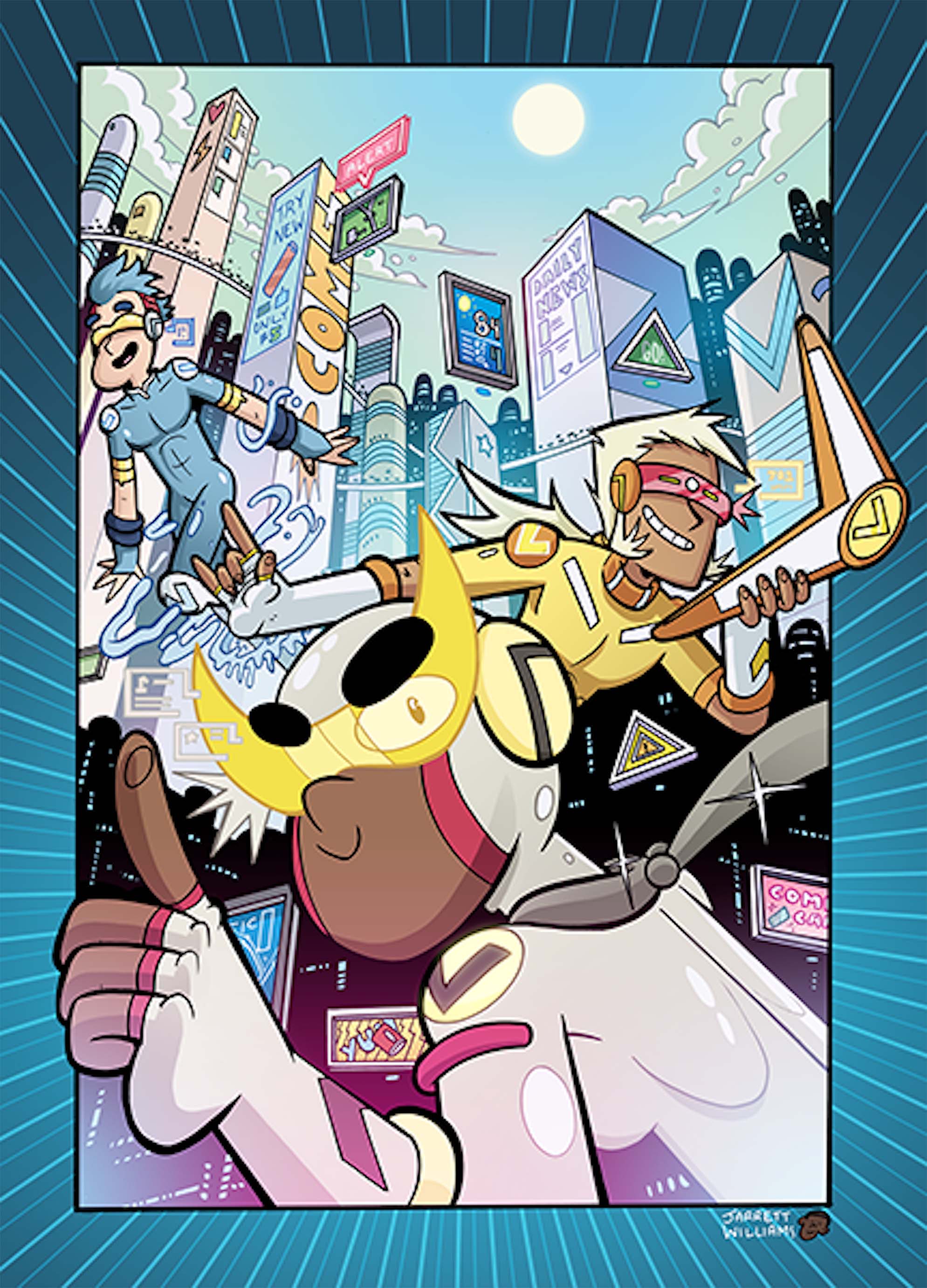 This story is begging to be animated. It can't all be contained or adequately conveyed through still images. Character, creature, and mech designs don't do these jumbled compositions any favors. Scenes can be hard to follow because you're just not sure what you're looking at. Angles, designs, poses, and clutter all conspire to ruin the few otherwise decent action scenes we get here. Williams crams so much data that needs to be mentally unpacked, but it's overwhelming. You want to keep up. You want to absorb it all. but the pacing of the story is so feverish and flop-sweaty you feel like you have to move on to the next page, if only to perhaps escape into something calmer. What's more, the pages of Hyper Force Neo are littered with text boxes indicating lots and lots of information. Though meant to be informative, these graphics are eventually very annoying, like pop-up ads strewn about the comic. They fit the aesthetic, for sure. This is certainly a future rife with pointless data points and social media ubiquity. But it makes for a difficult read. Info invades thought balloons and word bubbles. They point out details we don't need and info we can simply infer. Williams apparently wants to put everything on every page, but I can't help but believe Hyper Force Neo would benefit from a little restraint.
None of this is to say the art is poorly done. Quite the contrary, Jarrett Williams draws well, ably capturing his soft edged, ultra cute, super dense future. It is a future where nothing is spotlessly clean nor are we subjected to yet another grimy post-apocalypse. The book has a voice. And Williams' control over both the writing and the illustrations make this feel more personal, more intimate than it might otherwise.
The story itself is a very sweet one. It follows classic good kid Dean as he nervously navigates his first days as a student of New Sigma High School. The distant future setting feels familiar enough to be inviting. And the humor hits far more than it misses. Issue one is an origin story that does a very capable job of endearing you to the lead character. The supporting cast is also quite likable. Some of them fall into one-note joke territory, but even the supposed villains are written pleasantly. Most of the book has our hero out of costume. And these are the absolute highlights of the issue. Dean's sweet personality and seemingly unending reserve of enthusiasm instantly win you over.
By the end of issue one I was fatigued and on the verge of a headache. But, I’d still recommend the book. It’s a decent all-ages title that lacks coherence at times, but delivers enough fun, good-natured energy to warrant a try.
[su_box title="Score: 3/5" style="glass" box_color="#8955ab" radius="6"]
Hyper Force Neo #1 Writer/Artist: Jarrett Williams Colorist: Jeremy Lawson Publisher: Z2 Comics Price: $5.99 Release Date: 4/27/16 Format: Mini-Series; Print/Digital
[/su_box]
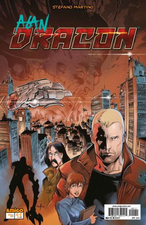
Review: Alan Dracon #1
We open this issue in stunning black and white with a shadowy monster munching down on a scientist in the labs at Biogen. Outside the building, a strange figure watches. Elite bodyguard Alan Dracon gets called in for the job of protecting the new scientists who are there to continue the work of the masticated Dr. Hans. At this point readers learn of Dracon’s past through some interesting explication. From there the story shifts to Koganeshima Island, home of the book’s antagonist. This elderly Yakuza boss sports a hyper cephalic cranium with countless tubes and wires running from his noggin.
 After a run-in with the creature that killed Dr. Hans, Alan and his new guarded body, Dr. Oni Demaite, strike a new friendship in an intimate way. From there, the mystery of Dr. Hans death deepens as Alan realizes that there’s more to this story than a simple out-of-control lab monster coming up for some revenge.
Martino’s use of black and white proves to be a strength for this book. The shadowing and details come off as more crisp and refined in the two-color medium. For example, the image of the monster’s teeth and gums, pictured in the third panel of the first page, contains enough vivid detail to eliminate the need for any coloring. In addition, the cityscape in the bottom panel of page six spreads in the frame with so many intricate nuances that the inclusion of any additional colors would almost drown out the fine pencil work. I also liked how the monster looked somewhat similar to Marvel’s Fin-Fang-Foom.
As far as the story is concerned, Martino gives us a great dose of gory action right at the get-go. Readers then get a story that cleverly unfolds around Dracon, a workingman hero who gives off the vibe of a Harry Canyon from 1981’s Heavy Metal. While some elements are left a little cloudy, for example, the true nature of Dracon’s powers and the purpose of his armor, there’s a strong possibility that those items will be explained in further issues. Nevertheless, the story’s mystery and entertaining characters do so much to make the book’s plot move at a balanced pace.
With outstanding pencil work and a hell of an entertaining story, Alan Dracon is the fun, new must-read book that reminds us how good comic books can be.
[su_box title="Score: 4/5" style="glass" box_color="#8955ab" radius="6"]
Alan Dracon #1 Writer/Artist: Stefano Martino Adapted by: El Torres Publisher: Amigo Comics Price: $3.99 Release Date: 4/27/16 Format: Mini-Series; Print/Digital
[/su_box]
Review: Injection #9
I've talked a few times recently about how burnt out I am on comics in general (perhaps something worth taking a more dedicated look at in the future), and last month's issue of Injection didn't help. Its central piece was a bizarre sex romp that didn't fit the story, the characters, or the mood of the book and felt like at best a waste of time and at worst a betrayal. The good news is, Injection #9 bounces back sharply with an issue that plays to all of the story's urban-fantasy strengths. The bad news is, it actually makes the last issue look a hell of a lot more self-indulgent and mediocre. Ah well, you can't win them all. In terms of Sherlock Holmes or James Bond, both clear influences on Injection, this issue is the first face-to-face between our heroes and the villain. And in the style of Moriarty or Blofeld, the Injection taunts our wary heroes before making a dramatic exit, leaving behind a possible clue. The issue opens up with Viv and his loyal assistant red fending off an assassination attempt from the terrorist organization Rubedo. With the help of the just arrived Sim and Brigid, a second attempt at the airport gives the group a prisoner to interrogate. At the same time, the part of the Injection captured in a laptop is isolated and examined by Brigid and Viv who have a truly disturbing conversation with the haunted A.I.
 There's a lot going on in terms of story in this issue, and I likely need another re-read or too to understand it all. I've not yet mentioned the latter half of the issue which is mostly structured around a tying together of disparate plot elements and clues into a cohesive plot. I like to think I am pretty patient with comics and generally a fan of decompressed storytelling, but it's truly a relief to see the story picking up steam on pretty much all fronts (the only character who doesn't appear is Maria).
It's also high time the series started taking advantage of its cyber-punk, urban fantasy stylings which has been the selling point from the beginning. Landing somewhere in between the X-files and Hellblazer, Injection is a creepy look at a world where magic and science have crossbred to form something monstrous. There are mentions this issue that it's not just science that has changed recently, it's magic too, which, from the barren, horrific bits of the magical world we've seen so far, raises a number of interesting questions. There's something electric about a team of powerful, rational thinkers being forced to deal with a being so strange and frightening that it defies each of their expertise. What's likely more disturbing is that they created it.
Going forwards then, the question is what does Warren Ellis actually want to do with the book. When it's functioning as a genre-mashup adventure story, it's one of the best books currently being published. When it's reveling in Ellis sharp but familiar take on gross-out comedy and crazy asides, it's incredibly limp. I remain fully on-board with Injection for the moment, but I sincerely hope Ellis will prove to be as disciplined an author as he clearly can be. For the moment, Injection #9 is simply a great issue.
[su_box title="Score: 4/5" style="glass" box_color="#8955ab" radius="6"]
Injection #9 Writer: Warren Ellis Artist: Declan Shalvey Publisher: Image Comics Price: $3.99 Release Date: 4/27/16 Format: Ongoing; Print/Digital
[/su_box]
Review: Micronauts #1
Micronauts #1 is not good space-opera, but it did leave me wondering what elements make for good space opera. After all a lot of what I don't like in Micronauts, has, in other situations, made for great stories. Cullen Bunn's opening space adventure introduces us to a cosmic threat on a massive scale (the entropic wave), a band of likeable space criminals, a series of bulky robots, a bunch of made up names, and a regal alien villain. In other words, the basic building blocks are present that form Star Wars, Hyperion, Prophet, and a hundred other better space books. But what's missing are the subtler, abstracter qualities that made the worlds of those stories and countless others like them come alive--a sense of scale, moments of raw creativity, and a strong sense of pacing. From a little research I did (i.e. Google and Wikipedia, so long barred to me as a college student but now my dearest friends), Micronauts is a property based on a series of action figures from the 70s and 80s. This aspect is made clear by the designs of the characters, specifically the robots, who looks sadly, a bit too much like jointed action figures to be taken seriously (the whole book has a candy colored, over-cartoony look that's a little too reminiscent of a middling children's cartoon). Anyhow, after the property bounced around a few publishers (most notably Marvel), it landed at IDW, the current king of the licensed property comic. Micronauts #1 is their attempt at a big relaunch, bringing in an A-list writer, a better than average artist (David Baldeon), and a slew of variant covers for a extra long debut issue.
 This brings us to the plot--well almost--it actually first brings us to the setting. As implied by the name, apparently this isn't actually space-opera but is a microscopic universe of some sort. This hardly seems to matter as it is never mentioned and looks exactly like outer space. Now as to that plot, I didn't get much from reading the issue itself. Basically, we are introduced to a group of loveable (well, actually mostly bland) pirates who are roped into attempting to steal some medical supplies from a heavily guarded space station. According to the book's backmatter, there is in fact a war going on between...someone (money's on generic space empires) and each of these characters have some sort of backstories. Also there will apparently be time travel. Having to garner important information like this from the backmatter is a clear sign of a clumsy story and there's not much to counter that idea.
I think perhaps, judging from the fast pace and quippy dialogue, Bunn was trying to avoid falling into the trap of making his story's introduction too dense and exposition-laden. Unfortunately, he overcorrects, making for a story that never really manages to infuse any of its tropes with a distinct personality. Nothing about Micronauts is new, creative, or even particularly distinct. I can't help but compare it to my favorite sci-fi comic of the moment, Prophet, whose debut issue was a quiet, disturbing tour through a sparse alien world of jelly cities and spider-ish nomads. Micronauts by comparison, gives us robots fist fighting and image after image of laser guns being fired off haphazardly.
As for the art, it's inconsistent. According to the solicit, the artist is David Baldeon, but the issue itself lists about five other artists who contributed. This might be why things range from highly detailed and beautiful artwork to other material that is cartoonily in-keeping with the bland IDW house style. I would like to compliment the coloring which is in places ridiculously gorgeous, but even there that becomes difficult as four different colorists are listed.
So Micronauts manages to be high-quality even while being a not-particularly good or memorable comic. Cullen Bunn has plenty of time to spin his book into something more special, but at the moment, the odds don't seem great.
[su_box title="Score: 2/5" style="glass" box_color="#8955ab" radius="6"]
Micronauts #1 Writer: Cullen Bunn Artist: David Baldeon Publisher: IDW Publishing Price: $4.99 Release Date: 4/27/15 Format: Ongoing; Print/Digital
[/su_box]
Review: Low #13
Low #13 brings the story back to the Caine sisters and their search for their mother. Tajo and Della are onboard their step sister, Lena’s sub toward the surface of the planet, and all seems to be well. At this point in the series we should know better than to trust a lull in a Remender comic, though, right? In what would otherwise be a dull issue, Remender hits us hard, proving that there is never any rest for the Caine family.
The majority of this issue focuses on Lena’s discussion with both sisters. She talks to Tajo about Della’s harsh upbringing and how violent she is. It’s obvious that she is trying to sow some type of dissent between them, but what is her motive? Della suddenly breaks their conversation after the sub runs into the remains of the Third City, the city that Tajo destroyed using the helm suit. She neglected to tell her sisters that brutal fact, and when she reveals the truth they snap. Tajo runs into her room to escape their anger and Lena uses this moment alone with Della to her advantage. 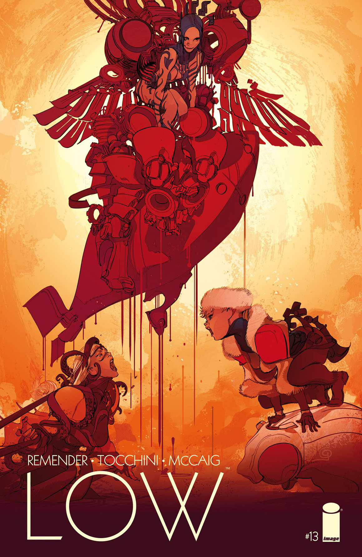 Lena wants Della to take the helm suit for herself, and just about convinces her when she plays her hand. Smashing Della with a wrench and sending her out of an escape hatch into the ocean, we now know Lena’s true colors. Turns out that Lena is actually one of the survivors of the Third City, and a pirate. She continues her rampage and when Tajo emerges from her room she is greeted with a knife in the gut. Tajo bleeding out, and Della running out of air out in the ocean, things are looking pretty grim for the Caine sisters. Remender leaves us hanging once again, until next month.
I had some pretty big hang-ups with this issue. The biggest thing was Lena being a pirate and a traitor. It makes sense that Remender wants to keep the tension going, but adding in a new villain like this just seems like too much. The world of Low is populated by nothing but evil monstrous things that want to see the main characters fail, and it hurts, even more, when someone seemingly trustworthy turns out to be just another bad guy. Issue #13 sets itself up for this big surprise, but you can kind of feel that Lena is up to something right away, a feeling that wasn’t really apparent previously. Although her appearance in the Caine home was kind of suspicious from the beginning. This entire issue just felt a little too convenient. With only three people on the sub, in order to push the action along one of them had to do something crazy, and it was Lena, drowning and knifing each of the sisters respectively. The writing on this issue was a little weak, and the art was also kind of shaky and inconsistent (more so than Tocchini’s usual). I hate to see a dip in quality in one of my favorite books, but this issue just felt a little rushed.
[su_box title="Score: 3/5" style="glass" box_color="#8955ab" radius="6"]
Low #13 Writer: Rick Remender Artist: Greg Tocchini Publisher: Image Comics Price: $3.99 Release Date: 4/27/16 Format: Ongoing; Print/Digital
[/su_box]
Review: Harley Quinn #27
Writing for the character Harley Quinn must be one bitch of an assignment. One can’t go too dark and brooding because this is, after all, a comic book. Go too light-hearted and you may irritate some of the fandom that look for a little more daring. And the split continues in the media because Paul Dini and Bruce Timm created Harley Quinn so perfectly in the Batman: The Animated Series run that readers want that comical tone. However, the Harley Quinn Margot Robbie projects so alluringly in the Suicide Squad trailers contains a well crafted blend of maniacal and seductive. Amanda Conner and Jimmy Palmiotti spilt it right down the center. Their version of the Joker’s paramour has the screwball (such as the deadly roller skating contest and a cybernetic beaver) and the adult (innuendos and other suggestive elements that may fly over children’s heads while causing adult readers to twit and giggle). Yes, the dynamic duo of writers has made Harley Quinn their own, and they have done so in grand fashion.
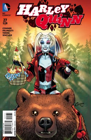 The artwork is as outstanding as one would expect from John Timms. My main issue with this issue is the parody of Deadpool, “Red Tool.” While the character has some clever moments and some interesting details such as speech bubbles in the shape of tool, the whole idea to satirize an opposing company’s character, when said character just made big bank on his film adaptation, comes off flat. Had this foil been an original creation and not just an inversion of the ‘Merc with a Mouth, then I would have regaled this comic with a much greater score.
Having a now B-level product (I predict Harley will continue to skyrocket in popularity after Suicide Squad) lock heads with a powerhouse franchise comes off like a kindergartener calling out the eighth-grade bully on the playground. Palmiotti and Conner have the opportunity to make something grand, irreverent, and original with the world of Harley Quinn. The comedic fun of a roller-skating competition is so attuned to the potential that lies in a character like this.
Let’s hope the parody ends quickly so Conner and Palmiotti can get back to making Harley Quinn the sadistic little temptress we all want her to be—minus the sour grapes attempt at jabbing the competition.
[su_box title="Score: 3/5" style="glass" box_color="#8955ab" radius="6"]
Harley Quinn #27 - “Tool Boxed In” Writer: Amanda Conner & Jimmy Palmiotti Artist: John Timms Colorist: Alex Sinclair Publisher: DC Comics Price: $3.99 Release Date: 4/27/16 Format: Ongoing; Print/Digital
[/su_box]
Review: Unleash #1
Unleash #1 is the most challenging book I’ve read in a while. To entertain is to provoke emotion and this book certainly did that for me. Unleash is the first issue in a four issue mini-series produced by Amigo Comics. I wasn’t familiar with this comic publisher until this review but if this title is any indication I’m a fan. Unleash #1 follows a mysterious girl named Emma Spencer.
Early on in the story we see that Emma is not like most young girls. She’s planning something very disturbing for someone who appears to have hurt her. Flashbacks reveal that Emma was sexually attacked by a stranger in her high school years. These pages were very hard to read. The way the panels zero in on the pain on Emma’s face during the attack is something that stuck in my brain long after I finished reading. They were graphic but I think they were necessary to set the tone for what follows. It becomes clear that Emma is similar to Dexter in a way. She finds men who have 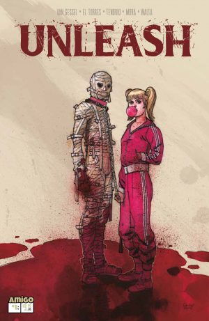 sexually abused women and orchestrates a violent punishment for them. The bizarre part of this story is that Emma is accompanied by a man who we literally learn nothing about. We see him once, barely and he appears to be a normal guy. Things change when Emma drags out his costume: a mummy outfit with a dog collar and leash. This unnamed aide is the muscle behind Emma’s plans. She seems to confide in him and talks to him like he’s a regular person even after he carries out her graphic wishes. These were another couple of intense pages to get through.
Artistically the pages are drawn in a moody and depressing style. The only kind of light parts of the book are the street scenes. These pages are handled very interestingly. They’re set in an urban setting and they’re filled with cigarette smoke and people eating McDonalds French fries. It made me feel like even outside of the shadowy torture zone of Emma there’s no escape from being disgusted and disturbed.
Rape is a very sensitive subject to deal with in any medium. It brings up a lot of strong feelings and when handled incorrectly can be seen as offensive and inappropriate. This book doesn’t fall into those traps. Even though this is a comic book I feel like Unleash #1 is telling a survivor’s story. Emma is someone who used to be a victim and is now taking her power back. Of course she’s doing so in the most violent way, by torturing other abusers. But I couldn’t help but root for her the same way I’d root for Dexter Morgan or Little Red Riding hood. Unleash is the type of book that gets under your skin and stays there long after you’ve put it down.
[su_box title="Score: 4/5" style="glass" box_color="#8955ab" radius="6"]
Unleash #1 Writer: Jennifer Van Gessel, El Torres Artist: Nacho Tenorio, Sergio Mora Publisher: Amigo Comics Price: 3.99 Release Date: 4/26/2016 Format: Ongoing; Print/Digital
[/su_box]
Super S with Cherry Blossom Girl & The Heir To the Dojo - E.01
Welcome to the first episode of Super S an anime podcast presented by Comic Bastards. Your two hosts Cherry Blossom Girl & The Heir to the Dojo will walk you through the following anime this week:
- Sailor Moon: Crystal Season 3 - Episodes 1-3
- The Lost Village - Episodes 1-3
- Noragami Season 2
- Kabaneri of the Iron Fortress - Episodes 1-2
Quick mentions for: Full Metal Alchemist and JoJo's Bizarre Adventure
CBMFP 231: You Just Have To Touch It Until You Finger It Out
Another episode of the podcast happened! Get out your party hats and give it a listen... Or just headphones since it's probably not appropriate to listen to without them. We have a special guest today as Isaac (from this very site) joins myself and Steve for a show about Rita's reveal, Iron Man's jizz hands and all the drama surrounding a particular DC editor. Books covered on this episode:
- Hercules
- 4 Kids Walk Into A Bank #1
- The Frogman Triology
- Vision

Previously on the CBMFP...