Review: Delia Awesome #2

To read the second issue of the independent comic series Delia Awesome, I had to first go back and read the premier issue, it having already been reviewed on this site some time ago. After wading through a bog of indie superhero comics for more than a week, I was pleasantly surprised to open the first issue and find a monochromatic art style somewhat reminiscent of turn of the millennium cartoon shows for adults like Daria and MTV's Downtown, and seeming to be a simple story about people and their relationships. The opening scene, a familiar but decently written breakup between the disillusioned and slightly alcoholic main character was a nice escape from the TV plotting and poorly staged action scenes that were rotting me from the inside. It wasn't a new take, but it was telling its story in a way that felt somewhat personal, and that was refreshing. The "Awesome" title seemed bitterly ironic and gave me hope that the story had an interesting direction to take these characters, lots of directions to go and a comfortable art style to tell it with. Near the end of the issue, Delia leaves her ex's band's show in tears, drunkenly cursing him on her walk home, when in the sky a flaming comet appears. It crashes, a giant alien robot emerges and injects our protagonist with fluid that gives her the ability to fly.

God fucking dammit.

Delia Awesome #2-1Yeah, it's relationships meets fantasy thing now. That Scott Pilgrim thing that Bryan Lee O' Malley made a hot ticket, but did so in a way people seem to not understand functionally. He didn't invent it, but this comic includes linear notes for the music that is the soundtrack to the pages, so I'm going to chock this one up to ole Hipsterpants McSnotgirl on principle.

“Hey,” I said, “you liked it so far. Maaaaaaaaaybe there's an interesting place for this to go?” The writer clearly has an okay handle on relationship dialog, and that shit is hard, so maybe they'll have a good angle to make all of this work in a fresh, interesting way.

Issue 2. Page 1. Her middle name is “Awesome.” That's where the title comes from.

God fucking dammit.

Now, I should say up front, I didn't hate this book, but it is interesting to ride the investment/disappointment train of two issues in under an hour. I was on board to read a sad shitty feeling comic about drinking in the shower and being ignored by former friends, getting plot-slapped by a tentacle robot with super juice was an inelegant surprise. Issue Two doubles down on what a terrible plot direction this is with the fallout: Delia calling her ex to meet her in a cafe to discuss their failed relationship and the fact that she can make literal silverware out of her hands.

The overwhelming problem here is the meeting of these two worlds. Scott Pilgrim is great. It's actually kind of the perfect generational story about millennials and hipsters, both written for them and critical of them. The reason Scott Pilgrim pulls off fantasy relationship drama is because it integrated the two elements together as one narrative, using the fantasy not as a novelty to pretty up a generic young-people-romance book (even though Volume One definitely felt that way, which is why I almost quit it there), but rather as a tool to symbolically explore the dimensions of the characters and their interactions in a unique way. The video game elements were part of the core story and gave it texture and imagination, a hybrid that O' Malley refined even further in Seconds.

In Delia, the shift in gears is enormous, suddenly taking grounded and reluctantly relatable characters and making them act uncharacteristic and unnatural in the face of extreme circumstances and elements of body horror. A full second issue of Delia having superpowers and we still have no idea how this will factor into the story. Is she going to become a superhero? Is this going to turn into The Fly? Is she just going to use the superpowers for petty selfish reasons? No idea, so far she's just used it as an excuse to meet with her ex so she could monologue about their failed relationship in a way that she could have done without superpowers.

When you have a scene about two moderately realistic characters having a conversation about their failed relationship and then throwing in a gag about how the girl has Cronenberg fork hands and she is uncomfortably poking her nethers with them in an effort to keep them hidden doesn't really help sell any narrative. I'm not saying there isn't a way for something like that to work, on paper, it sounds interesting, but here it comes off as wildly ill-conceived and tonally goofed.

I might check out the third issue of Delia Awesome, but I have to say that my expectations are more likely set on the content of the second issue than my impression of the first. Things can only get more superhero-ey as things go on I imagine, and that's where it loses me. Delia's life was a mess, she was self-aware of how she used her boyfriend's success as a mask to her own failed ambitions, and we were taken on the trip of her spiral down the drain. I did look forward to a story where she found her way out, a Frances Ha-esque story of twenty-something redemption, and the bitter rewarding journey that could ensue. I am infinitely less interested if the solution to her problems was giving her superpowers. I do want to emphasize I was actually engaged by the relationship dialog in the first issue, no small feat considering my lukewarm taste for general relationship drama, especially involving young people. I'll give it credit, it is trying something, I just hope it can figure out how to make that something actually work.

[su_box title="Score: 2/5" style="glass" box_color="#8955ab" radius="6"]

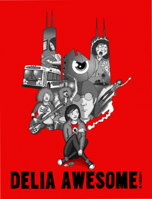
Delia Awesome #2 Creator: Michael Schneider Self-Published Price: $2.99 (Print); $0.99 (Digital)

[/su_box]

Review: Augmented #1

I'm feeling burned out on negativity. Not that I feel too terribly unjust in feeling negative so much of the time, but we all feed various engines within ourselves at any given point in the timeline, and getting back onboard reviewing here on Bastards hasn't fueled many productive ones. Despite the few standout exceptions, 2016 has been pretty uniformly a bunk year for media for me. All the good music I've listened to this year came out last year, save for that made by recently dead artists. I've only seen one genuinely great film this year, with an overwhelming amount of disappointments and skipped trips to the theater, despite making a personal promise to see more. And comics...well, let's face it. Outside of two or three vets who keep plugging away at the medium, most comics are a crapshoot for me. I don't gamble on DC or Marvel anymore, only ever reading them on an extraordinary recommendation or out of critical obligation. I don't know if it's about getting older or just being tired, but this isn't fun anymore. Most of the time I'd rather have a quiet night in talking about anime or Grant Morrison comics with a few friends than going to a convention just to be amazed at the ocean of premium priced novelty clutter. I don't know, like the old song says, "if you're bored then you're boring." Well, I am bored, and it's only getting to feel more like it's a part of me every day.

Augmented is...well, not as bad as the last two comics I read I guess. The story concerns a fighting match where fighters are sponsored by the wealthy to be enhanced with cybernetic augmentations, pitted against each other in a fight to the death. A prisoner is given a chance at a life beyond bars by being selected to be the latest fighter in the competition, but at what cost?

Augmented_1Did any of the wording I just used in the synopsis sound a bit awkward? It felt awkward to write because I realized how many big chunks of plot information are just completely absent from this book. There's actually one part that feels like a page might have been missing from the review copy, but here's a rundown of what we don't know. We meet our protagonist in prison. What was he imprisoned for? No idea. What did he do before he went to jail? Boxing, maybe? All we get is one line about someone having seen his "fights." The fighting tournament. Is it illegal? Doesn't seem like it, but we're never given any sort of motivation for why it exists. Our douchebag CEO antagonist seems really concerned about it but never explains if it's a matter of TV ratings, a la The Running Man, or an overly elaborate way to test out the technology he's developing for other means, as in D.O.A.: Dead or Alive. Nothing. Our protagonist makes a really dumb deal with really obvious dumb downsides, and we're not even provided with a horrible stock tragic story about how he just wants to get back to his wife and kid or girlfriend or terrier. He's just angry he got tricked in an obvious way but won't get to do anything about it until, oh, say issue #4 or #5. Probably the biggest piece of missing information: who are we supposed to be rooting for in the upcoming fights? The lead isn't sympathetic. The goals of every institution in this is unclear. So, where's the hook?

The one thing that helps elevate this a little is the art. It's by no means great, but it fits the popcorn storytelling well with exaggerated energy and 90's-esque ambitions. The colors are also decent, extremely saturated, but poppy enough to make the art look like what it is trying to look like. Everything flows nicely, save for the weird gaps in the narrative, making this book at the least seem a competent attempt at the limited premise. The nicest thing I can say about it is for a book about fighting tournaments, they at least did better than Kevin Eastman's Cage Hero, and that man created the Ninja Turtles.

Maybe I am boring. It is nearly midnight, and I'm in front of a computer at home, being unhappy about a comic that never really had a chance in appealing to me. I ate too much of the wrong things; the beer has worn off, and now I'm left trying to put words to the lack of anything I feel when I read these books. But there it is, isn't it? Beneath the ambitions to be art, to be personal, to capture imaginations, inspire controversy, or puppeteer the emotions, the simplest goal of media, the most primitive function, is simply to entertain. To provide an escape from the computer, and the job, and the aching shoulder. To be somewhere else that is just more interesting than here. Haven't found it here. I'll keep looking.

[su_box title="Score: 2/5" style="glass" box_color="#8955ab" radius="6"]

Augmented #1 Writer: Bill Stoddard Artist: Chris Royal Colorist: Nimesh Morarji Publisher: Tenacious Comics Price: $3.99

[/su_box]

Review: Predator vs. Judge Dredd vs. Aliens #2

It is very easy to follow the easy path when doing a crossover of franchises like these three. The fact is, one of the publishers of this book manages to do it at least a couple of times a year. It is why people hate crossovers. I will admit that I had that fear for this issue. I wondered if I had praised the first issue too much and would instantly eat my words. How could Predator vs. Judge Dredd vs. Aliens not fall into the trap of “okay everyone fight, but not really because we need to protect each brand”? John Layman, that is how.

Layman understands a few important things about this particular crossover, but then extremely important rules for any crossover. Layman protects each brand, but Layman knows that he has two disposable sides of it. No one is expecting the exact Predator or Alien to show up in something else which gives him a lot of leeways. The other important thing that he nails in this issue provides us with a bad guy. Not just any bad guy, however. Layman has created one and found a way to give him a superficial history with Dredd, but then managed to make him a threat to all parties. Now, he is not a threat to the Xenomorphs, but he is the force that can release them and thus destroys humankind.

Predator Judge Aliens 2It was incredibly refreshing to have a fucking villain in a crossover that felt like a real threat and not just another franchise character that no harm can come to. Other significant elements of this particular issue include the Predators tracking Dredd’s assault in the jungle which was a clever way of showing both parties arrival, but in a way that wasn’t annoying or clogged up a bunch of pages. The other was doing a call back to Judge Dredd vs. Aliens: Incubus which added more history to the story. Suddenly it did not even feel like a crossover, but more like canon.

I am going to spoil something with the art for you because it will tell you everything you need to know about Chris Mooneyham’s art on the book. Mooneyham illustrates a Predator/Alien hybrid that is actually really fucking cool looking. Not only that, but there’s a Judge/Alien hybrid as well created by the villain of the story. It too is fucking cool. The only thing else I will add is that Mooneyham’s visual storytelling is spot on and compliments Layman’s narration, particularly during the opening with the Predator’s figuring out the Judge’s battle with the Ani-mans.

I knew that I was going to read this issue no matter what, but I did not think there would be anything worth saying on another review. Thankfully the creative team surprised me. This crossover is a throwback to the early days of franchise crossovers in which they were cool and enjoyable. Thank god someone figured it out.

[su_box title="Score: 4/5" style="glass" box_color="#8955ab" radius="6"]

Predator vs. Judge Dredd vs. Aliens #2 Writer: John Layman Artist: Chris Mooneyham Publisher: Dark Horse Comics/IDW Price: $3.99 Format: Mini-Series; Print/Digital

[/su_box]

Review: Tomboy #7

I feel like an ass. I actually got this issue right after the sixth because Mia Goodwin was kind enough to share it with me. Then life exploded as it likes to do and I forgot I had the issue. Oh, the shame. One thought kept popping in my head as I read this issue and that was, “Stop it.” Stop being so damn good. Show some faults, give me something anything to demonstrate that it’s not this damn easy to make a great comic. I read many comics so I know it’s not that easy, and yet Mia Goodwin and Michelle Wong do just that. They make comics look easy because they technically should be, but actually it comes from their talent and skills.

This issue. Oh, this fucking issue. The cat is out of the bag. We now know that the supernatural element is real, but somehow that only opens the door for more questions. In the ending to the last issue, well… you know. It’s on the cover so it’s not like you cannot figure it out. Jessica was killed, by Addison. Take a deep breath and let the soak in because it changes Addison’s character. Until then she had only killed guilty people, but now she has an innocent on her hands.

The pacing for this issue is by far the best of the series. I cannot even adequately describe how perfect it is. From the cop procedural aspect to the news feed narration. It is spectacular. It’s so good that I want to spoil everything and at the same time, I don’t. What to do, what to do.

Tomboy 7Jessica’s death was the only one in the last issue which brings a new element to the story as a new detective makes an appearance and she is hard-nosed and doesn’t like Trent. The fire that Addison set has set the story on another path to play out in a way that now throws Ms. Trent into the spotlight of the murders even though she had nothing to do with them. It also attracted the attention of the Nurse and a reveal that she’s got some dark magic on her side as well.

The final sequence in Addison’s room is disturbing, creative, and chilling all at once. Who are the fairies that have been talking to her and directing her? What is their goal and how will this new one effect Addison? Even though there’s a finite ending to this story planned, there are so many new questions to be answered. I doubt that all of them will be answered and that’s okay. This story and the world have so many layers that it’s impossible to cover it all in a way that would do it justice. That and leaving it open for more is also completely fine by me.

Michelle Wong’s art continues to be the best and only suitable replacement to Goodwin’s artwork. The opening pages look and feel like the opening to a police procedural TV drama, but without the boredom. It’s exciting because we already know what happened, and we’re waiting for them to catch up. In that way, the story and art make us patiently hold on, but then once it is revealed its sprints to the end. This is probably the fastest I have ever read an issue of Tomboy. Going back to the closing sequence, it is all carried by the artwork. Goodwin gives the narration and dialog a rest and lets Wong’s artwork do all the talking. Again, it’s chilling. It is by far one of the creepiest aspects of the series thus far and amazing to look at.

Comics should be this good and no I do not actually want Goodwin and Wong to “stop it.” If anything I want them to never stop because I have adored this book so much. As a reader, as a reviewer, and as someone that just enjoys the hell out of a great story. Tomboy and others of its ilk are the reason I will never give up on comic books because, outside of novels, you will never get this pure storytelling. At the end of the day, that is why I read comics, for the stories. To see what someone else created and to enjoy it, to love it, to wish I had done it first, but knowing it had to come from someone else to enjoy it. It is inspiring; it is the reason we all read comics.

[su_box title="Score: 5/5" style="glass" box_color="#8955ab" radius="6"]

Tomboy #7 Writer: Mia Goodwin Artist: Michelle Wong Publisher: Action Lab/Danger Zone Price: $3.99 Format: Mini-Series; Print/Digital

[/su_box]

Review: Earth 2 Society Annual #1

The legacy of Batman is up for grabs. Who will take on the mantle of the Prince of darkness, the caped crusader? Perhaps Dick Grayson can fill the shoes of those who have come and fallen before him. Both Bruce and his father, Thomas Wayne sacrificed everything, including their lives to protect the people from evil and criminals looking to cause nothing but trouble and death. Is it even possible to fulfill the same destiny, and even shoes that Bruce and Thomas have left in their passing? Legacy as this issue is called, honestly, says a lot in terms of story progression throughout the issue. Interestingly, Grayson isn’t looking to outshine Bruce or Thomas, but rather do them proud by upholding the same standards and oaths that they took. Thomas Wayne, took on the Batman mantle when Bruce was killed saving the world. He wore the cape with similar ideals to that of his late son but with more ruthlessness. Grayson has also made his own take on what the Batman is like, making exciting changes to the armor that Batman wears. Grayson’s take on the Bat suit is quite different from anything you’d see Bruce wear. A red bat logo right on the front of the suit, possibly signifying the blood spilled by Bruce and Thomas as they EARTH2SOCANN_Cv1took their last breaths defending the people as Batman. It seems as though Grayson is on a suicide mission of sorts as he doesn’t have anyone in his life. It turns out his son is alive and was being controlled by the Humanite, an intelligent ape creature capable of telepathic abilities. Now with his son back in his life (who managed to acquire powers), Grayson is even more conflicted on whether the Batman is the right path for him.

The idea of continuing a legacy is an excellent way to start a story. Not only can most people in some way relate to maintaining a legacy, but in this case we are talking about one of the greatest legacies of all time, The Batman. Would everyone maintain the same ideals as the original Batman or create a new image of the all inspiring hero. Would someone use the Batman for a means to themselves or be a selfless hero. Abnett gives us a conflicted Grayson, on one hand, he wants to be the Batman as Bruce would want him to be, on the contrary, he feels that in order to be a great hero he would have to sacrifice his life. Inner conflicts are always interesting in stories especially when they create a situation that can send a character down a path that is catastrophic, it leaves an unknown for the reader, not knowing whether the writer will send our hero down a path that is not what we expect.

Art is always important to a solid comic; this is no exception. Batman is always depicted as a dark character, Grayson’s Batman is the same, granted the red logo definitely stands out a bit more than an all-black suit. Redondo, Neves, Albarran, Jose, work on delivering a dark, gritty issue. Character detail such as expressions and emotions are displayed very well. Getting the sense of self-conflict that Grayson feels is easily picked up within the panels. The style of art is similar to most DC comics, no surprise there.

All in all, this is a great first issue. Sets a good storyline for future issues to follow. If you are not a fan of the idea of having someone other than Bruce Wayne in the Bat suit, then I’d stay away from this series. If you can see past that then there is no reason you cannot enjoy this alternate storyline where Dick Grayson is taking on the responsibilities of the Batman. Last note, $4.99 seems a bit steep for this series. Maybe a price tag of $2.99 would attract more customers, but $4.99 would keep me from picking the issue up.

[su_box title="Score: 3/5" style="glass" box_color="#8955ab" radius="6"]

Earth 2 Society Annual #1 Writer: Dan Abnett Artist: Bruno Redondo, Diogenes Neves, Juan Albarran, Ruy Jose Publisher: DC Comics Price: $4.99 Format: Ongoing; Print/Digital

[/su_box]

Review: The Killer Inside Me #1

During my freshman year of college, I went through a mini crime phase; I read books like The Postman Always Rings Twice, The Long Goodbye, and a bunch of the Parker graphic novel adaptations. It was during this stint that I picked up The Killer Inside Me. The stark telling of such a cold, brutal subject is something I vividly remember even now years after I’ve read it. The source material dissects the personality of Lou Ford right down to the bone. Uncompromising and graphic, the book is famous for a reason. Sadly, the comic adaptation falls short of the source material. In its first issue, the creators dampen the edge of Lou Ford, and while the comic isn’t a total loss, the result is disappointing. KillerInsideMe01_cvrBefore I get into what I disliked about the issue, I’m first going applaud the choice of the creators to avoid one of the mistakes made in a previous adaptation. In 2010, a movie adaptation of The Killer Inside Me made its debut at the Sundance Film Festival. It was met with poor reviews, citing the portrayal of violence toward women. The opinion of most critics was that the violence was gratuitous and graphic to the point of excess. The comic (at least in this issue) doesn’t fall into that trap. There are a few panels where violence is shown, but the creators do not linger on it. And while this issue does not contain the most violent parts of the story, I believe the creators do have the intention to treat the book as an analysis of the mind of a sociopath. Which is where I believe the real story can be found.

I can tell that Devin Faraci is trying to do good by the source material, but because of the way this issue is structured he falls short of conveying Lou Ford’s true menace. In the novel, we have a lot more time to get to know our subject, but in this series, Faraci is given one issue to convey this manipulative killer. This is simply not enough time. He has to do in 32 pages of comic, what is done in around the same amount of pages in a novel.

But Faraci pacing isn’t the major problem with the issue. The weakest part of the book comes in the form of inconsistent art. Vic Malhotra draws a decent Lou Ford, but there are more than a couple close ups and mid-range shots where the characters look stilted or forced into a pose. Jason Millet’s inking is also suffers from the same inconsistencies. In some panels, he creates a very effective mood of foreboding, but there are panels where the texture of the characters faces and backgrounds appear to be nowhere near his capabilities.

There is definitely effort here. You can see it in the writing as well as the art, but sometimes for one reason or another the end product does not live up to what we would have liked. As I said earlier, the creators make an attempt at respecting the source material, but in the end, they just can’t seem to squeeze enough of the story into the issue.

[su_box title="Score: 2/5" style="glass" box_color="#8955ab" radius="6"]

The Killer Inside Me #1 Writer: Devin Faraci Artist: Vic Malhotra Colorist: Jason Millet Publisher: IDW Publishing Price: $3.99 Format: Print/Digital

[/su_box]

Review: My Hero Academia vol. 4 & 5

I ended up reading four volumes of this in a row. After really enjoying the first two volumes, I fell behind on the series and then the anime came out, which I watched and hated. It made me hesitant to go back to the manga. In the end, I did come back, and if you could not tell, I enjoyed what I read since I kept reading and reading. There is an imaginary “3” up in the title as well. I did not feel it needed to be fully included in this review because it is one of those annoying volumes that finishes a story arc and starts another and so you are left without much you can talk about because it is half spoilers and a half underdeveloped storylines. my-hero-academia-vol-4 Before I dive into the review for both volumes, I will say that my biggest problem with the anime was that they focused on Midoriya’s crying way too much. Sure, he cries; that is part of his character in that he cares so damn much it brings him to tears, but the anime showed him crying constantly and it got old quickly. Jumping back into the manga, I again noticed he cried, but the emotions behind the tears had so much more meaning, and it was nearly as annoying. If and when the next season comes out I hope that the people adapting the story finally understand that and can then produce something that’s viewable and instead of laughable.

Onto the recap of sorts. Volume 3 shows the end of the battle with the league of villains, which is the end of the first season of the anime. It also starts the storyline of the sports competition at the school, which has replaced the Olympics according to the story. It is just a way to rank the students which readers of Manga seem to love. It is also a chance to pit them against each other in a fantasy type battle since they realistically wouldn’t fight each other being heroes and all.

Volume four has interesting aspects in that Midoriya has a target painted on his back or more accurately his head having come in first on the obstacle course. Now they are playing the classic game of Cavalry Battle. The game itself is not that exciting because it has been done a thousand times in manga and will be done a hundred thousand more. What is interesting is the relationships that are built or changed. More people throw down the gauntlet with Midoriya because of All Might’s favor being shown towards him. While this is all okay, it is what happens after the match that matters.

Here’s where it sets up the story for a solid fifth volume. Shoto Todoroki’s father is revealed and also the reason why he will not use both of his powers. It is casually mentioned that he would only use his ice powers and not his fire powers, but after Midoriya pushes him in battle he uses them for just a moment. This makes Todoroki open up to Midoriya. I will not reveal all of it, but it gave much depth to this powerful character.

my-hero-academia-vol-5The fifth volume finds all of the students facing off in one-on-one combat. Midoriya and Todoroki go up against each other, but Midoriya’s plan is not to win this time. It is to fix Todoroki. It is wonderful as the scene manages to build up both characters and set up an interesting, be it a different final battle between the winner of their match. We are also left with a stern warning about Midoriya’s future as the Nurse is no longer willing to fix his broken fingers leaving him with a deformed hand as a reminder to find a better way to use his strength.

All in all, both volumes have their strengths and weaknesses. The Calvary Battle apparently only exists in the story for its familiarity because it is a strange second round when you think about where it fits in overall. The entire event also seems like an afterthought, but one that works out in the end because of the focus given to the individual characters.

The art is, of course, is exquisite. It’s done in the manga style and while I enjoy some of the more unique designs aspects to it like All Might illustrated as a Western superhero and the exaggerated hands and feet. It does not break the mold or push the visual medium, but I know that is not the goal of the work, so I am not judging it based on that. The action sequences continue to be easy to follow, detailed and over the top. You can tell this series is popular and being built up because there’s already seven assistants helping out on the art. I do not know if I have ever seen that many and not that many given credit.

I have one more review for the series before I am caught up, but I am glad to be back on board with this series. I hope that Midoriya has a leap forward in his powers so that he can use them in new ways, but I am patiently waiting for that time to come. At some point, I do have to compare this to superhero comics from the West, and I would say that it stacks up in many ways. I would read this over X-Men any day, and this book probably wouldn’t exist without the X-Men.

[su_box title="Score: Vol. 4: 3/5; Vol. 5: 4/5" style="glass" box_color="#8955ab" radius="6"]

My Hero Academia vol. 4 & 5 Creator: Kohei Horikoshi Publisher: Viz Media Price: $9.99 each Format: TPB; Print/Digital

[/su_box]

Review: Marie Antoinette Phantom Queen

I’m going to break editorial kayfabe and reveal that Marie Antoinette Phantom Queen has been up for review for as long as I’ve been writing for this website. Every week when I’d sign up for which release I’d review, this book would be nestle towards the bottom of our column reserved for only the most indie of indie comic books. Days went by, and it was there, then weeks and same result.

Then one day I threw myself into the pile of very indie titles and found this beautifully drawn, wonderfully colored comic. I couldn’t believe this had gone untouched for so long, that this went un-reviewed. I made a vow that when I had a week with fewer reviews going on, I’d read this one.

Now that I’ve read this book, I can tell you why this wasn’t talked about for so long. The answer is that, well, it’s French.

European comics took a stylistic turn away from the rest of Western comics at some point in history. They moved away from narrative, moved away from dialog and character and became more about the presentation of art and its visual juxtaposition of ideas.

Marie Antoinette Phantom Queen reads like a pastoral daydream. The line work is immaculate, the colors so soft and war they’re almost like watercolors. When a page portrays a rolling landscape or pristine neo-classical structure, the image could be enlarged and placed on a wall in a museum.

Marie Antoinette Phantom QueenDespite being enthralled by the art, I could never stop being tripped up by the narrative. Here we follow a painter in the 1930s as she inadvertently becomes the spiritual medium for the ghost of Marie Antoinette.  The art so strongly captures each period in vivid detail with particular attention to capturing the beauty of the settings’ styles of dress and with colors that provide this rich texture I’ve never quite seen in other comics.

The story’s pacing moves at a rhythm I could never match. Some scenes felt like they moved through too quickly or with too little connective tissue. Then while there is a horror and tension to Marie Antoinette’s history and imprisonment during the French Revolution, I kept expecting a sharper and harsher visual edge that I never found. The present story of the painter moves at a much more docile pace where events that should cause drama ended up sorting itself out. The internal narrative structure never matched my expectations. When I expected a scene to linger, to indulge in a character moment it was already over, but then when a scene might have traditionally been simply quick exposition connective filler, the pages waited here a little longer. Marie Antoinette Phantom Queen was a story that never match that narrative formula of Western comics but not in a way that challenged it but rather just different.

Here the narrative presents two different women who are turned victims of circumstance by simply existing as women in restrictive periods. Marie Antoinette was tortured, executed and desecrated for simply being born into her life—a life where she had no say or influence on political systems of royal France.

While in the 1930s, Maud becomes the target for her deceased husband’s son as he tries to steal her inheritance. Both women end up helping each other, but the story never has the sharp dramatic beats I expect. Maud’s former step-son tries to institutionalize her, but every effort comically fails, Maud has to find Marie Antoinette’s true remains but doing so turns out to be relatively easy due to her ghost friend’s powers.

There’s still a delight in this story. Maud and Marie Antoinette build a charming and beautiful friendship, and the story’s closest thing to a villain is legitimately funny as everyone one of his attempts at ruining Maud’s life fails. This could be a story that lingered on the cruelty of history especially towards women but instead focuses its content to empower.

I can’t blame a comic, however, for not doing something it isn’t trying to do. Marie Antoinette Phantom Queen invites you a fantastical, lazy afternoon story—one you might read on a porch overlooking a field or read over a cup of tea on a quiet rainy morning. This is a story you breathe in slowly rather consume, a story that’s beautiful and funny and moves at a pace you discover rather than one tied to a formula. Most importantly, however, a story that takes a tragic history and forces us to remember and engage with it so that we can create a better future.

[su_box title="Score: 4/5" style="glass" box_color="#8955ab" radius="6"]

Marie Antoinette Phantom Queen Writers: Rudolphe & Annie Goetzinger Artist: Annie Goetzinger Publisher: NBM Publishing Price: $17.99 (Print); $9.99 (Digital) Format: Hardcover; Print/Digital

[/su_box]

Review: Tokyo Ghost #10

Sigh… As we all know too well, all good things must come to an end. This is my review of the tenth and final issue of Sean Gordon Murphy and Rick Remender’s Tokyo Ghost.  First and foremost, this series has been great throughout, so to see it ending makes me a bit sad. Tokyo Ghost is a story about dependency; a love story with some incredible art and storytelling which is really easy to get behind. I took a lot away from this and I think Murphy and Remender have crafted a story here that will stay with readers for a good long while.

Tokyo Ghost #10Now, I can’t really say much about the contents of the issue, it’d be a bit of a dick move for me to ruin the last issue of such a great series but, as it stands (and what you know already if you’ve been reading it), it’s the final showdown between Debbie and that villainous fuck, Davey Trauma. He’s about to murder everyone on the planet and download 'em into a completely digital existence. No way, Davey. Debbie has a choice to make and it’s not an easy one for her…

Hot damn. Rick Remender's written a strong finish to this series. It's been an emotional roller coaster, lots of feels and fair dues to Rick because of that. He's got me to care about how this story ended and that's a rare thing these days. Great ending, too.

You get a lot of great visuals from artist Sean Gordon Murphy and colorist Matt Hollingsworth this issue, too. I like art when it’s like this, there’s a lot of emotion to the art and you can feel it pouring in through your eyeballs. Hollingsworth has done a great job putting the colors to it, a really rich neon/Day-Glo color scheme that gives you that menacing buzz of electricity throughout.

Tokyo Ghost is a comic with a creative team who are giving 110% and by the time I reached the end of it, I was more than happy with what I’d read. This is a fine conclusion to a story I’ve really enjoyed, and if you’re a fan of the series, you won’t be disappointed either.

If you haven’t read any of Tokyo Ghost and you’ve just landed here out of curiosity, give your local comic book retailer this code (JAN160652) for the first trade, tell ‘em to order it for you, thank me later.

[su_box title="Score: 5/5" style="glass" box_color="#8955ab" radius="6"]

Tokyo Ghost #10 Writer: Rick Remender Artist: Sean Gordon Murphy Colorist: Matt Hollingsworth Publisher: Image Comics Price: $3.99 Format: Mini-Series; Print/Digital

[/su_box]

Review: The X-Files: Origins #1

You might be turned off by the limp, marketing-focused title of this mini-series. That would be a shame because I'll go ahead and say at the start here that X-Files: Origins has a lot of promise for previous fans of the franchise as well as for newcomers. The book wisely splits itself into two equal parts, spending time with each of the series' leads in their younger days. The TV series played up the tension between Dana Scully's religious faith and her role as the official rational skeptic. In young Dana, we see a curious idealist who is confronted by a seemingly random act of brutality that could go ignored if not for her inquisitive mind. The issue touches on aspects of Scully's adult personality without filling its pages with annoyingly overt references. Origins wastes no time before establishing the role Catholicism plays in the girl's life. And it's probably somehow telling that her first taste of tragedy is connected to the church.

XFiles_OriginsFox Mulder's half of Origins takes place shortly after the mysterious disappearance of his younger sister. He's convinced he cannot tell any adults about his suspicions regarding what was, in his mind, the abduction of Samantha Mulder. There's an amusing bit that references adult Fox's need to stand apart from other conspiracy theorists. Other than his selective skepticism, young Mulder lacks the overt rebellious streak that characterizes his adult self. This Fox is a good kid, afraid to cause trouble for his parents, filled with guilt over not being able to protect his sister. Hopefully, Origins delves into his growth with a delicate touch; being too heavy-handed with Mulder could result in some unintended parody. The writing does a good job setting Fox apart from his peers, making it clear that, to him, most relationships are transient. You get the clear impression that losing Samantha was a major blow to his world view.

The art might seem like an odd or inappropriate choice for an X-Files book. It's very clean and bright in a way that goes against conventional portrayals of this franchise. However, the setting, time period, and tone justify a more cartoonish style of rendering that simultaneously contrasts nicely with some of the darker events taking place. As kids, Dana and Fox are cushioned from the uglier aspects of crime. And, of course, it will be decades before either character truly faces a more insidious darkness covering the world. The overall look is of young adult fiction, but the book doesn't suffer at all from kid-oriented visuals. Howell's art seems particularly suited to shift into a more horror-themed atmosphere if called upon to do so.

I'm excited about this book, as a casual fan of the television series and as a reader of speculative fiction. The pacing of each half is very efficient, packing a not insignificant amount of backstory into the framing narration. There're fun and suspense in decent amounts. And I can imagine the twist and turns of the plot being very engaging.

[su_box title="Score: 4/5" style="glass" box_color="#8955ab" radius="6"]

The X-Files: Origins #1 Writers: Jody Houser and Matthew Dow Smith Artists: Chris Fenoglio and Corin Howell Colorist: Monica Kubina Publisher: IDW Publishing Price: $4.99 Format: Mini-Series; Print/Digital

[/su_box]

Review: East of West #29

East of West #29 marks the third issue in a row which I had planned not to review and then, upon reading it, found I had a lot to say. Exactly when any long running series in the most danger of getting stagnant, Hickman and Dragotta have hit their stride, telling weird, gripping, action-filled stories of a very strange western world.  The 29th chapter of East of West serves as the finale of year two, bringing one major plot point to a head while setting up the book's third act. Let's get the big event of the issue out of the way up front: Death and Babylon have been united, which has been built to since the end of the first arc. Their union (I hesitate to call it a reunion since, as is a plot point in the issue, neither knows the other) brings out the softer side of death which to me makes him such an interesting character. After dispatching his son's would-be killer, East of West #29Death has no bravado or anger left in him. Suddenly he's reserved and gentle, almost shy around the boy who kicked off this whole story. The fascinating contradiction at the center of Death is that he is, by nature, unable to form attachments being a spirit of pure destruction and yet he loves his family with the passion and dedication of any father and husband.

Babylon for his part doesn't know how to react to the 'Mythological: Artificial: Reanimate: Apocrypha: Horseman' who is suddenly hugging him. While Babylon's humanity has been emphasized over the last arc, but Death recognizes, as his son cheerfully describes how he'll end the world, that there's work to do on him. How Death's new relationship will play out with the ever manipulative Balloon, remains to be seen, but it's interesting territory that should allow both Babylon and Death to become richer characters.  That along with an insane two-page final sequence serve as quite a hook for the Apocalypse year three.

All that being said, the issue contains a lot of material that is less concerned with the overall plot and is more simply, a lot o fun. We have a crazy action sequence that subverts more than a few expectations of how Babylon's fight with the bounty hunters will go down. We then are given a fascinating (if unimportant) look at the history of Psalm 137 who frankly is interesting enough to have his own series (if Death is Dirty Harry and The Ranger is Judge Dredd, then Psalm 137 is Robocop). All of this is brought to life by the ever imaginative pencils of Nick Dragotta. Part of the reason I keep meaning to skip these reviews is that I am running out of ways to say how good the art, but it would be a crime not to mention it.

East of West #29 ends with a callback to one of the first lines of the series, as we are once again reminded that "The dream is dead." It's a sharp, powerful little moment that propels us forward into a signaturely uncertain future. It also, along with the entire preceding issue, serves to remind me that another dream that East of West will continue its high level of quality through a fifty issue run is very much alive.

[su_box title="Score: 5/5" style="glass" box_color="#8955ab" radius="6"]

East of West #29 Writer: Jonathan Hickman Artist: Nick Dragotta Colorist: Frank Martin Publisher: Image Comics Price: $3.50 Format: Ongoing; Print/Digital

[/su_box]

Review: James Bond #9

When Umberto Eco wrote his final novel Numero Zero, he told a story about conspiracy. In his case, it was a conspiracy surrounding the history of Italy—that Mussolini never died but was secreted away and awaiting the day for a secret fascist army to rise up and place him back into power. Within the same year of that novel’s release, a superhero movie told a similar story—one where a supposedly defunct Nazi organization infiltrated the government of the United States and edged the country towards fascism and instability, a little movie called Captain America: Winter Soldier. The infiltration conspiracy has always been an attractive one. Where the villains of history, the bad guys we know and understand, can be blamed for every poor decision our countries’ governments and cultures make. The Illuminati, the lizard people—both explanations and diversions from the naturally chaotic and politically oppressive state in which the world functions.

Only Eco’s conspiracy was operating underneath something very real—a Cold War rumor that became a reality. Operation Gladio was a NATO-led campaign following the end of World War II that placed a stay-behind army in Italy either in the case of an invasion from the Soviet Union or a political rise in communism within the country.

JamesBond09-Cov-AStay-behind armies are a paranoia-inducing notion, one where a foreign country’s army doesn’t leave but rather secretly become civilians within that country, trained and waiting for their call to arms.

Warren Ellis’ current run on James Bond is a story where the rumors and myths of the Cold War haunt the present like specters or a dormant disease.

The revelation last issue that a stay-behind army infiltrated both the MI-5 and the CIA has made James Bond’s return to the United Kingdom less of a welcome home than a new, political battlefield.

In the first issue of this series Ellis introduced a new law passing through the government—one that would keep all British agencies disarmed while on British soil. What could have been a simple reflection of England’s modern gun politics now has a much more sinister tone as MI-6 is left to question if it’s a deliberate attempt to weaken them.

The political espionage paranoia permeates this tension throughout the issue as the first half is turned into a stand-off without any guns. A simple visit from an MI-5 agent with reasonable questions about an assassination attempt on a British citizen has everyone tensely itching for their weapons.

This tension built over the first twelve pages finds its release as the second half turns into a fun action sequence explosion with a gunfight in a train yard. Yet at the same time, this is where the issue also reveals its weaknesses. This story arc, Eidolon, even more so than the last reads like a broken up movie. So when the action sequence finally ends there’s no new revelation, nothing in the issue’s pace that brings me down from the visceral high of the sequence. This creates a tonal dissonance that would be fixed if I was reading a trade collection where I could move forward but here I’m only left with a pit in my stomach that never settles.

This is a symptom of an endemic trend across comic books as they write for long-form stories in a market that publish only in short-form. A trend that frustrated me so much that it stopped me reading single issues altogether for a long time.

Yet this is a Warren Ellis story and what might bother me more in other stories, is soothed over with the little ticks that bring me to his writings in the first place. He’s a tour guide for the weird sciences and forgotten histories of England. A traditional Bond movie might take Bond across a stumbling of beautiful vistas and happenstances that bring him to the villain. Eidolon instead finishes a hook left at the start of this arc.

The suspicious money being moved in issue seven is decrypted and revealed to loop back into England’s “Strategic Reserve Fleet”, a Cold War rumor here turned to reality. The British government during the Cold War expected that, in the event of World War III, nuclear bombs would completely wipe out their electric train lines and in preparation kept a reserve of steam engines underground to reform their lost infrastructure.

There’s a reason James Bond and the espionage genre broke out during the Cold War. There was so much paranoia, so many strange secret operations that we needed characters able navigate and make sense of the uneasiness. In our post-9/11 surveillance and internet age, we wrestle with an ever-present but very different brand of paranoia—one less on the level of nations as it is about a person’s individual privacy.

There have yet to be any standout characters that represent an answer to this reality and despite flirting with it; this series has yet to transform James Bond into that character.  Instead, this is a fusion where James Bond can exist in the present while still married to his Cold War roots, letting him be a savage instrument in a more sophisticated era.


[su_box title="Score: 3/5" style="glass" box_color="#8955ab" radius="6"]

James Bond #9 Writer: Warren Ellis Artist: Jason Masters Publisher: Dynamite Entertainment Price: $3.99 Format: Ongoing; Print/Digital

[/su_box]

Review: Jem and the Holograms #18

This story arc is certainly more grounded than the last. It has more drama and subjects our protagonists to more stress than their most recent adventure. And in spite of a brief near bear mauling, it remains far more focused on the human part of the drama. Jem18_cvrAIt's disappointing, though not surprising, how easily Pizzazz has slipped into her old ways. Her barely concealed distrust toward newcomer Blaze feels more than a little petty considering how little confidence the supposed usurper has displayed. It feels like forced conflict. Likewise, there's a falseness to Pizzazz's disapproval of Stormer's romance with Kimber. Hopefully, the Misfits will call out their leader's bullcrap, and we'll get to see some character growth. On that front, a significant portion of the issue's drama centers on Shana's decision to take what she sees as the next step in her life. If this is a book about finding your voice through art, then it makes sense that one of our artists would find release in an art form outside of music. After all, the Holograms can only do so much in one medium. Kelly Thompson handles this conflict particularly well. From Shana's boyfriend cautiously urging her on, to the shouting match between the bandmates, Thompson nails the mixture of joy, anger, bargaining, and reluctance that accompanies any attempt to alter a comfortable norm.

Jen Bartels art is less energetic than Sophie Campbell's work from the last arc. However, I find character faces here much more distinct and easier to immediately recognize. It's neither and improvement nor a downgrade. However, as the cast of characters seems to swell every few issues, I find Bartel's rendering of faces a little easier to follow. And Robado's colors still go a long way to match the shifting moods of this tumultuous arc. This series as a whole succeeds visually in large part because of the color work.

There's an inherent mystery to a story about change. I have to wonder how theses bands are going to look by the end of the story arc. I further wonder how much growth will take place from the beginning of this story to the start of the next. Many things are up in the air, and I hope they land somewhere interesting instead of hitting the ground and rolling under the couch to be forgotten.

[su_box title="Score: 4/5" style="glass" box_color="#8955ab" radius="6"]

Jem and the Holograms #18 Writer: Kelly Thompson Artist: Jen Bartel Colorist: Victoria Robado Publisher: IDW Publishing Price: $3.99 Format: Ongoing; Print/Digital

[/su_box]

Review: Army of Darkness: Ash for President

At first glance, I thought Army of Darkness: Ash for President was just another version of what is going on most news channels lately. I thought this was just going to be another group of creators plucking the low hanging fruit that is our presidential race. But while the comic does poke fun at the ridiculous circus that has been this 2016 presidential election, it does so in a way that revels in the absurdity of it all. This comic is a humorously cynical look at our political process. I’ve been an Evil Dead fan since high school, I’ve seen all the movies, I loved the show Starz put out and I can’t wait for the next season. But I have yet to jump into the comic version of the franchise. But after this comic, I’m definitely going to look them up, especially any of them written by Elliott Serrano. He really taps into who Ash is as a character and makes a seamless transfer from the movies to the page. You can tell Serrano cares about this character; he’s done his research and after writing him a couple of times in other one-shots and series, he’s got his voice down. The way Serrano writes him Ash’s goofy cocksure natures just never gets old.

AODAsh4PrezIn addition Ash’s quips, the strength of the book comes from the small jokes hidden in the margins of the story. Most of these are tiny offhand comments made by side characters. Whether it’s a small town hick or a demonic book, these small bits of humor that riddle the story make for some excellent moments. Elliot also plays no favorites; there are enough jokes for everyone, the ignorant voter, the puppet newscaster and, of course, the candidates.

What is surprising is that the comic did not include a parody of the raspberry bush of the low hanging fruit world, Donald Trump. The premise of the story is that one of the two candidates, either Democrat Brock Sanders or Republican Valerie Sexton are secretly agents of some great evil. It’s up to Ash, as the newly elected third-party candidate, to get close enough in the polls to get an audience with both of them. Now it could be that Ash himself is serving as a stand-in for the Donald, or perhaps the creators just decided not to include him. Either way, I’m glad they did it. With all the Trump news saturating the media today, I’ve already seen him portrayed as all manner of demons, to the point where to depict him as an agent of darkness would have just been lazy to do so. This was a bold decision by the creators, and the comic is better for it.

Artistically, the book is solid. Diego Galindo and Pete Pantazis do an excellent job with their caricatures. The action is done in that classic evil dead style with both the humor and violence done in excess. Ash’s facial cues are excellent, and for those of you who are fans of the show, this is the young ash of the movies, not the grizzled veteran that graces your TV screens. The close up of the demons also bodes well for the team capturing the sudden impact of the transformation that is one of the trademark shots of the films and show.

All in all, this is a great funny book. Will it win an Eisner? No. Will it encourage a third-party candidate to enter the fray late in the presidential race? Maybe. But what it will definitely do is make you laugh. And laughing about what’s on the news is always better than being embarrassed by it.

[su_box title="Score: 4/5" style="glass" box_color="#8955ab" radius="6"]

Army of Darkness: Ash for President Writer: Elliot Serrano Artist: Diego Galindo Colorist: Pete Patazis Publisher: IDW/Top Shelf Price: 5.99 Format: Print/Digital

[/su_box]

Review: TMNT Universe #1

TMNT Universe #1 is out this week from IDW, and I’ve picked myself a copy of it up because I’ve been needin’ some good ol’ Ninja Turtle action in my life for a while now. I completely missed the other Turtles series, and I’m one of those people who won’t jump into a book if I miss a lot of issues before I get to it. So, for me (and maybe you?) this is the perfect time to jump on board with The Turtles. TMNT-Universe01_cvrAGetting into it, in this issue, the story opens with The Turtles trying to tap up Baxter Stockman for some help by way of April O’Neil. Baxter’s being a dick about things and before long, there’s a badass scorpion-like mutant in the same building… The shit hits the fan quickly. Even worse for the lads, The Earth Protection Force are waiting outside, too…  That’s as much of the story as you’re getting out of me, haha.

I really liked this; it was well written, there’s an exchange between Donnie and Mikey about their choice of weapon right near the beginning that made me laugh out loud. It’s heavy on the action and fast-paced, which is great for a first issue. Writer Paul Allor’s done a great job of getting the hooks in me and I can’t wait to see where the story goes. All in all, a good job on the writing side of things. Nothing groundbreaking just yet, but a great start to a story nonetheless.

And, this is really nice to say: I loved the art in this book. I think Damian Couceiro’s art is fantastic; I’m really into it, and it works well for this story. Looking forward to seeing more from him and I’ll also take the opportunity to give a shout-out to Ronda Pattison who has done a great job on the colouring here.

I’m struggling to find anything I didn’t like, and I think I’m about to break Comic Bastards with all this positivity… As if the main story wasn’t enough, this issue has a back-up story in it. It’s a story plotted by Kevin Eastman, Bobby Curnow, and Tom Waltz, scripted by Waltz. On art duty Eastman has done layouts for the legendary Bill Sienkiewicz (copy and pasted his last name from Google there to make sure I didn’t fuck it up!) I really liked this, too! The art is absolutely phenomenal (I would expect no less from Sienkiewicz), beautifully complemented by colors from Tomi Varga. It’s a story focusing on Leonardo which is going to carry over to future issues, so I’m looking forward to that. Great job from everyone involved with this book. Well done.

I usually end my reviews with a big rant about why you should get the book I just reviewed; I’m not going to here. Go get it and see for yourself. This is a great first issue.

[su_box title="Score: 4/5" style="glass" box_color="#8955ab" radius="6"]

TMNT Universe #1 Writers: Paul Allor, Kevin Eastman & Tom Waltz Artists: Damian Couceiro, Kevin Eastman & Bill Sienkiewicz Colorists: Ronda Pattison & Tomi Varga Publisher: IDW Publishing Price: $4.99 Format: Ongoing; Print/Digital

[/su_box]

Review: Afterlife With Archie #10

Over the last week, I finally got around to reading the first volume of Roberto Aguirre-Sacasa's other Archie horror comic, the Chilling Adventures of Sabrina. It was, from start to finish, a sharp, scary horror book with great art (courtesy of Robert Hack) and a strong sense of characterization and I highly recommend it. And yet, when all was said and done, I couldn't help but notice that Afterlife with Archie is distinctly superior.  There are a number of reasons for this: Francavilla's art is better than Aguirre-Sacasa's, Afterlife is a more interesting story, and the emotions are not as rich in Sabrina. All that said, I was reminded by Afterlife with Archie #10 that the key difference between the two is that while Chilling is a scary book that happens to use Archie characters, Afterlife with Archie is, at its core, an Archie comic. Come entirely as a surprise after last issue's big last page cliffhanger, issue ten is a self-avowed, extra-sixed interlude--an interview with the lead singer of Josie and the Pussycats. Ignoring entirely (well, almost) the goings on in Riverdale, Aguirre-Sacasa creates a new Pussycats mythos from the ground up framed as a tell-all interview.  As we, and the increasingly terrified music reporter, learn, Josie and company are over a hundred years old and have survived by drinking blood.  In a comic where Sabrina is the Bride of Cthulhu and Jughead leads an army of the undead, there's something entirely fitting in the revelation that Archie comics cheesy pop trio are vampires. And if this sounds like a spoiler, it isn't--we find out the trio are vampires slightly before the halfway point, and things only get more interesting from there.

Afterlife with Archie #10Afterlife with Archie has been a book that has managed to intertwine horror with the nostalgic world of Archie by playing it entirely straight, never winking at the audience or acknowledging anything silly in the premise. Issue Ten is no different, and while on paper the story of Josie and the Pussycats as monsters in their own right sounds funny, it is in practice a haunting 37-page story centered around the type of human moments that allow AOA to be so consistently disturbing. Vampires are, in horror, no less a cliche than zombies (or Lovecraftian monsters for that matter), but seeing a group of formerly angelic young women turned into vicious beasts is arresting. Following the Pussycats through a hundred years and more than a few different bands, we are repeatedly reminded that the monsters in this world are a mix of fantastical (vampires) and very real (Klansmen and Nazis). The most striking moment in the book comes when Josie mercy kills an old friend of the band who has grown old and desperate after years of hard living. It operates both as an excellent Vampire story beat and as a real-world analogy for those left behind by fame.

That may sound a little scattered as I am still trying to wrap my head around the scope of AOA which, along with encompassing ten decades, sees fit to pay tribute to F Scott Fitzgerald in a way I am still considering.  Ably bringing Aguirre-Sacasa's dense scripts to life is Franco Francavilla whose work I quite literally like better every issue. Here he plays the horror more subtly than in past, indicating evil happenings with half-seen monsters, bloody spatters, and eerily orange-lit mansions. Because of this, when a few moments do show something horrible directly, they are that much more disturbing.

At the very start of Afterlife with Archie #10, I wondered whether a 45-page interlude was really needed but a few pages after that I was caught up in the fully-realized new characters. Later I questioned the intrusion of vampires onto a story with plenty going on already, but here again, I was proved wrong by a hugely confident, expert take on familiar material. In other words, by the halfway point of the book, I realized it's foolish to question the twists the story takes and just trust that the creators know what they're doing. As the Pussycat's plane prepares to touch down in a now apocalyptic Riverdale at the issue's end, I was almost sad to be returning to the main plot. But then again, this issue evinces in every possible way that Afterlife with Archie has plenty of material left to explore. I cannot wait.

[su_box title="Score: 5/5" style="glass" box_color="#8955ab" radius="6"]

Afterlife with Archie #10 Writers: Roberto Aguirre-Sacasa Artist:  Franco Francavilla Publisher: Archie Comics (obviously) Price: $3.99 Format: Ongoing; Print/Digital

[/su_box]

Review: Suicide Squad Special: War Crimes

In his much-anticipated return to the team he made famous, John Ostrander pens the tale of the Suicide Squads' latest mission: the rescue of former Secretary of Defense after he is kidnapped on American soil and taken to stand trial for War Crimes in The Netherlands. Needless to say, Amanda Waller doesn't want a guilty man to stand trial. Enter Task Force X, comprised of Rick Flagg, Deadshot, Harley Quinn, Mad Dog, El Diablo, and Captain Boomerang. Full-disclosure: I don't have much history with the Suicide Squad. I've read the Rebirth issue, seen the movie, and now I've read this, and so far I've enjoyed what I've seen. This feels very much like the kind of missions and adventures Suicide Squad would undertake. The characters, also feel in-character very much. In particular, Captain Boomerang is particularly surly.

SSQUADSWC_Cv1Ostrander lives up to the hype in perfectly balancing the key and well-known members of the Suicide Squad, with new characters that can likely have a history outside of this particular story. Likewise, he also manages to make this story live up to it's title, of Suicide Squad. The implication is never lost that if there's even a slight screw-up on your end, Waller will blow your skull out without hesitation.

Unfortunately, the art, by Gus Vasquez and Carlos Rodriguez doesn't have the same impact. At one point, I'm 99.9% sure there's a case of mistaken identity between Boomerang and Harley that any editor should be catching and likewise, you just shouldn't see in a book from DC. In addition, there, at times appear to be some scaling issues. Otherwise, cars in the DC Universe have suddenly become much smaller than I would imagine. Sadly, the art is similar in feel to Brett Booth (known for his work with The Flash, Aquaman, and more recently Titans), but lacks the flair and sheen that have made his art so impressive to look at.

What gets me most about this book is the character work by Ostrander. The book features a lot of characters we've never seen before, but it's clear some solid thought went into them and allows them to be revisited. Likewise, classic characters like Waller feel like themselves right up until the expected, but still intriguing twist at the end that punctuates the fact that you're reading what would be considered "classic" Suicide Squad.

As a one-shot, War Crimes does a solid job of getting across who these people are and what they do, as well as the consequences and ideologies behind their actions. This is something I think worth handing to a newer fan of the series like myself especially if you're not keen on digging through older Ostrander Suicide Squad stories. But if they like this, it feels like a good gateway to more Squad adventures.

[su_box title="Score: 3/5" style="glass" box_color="#8955ab" radius="6"]

Suicide Squad Special: War Crimes Writer: John Ostrander Artist: Gus Vasquez, Carlos Rodriguez Publisher: DC Comics Price: $4.99 Format: One-Shot; Print/Digital

[/su_box]

DC/Marvel Formal Wear Available for Pre-Order

If you recall a month ago on the CBMFP, Steve and I talked about some DC and Marvel formal wear suits that were coming from Fun.com. Well, they're available for pre-order now, and we'll likely revisit this on the podcast, but in the meantime, you can check them all out here. There're some images below along with my initial thoughts on a few of them. My initial thoughts are that the "secret identity" suits are way better than the... non-secret identity suits. You can tell them apart because one looks like a suit and the other looks like cosplay... but still a suit. They're strange and hey I'm sure someone will buy them, and I'm not knocking that. My personal taste is that I liked the "secret identity" suits because they were subtle. That's what made them cool. Every comic book shirt, jacket or merchandising product, in general, is flashy. Too flashy. It's why I shy away from it because it says "tacky" more than it does "comic fan."

Here's what I'm mean.

Marvel Formal Wear 1

And it's not just a Marvel suit problem in case you were wondering.

DC Formal Wear 1

There are two authentic DC suits as well. One for the Joker and the other for the Riddler. I'm not a fan of that version of the Joker, so I have no interest there, but it does come with the overcoat. The Riddler one is almost cool enough to get away with wearing it regularly, but I can see assholes walking up to you and making bad puns all night long or worse, asking you things that aren't technically riddles which would annoy me.

[su_slider source="media: 140405,140406" limit="35" link="image" width="440" height="640" responsive="no" pages="no" autoplay="3000"]

There is a catch... you have to know your suit size already. Meaning if this is your first suit, don't do it. You'll end up with a mess on your hand. That and any suit needs to be tailored to you to make you look good. Those guys in the pictures didn't just walk in the morning of the photo suit and pick out their size and go to it. No, they had that tailored to them. That's not a bad thing, but it's something you want to consider. The prices are pretty reasonable, so I have no complaint there. It's in line with the suits I've had to purchase, but I live in L.A. Someone that buys a lot of suits in another state could be shitting a brick right now, but I kind of doubt it.

Bottomline for me, I still want that subtle Joker suit. I would love to think that I'm capable of rocking the Justice League suit, but light colors on me will make me look like Kimdotcom, and I do not want that comparison made in the real world. There are kids suits, but that's like throwing money into a toilet in my opinion. "Oh hey Juan, you want to wear your Iron Man suit today? No? Yeah, fuck me for spending $200 on your ass." Or something like that.

Now more pictures:

[su_carousel source="media: 140412,140410,140411,140413,140408,140414,140407,140415,140409,140416" link="lightbox" width="360" height="540" responsive="no" items="1" pages="yes" autoplay="3000" speed="500"]

See The First-Ever Spawn #265 Variant Sketch Cover

SPAWN, the best-selling independent comic of all time has released two extremely limited variant comics covers for SPAWN issue 265 being sold only by Scorpion Comics. Spawn 265 Gold Blank Variant Cover - This unique covers feature a gold Spawn logo, the traditional markings, borders and bleed lines of the Image Comics art board used by the artist and an extremely rare printing of only 666.

Spawn #265 Red Blank Variant Cover - A classic sketch cover, perfect for your favorite’s artist sketches or signatures. Features a red Spawn logo and a limited print run of only 1500. There have never been variant sketch covers like these before and now fans and collectors can own these limited sketch covers available only at

There have never been variant sketch covers like these before and now fans and collectors can own these limited sketch covers available only at http://www.scorpioncomics.com

Spawn Sketch 1 Spawn Sketch 2

Dark Horse Releases Trade Paperback of Fantastic First Issues

Dark Horse is making it easy for you to find your next favorite series! Dark Horse is excited to announce the Dark Horse Number Ones trade paperback, which will allow readers to familiarize themselves with some of our most talented creators in a value-priced collection. Dark Horse Number Ones opens the door to new storytelling worlds with eight first issues from a diverse selection of genres:

  • Fantastic FirstsGerard Way and Gabriel Bá’s The Umbrella Academy is the story of a group of superpowered children, born on the same day and subsequently adopted and raised by a scientist as secretive as he is wealthy.
  • Mike Mignola’s Hellboy in Hell finds Hellboy dead and in Hell, where a throne awaits him—along with familiar faces.
  • Joëlle Jones and Jamie S. Rich’s Lady Killer showcases a 1960s homemaker who is also a ruthless assassin for hire!
  • Jeff Lemire and Dean Ormston’s Black Hammer finds a group of superheroes banished and trapped in a small town as they struggle to return home.
  • Matt Kindt and Sharlene Kindt’s Dept. H follows a special investigator assigned to uncover possible sabotage taking place at a deep-sea research station.
  • Brian Wood and Mack Chater’s Briggs Land introduces the Briggs family, the leaders of an antigovernment secessionist movement in the United States, as the matriarch, Grace Briggs, attempts to take control from her incarcerated husband.
  • Kurtis Wiebe and Mindy Lee’s Bounty features galactic bandits turned bounty hunters as they fight their way across the galaxy.
  • Cullen Bunn and Tyler Crook’s Harrow County features a young girl who learns about her origins and discovers her supernatural powers.

At over 200 pages, the Dark Horse Number Ones trade goes on sale March 29, 2017, for an unheard-of price of just $5.99! Comics fans, prepare to find your next obsession!