Crowd Funding: Monsters - An Anthology of Short Comics For Children

[button btn_url="http://www.pozible.com/project/204455" btn_color="teal" btn_size="large" btn_style="default" btn_outlined="yes" link_target="self" link_rel="" icon_left="" icon_right=""]Pozible Link![/button]

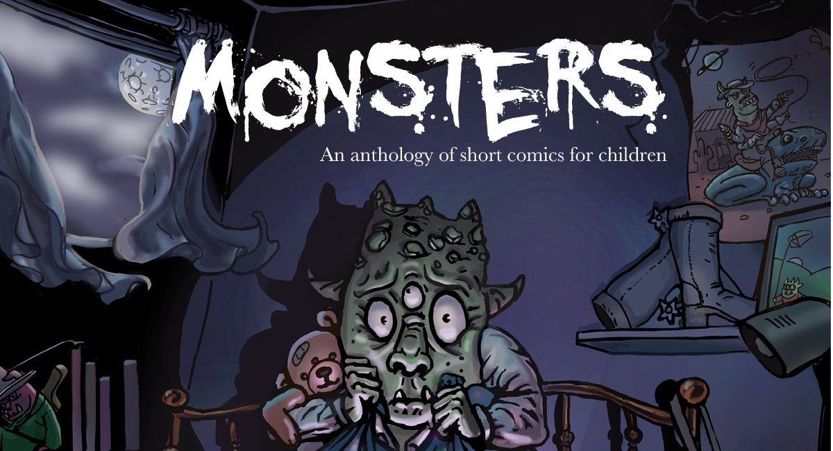
The spider in the corner of the ceiling. The monster under the bed. The dark and the great unknown. These are the things we fear—both as children and as adults.

Over 11 terrifying, provoking and entertaining comics about monsters, Karen Beilharz and some of Australia’s best independent creators explore our deepest fears and anxieties through the medium of comics.

Conceived in the spirit of the Jim Henson’s The Storyteller graphic novel series, Monsters was created for families to share and read together. “I wanted to open up a conversation between children and adults about fear,” says writer Karen Beilharz and Sydney mother of two. “Often adults are mystified by the things that scare children. I think it’s important for parents to be able to grasp and see things from a child’s point of view, because it helps your child deal with their fears and strengthens the relationship between you.”

1200_650_1000

About the creators

Monsters was written by Karen Beilharz (Kinds of Blue, Eternal Life) and illustrated by a range of exciting talent from the Australian comics community: Mike Barry, EmmJ, Peter Fairfax (Valentine’s Dei), Kathleen Jennings (Ditmar award-winner and World Fantasy Award nominee), Greg Lamrock, René Pfitzner (former animator at Walt Disney), Nathan Seabolt, Belinda Stead, Jordan Taia and Jemima Trappel (Wonderfully Madison, Fearfully Madison, Same). Karen Beilharz’s long-time collaborator on Eternal Life, Paul Wong-Pan, provided cover art.

About the anthology

Monsters was written for preschool-aged children and up. It consists of 11 short comics told over 76 pages, and it is being self-published through the power of crowdfunding.

At time of writing, the project has raised almost $4000—virtually half of its goal of $9,900. Rewards for supporting the campaign include: the book in digital and paper format, colouring books featuring original art by the creators, a one-of-a-kind poster featuring art from the book, knitted monster softies, and custom sketches. The campaign ends on Friday 29 April 2016. Find out more at http://pozible.com/monsterscomic.

Review: 2000 AD - Prog 1974

Tainted and Survival Geeks are the stars of the newest set of stories so far.
2000-AD-Prog-1974-1Kek-W will always hold a spot as one of my favorite writers in the Progs after his initial run on The Order hit so many high notes.  The latest run wasn't as tight, and the initial Deadworld story was a little too stilted to flow well as a comic, despite the promise the story had in that it was outlining the origins of the four Dark Judges.  Tainted is much more brisk than the previous Deadworld story, and Kendall's minimal but muddy inks create a drab world that is too depressing to even resemble ours.  Showing new, unfamiliar things happening in a story for the first time is difficult in the Progs since there are only so many pages these creators have to work with. This team, however, is making quick work of showing us the problems that Deadworld faced and the factions that were on either end of its downfall.
Survival Geeks is still a hoot, and not even overwhelmingly so despite the fact that the band of misfits has doubled in size now that they're in the dimension-hopping home of their gender-swapped alternate universe counterparts.  The Firefly reference is a happy reminder that the geekyness is not limited to the characters themsevles but is also a nod to the demographic who are likely to enjoy the comic.  I'm also a big fan of the gender-swapped movie posters.  Another great feature of the gender-swap gag so far is that the women are essentially better at everything, from inventions to their pets, which is an unexpected underscore to how much of a group of fuck-ups we're dealing with in these main characters.  On top of all of this cleverness is a comic that really stands out with its own visual style and fun, colorful pages.
It usually takes me a few chapters to get into Carrol and MacNeil on Dredd, so I will likely have more to say about that soon.  O'Grady is excellent as always on colors.

[button btn_url="" btn_color="pink" btn_size="large" btn_style="default" btn_outlined="no" link_target="blank" link_rel="" icon_left="" icon_right=""]Score: 3/5[/button]

2000 AD - Prog 1974 Writers: Various Artists: Various Publisher: Rebellion Price: £2.55 Print / £1.99 Digital Format: Print/Digital Website

Review: Weekly Shonen Jump #17

Exciting times in the Jump world as Naruto, Boruto, and Hunter x Hunter are all making returns to the pages soon, while My Hero Academia has an anime on the way. One Piece has the week off, but Bleach is still swinging away with one of my favorite recent title pages this week, which is saying something because of how stellar they have been recently.  Two of my favorite characters have been embroiled in battle in the past few weeks and I am freaking out about the prospect of seeing Kenpachi's Bankai.  For the millionth time, it has to be said that Kubo drove Bleach as an overall story into the ground a long time ago.  Reader polls suggest as much, with Bleach almost never cracking the top 10 in the past year.  Any other series would get the ax in rather short order under these kind of circumstances, but I imagine that 1. Bleach trades sell well enough and 2. Kubo has earned the right to finish things out.  Visually he continues to be on another level, one that is probably *too good for shonen* if we're going to oversimplify things.  I really don't care where the story goes as long as he continues to make these fights huge bouts of fan service (the character kind, not the porny kind) that are visually stunning.

wsjcover17Food Wars and Academia were slow this week, with the former wrapping up the results of the first Central shokugeki defeat and the latter preparing us for the attempted rescue of Bakugo to come soon.  Black Clover, however, is still reeling from the latest insurrection of the Eye of the Midnight Sun, and we've found out which captain was, allegedly, spying for them.  Tabata wrote it so that this captain would have a particularly impressive ability with only one exploitable weakness.  And guess who can exploit it?  Yup, Asta.  Sometimes Black Clover seems a little too easy when it pulls stuff like this, but when the main protagonist's ability is literally anti-magic, it does constantly make sense that he'd be able to counter things that other magic users do.  For yet another chapter in this arc we get a hint of the full might of all of the captains in concert, and as the intrigue continues to get ratcheted up, this series is about to get a lot more interesting overall.  I'd bet anything that if Tabata can come out of this arc strong, we'll hear a Black Clover anime announcement some time in the next year.

Things are finally starting to shake loose in One-Punch Man, as the focus of the story turns from the hero-hunting Garo to a slew of villains (including a large porcupine doing nothing but holding a "Free Hugs" sign) who are popping up across all of the cities.  Saitama is busy, as usual, doing something useless.  I'm hoping there's something particularly interesting about this conspiracy, since it's been awhile since we've seen some real action aside from Garo, who was a promising plot point himself.  Still, any opportunity to see Murata draw some more fights isn't one I'll soon scoff at.


[button btn_url="" btn_color="teal" btn_size="large" btn_style="default" btn_outlined="no" link_target="blank" link_rel="" icon_left="" icon_right=""]Score: 4/5[/button]


Weekly Shonen Jump #17 Writers: Various Artists: Various Publisher: Viz Media Price: $0.99 Format: Weekly; Digital Website

Review: Food Wars! Vol. 11

This volume is impossible to talk about. I mean I could, but it would be spoiled for you from the get go as it concludes the battle between Soma and Subaru that technically began in volume 10. How could I possibly ruin the experience of a Shokugeki in which Soma’s blade and livelihood as a chef is on the line? I can’t. I won’t. It’s spectacular. You’ll never be able to figure out what Soma’s up to in order to beat the perfect tracer and that’s why it’s so damn good. The second battle of the book is between Ryo and Akira and it’s okay. Frankly I don’t personally care about either character. I don’t enjoy the series when it’s shifts it’s focus on to the other characters too much, not unless they’re Soma’s current opponent. Their battle is important to the overall story which is why I liked it because it sets the stage for the final showdown of the spring final. Again, I don’t want to ruin anything because even the outcome of this battle would potentially ruin the outcome of Soma’s battle.

FoodWars_GN11_WebIt kind of blows my mind that people like the other characters of this manga. In thinking about, I guess it’s a bit like liking Vegeta on DBZ. Even though that didn’t happen until after Goku had beaten him, but whatever. I’m just a huge fan of Soma and his supporting cast.

The writing is as strong as ever in this volume. I mean that battle is amazing and nothing like anything else the series has done up until this point making you wonder just how the hell they can top it going forward. Really how the hell are the creators going to continue topping themselves over and over and over? This series continues to be everything a shonen should be, but without being generic. I know it’s not the only food manga, but it is the only one to bring me into the world so inclusively and be immersive in a way that I can’t even thumb through the book without being sucked in again. True story, I got side tracked re-reading this volume while looking for details for this review. Read the entire thing for a second time.

I think the reason so many readers like myself enjoy manga is because the art is fantastic. I wish that every American comic I picked up had amazing art, but there’s so much bad art out there. Now, that doesn’t mean I don’t enjoy different styles to art which is where the American market greatly differs, but if I pick up one of the big three’s books I should see impressive art each time and that’s not a guarantee. When I pick up a manga, even if I don’t like the story the art is usually impressive. When you pick up a great manga like Food Wars, the art is flawless. I have no criticism for the art on Food Wars, just that I wish there was more and love the visual gags that this volume has.

I know that this is a short review for a book that’s almost two hundred pages, but it’s one of those volumes that shouldn’t be spoiled. It’s fantastic in its storytelling, its creativeness and how it maintains its character evolution from beginning to end; but most importantly every bit deserving of your time.


[button btn_url="" btn_color="primary" btn_size="large" btn_style="default" btn_outlined="no" link_target="blank" link_rel="" icon_left="" icon_right=""]Score: 5/5[/button]


Food Wars! Vol. 11 Original Creator: Yuto Tsukuda Artist: Shun Saeki Contributor: Yuki Morisaki Publisher: Viz/Shonen Jump Manga Price: $9.99 Release Date: 4/5/16 Format: TPB; Print/Digital

Review: Fish

Fish is one of Nobrow’s 17x23 graphic short project. It’s supposed to be a springboard for up and coming creators for more ambitious projects. Of the ones I’ve read, I’ve liked in varying degrees. The bottom line is that I’ve liked them all and Fish is no exception. Fish is a story about a young boy dealing with the loss of his parents and looking for some kind of closure, even if he doesn’t realize it. He’s now being raised by his grandparents and spending time with his cousins that of course he’s having a hard time relating to. He also doesn’t really like seafood and I can’t blame him there. That's not really a huge part of the story, just something that I want to say on the record.

FishI feel like there was a deeper meaning to the story that either didn’t quite present itself or that I missed. It’s not a bad story and I do really get the point and like the ending. There’s just some scenes in between all that, that were lost on me. I couldn’t quite see their importance to the narrative, but they didn’t make me enjoy the story less.

The dialogue and narration is well written. Especially the narration which presents a teen boy dealing with death in a realistic way. There’s a lot going on in his head and creator Bianca Bagnarelli captures that on the page.

Bagnarelli also does the art for the story and that was by far my favorite thing about the book. The line work is very detailed. It had a style to it though and I couldn’t quite place what it reminded me of, but it reminded me of something for sure. I guess that’s a good thing for art, for it to look familiar, but remain mysterious. The coloring is what really makes the book stand out. My goodness is the coloring great. It puts a lot of “professional” comics to shame. It still baffles me how the industry as a whole settles for mediocre coloring, when great coloring elevates the art which in turn elevates the story as well. As represented on the cover there’s a lot of pink and purple hues used throughout the story. It gives it a great look and makes the characters stand out on the page.

What I enjoy about Nobrow’s 17x23 series is that it introduces me to new creators. Knowing Bagnarelli’s work now, I’m looking forward to more and would gladly check out anything she’s attached to. If you’re looking for a one-shot story that’s a step above other publisher’s one-shots, then look no further than Fish.


[button btn_url="" btn_color="teal" btn_size="large" btn_style="default" btn_outlined="no" link_target="blank" link_rel="" icon_left="" icon_right=""]Score: 4/5[/button]


Fish Creator: Bianca Bagnarelli Publisher: Nobrow Press Price: $11.00 Release Date: Format: One-Shot; Print [button btn_url="http://nobrow.net/" btn_color="primary" btn_size="large" btn_style="square" btn_outlined="no" link_target="self" link_rel="nofollow" icon_left="" icon_right=""]Website[/button]

Review: One-Punch Man Vol. 6

How do you follow up the previous volume of One-Punch Man? You just keep pumping out the jams that’s how. In all seriousness, this series is by far one of the most enjoyable manga/comics I’ve ever read. The mixture of humor, action and drama is masterful. It really is. I’m not just throwing that around to fluff up the creators or publisher, it’s the fact that you really have to search and hunt for faults in this story. Even then I think the things that people would find, like the opening of this issue, are actually just breadcrumbs for the reader to follow into later stories. The volume begins with Saitama and Genos at Silver Fang’s dojo as he tries to recruit them. He explains that his school has fallen under hard times when one of his students incapacitated several of the other students. Breadcrumbs my friends, breadcrumbs. The hero agency barges in and alerts Silver Fang and Genos that there’s a mandatory and immediate meeting for all S rank heroes and Saitama decides to go with them.

One Punch Vol. 6Later, after more of the S rank characters are introduced we see that there’s a full on alien invasion going on and that city A has been destroyed in one attack. The S rank heroes scramble to take on the invasion, but while most of them tangle with just one dude, Saitama goes inside the ship and beats the living piss out of everyone he runs into until coming face to face with the leader of the ship.

If you’ve seen the anime, then I’ll tell you that its very faithful to the events of this volume. What it doesn’t have though is the bonus material which has one incredible story about a man trying to commit suicide and Saitama saving him in his own unique way. It was a great story with a lot of heart.

The writing from One continues to be as I said, masterful. The pacing, the execution and even how the new characters are introduced to the story is subtly perfect. The humor continues to be one of the best things about this series. I just can’t get enough of Saitama and Geno’s relationship as Geno’s gets everything handed to him and yet he looks up to Saitama more than anyone else in the world. It’s just an odd dynamic that works wonderfully for the story. In particular I enjoyed the way both of them blew of Silver Fang’s recruitment attempt.

The art is of course brilliant. I really can’t think of a book that has this perfect of a balance of story and art. Usually I favor one over the other, but you’d be hard pressed to get me to say such a thing about One-Punch Man. Even in my glowing review for volume five I may have focused on the art, but damn that story was good. This time around the art has everything thrown at it. Aliens of all shapes and sizes, a giant space ship, a destroyed city and several new characters. It’s handled wonderfully and I couldn’t get enough of this eye candy.

The only problem with this volume is that it ends just as it’s getting really, really, really (I could keep going), really good. If you don’t have volume seven in your hand right after finishing this one you’re probably going to be pretty pissed at yourself. Plainly put, One-Punch Man continues to be one of the absolute best manga on the market and I can’t wait to read more.


[button btn_url="" btn_color="primary" btn_size="large" btn_style="default" btn_outlined="no" link_target="blank" link_rel="" icon_left="" icon_right=""]Score: 5/5[/button]


One-Punch Man Vol. 6 Writer: One Artist: Yusuke Murata Publisher: Viz/Shonen Jump Manga Price: $9.99 Release Date: 5/3/16 Format: TPB; Print/Digital

Review: King Conan #4

Even as an old man Conan still finds himself in the presence of more adventure than most people (and many fictional characters) will ever find themselves in. It’s a good thing too, because no one wants to see an aging Conan as he withers away on the throne. Really the only difference between King Conan and younger Conan is his wisdom, he no longer rushes immediately into battle but rather waits just a little longer before doing so. In reality there is just as much action and violence, and as few words, as there are in a comic based on a younger version of the character. It’s a Conan comic and fans of the series come expecting escapist fantasy, and King Conan #4 delivers, as it has been its entire run. King-Conan-#4-1In the aftermath of a battle Conan and the witch Nai look down upon the Wolf Tribe’s standing chieftain, Bril’s limp corpse. Casting spells upon him to keep him among the living they discuss what to do next. The heir to the tribe has been captured by the villainous Kwarada and action must be taken. Luckily for them (and for us) Bril recovers quickly and it’s off to battle once more. Meanwhile Brune is tossed into a sacrificial pit by Kwarada in order to summon some type of ancient darkness upon the land. Yeah, it’s all very Conan, but like I said in last month’s review this is a comic that benefits from a little cliche. You can probably guess how this issue and arc ends, yes, Conan hacks and slashes his way to victory yet again. But the ending itself isn’t as important as how Giorello and Truman pull it off. I constantly sing their praise, but honestly these comics are so fun to read, and they go down so easy, they’re hard not to enjoy.

Four issues, or four hundred, I could binge read Conan comics and not get bored. It’s the simple nature of the character and of the setting that make returning to his world so easy. Sure, Conan has been parodied over and over again, but his hold on pop culture still stands as testament to his legacy. Conan is familiar, he is the original soul searching warrior, seeking peace and contentment, it just so happens that he does these things through sword and axe rather than say, reading a book or taking a walk. In the worst hands he is a thick musclehead who slings a nearly-nude woman across his shoulder. In the best hands he is a mirror of the reader, just an everyman seeking things that we all quest for in our own ways. Conan has outlasted many comics and as his legacy reaches its 100 year anniversary (he is currently 83 I believe…) it just goes to show how powerful a character he truly is. Many great comic writers and artists have traveled with him, Truman and Giorello will definitely go down as some of the best. Wolves Beyond The Border is fun, fast, and full of adventure and action. This time around Truman may not leave you soul searching, but there is always something exciting to be found in an issue of Conan, and this miniseries is no different.


[button btn_url="" btn_color="teal" btn_size="large" btn_style="default" btn_outlined="no" link_target="blank" link_rel="" icon_left="" icon_right=""]Score: 4/5[/button]


King Conan: Wolves Beyond the Border #4 (of 4) Writer: Timothy Truman Artist: Tomas Giorello Publisher: Dark Horse Comics Price: Print: $3.99 Release Date: 3/30/16 Format: Mini-Series; Print/Digital

Review: Tokyo Ghoul Vol. 5

The thing I continue to enjoy about the Tokyo Ghoul manga series is just how different it is from the anime. When I originally dove into the manga I had already watched two seasons of the show and I expected the manga to be pretty much the same. Thankfully it’s not. There’s a lot of similarities, but the manga continues to surprise me with its character development and extra backstory that it adds. This volume picks up just after Kaneki was nearly eaten by Tsukiyama's eclectic gathering of fine diners. He’s a bit frightened at the moment which is understandable. Unfortunately, it’s not long before he has to deal with Tsukiyama again as he kidnaps Nishio’s human girlfriend Kimi. That’s the bulk of the volume as Kaneki and Nishio go up against a fully charged Tsukiyama, but thankfully Touka shows up to help out.

The second part of the story is actually spent with Rize as it shows her in the 11th ward and just how freaking dangerous she is. This was actually the best part of the volume to me since it was completely new, but also because Rize’s character is just fantastic. She’s intentionally cute to throw off her prey, but even when she’s angry and killing she’s still strangely sweet. It’s very strange and it makes her even more terrifying.

tokyo-ghoul-manga-vol-5There’s also a segment with the Dove’s and that kid with the stitches is introduced. I like his character even less here. He’s one of the few elements of this story that seems completely out of place and it’s no different here. If anything he feels more out of place in the manga.

While the bulk of this volume is a battle and backstory for a deceased character, it’s really enjoyable. The pacing towards the end is a bit strange, but it in a way it sets up the next leg of the story for volume 6. The writing manages to build the characters and in particular show Touka in a different light and strengthen Kaneki. It also shows how attached everyone at Anteiku is to Kaneki which was something severely under developed with the anime.

The art has developed more since the first couple of volumes. It’s a lot cleaner now and you can really see how Sui Ishida has grown. The only downfall to this is that a lot the unique style and look that the early volumes had is now gone. It’s not as artsy and free flowing in this volume, but rather a crisp detailed piece of work. It’s good. It’s just that it looks a bit like everything else now and that’s a shame. It really stood out before and now it’s just the covers that do.

As much as I enjoyed this volume it does very little to move the overall series forward. Sure we get some backstory for Rize and the mystery behind her, but there’s not a lot to this volume other than that. It’s still good, but the action needs to be spread out more so that it’s more enjoyable. This is one of those unfortunate volumes that’s a transition volume. We’re getting the conclusion of the last story arc and starting the next one with leaves this one a little awkward on its own. But if you’re reading the series there’s no reason to stop here.


[button btn_url="" btn_color="pink" btn_size="large" btn_style="default" btn_outlined="no" link_target="blank" link_rel="" icon_left="" icon_right=""]Score: 3/5[/button]


Tokyo Ghoul Vol. 5 Creator: Sui Ishida Publisher: Viz/Viz Signature Price: $12.99 Release Date: 2/16/16 Format: TPB; Print/Digital

Review: Black Science #21

It’s been three years since Grant McKay saw any of his crew, including his two children. In those three years a lot has changed, including Grant himself. After a couple issues of self discovery, he has finally pulled himself out of the mud and is ready to find his missing companions. As he rips through dimensions in his newfound ship, he realizes that other versions of himself have also created Pillars and at some point one of them will create one that will end up destroying his universe, which could lead to the destruction of all universes. This idea is no doubt going to reappear later in the arc, but for now is sidelined as Grant closes in on a homing beacon for one of his lost crewmates. Turns out that it’s Rebecca, and she is just a burnt husk of a corpse. McKay’s computer alerts him that this Rebecca belongs only to this dimension and the Rebecca that he knows is still alive and well.

Black-Science-#21-1The rest of the issue shows Rebecca in her new life that she stole from this dimension’s Rebecca. Grant in a fit of vengeance goes about ruining that stolen life. He places the blame on Rebecca for seducing him, for pushing him towards overwork, and pretty much every other negative thing that happened to him thus far. It’s a bit extreme, but then again Grant isn’t really that logical of a guy. Rebecca’s brother and husband reject her, and soon after she breaks down she sees Grant. Realizing what he did she begs him to take her with him, but Grant simply blasts off into another dimension leaving her with the cops closing in.

Black Science #21 is pretty dark. It forgoes the fun, space hopping adventures of the earlier arc for a more introspective one. This is nothing new, especially in this arc, where Grant alone is the main focus of the story. We are left with his internal monologue more often than even in the earlier issues, as his thoughts play out across the pages. Grant seems more focused than ever before, frantically searching for his children, hoping that they aren’t dead. What he finds though is his own crew scattered and broken, when he finally does catch up with his kids there’s no way it can end well.

Remender pushes this arc along while Scalera beautifully fills in the blanks. This arc concludes with issue #21, and hopefully things will heat back up with the next storyline. Grant has had his time in the spotlight, and I’m not so sure there’s that much more to dissect. He’s a fucked up scientist with an anarchist background. He’s done a lot of stupid things in his past, and he is forever trying to atone for them. McKay is an interesting character and a solid protagonist but these five issues with him haven’t been my favorite. Remender writes such fleshed out characters that I want to see the story from all perspectives, not just that of the protagonist. And because of the nature of Black Science (infinite dimensions, infinite possibilities), I have always been hoping for more of that wild energy that I fell in love with during the first few issues. Before the plot became totally clear, and the crew was just trying to get home by any means necessary. Maybe Black Science will never be like that again, and that’s fine, the plot developed and I’m okay with that. I just hope that someone else gets a chance to have a voice rather than just Grant.


[button btn_url="" btn_color="pink" btn_size="large" btn_style="default" btn_outlined="no" link_target="blank" link_rel="" icon_left="" icon_right=""]Score: 3/5[/button]


Black Science #21 Writer: Rick Remender Artist: Matteo Scalera Publisher: Image Comics Price: $3.99 Release Date: 3/30/16 Format: Ongoing; Print/Digital

Review: Departure

Departure is a story of a family that’s torn apart by abuse. We see that from the beginning of the story as we’re introduced to young kids Rafe and Michael and their parents. Their father abuses their mother over and over throughout the story and this effects Rafe a great deal. We see the story though Rafe’s eyes as he protects his brother, but his anger towards his father continues to build and build until he does something fairly regrettable and no longer knows who he is. The story is very mature and one that’s not commonly seen in comics. Stories of abuse are always difficult to read because if you’re a compassionate human being you shouldn’t be able to stomach seeing such a thing. As the reader what’s worse is that there’s nothing we can do to help the situation which gives you a feeling of helplessness which is likely what the characters are feeling.

DepatureWhat doesn’t particularly work for the story is that it becomes predictable from the get-go. Which isn’t always a bad thing since it’s the journey, but the journey has a lot of bumps. The one-shot jumps forward in time to show the history of the abuse and how it’s affected Rafe. The problem I have is that I don’t think it does a very good job of showing it affecting Rafe. He’s pretty much angry and upset the entire time we see him so when that anger boils over it’s not really character development paying off, but rather the natural conclusion to everything that we’ve seen.

The ending comes across as abrupt. It’s not unexpected entirely, but the story could have used just one more page showing something more. It really leaves you without any closure and maybe that’s the creator’s intention and that feeling is supposed to relate to the story and how the character’s feel, but if that is the case it really doesn’t come across as such without putting in too much thought. Most people are likely to see it as an abrupt ending.

The art is in all black and white, but it looks like it was illustrated with the expectation of coloring because a lot of the panels and backgrounds are very empty which stands out a lot with a black and white comic. The character designs aren’t bad, but there’s a lot of inconsistencies with proportions at times. In general, the art lacks detail and ultimately there's a lot of dead space on the page because of it.

I’m on the fence about recommending this one. Though it does deal with abuse, I don’t know if it really adds anything to the conversation. That’s more than likely in the eye of the beholder and everyone is going to bring different experiences to their reading experience. For me though, I think the story needed to go deeper and present deeper emotions and say something about abuse rather than running away from it.


Score: 2/5


Departure Writer: Jeane Wong Artist: R.H. Stewart Self-Published Price: $9.99 Format: One-Shot; Print/Digital Click to purchase

Review: Jem and the Holograms #13

Blaze's big debut gets dampened by the gloom that is Dark Jem. There’s not a whole lot of beating around the bush this time around. I half expected Thompson and Campbell to spend a little more time on the ladies spinning their wheels. Instead, an uncomfortable encounter shakes something loose in our hero’s head. With the aid of a handy pair of boyfriends, the hologramatical quartet is set to figure out what's up with their newly corrupted cyber-magical buddy Synergy. It all happens quickly, believably, humorously, and briskly. Kelly Thompson is very skilled at managing her cast and keeping their subplots in sight while executing on her main plot with heart and dramatic tension.

Jem's attempted romantic encounter with the very much not her boyfriend Rio plays out in a refreshingly earnest and painful manner. The Holograms' reaction, however, comes across as equally believable, but a bit condescending toward their leader’s love interest. This book, being a female driven comic about representation and presentation, could do well to remember its males don’t have to exist purely to dote over their lady friends.

Jem13_cvrADespite what the primary cover art leads you to assume, Pizzazz only appears for a handful of panels. She looks ever so sad. And then the book moves on. It is perhaps a smart choice to avoid dwelling on her continued suffering. That could get really gross and mean. However, as her role in her band diminishes and her visibility in the book lessens, I'd like to see more of how she's coping. Her livelihood and support system are shifting beneath her feet. And all we’ve seen is Pizzazz shuffling around her house, mouth down-turned. It’s a pretty accurate portrayal of depression. But I have to wonder where the book is going with regard to her sub-plot.

Something about the art this issue really hits the mark. The lines seem cleaner than usual, the faces are more demonstrative, and the many close-ups feel extremely intimate. Comics are brilliant for their ability to capture complex actions and thoughts and emotions in static moments. This issue uses that strength to its advantage. Sophie Campbell reveals a ton of emotional depth in Jerrica's struggle to break through the literal shell preventing her from genuinely interacting with loved ones. I can't help but think the Dark Jem experience will initiate a very serious conversation about Jerrica's identity. She's a musician, not a vigilante. Hiding behind an outlandish public persona may help her perform for an audience, but it is a layer of separation between Jerrica and Rio that can only hurt them both.

There's one thing in particular worth loving about Jem and the Holograms -- while it may not be especially inventive, but it refuses to be boring. And hard to predict. I’m excited about what the future holds for these characters because the writing takes time to give them charming, relatable, attractive, and sympathetic identities, complete with foibles and strengths. Perhaps we'll get to peer inside Synergy's personal problems in future issues, as she’s the least developed of our main characters. Maybe the bands will merge into a super group with Blaze at the helm as Jerrica finally has that important talk with Rio. There are many places the series can go. And there are few reasons not to go there.

Another satisfying issue.


[button btn_url="" btn_color="teal" btn_size="large" btn_style="default" btn_outlined="no" link_target="blank" link_rel="" icon_left="" icon_right=""]Score: 4/5[/button]


Jem and the Holograms #13 Writer: Kelly Thompson Artist: Sophie Campbell Colorist: M. Victoria Robado Publisher: IDW Publishing Price: $3.99 Release Date: 3/30/16 Format: Ongoing; Print/Digital

Review: The Fitzroy

Themed anthologies are in my opinion difficult to pull off. You have to have a strong theme otherwise you run the risk of filling the pages with stories that aren’t very strong. The Fitzroy has a strong theme or really a strong concept and setting. The idea behind this anthology is that it’s 1950’s Britain and a poisonous gas has spread everywhere making it a bit apocalyptic outside. Each creative team takes that setting and crafts their own tale. Some humorous, some grim, but all of them different.

iL3v7UeSince there’s only six stories and they’re not very long I will only talk about two of them that I enjoyed so that I don’t spoil the one-shot. The first to talk about is a story about two men on a hot air balloon trying to illegally immigrate out of the country. Immigration is illegal due to the poisonous gas and all, but these two gents are giving it their best show. It doesn’t have any dialogue, but we see that the balloon is dropping and each time they’re forced to get rid of more and more of their supplies. The ending is amusing. The art does all the heavy lifting obviously and it’s an interesting style. It’s a little cartoonish, but there’s something charming about the artwork.

The next tale I would like to mention is called “DIG” and is about a door to door salesman that’s selling cleaning goods. He gets invited into an old lady’s home and the husband kind of shakes him down. There’s a twist here as well, but it’s pretty good. I really enjoyed the art for this one as it looked like comics from the era in which the stories take place.

Overall the stories are all enjoyable and more in line with dark comedy now that I think about it more. I did really enjoy the letters that bookend the book as they are humorous and especially the first letter sets the tone for what’s to follow. This is definitely an idea that could provide more stories and hopefully there will be future editions of the anthology. If you like anthologies, then this is definitely one to check out.


[button btn_url="" btn_color="teal" btn_size="large" btn_style="default" btn_outlined="no" link_target="blank" link_rel="" icon_left="" icon_right=""]Score: 4/5[/button]


The Fitzroy Writers: Various Artists: Various Publisher: Dead Canary Comics Price: £2.49£4.99 Format: TPB; Print Website

Review: Judge Dredd #4

Judge Dredd is diving into the entrails of Ang Avi to try to make sense of what’s happening, when or where is he. He has been separated from Lolo, Quill, and Iggy who have been sent back to the lands outside. Some of them wait for Dredd to come back for them, some don’t wanna see him again. JudgeDredd_Ongo2015_04_cvrAThe pacing in this issue takes two different approaches. One is from Dredd’s point of view who is diving into the bottoms of the block, and the other one is from the girls who are trying to figure out what they will do next while outside. The contrast in the pacing works to raise the tension onto what’s happening to the feral girls in Dredd’s absence.

There is a small confusion on the opening narration of this issue; while it’s telling the reader that Dredd doesn’t want to find out what has happened to Mega City-One, which left me wondering what he’s doing in the first place? What is he going into the lowest levels of Ang Avi if not to find out what happened to it?

Art although consistent, there are some panels I had to double back on to figure out what exactly was happening. How did Lolo get to where she was going and bypass the guards? Now that Dredd has been removed from his iconic and contrasting uniform, he’s beginning to blend into the background of some of the pages and without that contrast, Judge Dredd #4 has the signs to start looking and sounding monotone. This was a definitive transitionary issue that promises to deliver more action more of the great thematic dialogue from the early installments. More mysteries are poised in this issue as The Judge seems to get more and more questions than answers the deeper he digs, and finds more lawless men controlling the city and its outsides with him being the only semblance of law and decency around. Judge Dredd #4 delivers enough to make me want for the next issue, but makes for weary if it doesn’t deliver on a bigger payoff.


[button btn_url="" btn_color="pink" btn_size="large" btn_style="default" btn_outlined="no" link_target="blank" link_rel="" icon_left="" icon_right=""]Score: 3/5[/button]


Judge Dredd #4 Writers: Ulises Farinas & Erick Freitas Artist: Dan McDaid Colorist: Ryan Hill Publisher: IDW Publishing Price: $3.99 Release Date: 3/30/16 Format: Ongoing; Print/Digital

Review: Ultraman Vol. 2

Ultraman has a long history. So long and so detailed that I won’t even begin to try to sum it up or say that I know it all. I know what I know about Ultraman and that’s it. What I continue to find really enjoyable about this new Ultraman series is that it takes what I know, but does everything different. No more are the days of growing large and battling across a city, but instead it’s adapted to modern manga in which it doesn’t need to do that. Simply put, that doesn’t work in a comic book and while there’s still a place for stories about characters growing to such a size that they would poking out of the atmosphere of earth and beating the tar out of each other, this isn’t that story. This is the realistic continuation of that type of story and it’s pretty fantastic because it takes everything old and makes it new again. Now… let’s get this out of the way. I’m sure there are some fans of the original Ultraman stories that find this a bit distasteful. After all, it’s taking a beloved franchise and removing a key feature from it. It’s a little like revamping Superman for American comic readers, you’re going to get backlash. So I acknowledge that because I have been on that side of the outcry, the fanboys that say “just tell the story with new characters rather than calling it something it’s not.”

Ultraman Vol 2My counterpoint to this is that if you’re going to change a long running franchise… this is the blueprint. I could never be mad at this new Ultraman because it is handling the entire history of the franchise with intense care. The change it’s made has also been handled with intelligence and a lot of thought. It’s not just, “we don’t need that gimmick” there’s an actual explanation for why and it’s that the power set has changed. The actual Ultraman power is gone and what remains is a fraction of that. It also leaves some possibilities for the future of course, but I personally really like this new direction it’s going in.

This volume introduces a lot of characters and kicks off some story threads that are sure to be explored either in tandem as the story continues or just as needed for the next few story arcs. What is clever about all of these different threads that are introduced is that they’re all woven together at some point in the story. You see them slowly come together and while that doesn’t mean they’ll all conclude at once; you do get see just how well-plotted the story is.

What happens in this volume is the next logical question so let’s give it a quick breakdown? We meet an old Ultraman villain who has reformed and is now basically running the SSSP. I won’t spoil that for you because I did say old villain and that’s enough to go off. This character does pull some strings throughout the story though as their plan to reveal aliens to the population again is playing out to their design. On Shin’s side of the story he’s deciding if he wants to be Ultraman… by being Ultraman. He starts saying ordinary people from dangerous situations and the media gets to buzzing about this new Ultraman that’s being dubbed a cosplayer. Shin is pushed to his mental limit when he’s sent to deal with an alien feeding on humans in brutal fashion. Suddenly the hero games gets real to him.

The art is a huge reason of why this series is so damn good. It’s extremely detailed, but aside from that the designs for Ultraman and really everything in the comic is incredibly cool. It’s a manga you pick up and just know that it’s so freaking cool. I mean if you were given this suit you’d where it in a heartbeat and never feel ridiculous because of how damn cool it looks. The detail is tremendous, the design in cool, but the action is top-notch. The action is easy to follow and because it has the cool design and detail it’s pretty amazing to read. It makes for a quick read, but at the same time you’ll just want to stop and soak in a page.

There’s a lot of moving pieces for the story. I mean there are so many elements of this story and world at play that it’s hard to sum them all up without feeling as you’ve missed something. The best thing about this book though is that it’s for new and old Ultraman fans. Hell, if you’re just a superhero comic book reader this will definitely be for you so check it out.


[button btn_url="" btn_color="primary" btn_size="large" btn_style="default" btn_outlined="no" link_target="blank" link_rel="" icon_left="" icon_right=""]Score: 5/5[/button]


Ultraman Vol. 2 Writers/Artists: Eiichi Smimizu, Tomohiro Shimoguchi Publisher: Viz/Viz Signature Price: $12.99 Release Date: Format: TPB; Print/Digital

Review: Overtaken #2

I'm struggling to imagine the audience for Frank Mastromauro’s Overtaken. Its premise has promise, but the delivery is more than a little lacking. We frequently, in fiction, get to follow someone on their space adventures. We rarely, however, get to see how that hero's departure impacts their left-behind loved ones. In Overtaken, Mister Will Harden (ha ha) is struggling between mourning his missing wife Jessica and searching for her, both seemingly in vain. The parallel stories do not complement each other well. One moment, you’re watching a man wading through the melted remains of his life. Then the next half of the book has some mild techno babble and vague hints at a grand conspiracy… in space.

Overtaken-02b-KonatThere’s some questionable and inconsistent art. For the most part it’s passable. There is one problem that sticks out for me. Maybe it’ll seem petty to you. But we're supposed to believe Will, an extremely fit man, seemingly carved from godly stone, is subsisting solely on pizza and cereal? His figure is that of your typical superhero comic lead. And it just doesn't fit. It's as if Marco Lorenzana is illustrating by rote memorization of how a comic character looks, rather that drawing Will as he should appear in this particular book.

The writing is similarly by-numbers. For instance, there’s a crusty old sheriff who, despite looking neither crusty nor at all older than young Will, refers to the protagonist as "son". It comes across as Mastromauro writing what he expects a character is supposed to say, without considering appropriateness. I can recognize the potential drama of the book. It comes straight from your typical serialized television tale. But basically nothing happens in this issue. And it is just impossible to feel anything for the characters as a result, despite the writer’s labored efforts.

One scene commits the sin of using the phrase "as you know" to deliver exposition to a character who -- if he already knows the exposited info -- doesn't need to hear the exposition. Add to that some minor grammar problems, and the script feels weak.

The book as a whole is fine, focusing in on a small human tragedy, and then zooming out to the much larger intrigue of some kind of space opera. And the point where it zooms feels like the book shrugging its shoulders at you.  “You probably want to see the space stuff, huh?” the script seems to be saying. “Well, okay. Never mind that there’s nothing to show you up there.”

All-in-all, just a very bland read, though inoffensively so.  A mild curiosity at best.


[button btn_url="" btn_color="violet" btn_size="large" btn_style="default" btn_outlined="no" link_target="blank" link_rel="" icon_left="" icon_right=""]Score: 2/5[/button]


Overtaken #2 Writer: Frank Mastromauro Artist: Marco Lorenzana Colorist: Justice and Enrica Eren Angiolini Publisher: Aspen Comics Price: $3.99 Release Date: 3/30/16 Format: Mini-Series; Print/Digital

Review: Adventures of a Japanese Businessman

The first thing to note about Adventures of a Japanese Businessman is that it’s what we as comic readers call a silent story. There’s no words or dialogue to this strange and wonderful tale about a Japanese businessman that ends up having the an unexpected and bizarre adventure after leaving work one day. I’m not going to tell you what happens to him because I feel that it would be pointless. It would mostly be my interruption of the art and I think everyone that reads it will take subtle nuances their own way. The gist is that he goes on a seemingly endless trip after running from a Yakuza attack.

The art of course is doing all the work for this story and it does an amazing job. The best way I can describe it (as I did on this week’s podcast) is that of an old school RPG, think almost Final Fantasy, but with better art.

ps_b_jd_adventures_of_a_japanese_business_manThere is a natural flow to the book that also gives it a flipbook feel to it. Our businessman essentially stays in the center of the panel (there are four per a page) and the world moves around him for the most part. There is a strange sense of movement because of this and it controls the pace in which you read the book. Sometimes you’ll read quickly because there’s a frantic pace. Other times you’ll slow down as the character looks around and soaks in his new and crazy location.

The art is very detailed as well. There’s a great cartoonish style to the book. I can’t really peg any influences, but I can say that the panels are packed full of detail, characters and just things. In a way it reminded me a little of Where’s Waldo?, but only in the sense that creator José Dominco packs a lot into each panel. It’s never overkill, but there’s a lot to absorb and gaze upon.

The book itself is massive. I don’t have the exact measurements, but I’d say it’s 11’x14’ just to give you an idea. It’s a book that stands out, but the impressive size really is the best way to enjoy the artwork. That and the paper stock is perfect for the book, not too heavy and easy to flip the page. If like me, you sniff your books then you’ll love the inky smell that it has as well. I’m not kidding either, I love the smell of this book and I don’t care if that makes me weird.

There’s really nothing else like this in the world of comics. It was a first for me and that’s saying something. I mean I don’t know many comics I’ve read, but it’s safe to say that the number is extremely high and probably frightening to non-comic readers. The point is, this was a first for me and it was an incredible reading experience and truly, an experience. There’s not many comics that are actually an experience to be had, but Adventures of a Japanese Businessman is definitely one. Have an adventure of your own with this fantastic work.

[su_box title="Score: 5/5" style="glass" box_color="#8955ab" radius="6"]

Adventures of a Japanese Businessman
Creator: José Dominco
Publisher: Nobrow Press
Price: $29.99
Format: Hardcover; Print

[/su_box]

Review: Doorman #1 & 2

I will say this about Heavy Metal’s comics, no two titles are alike. Hell, they’re not even close. Doorman is the third title from Heavy Metal that I’ve checked out and it may only be their third title… I don’t know if there’s one that I’ve missed or not and it’s not going to help or hurt this review for me to look it up… okay it’s the third I looked it up. Doorman-#1-1Doorman presents an interesting concept on its front page:

“Every populated planet has a DOOR.”

“Those who operate the DOORS are known as PORTERS - - Interplanetary doormen who usher visitors from world to world.”

It goes on from there to establish some backstory and essentially it lays out the rules for the world. Which with sci-fi stories it’s not terrible. It’s better than exposition from one character to another so let’s not knock it as it opts to get it out of the way quickly.

The first issue establishes our main characters of Henry Clay Waters and Detective Flower. Henry is Earth’s Porter and he’s never had a visitor in all of his forty-five years on the job. His one and only visitor arrives and is there to kill him. He’s narrowly saved by Detective Flower after causing a scene and breaking a lot of Porter rules. Soon they become wrapped up in a conspiracy by the Universe’s richest and most powerful man whose goal is to shut down the doors so that people will use his spaceships to travel. Money… it’s a motivator.

The second issue sees that plan take more and more steps in the favor of our crazy rich person who happens to have Flower’s boss in his pocket and tells him to kill her and Henry. Henry manages a plan that saves them and there’s an extra twist added to the story at the end of the issue.

Doorman-#2-1You’re not supposed to take this story too seriously. Henry is the straight man while everyone else is pretty much over the top versions of their character architypes. The story has an interesting concept, but it’s a little predictable with its set up and the “woe is me” last day on the job routine from Henry. The fairly obvious guess is that everything will wrap up with a tight bow around it and Henry will train the next generations of Porters or at the very least we’ll have the door’s origins revealed to us or both.

That’s honestly not the reason to read the comic. It’s entertaining. I didn’t bust a gut reading it, but I did have fun with it. I really think that if it was an animated story or live action that it would be funnier. We don’t have a feel for the characters and we’re not going to be with them long enough to really understand them. It’s good dialogue, but it’s performance dialogue. It needs a performer to breathe life into it.

While the art is very good I think that it sometimes misses in the humor department. There are definitely times when it’s spot on, but others… not so much. In particular I think Flower’s featureless face hurts her comedy since she’s the funny one. The design limits the range of emotions and often times leaves her with the same few emotions sprawled across her face. In general, the art is strong enough to raise up the story. The coloring is also very strong and gives the book a sci-fi/alien look to it.

Again, you’re not going to bust out laughing on this book, actually you might. My experience isn’t yours so it’s quite possible that you’ll laugh at Doorman which is the point of the series, to make you laugh. Even if you don’t laugh out loud you’ll still find a well-plotted and different sci-fi story waiting for your eyes to take a gander.


Score: 3/5


Doorman #1-2 Writers: Eliot Rahal, Daniel Kibblesmith Artist: Kendall Goode Flat Colors: David B. Cooper Publisher: Heavy Metal Price: $3.50 Release Date: 3/10/16 (Issue 2) Format: Print/Digital

Review: Godzilla: Oblivion #1

"So you're into sports?""Oh yeah! I watch the Superbowl every year!"

"So you're a Trekkie?" "Oh yeah, I just love JJ Abrams."

"So you're a comics fan?" "Oh yeah, can't get enough of Calvin and Hobbes."

That's roughly equivalent to someone asking me "are you a fan of Godzilla comics" and me answering honestly "Oh yeah! I loved Godzilla Half Century War!".  James Stokoe's masterpiece summed up the entire franchise in one mini-series that managed to be a love letter to monster movies, comics, and kaiju culture all without ever losing sight of the elemental awe inspired by the titular lizard.  I loved that book, but everyone who read it loved that book, so it hardly makes me a fan of Godzilla. And the original Kaiju is a cultural phenomena far bigger than one volume of comics. I've seen the American movies, both of which hold a soft spot in my heart, but in many ways Godzilla: Oblivion marks my first foray into the extended world of Godzilla.  This might not be ideal, so perhaps fans of Godzilla should take this review with a grain of salt.

I get the impression that Godzilla as a comics franchise has gotten a lot of mileage out of subverting the simple monster destruction story (or perhaps there are only so many such stories to tell). Fialkov establishes a new wrinkle by setting his story in a Kaiju free world and having a dimension hopping trip by greedy industrialists (damn them!) and a concerned scientist accidentally connect to the world of Godzilla. It's an idea that may have some legs, but at the moment feels a little obligatory. It will likely give Godzilla and his friends a new playground to smash, but otherwise, I find it hard to imagine this new setting will really add much to the mythos.

Not helping matters is Fialkov's approach to dimensional travel which is more than a little generic. Crossing over into other versions of earth is such a traditional sci-fi prelude to disaster that Dr. Eli Talbert, afore-mentioned concerned scientist, calls it out. " I've seen this movie before", he tells the evil industrialist, "I turn it on. Terrible things happen. I'm not doing it." It's a clever moment, that is immediately undercut when Talbert does indeed turn it on and disaster does indeed follow. It reads as a lazy shrug of the shoulders, as if Fialkov knew the story was following long standing cliches but ultimately couldn't think of anything better. But of course, if the good doctor didn't open up a dimensional rift, where then would be our stompy monsters?

And to be fair, the arrival of stompy monster is the highlight of the issue. I may be an easy mark for this sort of material, but watching a robotic monster duke it out with biological monsters while sweaty soldiers exposit on the state of Godzilla's world is a lot of fun. Or, well, it would be with a little bit better art. I hate to call it a house style, but there's no denying one can recognize commonality between IDW's licensed property art.  Brian Churilla's work is rough and cartoony, often undercutting dramatic moments through its own simplistic goofiness. The upside is Churilla's grasp of the large action dynamics, allowing the reader to never get lost or lose sight of the conflict's massive scale. Still, it's simply not an iconic or particularly memorable take on iconic and memorable monsters (an impression increased by two gorgeously detailed James Stokoe covers).

All told, Godzilla: Oblivion has a lot of potential. If there's a plan in place to use the series big sci-fi hook to good purpose, perhaps this iteration of Tokyo's scaliest natural disaster will shape up into something slightly more than dumb action. As is, it's a pretty forgettable mass of people running and ineffectually shouting things about portals. There's a certain b-movie entertainment in the generic genre cliches that are being thrown around here, but until Fialkov brings a little more to the table, fans would likely be best to sit this one out.


[button btn_url="" btn_color="violet" btn_size="large" btn_style="default" btn_outlined="no" link_target="blank" link_rel="" icon_left="" icon_right=""] [button btn_url="" btn_color="violet" btn_size="large" btn_style="default" btn_outlined="no" link_target="self" link_rel="" icon_left="" icon_right=""]Score: 2/5[/button][/button]


Godzilla: Oblivion #1 Author: Joshua Hale Fialkov Artist:  Brian Churilla Publisher: IDW Publishing Price: $3.99 Release Date: 3/30/16 Format: Print/Digital

Review: Ken Games - Vol. 2: Paper

Man oh man does our story get complicated! The drama is thick in this volume of Ken Games, but most it comes towards the end setting up the final volume which I can only imagine is going to be spectacular. To recap, the first volume of Ken Games followed Peter aka Rock. He’s an amateur boxer and in a way an amateur math scholar. He’s boxing while he waits to get back into school on a scholarship which plays out a bit in this volume. We also meet TJ aka Paper who pretends to be a banker, but is really a professional gambler that plays with criminals and other shady types. Lastly we met TJ’s girlfriend Anne aka Scissors. She pretends to be a teacher to TJ, but then works as a waitress where Rock finds her, but she’s actually an assassin for the mob that owns the gambling house that Paper plays at. Also everyone is lying to each other.

Here we see that continue even as their lives become drawn closer and closer to each other. The story though focuses on TJ as we learn that his dad was a card player as well, but he liked to cheat… and was pretty good at it. He taught TJ everything he knows and had him help him cheat. TJ’s story takes him to Europe for a “World Series of Poker” tournament. It’s interesting because it’s televised and everything and yet he still does it even though it would potentially expose him to his friends. TJ’s story has some interesting aspects, but it’s how it concludes that really makes it worth reading. Much like Rock’s story you have to wonder if he can escape the shadow of his father?

Ken-Games-Vol-2With the other two characters we follow Rock the least. We see him become more and more concerned about being hit in the head because he is trying to get a scholarship. He gets a rematch with boxer that beat him before and the boxer actually tries to help him. The match is interesting because it’s actually for the mob boss that Scissors works for. Her side of the story has a lot going on. Her former flame is her new co-worker and they’re given a job to take out the guy that fucked with TJ in the first volume.

There’s actually a lot going on in the background that’s building Scissor’s story for the next volume. It’s exactly what Robledo did with the first volume in which we focused on Rock, but he built up TJ in anticipation of this volume. I don’t know how that will work for the final volume, but I don’t doubt that Robledo has the skills to pull it off.

The character development in this volume is much better than the first. For the first we were still getting to know the characters and their lies, but here we now know them and so seeing them develop and maintain their lies is captivating.

The artwork continues to be beautiful even if it is gory and violent at times. The style can only be described as European, but that’s a very good thing in my book. It’s detailed, stylized and tells the story every bit as much as the narration and dialogue. The art holds its own rather than just supporting the story. That cover is the interior art in case you were wondering, no bait and switch here.

The coloring is by far some of the best I’ve seen. The different hues each scene uses adds a lot of personality to the story. There’s a seedy underground feeling to the overall story which is exactly where it’s taking place, the seedy underground of society. The coloring really is vibrant and the most striking thing visually.

I know that this is the second story in a three story volume, but the creators have managed to make this volume stand on its own. Sure it references things from the first volume, but it does so in a way that it includes new readers. You can just read Paper and be fine. You’ll get a rewarding story that has a beginning, middle and end. That’s a challenging task for any creators telling a story in multiple parts so I really applaud that. With that said, it’s even better when you read it after the first volume.


[button btn_url="" btn_color="teal" btn_size="large" btn_style="default" btn_outlined="no" link_target="blank" link_rel="" icon_left="" icon_right=""]Score: 4/5[/button]


Ken Games - Vol. 2: Paper Writer: Robledo Jose Manuel Artist: Toledano Martial Publisher: Europe Comics Price: €6.99 (Roughly $7.65) Format: TPB; Print/Digital Website

Review: Stillwater #1

Action Lab's Danger Zone has released their newest title and it was a pleasant surprise for me. I want to call Stillwater a psychological thriller, but it also has elements of horror. The story follows a young man named Bill who inherits his Uncles farm in the mysterious town of Stillwater after his suicide. Strange things happen in Stillwater and they all seem to revolve around the lake that is also part of Bill’s inheritance. Stillwater-#1-1There’s not a lot I can say about what actually lurks within the lake but whatever it is it leaves behind body pieces of its victims. Bill is met with other odd encounters like hostile neighbors and chilling nightmares. I think any young person whose lacking direction in their life can relate to Bill. He’s isolated, depressed and desperate. As a first issue this book works because it lays out the pieces of a mystery. Violence is often suggested but not explicitly shown which leaves a lot of horror to the imagination. These days it takes a lot to disturb a comic book reader. This book achieves that for me successfully.

The cover is a definite hook and has a really unique image. The main character Bill is sitting on his porch and up to his ankles in water. Once you start reading the book there are plenty of explanations for it. I interpret it as a fish out of water. What got my attention about the interior artwork was the distinct style. Everything is slightly off in shape and size. It makes the whole issue feel like a memory or a dream and helps increase the creep factor. The best way I could describe the style is it’s like Tim Burton’s movies. There’s a Gothic tone to each character. The water scenes are horrifying especially when it looks like the characters are popping out of the pages while being swallowed by it. WARNING: If you have a fear of water or drowning then this book will not comfort you.

Overall I enjoyed reading this book and I’m intrigued to know more about the town of Stillwater. The characters all seem to be hiding something and there’s a sense of doom about everyone. If you like the more psychological side of horror then you’ll definitely enjoy it as much as I did.


[button btn_url="" btn_color="teal" btn_size="large" btn_style="default" btn_outlined="no" link_target="blank" link_rel="" icon_left="" icon_right=""]Score: 4/5[/button]


Stillwater #1 Writer: C.W. Cook Artist: Kelsey Wroten Publisher: Action Lab/Danger Zone Price: $0.99 Release date: 3/16/16 Format: Mini-Series; Digital