Review: The Work #1

To start with I’m going to tell you to not read this review. Instead just go to the Kickstarter for The Work and support it because it’s worth your money. If you’ve decided to continue reading the review then that’s cool, I mean that’s why I’m writing it, but do support it. It’s a weird thing, sometimes you piece together things after you’ve already talked about it. For instance, it took talking to Steve on this week’s podcast to put all the pieces together for this comic. The Work is in reference to the wrestling term, “work” in which the decision for the match is already made. The winner is predetermined so it’s a “work” on the audience. That’s not the only marriage of comics and wrestling, two entertainment mediums that share a lot in common including their fanbase at times.

We meet Conner who is disturbed on his day off. On his way to work his narration explains the world to us. The average Joe buys into the superheroes that parade around the city, let’s call them our marks. The rich and others bet on the fights as a form of entertainment, we’ll call them smart marks. Lastly is The Party which is a secret organization of the mega rich that fix every fight. Conner is an agent and he orchestrates the fights to go down without a hitch and the way his employers want. If you know a thing or two about wrestling, this should all sound familiar.

The-Work-#1-1Conner’s day off has been interrupted by his boss to inform him that he has a new person to train. We meet Scarlet who has apparently found out a bit too much about the behind the scenes of the superhero world, but talked herself into a job instead of an early grave. Her outlook on the world is positive while Conner's is jaded and bitter. In a way it's like a new wrestling fan talking to an old wrestling fan (bonus switch the world "wrestling" for "comic" and it still works!).

The Work is the perfect blend of wrestling and comics. Really if you know anything about the two then you’re going to love this book because you’ll be able to see how well laid out it is. As great as the concept is, the thing that will keep the story moving is Scarlet being the polar opposite of Conner. Their dynamic will be the thing that makes or breaks the entire series, but given how well they banter with each other in this first issue, I’d say we’re in for a treat.

The concept is great, but the dialogue and narration are equally deserving of praise. The dialogue is natural and uses swearing, in a way that isn’t annoying or gratuitous. I love swearing, but when a comic swears so much that you lose the sentence in the swear then you’re doing it wrong. The Work makes it fit naturally and not come across as a Tarantino movie.

In the end though the art is what sold me on this book in a big way. For an indie comic with just one creator, Andrew Sebastian Kwan, it’s a professional presentation. Kwan not only has a wonderful style, but he understands the medium and uses the gutters in interesting ways to move the story along. Even though there’s narration, the visuals are well-balanced with the narration.

The coloring though, oh man it's really good. Coloring and lettering are the unspoken heroes of comics and sure they’re getting more recognition lately from reviewers, but they’re still not given enough credit. Kwan does the coloring with flats by John Siozon and it’s some of my favorite coloring I’ve seen so far this year. It’s professional looking and honestly puts a lot of major comic releases to shame. Kwan’s lettering is also professional and a part of the visual storytelling. A great example is Scarlet’s alarm blaring and then the “Click” of her turning it off. The unspoken heroes are just straight up heroes in this issue.

If you stuck around this long than thanks, but really you should go check out the Kickstarter. I’m hopefully that Kwan will make his goal because it’s a book that I instantly wanted to read more of. Being a wrestling fan helped, but at the end of the day this is just a really interesting take on the superhero genre and that’s extremely difficult to do these days.


Score: 5/5


The Work #1 Writer/Artist/Letterer: Andrew Sebastian Kwan Color Flats: John Siozon Self-Published Kickstarter Link

https://www.kickstarter.com/projects/929507002/the-work-issue-1

Us Versus Movies: Time Lapse

If there's one subject that Kevin and Dustin like it's time travel related films. Time Lapse falls into this genre so sit back and find out what the duo thought of this 2014 film written by BP Cooper and Bradley King and directed by King. UVM-Time-Lapse-Full

Previously on the CBMFP...

Review: Interceptor #1

There’s a lot to love about this series. It’s a hell of a ride so far, but what I like best about it and really what I like about Donny Cate’s writing is that he takes risks. He creates characters that you wouldn’t see in another story like a foul-mouthed girl hell-bent on killing all vampires or a child president that acts like he knows everything and can’t be bothered to care. It’s that coupled with his outrageous, but not really that outrageous story that makes it all work. The premise is simple, humans have abandoned earth because of vampires, but they’ve kept it secret. What makes it outrageous is that Donny Cates and artist Dylan Burnett crank the idea. They left earth, but they nuked the planet. Now the Vampires with their own civilization have begun space exploration and could be closing in on their food source. To counter this, the former earthlings have trained a soldier to kill them with a mech suit. Simple premise that has been amped up so that it’s a bit ridiculous, but all awesome.

Interceptor-#1-1That’s why I like Donny Cates as a writer, easy ideas to understand, but the execution is so much bigger than the sum of it's parts. Take Buzzkill for example, a hero that has to take drugs to have powers and each drug gives him a different power, but he’s not exempt from the drug’s effects. Drinking still gets him drunk and so on. And that’s not even what the story is about. It’s like when I tell you that a government semi-truck story is really about the apocalypse. You’ll kind of go, “huh?”, but that’s exactly what The Ghost Fleet is about when you boil it down. They’re simple to explain which is the charm, but then very detailed and deep stories.

Another risk that Interceptor takes is the dialogue. Because Donny Cates writes how most people I know talk. I consider this a new school of comic writing because instead of what I call the “Bendis style”, in which there are personal details added to a conversation to humanize the character, Cates and others just write like real people talk which in turn also humanizes the character. It's instantly relatable and especially to the growing prime demographic of comic readers in their thirties. Frankly this first issue of Interceptor has some of the best dialogue I’ve read in ages making it a real treat.

With all of this praise that I’m heaping upon Donny Cates I must give equal praise to Dylan Burnett who creates this fantastic world visually. When you have good writing in a comic there’s a huge catch… you need good or great art to go with it. If you don’t, then really no one will care. I’ve read countless stories that were good, but could have been great if the art was different or simply better. Burnett is fantastic and his art brings the story to life, but adds the personality that matches Cates writing.

There’s also this great neon future vibe to the series that reminds me of video games in their early conception. When greens, pinks and purples somehow signified, “future stuff.” It’s perfect for this series as it plays on that nostalgia, but then also just looks really fucking good. Burnett also creates some wonderful characters because frankly if your clothes aren't iconic in a comic book you may as well start over. And you’re lying to yourself if that’s not part of the reason you love comics and secretly want to cosplay.

The collaboration on Interceptor is perfectly in sync. I can’t remember the last time I read a first issue in which the writer and artist were working this tightly together and weren’t the same person. Here’s the thing, this book is for people who enjoy comics. Not superhero comics. Not big two only comic readers, but people who have grown up with the medium and figured out, “hey this shit is like tv, movies and video games all rolled into one.” With comics you get stories that are amazing and would never exist anywhere else. This is one of those stories.


Score: 5/5


Interceptor #1 Writer: Donny Cates Artist: Dylan Burnett Publisher: Heavy Metal Price: $3.99 Format: Print/Digital

CBMFP 223: A Face For Not Seeing

Hey, hey, we're back with another episode. This Steve and I catch up on Comic Book TV shows that include DC's Legends of Tomorrow, Lucifer, Agent Carter season 2 and a little Flash. Not much on the news, but we quickly talk about more Archie Riverdale casting and the molehill that the internet made out of the Iron Fist casting. Books covered on this episode:

CBMFP-223-Full

Previously on the CBMFP...

Comic Book Couples That Stand The Test of Time

  Often times I ask myself why so many comic book couples are iconic. It seems like no matter how many new pairings new writers try certain pairings are just untouchable. I chose to examine two comic book couples that I feel have endured the test of time.

Peter Parker and Mary Jane Watson

69cbdb19879507.562e1ce56a856

When you think of Spider-Man’s girlfriend who pops into your mind? Spider-Man is one of the most popular comic book characters of all time. Since his introduction the web-slinger has captured the hearts of all ages. He has lead a series of celebrated television shows and box office topping films. The image of Spider-Man is just as recognizable as his relationship with model/actress Mary Jane Watson. From their dating days in the early Spider-Man issues to their marriage to the controversial dissolving of their marriage; Spider-Man and MJ have been a constant source of some great storylines.

The success of their relationship came at the end of Spidey’s first relationship with the character of Gwen Stacy. Although there have been attempts to revive the Peter Parker and Gwen Stacy coupling, it always feels like I’m waiting for Mary Jane to show. What makes Peter Parker and Mary Jane’s relationship stand out? To me the appeal of Spider-Man wasn’t his abilities or his enemies. It’s that he is a character with something to lose. Mary Jane is a human character and yet she is the one who understood Spider-Man best. She knew about his secret identity. She risked her life to be with him. She is his equal and he loved her for it. Everyone likes a good love story.

After so many years it feels like I watched their relationship grow. I found the idea of a superhero that has someone at home waiting for him really interesting. It is this same reason that I lost interest in the Spider-Man comic books after the “One More Day,” arc which resulted in the end of their relationship. Luckily there are countless volumes of Spider-Man that document it. Hopefully Marvel will give fans what we’ve been begging for and bring them back together.

Batman and Catwoman

59571e11597099.560fa6490280b

The second couple that I chose is Batman and Catwoman. They’re both on opposite sides of the law. Batman is a soldier for justice. Catwoman, a thief who steals whatever she desires. This couple stands out because of the opposition between the characters. Batman is known for being intolerant when it comes to criminals, but for some reason he has a soft spot for Selina Kyle. He cares about her. He wants her to be good. On more than one occasion Catwoman has taken this kindness for weakness.

Unlike Spider-Man and Mary Jane, Batman and Catwoman’s relationship status has never been traditional. Sometimes they go on dates in their secret identities. Sometimes they have random flings in their costumes. This has allowed writers to keep telling new stories where the characters intersect with each other. I think this relationship is relatable to a lot of people. Opposites attract.

In spite of their differences both characters have a lot in common. They both dress in leather mammal themed costumes. They both share a dark side. Sometimes the person you want is bad for you. Every time they interact there’s a sense of danger. Beneath the physical attraction. I do feel that there is a genuine love between the two. Batman keeps trying to help Catwoman convert to being a hero time and time again. Catwoman has saved Batman’s life on more than one occasion. As a reader this is a “will they or won’t they?” story that has never gotten old.

Classic comic book couples last for a number of reasons. Most superheroes have a love interest. When the right writer comes up with the right love interest it can elevate both characters to being memorable. Love is a human quality that makes comic book characters more relatable. We can look at Spider-Man when he’s at his worst and has Mary Jane to confide in. That’s what we all want. We can look at Batman saving Catwoman’s life even though she’s made mistakes. That’s the type of display that stays with readers. Hopefully we can all find someone to read these awesome comics with. If not, we’ll be living through our favorite heroes in more ways than one.

Review: Wynonna Earp #1

I dug into another TV show tie-in with my expectations somewhere in the middle. This one is a little different since technically the upcoming Syfy TV show Wynonna Earp is based on a limited comic book series called Wynonna Earp, which was created in 1996. The three pages of cast and set photos assure me that this new book has more to do with the TV show Wynonna Earp, than the original comic Wynonna Earp. Hope you could follow all that. WE_01_CVR-A
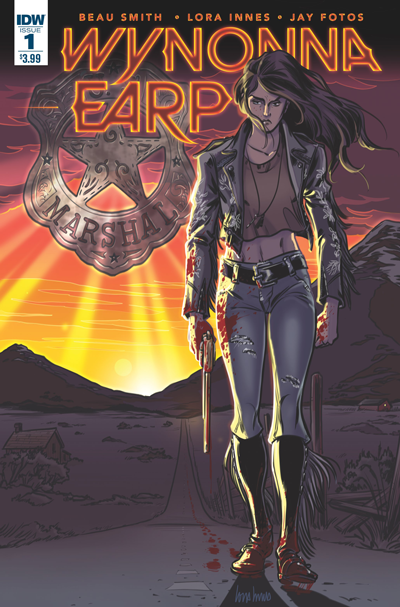
Wynonna Earp (a descendant of Wyatt Earp) is a Special Agent of The Black Badge Division of the U.S. Marshalls. Her job is to hunt supernatural entities that are causing harm to the normal world. In this issue she is investigating cannibal creatures in the middle of Idaho with ties to her archenemy Mars Del Rey. The concept here isn’t original but the execution is decently done.

Wynonna is a tough as nails, no nonsense kind of heroine. She reminds me of Jessica Jones, leather jacket and all. I’m afraid that those comparisons are going to be more frequent as the series goes on. The dialogue is pretty fresh and clever when it comes out of Wynonna’s mouth. She spouts off a couple zingers here that had me laughing out loud. Other characters aren’t written with the same wit that Wynonna is and seem like your average supporting cast.

The artwork here serves the purpose of the story. It’s a fun, zombie hunting setting. Some of the details in the drawing lacked definition but that’s just me nitpicking. Splashes of colorful gore fill the pages during action scenes. I had fun seeing zombie heads explode in a really comical way.

I’m a big fan of supernatural detective stories but they’re all basically the same format. Wynonna Earp doesn’t stray from that format. It’s a monster of the week book which will probably translate into a monster of the week TV show. There seems to be a thin mythology here involving Wynonna’s past dark past and her unseen enemy Mars Del Rey. The book served the purpose that tie-in books are supposed to. I’m interested in the TV series. The book is good but the next issue won’t be at the top of my list. There are too many other books that do the same concept only better.


Score: 3/5


Wynonna Earp #1 Writer: Beau Smith Artist: Lora Innes Publisher: IDW Publishing Price: $3.99 Release Date: 2/24/16 Format: Ongoing; Print/Digital

Review: Judge Dredd #3

Judge Dad wants to know what happened to Mega-City One that’s now in chaos and ruin; more so what happened to law itself, as the feral girls he’s got on his side are trying to live inside the city he barely knows anymore. Dredd and the girls have survived the weirdest juries who changed their minds and a Trog who might kill you if the debate you’re having with turns heated. Debate and philosophizing about law and freedoms seems to be the only form of conversation the people of Ang Avi have, which helps Dredd in no way as he tries to figure out where he’s been tossed, and further on what happened to the city he swore to protect. He’s thrown into an arena to fight the out of control Trog and a wild audience who are keen on participating, and he finally realizes there is no law and no authority left in this city. There are the terms of service, becoming a username and the only law is that you can’t impose one. That ain’t gonna sit well with the man who many times has claimed to be the law.

JudgeDredd_Ongo2015_03_cvrA
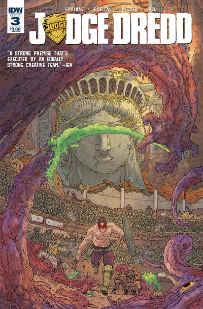
Judge Dredd #3 continues to put overwhelming physical and psychological odds against Dredd and juxtaposes a more complicated goal than ever before. How is he supposed to be something that no longer exists? That is one of the hardest perils Dredd has had to deal with in the many years he’s been in publication. The addition of the feral girls, just like pairing him with Judge Anderson, allows for Dredd to be the unwavering badass he is while they fill the role of putting emotions and sensible reactions to the situations. Their characteristics are well defined and the have a good balance with each other with clear voices and like all children, wearing their hearts on their sleeves. The goals of Dredd, although established, the method he could take seems to blur away more and more, while it’s seen what he might set out to do as far as finding out what happened to Mega-City One, it’s only a glimpse and and this issue favors more to resolving the short term problems at hand.

The art continues to be strong and gritty. A stripped down Dredd, although still intimidating, it is less so just by seeing that his uniform doesn’t contrast the skin of the other people living in Ang Avi anymore, he’s all flesh and furthermore, wounded. The expressions on the children’s  faces match the dialogue portrayed, McDaid drives their emotions forward by balancing the innocence of being a child and the fear of being apart from each other. Colors keep everything claustrophobic when needed and revealed more of the world as I read along. The art uses the style Jason Latour has for Southern Bastards with wider shots and lets the colors clash and tell more story than a caption box could. Judge Dredd #3 keeps the pace and intrigue and definitely makes the reader want to know what will happen in the next.


Score: 4/5


Judge Dredd #3 (2016) Writers: Ulises Farinas and Erick Freitas Artist: Dan McDaid Colorist: Ryan Hill Publisher: IDW Publishing Price: $3.99 Release Date: 2/24/16 Format: Ongoing; Print/Digital

Review: 2000 AD - Prog 1969

A new run on Dredd with art from the always excellent D'Israeli breathes life back into the Progs. Early on in the last Dredd run, I was quick to praise the really effective, gritty art from the Sexton and O'Grady team.  Unfortunately, there came a point where the story fell kind of flat for me, and sequences were only bailed out by detailed art that wasn't doing much for the story itself.  The new arc is a massive shift in tone from the previous one, and looks like it's going to feature the return of Sensitive Klegg.  Though the rest of the Kleggs typically appear ferocious, D'Israeli's colorful, cartoony approach has set a comedic mood for a plot that teeters between absurd and quite serious.  The first episode was already a lot of fun, and I trust that the brisk, comedic pace will keep things interesting.

2000-AD-Prog-1969-1Strontium Dog remains excellent, especially since one of my favorite things is when Ezquerra draws spaceships.  Not only do we get spaceships in this issue, but we get spaceships shooting other spaceships.  And really, what's better than that?  The "Repo Men" arc appears to be nearing its climax, and while it has taken its time unfolding, particularly in the middle, it has still been the star of the last couple of months of Progs.

ABC Warriors and Kingdom continue to be a little obtuse for me, despite several pages in both that were excellent this week.  Meanwhile, things have opened up in The Order and the series has once again become familiar to me.  Unfortunately, I think it might be too little too late: this leg of the story took far too many issues to return the story to a recognizable, or even consistently enjoyable place.  It's a challenge, of course, to start your plot somewhere else and try to work back to the essential elements of an earlier volume, especially when you only have a single digit's worth of pages to do so each week.  Still, it's inherent to this format that doing things with an eye towards, say, a normal issue length will make things feel languid.  Often, this round of The Order has suffered from exactly that.  It seems as if my complaints might be different or at least diluted if this story were released monthly in longer blocks; however, it isn't.  My experience of the story is defined by reading it as a weekly smaller installments: it either succeeds or fails as consumed in that manner.


Score: 4/5


2000 AD - Prog 1969 Writers: Various Artists: Various Publisher: Rebellion Price: £2.55 Print / £1.99 Digital Format: Print/Digital Website

Review: Heartthrob #1

There seems to be no rest for Chris Sebela as he gears up to deliver this new title. With art by Robert Wilson IV, this book packs the punch that 2001 movie Bandits wanted to with a better setup and more interesting characters. Callie has had heart problems since she can remember. Failing in every relationship she’s ever been, and she’s also terminally ill and will die without heart transplant surgery, which luckily she gets. The problem now is that this new heart comes with its former owner, a con artist. Now they will embark in love-fueled crime spree.

HEARTTHROB-1-RETAIL-CVRHeartthrob #1 thoroughly sets up its world, which is equal parts the beginning of Wanted, mixed with the damaged and careless character of Jessica Jones. Callie’s world is shown up until that moment. How she coped with her condition and how sick of the world she is pitying or flat out rejecting her, she wants to do more and she’s on a mission to give herself the extra life to do it. Once she’s able to do it, Mr. Mercer begins to show up and whisper sweet nothings to her. Callie is a deeply flawed character and a strong protagonist. A person who has always aspired for more and the opportunity to do something big presents itself in the least way expected. As far as Mr. Mercer goes, he is presented in a very interesting way; vulnerable. There are glimpses of him as the cool and suave con man he is poised to be, but that persona has been portrayed time and time again, so the choice to have him put himself out there for Callie is a lot more interesting. Hopefully this continues and Mercer will show to be just as flawed as Callie if not more, which will make for a great relationship.

Wilson IV art shows as much character as the writing does. He brings the same amount of intensity he had on Bitch Planet #3. Callie wouldn’t have felt as real or as damaged with another artist, this way we don’t only read that Callie is very ill, but we see it as well. Chris Sebela and Robert Wilson IV compliment each other very well. Nick Filardi’s colors accentuate the book and give the tones necessary when she speaks of her past, even more so when Mercer shows up and before his truth is revealed, we’re aware that this encounter is different and new.

Chris Sebela has proven time and time again that he can write characters with simple goals and complex emotions. Robert Wilson IV can portray that emotion and all the action that’s to come in this new series. Keep a look out for Jamie McElvie’s fantastic variant cover which honors the great Fleetwood Mac album Rumours.


Score: 5/5


Heartthrob #1 Writer: Christopher Sebela Artist: Robert Wilson IV Colorist Nick Filardi Letterer: CCrank Publisher: Oni Press Price: $3.99 Release Date: 4/13/16

Review: Wayward #14

Despite fun villains, compelling designs, and some stellar visuals, Wayward #14 feels like it lacks depth where it really counts. Summing up Wayward is hard for me.  The plot is uneven, but effective.  Characters are interesting, but stilted.  Set-pieces of the action can be visually stunning, but sort of shallow.  Take Dermot Lane, for instance.  In this issue, Rori's father spends most of his panels being a cardboard cutout of a character: he's Irish, he's a dad, he has an accent, and he's mad!  Then, just when you've settled in to this fairly uninteresting perception of the fellow, the guy starts carving Gaelic runes into shit.

Is that what's carrying this book, though?  At times, I find myself wondering whether the mythological elements and their novel interpretations within the confines of this story are enough to keep readers intrigued.  Original characters don't need to be particularly interesting when they are either juxtaposed with or channelers of cultural monoliths that have thousands of years of staying power.

Wayward-#14-1Of course, there's more to Wayward than just a showcase of yokai: if there wasn't, I don't think it would still be published, nor would I still bother reading it, frankly.  But the experience of reading Wayward is interesting in that reading it monthly and reading a trade feel more different than a similar reading exercise with another title.  Much of the substance of the series comes from reading it while focused on the meat of whatever the current arc is concerned with.  This isn't something that comes across well in single issues, sometimes.  Issues of Wayward, taken individually, often have an uneven pull between character development and the plot at hand.  Switching from the nefarious plot of the villain to tender character moments feels like an exercise in plot necessity rather than an organic development.

The pencils don't do a ton of favors here.  Massive character moments aren't really sold unless something supernatural is dominating the scene.  While the supernatural is so often a boon that this rarely matters, sometimes people with crazy powers get upset when they're not blowing shit up, and one particular scene that's really supposed to pack a wallop emotionally in this issue falls dead flat for me as the art sort of shrugs its shoulders in between supernatural encounters.

As much as the overall plot has often been the strong point carrying the series--which is one of the reasons I think reading a trade actually holds up as a better reading experience--that's starting to buckle here in this issue.  The villains are compelling, but the children seem almost laughably stupid.  I might be willing to forgive their ignorance if they were more likable, but at some point in this arc the story started taking for granted the fact that I would care about these kids no matter what.

There simply aren't enough new, successful story beats for me to latch back onto some of these characters and say, "hey, you know what, I hope they turn out alright."  While such vague support for characters makes sense in a story that is trying to blur the lines between good and evil, this particular story in the last few chapters has not spent the time with these characters necessary to allow them to carry the burden of being morally ambiguous.  In other words, either these characters are suffering from being underdeveloped, or they are suffering because the developments of the story have moved on without them.

Despite all of this unevenness, I still find myself enjoying this book in some important ways.  It has a raw, original feel to it, despite leaning so heavily on extant ideas.  It's just not the kind of mix of mythology and super powers that usually saturates comic stands.  And, speaking of saturated, the color work on this title is  special.  This coloring team is nailing it week in and week out, and almost single-handedly defining the feel of this comic.

While the brisk pace of this series was one of the more successful things about the previous arc, the older characters are starting to be alienated, and it's something that needs to be balanced soon.


Score: 3/5


Wayward #14 Writer: Jim Zub Artist: Steve Cummings Colorist: Tamra Bonvillain Publisher: Image Comics Price: Digital $2.99 Print $3.50 Format: Ongoing, Print/Digital

Review: Ringside #4

We’re coming right off one of the dullest Pay-Per-Views this year and a very strange Monday Night RAW. But all of that is further establishing that Mondays aren’t the time for wrestling, it’s Wednesdays. There’s new NXT, season 2 of Lucha Underground is in full swing with a 3rd season confirmed, and once a month, the trifecta hits all the right places and makes us all marks for a new issue of Ringside. This month is no different. Ringside-#4The table is set and everyone is having their own dinner. What I mean to say is that all our characters are set up, and they’ve set off on their own paths that cross from time to time, depending on what time the story is being told and from whose point of view, which is something that speaks to the world of independent wrestling circuit, where everyone comes around each other at one point of another. Ringside continues to be gritty and gnarly but has one or two more twists in this issue. The conversations are prolonged, and also shows a new side of prospect wrestlers, who want to stay in the straight and narrow, whereas the old guard were just enjoying their time in the spotlight and Carpe fucking Diem. The issue keeps going back around Dan’s quest to find Teddy, and his newfound bail bonds friend who’s taken pity on Dan and helps him not get killed without getting his own hands dirty. Little does he know, the old Minotaur can still ram some motherfuckers here and there if needed.

Ringside #4 is where the story is really kicking off, although very enjoyable previous issues, there was still that air of world building in them. whereas this issue trusts the reader to know who the players are and moves forward with the story. One of the biggest complaints I kept hearing from other who read ringside was the lack of actual wrestling on the book, which is a fair point, given the covers have in-ring action in them, but the title itself tells it all. This is about everything that happens outside the ring, and the crazy life the people who run inside it have. I would definitely like to see Barber and Gough take a couple of their characters through Suplex City, but I’m very much ok with the level of violence in the book already.

Ringside #4 is a sure buy for those who love wrestling and continues to show that there are more options out there than being forced to watch some guy bathed in baby oil punching people with the supposed strength of a famous DC character.


Score: 4/5


Ringside #4 Writer: Joe Keatinge Artist: Nick Barber and Simon Gough Publisher: Image Comics Price: $3.50 Release Date: 2/24/16 Format: Ongoing; Print/Digital

Review: Weekly Shonen Jump #12

No One Piece this week, but My Hero Academia, Food Wars, Black Clover, and One Punch Man continue a seriously excellent streak of chapters. Murata draws a spread in this week's One Punch Man that should honestly make everybody else in comics doing action spreads feel bad about themselves.  We've seen him do this before, and I've praised him for it as well: Murata is very good at drawing several quick actions occurring in a single panel.  He uses bold, dramatic lines curving in arcs to depict motion, as he draws a character (mostly Garo, as of late) blurredly dodging around them.  I see spreads depicting a single action all the time that fail to have the clarity and impact of these sequences, and this is one of Murata's best.

Kurokiba is one of my favorite characters in Food Wars, so I am both excited and nervous to see what happens to him as he goes up against one of the council members who we really haven't seen in action.  Kurokiba just looks like a lot of fun to draw, which makes him a lot of fun to read.  This is the first of the legitimate Central vs. Everyone shokugekis that we're getting to see, so the result is going to set the tone for the next part of this major arc.

wsj 12 coverBlack Clover has cemented itself as a must-read.  It's honestly worth it to go back and buy the issues that comprise the current arc just to witness the fight with the mysterious, treacherous bearers of light magic.  As I mentioned several reviews ago, a big part of the current fight is the fact that it hinted at an important secret underlying this series: the theft of magic via the genocide of the original magical race.  If true, it changes the landscape of this series completely.  Yet even independent of the brief but major tease embedded in this fight, the fight itself has been outstanding.  Tabata has shown before that detailed magic fight scenes are capable of setting Black Clover apart.  This fight, however, features Asta maturing as a swordsman.  Adding this dimension to the series is such a huge boon to the series, both dramatically and visually.  The sword has been anti-magic and a central feature of the series so far, but hasn't really seen much action as a sword ought to.

Academia continues to be excellent, but it's just so good that I want to wait out until the end of the arc and then write a blow-out review about how much this series continues to mature.  So be on the lookout for that!

The Jump Start I spent so much time on last week, Kimetsu no Yaiba, pretty much let me down this week.  The pacing is choppy, as pages and even panel-to-panel sequences jump around more than they should, particularly in a chapter where only a couple of things are really happening.  The visuals maintain their rustic feel, which I found charming last week, but suffer from being too rough around the edges.  Especially in English Weekly Shonen Jump, the caliber and type of art with which Gotouge must contend sets Kimetsu no Yaiba apart in a bad way: nearly everything in this anthology feels decidedly polished and contemporary.  While I am open to artistic styles that break with that trend (as you should be too!), that doesn't really change the de facto standard that a reader is going to have while reading through Jump.  If the story doesn't do some big, interesting things fast, I don't expect this series to stick around long, even in Japan.


Score: 5/5


Weekly Shonen Jump #12 Writers: Various Artists: Various Publisher: Viz Media Price: $0.99 Format: Digital Website

Review: King Conan #3

Truman and Giorello are back at it again! Bringing the high fantasy adventure that Conan readers have come to expect from them. King Conan’s story continues to unfold and entertain. As I state every month, I am a biased Conan fan. And yet, every time I pick up an issue of Conan I always half expect to be let down based purely on the idea that eventually I’ll get bored of watching Conan cut people in half, or fight monsters, or yell really inspiring things. However, every time I finish an issue this is never the case, I am always on the edge of my seat wanting more. Maybe I’m just a huge fan of adventure stories, or maybe Truman and Giorello’s ability to consistently write an epic yarn full of fast-paced action can’t be beat. Conan finds himself at odds with the Pict Wolf Tribe that just rescued him from the Witch Kwarada and the Pictish hordes that are on the brink of invasion with Aquilonia. While Conan is grateful for his rescue he still considers the Picts to be his sworn enemies, but now he sees that alliance may be the only way to combat the hordes that will soon be at his doorstep. Conan discovers that the future chief of the Wolf Tribe (who happen to be the most powerful and most influential of all the tribes) is just a boy, who is traveling with them through the jungle. Conan agrees to make a truce with them after much deliberation.

King-Conan-#3-1The young chieftain reveals that he was watching when Conan and his comrades were first ambushed back in issue two, and that he saw where Conan hid the ancient crown, things begin to look up. All hope is lost when the evil Picts emerge from the jungle, the Dark Witch Kwarada was, unsurprisingly, tracking Conan the entire time. The ensuing battle leaves Conan the last man standing, the young Chief captured along with the crown, and a pile of corpses rotting in the jungle heat. A perfect set-up for the final chapter of this excellent adventure.

Conan is one of those rare comics that benefits from being a little derivative. A lot of media be it video games, movies, or TV are often derided for their lack of originality, and yet Conan stories are praised for following the path set by Robert E. Howard all those decades ago. They are supposed to read like the dog-eared paperback wrinkled by repeat reads. Surely there are critics of this derivative style, but for those who are looking for the pulpy classic feel of 1920s fantasy Dark Horse’s Conan comics never fail to deliver. This doesn’t go to say that they feel old by any means, even compared to the 70s Marvel comics they feel sleek and modernized. Each panel lush with detail, and overflowing with kinetic energy. It takes a lot of skill to translate a literary character and put them into fast moving visual oriented comic books, and Dark Horse constantly does just that. Alright, that’s enough praise for Conan for one day, just go and read this miniseries yourself, just in time for the finale next month!


Score: 4/5


King Conan: Wolves Beyond the Border #3 Written by: Timothy Truman Art by: Tomas Giorello Publisher: Dark Horse Comics Price: Print: $3.99 Release Date: 2/24/16 Format: Mini-Series; Print/Digital

Review: Cry Havoc #2

Part of the experience of the first issue of Cry Havoc is adjusting your expectations of how narratives usually go.  The unorthodox choice to tell the story simultaneously in three phases means that readers have to, even if only subconsciously, come to terms with jumping around to different points in the narrative.  The well-populated creative team has done a lovely job of making this temporal hop-around stand out as a story feature, and the story rarely feels as fragmented as it could have with less care. What I realized this issue is that one of the reasons I had some reservations, however minor, about the first issue was because this team was doing such a good job of putting together these temporally disparate narrative puzzle pieces that it was quietly adjusting the way I was reading the story as it went along.  The second issue of this series reads incredibly smooth, especially considering how much interesting shit happens in each of the story's unique spatio-temporal compartments.  It's not often (and perhaps not often enough) that a comic challenges my narrative expectations to the point that I have to worry about being subconsciously sold on something, but Spurrier is one for making the reader do healthy mental calisthenics in their engagement with his narratives. Doing so with an artist of Kelly's caliber and an army of colorists gives him quite the platform to continue this kind of work.

Cry-Havoc-#2-1Cry Havoc #2 strikes me as being the issue where readers will be able to grasp exactly how excited they are about this series.  The first issue floats around the edges of what this story has in store, but the second sends us headlong into a churning eddy of monster, myth, and... well, masturbation.  The tripartite juxtaposition of the rote, repetitive London life, the shock of serving in Afghanistan, and the horrors of being held captive is executed to great effect by this three-pronged coloring team.  What sets them up for success, however, are the more basic page elements, both in the story itself and in its construction, that really give this story its personality.

When I say, "rote, repetitive London life," I'm not just referring to some intangible feature of the story's feel: several sequences in London play out with visually repetitive elements.  Now, these particular story beats aren't there to demonstrate the dull routine of mediocre city life, per se; but, they set a tone in the story that certainly could not be set in the more serious circumstances of its other locations.  A tone, by the way, which comes crashing to a halt even right in London each time the reality of the main character's situation rears its head.

Other than pages that really set the tone in their approach to telling this story, Kelly's art has crescendoed from impinging the monstrous on the mundane to imposing it.  What every piece of this story has in common is really this imposing bestial imagery.  One look at the footnotes and it's easy to appreciate just how much juice Spurrier is mainlining into Cry Havoc through a membrane of extant folklore.  Because of Kelly's haunting work in building these myths and monsters into this world, the footnotes function just as they should (as footnotes!), and the reader doesn't really need to know a god damn thing about Freyja to appreciate the appearance of this issue's cover star.

On top of everything else, this issue leaves the reader with a massive "OK; what the FUCK?" which is always nice.  More than that, though, I think it leaves the reader waiting to see what other ways this creative team can succeed with this approach to storytelling.


Score 5/5


Cry Havoc #2 Writer: Si Spurrier Artist: Ryan Kelly Colorist: Nick Filardi, Lee Loughridge, and Matt Wilson Publisher: Image Comics Price: $3.99 Format: Mini-Series, Print/Digital

Review: Plutona #4

Jeff Lemire originally gained a lot of attention for his comic 'Essex County' (which remains his best work). The first arc of Essex County followed a lonely boy who uses superheroes as a means of escape from his boring farm life. This arc is a clinic in understatement and rich subtext, as Lemire uncritically portrays the boy's struggle to connect with his uncle and his father through sparse, unemotional moments that connect to form a rich, fully-realized world.  Nine years later, Lemire is writing (with Emi Lenox) 'Plutona' with a similar concept and approach, and somehow, nothing is coming together. The concept for 'Plutona' is a simple one: five school children discover the body of the titular super-heroine, and deal with the emotional consequences. Having childhood butt up against the harshness of reality and death is time-tested story fodder, and introducing caped superheroes into the mix is a clever way to make it specific to comics. But four issues into 'Plutona' (a five issue mini-series), a meandering plot and low emotional stakes have made the comic feel entirely inconsequential.

Plutona-#4-1The characters are exclusively the five children mentioned before, but oddly, they remain largely undefined beyond a few stereotypes. We have a bully from a bad family, an unpopular chubby girl, a moody nerd, an annoying little brother, and a flaky wannabe popular girl. These are not bad starting points for characters, but over four issues, no noticeable growth has occurred, and, more annoyingly, no reason to care has been given.

Issue four finds Tugger continuing his obsessive plan to swap blood with Plutona's corpse to gain powers, but we don't really know why. Tugger is superhero obsessed, but choosing to go this drastic, gory route seems like it would require a further motivation, something he's not given.  Meanwhile Mie (wannabe) ignores Diane (chubby) in favor of Ray (bully), because kids are jerks.  It's not a bad plot-line actually (since kids really can be jerks), but it's oddly divorced from the main plot-line of a literal dead superhero. None of the plot feels particularly fresh or well-wrought culmination in an issue-ending twist I have already seen this year ('Snow Blind #2').

In the midst of an otherwise unremarkable issue, the team of Lenox and Bellaire continues to turn in spectacular work. Lenox's art has a Saturday morning cartoon quality of big shapes stylized characters, but with a subtlety and specificity that makes it easy to take seriously.  The characters are simple and yet each one is distinct and evocative (more information is communicated through the character's eyes and body language than through the script). And Bellaire colors with her usual eye for mood and simplification, creating cheerfully lit suburban homes as effortlessly as flashlight illuminated forest.

Perhaps as a consequence of the charismatic art style, I want to like Plutona far more than I actually do.  I'd like to see a book that tackles the concept of children dealing with death through superheroes. But as it stands, there's very little to recommend the book which feels increasingly dull. Perhaps when the mini-series is collected as a volume after next month's issue, it will read better, but it's hard to imagine it, at its best, being more than an example of when good creative teams make something that isn't quite good.


Score: 2/5


Plutona #4 Authors: Jeff Lemire, Emi Lenox Artists: Emi Lenox Publisher: Image Comics Price: $2.99 Release Date: 2/24/16 Format: Mini-Series; Print/Digital

Review: Four Eyes: Hearts of Fire #2

As confused as I was when I dropped into this sequel series (not having read the original), I am so glad that I finally found Joe Kelly and Max Fiumara’s Four Eyes: Hearts of Fire. If you’re anything like me, take note, because this may be the best comic book that you’re missing. Hearts of Fire #2 continues to follow second-generation dragon trainer - the young and tragic Enrico - on the way to avenging his father’s death. But that’s just the overarching motivation. This time, the series focuses on the gravity of a mid-twentieth century world where dragon fighting is society’s favorite underground pastime. It does this first by showing the brutality and depth of mythos in the bloodsport itself, portrayed in a dizzying sprawl of pages that really takes you into the high stakes of its story.

Foureyes---Hearts-of-Fire-#2-1But it measures this in something rather more intimate: a violently fractured family dynamic so common of the actual depression; one that, again, is built as perhaps the world’s most pressing threat. And honestly, this issue has it all: fantastic, dynamic characterization, which shows true autonomy of voice; simultaneous conflicts that range from class to race warfare; and that family story, which focuses everything into a personal struggle not unlike what you might see in Locke & Key in a weird way. Kelly coagulates all of this into an atmospherically thick story about blood, fire and pain that is truly beautiful to behold, with an equally gorgeous visual assist from Fiumara’s singularly unique artistic style.

It almost goes without saying how magnificent, how real and full Fiumara’s world feels. Whether it’s the action in the foregrounds, the detailed architectural trappings of his backgrounds or anything between, he nails almost every single panel; wavering only slightly with some of his more cartoony facial acting.

The juxtaposition of figure work between his people and dragons is perhaps his greatest feat in this series. It is as stark as his decision to go mostly monochromatic, and just as arresting. This is a world dangerously ill at ease with itself, where fiercely chiseled dragons bely the savagery of the story’s true monsters: mankind. And it’s that visual schism that really sells the point, particularly in the soft lines of someone like Enrico and the harder, more gruff gnarl of his otherwise innocent dragon, the titular Four Eyes. That difference plays out particularly well, and sadly, by the end of the issue.

Four Eyes: Hearts of Fire #2 is a damn triumph, and if you are sleeping on this, as I did, then it’s time to wake up and smell the burning.


Score: 4/5


Four Eyes: Hearts of Fire #2 Writer: Joe Kelly Artist: Rafael Ortiz Colorist: Max Fiumara Letterer/Designer: Thomas Mauer Publisher: Image/Man of Action Release Date: 2/24/15 Cover Price: $2.99

Review: Bang, Bang, Lucita #1

Bang, Bang Lucita is a collaboration from indie publishers Isle Squared Comics and NimProd Comics. Set in Harrisburg 1874 the story follows a Mexican cook named Lucita as she is drawn into a rescue mission for President Ulysses Grant’s wife. There is a decent amount of set up before the action takes place but it feels necessary in order to get to know the characters of the story. By the time Lucita shows off her skills during a fight with a local gang we feel like we know her as a person instead of just a hero. The role of a woman wasn’t very diverse in this time period neither was that of an immigrant. Westerns are dominated by males in media. Lucita is a strong female character. She’s is ready for any challenge that is presented to her. It’s refreshing to see Lucita thrive in this environment.

Bang-Bang-Lucita-#1-1Writer Chuck Amadori doesn’t shy away from social commentary here. The attitudes of racism and sexism are brought up several times, but they are balanced by acceptance and characters seeing past their differences to unite for a common good. Dialogue is definitely realistic for the time period. Each character has their own distinct dialect specific to their background. This made every character feel well-represented and believable.

The artwork in this book is beautiful. Artist Edson Elves and Colorist Nimesh Morarji do a great job making the setting perfect for the Wild West. Nimish paints vivid sunny desert skies with shades of yellow and white. The mountain ranges textured by Edson down to the tiniest piece of rubble. It’s really easy to get lost in the details of these pages before you even begin to read the dialogue. The costumes are just as rich and colorful and the action scenes are well-paced. This is the type of quality that makes a book stand out.

As far as indie comics go I feel like Isle Squared and Nimprod have a really solid book here. It’s a western that doesn’t feel too over-the top to take serious. There’s also a lot of action and fun. More issues are to come and I for one can’t wait to read them.


Score: 4/5


Bang, Bang Lucita #2 Writer: Chuck Amadori Artist: Edson Elves Colorist Nimesh Morarji Publisher: Isle Squared Comics, NimProd Comics Price: $4.00 (Print)/ $2.00 (Digital) Release Date: 11/25/15 Format: Ongoing; Print/Digital

Review: Jem and the Holograms #12

Dark Jem continues apace. Truthfully, the whole concept feels like an excuse for Sophie Campbell to draw severely techno, hyper gothic fashion on the main cast of characters. And I approve. One could easily argue the whole enterprise of a Jem comic exists to facilitate designing hyper glam outfits. Most pages look like they have been torn from a heavily caffeinated fashion student's sketch book. However, past issues of Jem and the Holograms have proven to be cute and non-cynical explorations of friendship and family. As such is the case, I can imagine the Dark Jem story arc will be more than just a fashion show for mopey kids. Inevitably, a book with such a large amount of characters will need to push some aside from time to time. Writer Kelly Thompson, however, seems especially skilled at focusing in on her main figures without ignoring the folks in the background. All the pieces are moving in some way, even if only a few matter right now.

Jem12_cvrABlaze, has emerged as the new Misfits lead vocalist, replacing the sidelined Pizzazz. And Blaze always looks understandably lost, a little dazzled and awed by the flashiness of her rock star friends. She's a stand-out character. I won't get into exactly why that is, but if this was at all a superhero book I would expect Blaze to become the temporary new lead character. The tone of this issue really has the feeling of a new hero rising from the shadows to save the old hero. And it should suffice say the Misfits' portion of this issue very briefly and nonchalantly addresses a hot topic in the context of how groups accept new members. The book does this without making me imagine slow, twinkling, very special episode of "Full House" music playing over the scene. The Misfits are kind of crappy people, but even they have their crap limits. This is kind of a theme throughout the issue.

Meanwhile, the titular characters are becoming more like their rivals. Worse even. They're defensive, boring, and emotionally shallow. The "Dark" element isn't manifesting as the cackling evil of world-ending madwomen. They've become the opposite of what the band is meant to represent. As the Misfits lose some of their chilly aloof attitudes, the Holograms have shed all of their own warmth. The Holograms are just backbiting automatons, sniping at each other with bitter, digging remarks. And still, they are seemingly unified in their actions, moving toward some ultimate, mysterious goal. The climax of this issue's surprising amount of development is the paranoid fantasy predicted by anti-music propaganda like 1982's "Rock: It's Your Decision". That's not a spoiler. We’ve been getting bits and pieces of dread leading up to the actual act that seems to be the major plot point of this arc.

Issue twelve delivers a very satisfying amount of story in a single issue. And next issue seems to promise a focus on how Pizzazz is dealing with abandonment, obsolescence and her possibly career-ending injury. Should be fun!


Score: 4/5


Jem and the Holograms #12 Writer: Kelly Thompson Artist: Sophie Campbell Colorist: M. Victoria Robado Publisher: IDW Publishing Price: $3.99 Release Date: 2/24/16 Format: Ongoing; Print/Digital

Review: Black Magick #5

This week saw new issue of three urban fantasy series from Image, 'Black Magick #5', 'Cry Havoc #2’, and 'Wolf #6'. I read all of them and while I'm not going to compare them in terms of quality (don't read 'Wolf', people), I was immediately reminded that 'Black Magick' is the only book of the three that could open with a five-page sequence of people discussing parenthood with nary a mention of magic and make it work. It's not that there's anything wrong with a more spectacle-laden approach, but it's refreshing to see a book that is confident in its characters and their emotional lives enough to hold off on the monsters for a while. And there is still plenty of action (and monsters) in Black Magick #5 as the first arc draws to a close in explosive fashion. Also, seriously, don't read 'Wolf'. Issue four left off with Rowan's friend and fellow-with Alex Grey attacked by a demonic lookalike, but this issue takes some time getting back to her.  We are first given a scene of Rowan having dinner with her police partner and his wife (with the afore-mentioned discussion of parenthood). After that we are reintroduced to the shadowy magical organization tracking the witches and their extremely serious operative. Finally, at the halfway point, we return to the magical fight in progress.  This is not actually a bad structure as Rucka's choice to hold off resolving the cliffhanger builds up the tension and then release it in a spectacular finale. And the latter half of the issue is indeed spectacular.

Black-Magick-#5-1Rowan's attempts to enter the house to check on Alex interspersed with her battle with the duplicate is a tense horror-movie sequence that functions incredibly well, due in no small part to how much the reader is invested in both characters.  Nicola Slott sells the physicality of the fight even though parts of it are completely magical (a pattern of bruises and wounds appearing magically over Alex's face is extraordinarily creepy). Similarly, the subtle coloring works when wonders when Rowan gets involved in the fight. Her use of her gun and badge as part of her magical attack are hugely in keeping both with her as a character and with the world that Rucka has been so carefully setting up.

I have been critical before about how long the plot has taken in Black Magick to get rolling, and this issues still leaves most of its mysteries hanging. However, issue 5 also demonstrates that what the book has lacked in plot coherency it has made up for in world-building.  The idea that magic has real physical consequences (reinforced by the two earlier murders), put the stakes in place to understand the threat to Alex and Rowan even while the reasons behind it remain a little unclear. While it's not uncommon for comics to have a slow rollout of its mysteries, it remains unusual to find a book that takes its time with characterization and world-building, making Black Magick one of Image's best new titles.

I would be remiss if I did not mention the final two pages of the issue which tease a surprisingly pulpy, scary direction for the book going forward. We finally have a face to put behind our villains (or more accurately, a lot of faces), and seeing how these new character will fit into Scott and Rucka's world is an enticing prospect.  Frankly though, even without a big last minute twist, there's plenty in Black Magick #5 to indicate that the title is going to continue its excellence when it returns.


Score: 4/5


Black Magick #5 Writer: Greg Rucka Artist: Nicola Scott Publisher: Image Comics Price: $3.99 Release Date: 2/24/16 Format: Ongoing; Print/Digital