Review: Tiger & Bunny Vol. 8

I’ve never read or watched anything from Tiger & Bunny. That might have been why I didn’t really get into this story. That and it seems as if it’s geared more towards female readers/fans because of all the attractive men and the subtle love between the characters. Sure it’s brotherly love, but everyone that reads manga know what’s up. The story is about the Next (basically mutants) causing mayhem all over the city and Tiger and Bunny trying to stop it. They get some inside help and eventually learn that the man they’re after can read minds. There’s a lot of action, the bad guy gets away which is all part of his plan and really the police seem incompetent. We also get some backstory on our villain which was okay and definitely the deepest character moment of the volume.

Tiger and Bunny Vol 8The story isn’t deep. It’s thick with drama and moves at a snail’s pace. I haven’t read the last seven volumes and yet I didn’t feel lost or behind on the story. Sure I had some generic “who’s that”, “what’s going on?” questions, but nothing that really need to be answered in order to read and enjoy the story. It’s just not a very deep world which is probably why I’ve passed on it before. It attempts to be cute and playful because again it’s an action drama trying to capture a very specific audience that basically already likes this style of story and world creation. I would argue that because it chases that audience it alienates new readers looking to just explore the world and not have a formula forced upon them. And sure there’s powers and fighting, but you can get that anywhere so it doesn’t actually hook me on the product.

The art is good of course. I don’t think it has as much personality or visual storytelling skill as a lot of other mangas out there. By far things like Food Wars, One-Punch Man and Ultraman blow it out of the water, but it’s still skilled. It just needs to have its own personality and it doesn’t. It feels like a licensed product with very tight restraints on what it can and can’t look like visually and that’s a shame. Because if the story is just meh, then the art can at least blow you away but it doesn’t here.

I doubt I’ll ever read or watch anything else set in the Tiger & Bunny world. It’s not terrible, but it’s not interesting either. It’s just there. Some people obviously really enjoy this franchise, but I doubt they’d ever be able to win me over with their reasoning. It’s just not something that I want to read.


Score: 3/5


Tiger & Bunny Vol. 8 Story: Sunrise Script: Masafumi Nishida Artist: Mizuku Sakakibara Publisher: Viz Media Price: $9.99 Format: TPB; Print/Digital

Review: Spiral #1

I will say complimentary things about Spiral, but I will also critique it. I say this so that my very first thought on the comic doesn’t chase you off. Spiral is too complex for its own good. The story is about family. Families on both sides of the law. On one side we’re introduced to a crippled man and his EMT son. Their conversation is vague as the father tries to recruit his son for some calling unbeknownst to us at this time. The son turns him down and mentions his sister. The sister/daughter we’re told is too much of a wild card and then learn that she’s a police officer.

On the other side we meet an arms dealer as he’s about to pass the torch to his son. His son is ambitious and doesn’t want to take his father’s advice. That advice being sell low and get rid of all of them… guns that is. Eventually the two family’s cross paths as the younger generation takes the mantle from the older generation. What each mantle is, is for you to find out.

The reason I say that this story is too complex for its own good is that it breaks its own narration flow. It attempts to establish a constant timeline and forces single pages of story when not needed. The opening is very choppy because of this. The story also keeps the reader constantly informed of the location of the different events. The book is made by creators from the U.K. so they know London and play off what others might consider common knowledge. For me, without a map… I didn’t care. Hell, even with a map, I wouldn’t care. I don’t want to do research while reading and if it’s not a video game I don’t need a map for location reference. It became a distraction to the story.

Spiral-#1-1The characters aren’t there yet. They have potential, but right now they’re too one-dimensional. The daughter, Olivia, is a wild card for sure. She’s so wild that she’d likely be suspended by any police force and yet they just kind of ignore her and let her go wild. We are given some explanation as to why she’s like this, but the story really needs to tone her down some otherwise our main character risks becoming annoying.

The artwork is fantastic. In a way it distracts or allows you to forgive the faults of the story because you’re so captivated by the art. I mean that cover alone is poster worthy. The opening credit pages are some solid design and everything else is just glorious and a credit to the genre it’s going for. It’s just that it’s chopped up by the narration so much that at times it feels like it isn’t given a chance to get started. Towards the end there is a harmony between the writing and the art and I would think that the rest of the series would be more in line with that.

The coloring is very earthy. There’s a lot of green, brown and orange hues that are used. Really the entire rainbow is used and wisely, but overall the muted earth tones stand out and dominate the most. There is a great piece of narration and design which shows three different fathers talking to their sons and each is laid out in the same page position. It was clever and visually strong.

At the end of the day I’m not sure if the story is elevating the art or the art is elevating the story. If anything it shows a strong collaboration at work. This first issue hiccups in places. It’s not smooth and perfect and again it’s more complex than it needs to be with its design and story elements, but the bottom line is that I would read the next three issues. If you’re interested in checking it out, then head over the teams Kickstarter by clicking the link below.


Score: 3/5


Spiral #1 (of 4) Writer: Magnus Aspli Artist/Colorist: Emerson Dimaya Design/Letterer: Nic J. Shaw Kickstarter Link!

Review: Corrsolla Robot #2

Two years ago I checked out Corrsolla Robot while at New York Comic Con. I enjoyed it but largely due to the art. It was a very fantasy driven story full of escapist themes. Escape your mundane life by having a chance encounter with a magical being. There were some confusing elements in the first issue that left me wondering the exact outcome of the issue, but thankfully after diving into the second issue everything was cleared up. Our main character Ceri’s comic book creation Corrsolla has come to life and wrapped around her like armor. We learn from the angel that’s not trying to kill Ceri that Corrsolla is the earth’s last hope and that she and Ceri must learn to work together to save the planet. Our now wingless angel Cassiel is opposed to this and feels that humans can’t be trusted. We learn more about Ceri’s life and wait from Cassiel to attack by turning another angel into a T-Rex.

Corrsolla-Robot-#2
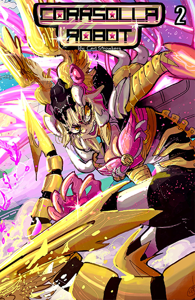
This story is fantasy, but then also very meta. I think that’s why I like it. The creator and the character share the same name. The comic Ceri has a comic book about Corrsolla and everything that her Corrsolla does is in her comic book. There’s just this great bit of back and forth and it becomes a joke at times because of it. There’s a lot of humor in the comic as well. Not all of the jokes land. There’s just not enough of a report with the characters yet and unfortunately comic Ceri and her new pizza delivery boy kind of talk the same. The writing just relies on Ceri to be the butt of the joke too much or deliver the punchline which often breaks her from what she’s doing too often.

Otherwise the story’s pacing is a little off. We have a bit too much downtime from the beginning to the end, but I did enjoy that the story begins on action and didn’t have to do the “let’s rewind and see how we got here.” Stromberg has a bit to go before this is a well-polished story. There’s a lot of convenient writing for the sake of moving the story along. That and the dialogue tends to be more exposition than natural flowing conversations.

The artwork continues to be visually striking and a huge part of what makes the story work. Stromberg even address her two angels that look the same with a joke, which may be a design choice or just her own skills developing. The action scenes were a little jumbled and hard to tell what was exactly happening each time, but the overall style is great. Its influenced by manga/anime, but has an American twist to it. I could stare at Stromberg’s art all day I really enjoy it. She’s a talented visual storyteller as well and I think if she starts to rely on the art telling the story more than the dialogue there will be a shift in the quality of the storytelling.

You will definitely need to have read the first issue to understand and enjoy this second issue. If you’re a female reader looking for a comic that appeals to you more than men in tights, then I would check this series out. Now that’s not to say that men won’t enjoy the book because I’m a man and I enjoyed reading it, just that female readers might latch on to this faster than the average male reader. And if you’re not reading it… well that’s your loss.


Score: 3/5


Corrsolla Robot #2 Creator: Ceri Stromberg Self-Published Format: Print Website

Kickstarter: Doc Dino #1 by Tom Ward and Chris Welsh

ABOUT THE PROJECT

DOC DINO, the book, is a 68 page full colour, self contained comic book that's 90% funded on Kickstarter with almost three weeks left to go.

Kickstarter Link!

Doc Dino, the character, is an aristocratic teacup Tyrannosaurus Rex who might just be the greatest surgeon on the planet. On paper. In practice, not so much… y'know, because of those damn arms of his… He's performed a thousand surgeries and caused at least that many fatalities, and Head Doctor Hoved has finally had enough. Doc Dino loses his job, the only thing he was ever (theoretically) good at, and is replaced by a robotic surgeon created by a man who just so happens to be the Doc's long-lost arch nemesis…

It's a tale of emotion, treachery, backstabbing, lost love and even a little bit of kung fu. There's a mad doctor who does questionable things with homeless people, a robotic dinosaur who goes on a murderous rampage after being infected by a mysterious disease, and a forgotten friendship that might, maybe, possibly, hopefully, be repaired.

It's our homage to films and TV we love, from 80s classics, through Jurassic Park, to newer adult cartoon shows like Archer, Rick & Morty, etc. It’s also a brightly coloured, ridiculous antidote to our established series’ - the rain-sodden victorian streets of Merrick, and the cosmic horror flavours of Wart.

2aaa7d7141a1c1924e98486b2e049fea_original.png-v=1448320808&w=680&fit=max&auto=format&lossless=true&s=e6f1e732e150086c595ee5aec76011e7

WHO'S INVOLVED?

The book is written by Tom Ward and Chris Welsh. Tom cut his teeth on the cult hit MERRICK: THE SENSATIONAL ELEPHANT MAN, whereas Chris has been writing WART – THE COMIC for the best part of two years. Between them they've had four successful Kickstarters in the past, raising over £14,000 collectively. Now they're back and asking for £1500 to get Part One of this dinosaur tale into print!

The excellent art is handled by Mac Radwanski (http://mac240.deviantart.com/), the colours are by Dee Cunniffe (whose recent work includes The Wicked + The Divine, and ODY-C -http://deesaturate.blogspot.co.uk/), and the letters are handling by small-press lettering maestro Micah Myers (https://www.facebook.com/micahmyers)

5rQPj-xTABV4yrHQJuVcYLDWuFhs3f1NAucSyuqdpwPpJcmUNea8nJlnqyMr8NjGFPt-MoOYCUA2XF-N03MMU6rES2P6moik-5Gfl-lGFiHBSZCFk4Es5FQ9OKJZkSqx4K_Q1TTk

WHAT'S HAPPENING?

Well, we're back on Kickstarter trying to gather funds to print this brilliantly ridiculous book. The goal of £1500 covers all the art, colours, lettering, printing, postage and extras (like prints, etc). In return for their pledges, backers can grab digital or physical copies of the book, prints, art cards, and even original pages of art from Mac’s desk.

Though we think the Doc Dino Surgical Megapack might prove most popular… it includes digital and physical copies, 5x exclusive Doc Dino art postcards, 2X A3 Doc Dino Prints, customised surgical mask, surgical gloves, monocle, moustache, stethoscope and your very own medical certificate to enhance your Doc Dino reading experience. It's everything you need to set up your own prehistoric medical practice.

We’re expanding the rewards section with new tiers and special add-ons, which will be announced as we hit certain targets.

BLUEFIN TO SHOWCASE A COLORFUL VARIETY OF UNIQUE NEW COLLECTIBLES AT 2016 TOY FAIR

Bluefin, the leading North American distributor of toys, collectibles, and hobby merchandise from Japan, Hong Kong and more, returns to New York City this month for the 2016 American International Toy Fair, taking place February 13th – 16th at the Jacob Javitz Convention Center in Manhattan. Bluefin will be located in Booth #4834.

Toy Fair is an annual industry event that is produced by the Toy Industry Association™, Inc. (TIA), a not-for-profit trade association representing all businesses involved in manufacturing and distributing toys and youth entertainment products to consumers. TIA’s more than 900 members account for approximately 90% of the annual U.S. domestic toy market of $22B. More details are available at: http://www.toyfairny.com.

During this year’s Toy Fair, Bluefin will showcase a variety of new and upcoming products set for release later this Spring and Summer. Many of these items will be available for pre-order during the show.

Bluefin is proud to expand its popular line of Teenage Mutant Ninja Turtle products with a preview of the forthcoming new Tamashii Nations S.H. Figuarts Ninja Turtles Leonardo and Donatello figures. Set for release later this Summer, the new figures will be debuted specifically for the North American market.

Also on display will be the new Beast Kingdom Star Wars Egg Attack Star Wars Episode V: Millennium Falcon Floating Version and the Kids Logic Back to the Future II Floating DeLorean Car. These innovative products feature the iconic machines from Star Wars and Back to the Future II floating in mid-air atop a customized electromagnetic base.

Booth visitors also can catch the sixth installment of the Terada Mokei’s Architectural Model Series – a beautifully crafted and ingeniously designed construction set featuring a highly detailed 1:100 scale paper model of New York City.

Bluefin Products To Be Showcased At 2016 Toy Fair Include:

Tamashii Nations S.H. Figuarts Ninja Turtles - Leonardo and Donatello Figures ·

MSRP: $62.99ea · Available Summer 2016

Collectors will not want to miss what’s in store from S.H.Figuarts! The first-ever S.H.Figuarts versions of everyone’s favorite Teenage Mutant Ninja Turtles are coming in classic animation colors! These new Tamashii Nations figures are being made specifically for the North American market and will be available for a limited time.

First to join the line-up is the leader and most pragmatic of the brothers - Leonardo. Strategic use of die-cast material is integrated for realism in the belt buckle and weight in the legs. The Leonardo set includes his iconic katana (x2), interchangeable head, interchangeable hands (x6), weapon holding parts, and manhole covers (x2).

Second to join the line-up is the brains and inventor of the brothers - Donatello. Strategic use of die-cast material is integrated for realism in the belt buckle and weight in the legs. The Donatello set includes his formidable staff, interchangeable head, interchangeable hands (x6), weapon holding parts, and a pizza.

Get your cowabunga on S.H.Figuarts style (and grab some pizza while you’re at it)!

Beast Kingdom Star Wars Egg Attack EA-020 STAR WARS Episode V: Millennium Falcon Floating Version · MSRP: $184.99 · Available May 2016

Beast Kingdom delivers the Egg Attack Star Wars Millennium Falcon Floating Version -- the world’s first floating Millennium Falcon! The innovative product uses electromagnetic attraction and repulsion to make the Millennium Falcon float on air! Pre-orders for this product, which ships in May 2016, will be available during Toy Fair.

To reproduce the iconic Corellian YT-1300 light space freighter, every detail of the Millennium Falcon was meticulously crafted, including the armor plating, AG-2G quad laser cannon, and sensor dish. The Millennium Falcon floating version is painted with high-quality metal coating, showcasing steel-like armor and battle damage. Each Egg Attack - EA-020 Star Wars Episode V Millennium Falcon Floating comes with a magnetic levitation Echo Base. A perfect item for the avid Star Wars collector or pop culture fan.

Kids Logic “Back to the Future” Floating DeLorean · MSRP: $224.99 ·

Available Spring 2016 (Estimated)

The famous DeLorean time machine as featured in Back to the Future Part II is offered in a high detail floating version officially licensed by Universal Studios. The 1/20 scale recreation of the car is about 8.6 inches in length and features 10 light-up LEDs, opening doors and removable, swappable wheels (two sets) for normal driving and flying scenes. Flame effect parts are also included along with 2 different bases – a magnetic floating base and a standard display base. A truly unique item!

Terada Mokei’s Architectural Model Series: No. 6 New York · MSRP: $14.95 ·

Available Now!

The sixth installment of the Architectural Model series features famous landmarks from the street corners of one of the world's most exciting cities. Created by Japanese architect Naoki Terada, these amazing 1:100 scaled paper models offer simple, charming snapshot of commonplace scenarios including children playing in a park, a cherry blossom viewing, patrons enjoying coffee at an outdoor café, the hubbub of activity in front of a New York subway and much more. Each model is packaged in single-colored sheets equipped with individually laser-cut parts, reminiscent of model die-cuts. This is a perfect compact items that also makes a thoughtful gift and can be included in greeting card envelope.

Review: Shaft: Imitation of Life #1

Shaft is not a gay man.  Shaft is a charismatic, stoic, street hardened black private detective; one who casually, if not lethargically, has co-opted gay rights in his latest story: Imitation of Life.  It’s these interesting cultural conflicts and strong character development that should make this a Shaft story worth following. First we should call out the elephant in the room and that’s how brutal black culture has historically been towards LGBT culture.  And also how historically difficult it is for black gays or bisexuals to find acceptance in their own communities (please see the tragic tale of Donny Hathaway or the apparent shunning of Frank Ocean).  Thrusting an African American hyper male with a chip on his shoulder, like Det. John Shaft, into the seediest parts of gay culture immediately creates powerful conflict.  Kudos for David Walker for seeing that and building a story around it.

Shaft-Imitation-01-Cov-A-ClarkeThis is not a Blaxploitation story, at least as far as Issue #1 goes.  In fact, the second time through (and maybe it’s the Steve Dillon-esque feel of some of the characters) this felt a lot more like a Punisher book to me.  Shaft’s Vietnam cred is on display as he tears ass (not a pun) through multiple baddies like a finely tuned machine.  The character models don’t quite fully express the stoic nature of a man like Shaft or the desperation and fear of a kidnapped sex slave but still manage to adequately move the story along.

Shaft is no Punisher, and I mean that in a good way.  Coupled with the occasionally banal visuals, we get some very strong introspection from our main man Shaft.  These aren’t just casual thoughts or mental meanderings, these are meticulously crafted memories and observations that manage to serve as foundations for how Shaft approaches the world around him.  Even with these insights it’s still unclear why he decides to investigate the case of the missing gay boy, even Shaft questions himself about it multiple times.

Whatever Shaft’s reasoning, be it boredom or cabin fever, the Imitation of Life is setup for a fantastic story.  While the artwork was a little stagnant at times the story carries the load through Issue #1.  With all the cultural conflicts naturally setup and David Walker’s talent for contextualizing internal dialogue I expect this will be a series worthy of our attention.


Score: 4/5


Shaft: Imitation of Life #1 Writer: David Walker Artist: Dietrich Smith Publisher: Dynamite Entertainment Price: $3.99 Release Date: 2/10/16 Format: Mini-Series; Print/Digital

Review: The Last Contract #2

Clichés are like getting a hug from a writer.  A fuzzy warm embrace that tells you everything in the world is exactly as you’d expect it to be.  Though not particularly challenging to readers, clichés handled well, like in The Last Contract, can still create an entertaining and compelling story. Levels on levels!  Ed Brisson is the spoon man, feeding us small bits of story at a very pleasing pace.  It’s been 20 years, we learn, since open season on cops and their families and now we finally have the great horror in the past that weaves this collection of characters together.  And, despite the blood thirsty gangsters capping everyone under the moon attached to said horror, us fortunate readers get a glimpse of true vulnerability within their entire organization.  It’s kind of refreshing!

The-Last-Contract-#2-1In this is a dark and gritty Canada the coloring really stands out; asserting itself in what I will use my super non-art educated brain to classify as ‘layered opaque’.  Ooh la-la (said in French Canadian)!  Lisandro beautifully marks each character who’s tied to the underworld with aged faces, lined with the stress that such a life would bring.  Not to say that every innocent character getting wrapped up in this macabre world is cherub faced buuuut…

I’m certainly glad that the character pool is deepening.  Revenge stories can become so telescopic, with our hero chopping or shooting his or her way through nameless (may as well be faceless) hoods/hit-men/ninjas/goons to get to the one top villain that we are supposed to hate.  By introducing some vulnerability to the mobster’s organization it inevitably humanizes them and puts something at risk for them.  No longer nameless, no longer faceless, we get some actual motivation and depth.

And it’s for the better.


Score: 4/5


The Last Contract #2 Writer: Ed Brisson Artist: Lisandro Estherren Publisher: BOOM! Studios Price: $3.99 Release Date: 2/10/16 Format: Mini-Series; Print/Digital

Review: The Manhattan Projects: The Sun Beyond the Stars #4

Oh 'Manhattan Projects', what happened to you? Through its first three arcs, Jonathan Hickman's atomic alternate history was thrillingly sharp and strange, an avowedly insane melding of weird science, extreme gore, and egotistical famous men. But then, without warning, the book simply lost steam. The main plotline wrapped up, more or less, and the book sputtered along trying to find something to do with itself. Eventually, MP split its large cast into separate, unrelated mini-series. I had hoped this would be just the thing to shake the once great book out of its lethargy. Instead, 'The Manhattan Project: The Sun Beyond the Stars' , the first such mini, has been a limply scattered space-opera, seemingly divorced from the strongest parts of the series bur bearing all of its weaknesses. Issue four finds cosmonaut Yuri Gagarin, Laika the space dog, and a bevy of aliens I can't begin to care about surrounded by an evil empire bent on recapturing one of its own. Yuri's ship quickly gets boarded and what ensues is horrible bloodbath that gets more widespread and ridiculous as it goes on. The series has in past mined some humor out of ridiculously over-the-top gore, but here, devoid of any stakes, it has a repetitive quality. It's an extra-long issue and near the end things seem to pick up. The focus is brought back to Yuri and Laika, the two characters from earlier in the series, and we are given the first emotional beat the series has attempted in quite some time. And then, that same beat is subverted with a bad joke. Ah well, it was nice for a moment.

The-Manhattan-Projects---The-Sun-Beyond-The-Stars-#4-1That all sounds horribly negative, but with a book as strong as Manhattan Projects used to be, there are a number of elements that still work. Nick Pitarra's cartoony but hyper-detailed art continues to be a joy. And Michael Garland (who replaced Jordie Bellaire recently) makes excellent color choices (which keep Pitarra's art from collapsing under its own frenetic convolution).  Similarly, the relationship between Yuri and Laika, for all that it remains unexplored, is surprisingly sweet, as this whole messy space escapade is predicated on one man's search for his dog.  As such there is a bit of charm that keeps the whole issue from sinking entirely.

What's odd though is that the element that fails here is the one that I would expect to be most consistent, the writing. Jonathan Hickman has been turning in his best work to date in East of West and a little book called 'Secret Wars', but this doesn't feel like the same author. The story seems like a small excuse to connect a series of juvenile (though occasionally funny jokes) and avoid progressing the main story of the titular projects. Gone is his odd sense for epic moments and well-placed foreshadowing. Instead, we have what feels like a half-baked attempt to tie-up some loose ends.

And tie them up Hickman does. The book ends on a note of extreme finality which is hugely disappointing not only because it unceremoniously concludes the stories of two characters I like a lot, but because it indicates the direction the rest of these mini-series may take. It seems that the disparate plotlines may not ever come back together but instead reach their own dead ends and disappear. I have invested enough time into the series to remain on-board, but I really hope Hickman's script catches up with Pitarra's lovely artwork.


Score: 3/5


The Manhattan Projects: The Sun Beyond the Stars #4 Writer: Jonathan Hickman Artist: Nick Pitarra Publisher: Image Comics Price: $3.50 Release Date: 2/10/16 Format: Mini-Series; Print/Digital

Review: Meteora #1

The second book from Bubble I checked out ended up being Meteora. I will fully admit that it was the cover that sold me on checking the book out. I mean just look at that cover. The good news is that the interior while different mostly due to the coloring, is really good. In general, this is a good-looking book. The story of Meteora is set in future space. We meet Alena, whose nickname is “Meteora”, as she tries not to get sucked into a sun. The book then goes back in time to explain how the story got to that point which is not my favorite storytelling device. I will say that it works here because we’re only introduced to Meteora and her narration. Ora (the shortened version of her nickname) is a smuggler.

mt_n01en_01In the true begging of the story she and her cat person partner Push are on their way to a job. Ora has asked none of the important questions about the job which makes Push nervous. Ora breaks all of the smuggling rules that keep them safe and she knows it. Once at their meeting spot some natives give Ora a hard time about being a human or a “Hume” as they call her. She beats their ass in a very “Han shot first” type of moment and they bounce. Their contact ended up waiting for them outside anyway. The job is fishy. Ora pumps the guy for info to appease Push, but it turns out poorly when their third crew member Ziggy (who is some kind of space squirrel) interferes with the cargo.

This book is funny. Ziggy reminds me of Bender from Futurama, he causes more trouble than he’s worth, but they keep him around. Ora is badass and really reminded me of a gender bent Han Solo. Push is the straight man and the voice of reason that no one listens to, but he looks like a powerhouse so I’m hoping he doesn’t play the worry-wart the entire time. The writing is really good. The issue sucks you in and while the outcome is a little typical, it was fun as hell to get to there. After finishing the issue, I wanted to read more. It has a familiar vibe, there’s a lot of influences at play here, but it makes for a great comic that you feel at home reading instantly.

Again, the artwork is great. Really the only difference in my opinion from the cover to the interior is the style of coloring. The cover is layered more like a CG animation while the interior is flattened like, well a comic book. It looks great. The character designs are interesting and there’s a range of creatures/aliens to us, to look at. Ziggy’s look tells you everything about him and then when he opens his mouth he confirms it. Ora is beautiful, but not sexualized. Sure she’s rocking a mid-drift… I don’t see the problem so I have no other way of finishing this sentence. The art and coloring really elevate this book in terms of quality.

Maybe I’m a sucker for a good space story or space smugglers story, but Meteora managed to grab my full attention. You might be reading some of that Marvel space stuff right now and if you are, try this out. This is better unless you’re a blind loyalist in which case you shouldn’t even bother reading this review. If like me you just love a good space story and rich characters to journey with, then Meteora is definitely the book for you.


Score: 4/5


Meteora #1 Writer: Artem Gabrelyanov Artist: Konstantin Tarasov Colorist: Anastasia Katerinich Publisher: Bubble Price: $0.99 Release Date: 10/14/15 Comixology Link

Review: 2000 AD - Prog 1967

"Manky Moses!  You're pullin' my wires!" I won't spend time this week reminding you how good Strontium Dog has been.  As usual, this title switches things up in a way that's funny but doesn't really detract from the gravity of the situation.  Honestly, the last few serializations of Strontium Dog have been even more solid than their Dredd counterparts.  One has the burden of being in every single issue though, I suppose.

On Dredd, Sexton continues to prove that he can draw some really brutal, detailed scenery, while O'Grady is up to the task of keeping it all tight and colorful at the same time.  Kingdom appears to be launching headlong into its climax, but since Kingdom has never really been my jam, I haven't been too crazy about this latest chapter that really relies on me either going wholesale for hack and slash or caring about what happens in this world.

2000-AD-Prog-1967-1ABC Warriors grabbed my attention again this week, with it's awkwardly levitous robot humor mixed with outright murder, terrorism, and revolution.  It's like that every week, but there's one scene in particular that occurs in a robot bar (a... robar?) that I just sat and stared at for awhile.  Part of the appeal is the fact that this page felt more analog than some of Langley's heavily rendered pages at the beginning and in other parts of his story.  Unlike many other pages in this story, if you told me Langley made this one entirely by hand, I would believe it.  The whole aesthetic of this page was just right up my alley, even if a lot of the ABC Warriors story feels like it's been spinning in circles from issues one.

I officially have no fucking clue what's going on in The Order, and I know I've probably said that at least twice, but it's very clear that it's intentional now.  The Order is building towards something that the reader is supposed to be in the dark about.  While this makes me feel better about a lot of my confusion so far, it's been a terribly slow start, both narratively and visually, for what was once a compelling series that used to have me saying "holy shit!" every week.  Burns is very slowly getting to have more fun with the story on the page.  I'm not saying everything the man does in his unique painted style has to be action-packed, but goodness gracious it's about a secret order battling the Wyrmqueen.

Things felt a little steadier this week, but outside of Strontium and Kingdom, the stories being told feel really heavy in addition to the other problems I am having getting through them.


Score: 3/5


2000 AD - Prog 1967 Writers: Various Artists: Various Publisher: Rebellion Price: £2.55 Print / £1.99 Digital Format: Print/Digital Website

Review: The Troop #3

This issue of The Troop is a strange one. There’s some parts that feel forced upon the story, but then there’s some really cool reveals that get you excited for more. It’s not perfect and stumbles a bit compared to the first two issues, but even in its stumbles it’s interesting. What’s become the norm is meeting two new characters or at least two new groups of characters per an issue. It’s building the world rather quickly, but at least it’s explained a little in this issue. Well, I should say the event behind the powers is explained which in a way explains the surge of powered people. It honestly reminds me of early X-Men books which were constantly introducing new characters each issue. Here though, it feels like an intentional device so that there’s more characters possibly to kill later on. Who knows.

We learn about the man in the room… it’s fucked up for sure. I won’t spoil it, but that’s the scene that reveals the event behind the powers so it’s important for a few reasons. The logic behind keeping the man alive… I don’t know. The third richest man in the world has suddenly become a walking Xavier (if you don’t know Xavier’s fucked up past listen to this week’s CBMFP!).

THE TROOP #3 COVER A by Josh CassaraThe group of powered characters we meet; we’re given no back story on. Other than their parents left and are probably dead. It was a change in pace from the format the first two issues had and I don’t think it was the best choice. I think it was a good issue to do it on because you don’t want to be too boring with your formula, but not the best characters to use it on. I really needed more time with them to care about them as they came face to face with not just one, but two evil organizations. That’s right, there’s a religious element to the story now and again, it hit those X-Men buttons in all the right places. That might be why I really enjoy this series, I don’t read X-Men anymore because of how terrible and jacked up it is, but with The Troop, it’s like a fresh start.

The character on the cover is the one we spend the most solo story time with. His power is interesting, but I don’t know if I’m going to like his character. I think he might end up being a character you love to hate just because of how he lives life. You don’t feel sympathetic towards him at all even when tragedy hits.

Because I don’t care I never realized that the writer of this series was on Doctor Who. Now that I know that it doesn’t change anything for me in the slightest, but it was cool to realize it. He’s a talented writer and I continue to be impressed with the pacing and narration of this story. Like I said, there’s some stumbles. There’s elements that feel forced. Some of the reveals weren’t fleshed out enough to enjoy in this issue, but overall the good outweighs the bad.

The art I have no complaints about. It’s gritty and violent when it needs to be. It’s realistic and should remind anyone of Bryan Hitch's work without the annoying photo reference of the same dude over and over. This world visually puts the X-Men to shame and makes the children of the atom look like a comic book from a bygone era where as The Troop look modern and fresh.

The series still needs to spend more time with the characters already introduced. Hell it needs to spend more time with the villains as well, but overall it’s a great read. As long as it keeps up the quality, I’m not worried about this book. If the writing or art dips, it could be the end of it. But right now it’s the only book about powered people hitting puberty that you should be reading about.


Score: 4/5


The Troop #3 Writer: Noel Clarke Artist: J. Cassara Colorist: Luis Guerrero Publisher: Titan Comics Price: $3.99 Release Date: 2/10/16 Format: Ongoing; Print/Digital

Review: The Adventures of Luna the Vampire #2

Yasmin Sheikh pours more syrup madness onto your skull and into your eyes. What I find most intriguing about Luna the Vampire is how mundane it is once you strip away the thick layers of nonsense. At its core, the book is made of vignettes shining a light on the insecurities and hassles of being an adult. Luna, seemingly disgruntled by anything that distracts from her chosen routine, is constantly trying to deal with the quiet menace of other people.

Sheikh's writing works best when it gentle mocks adulthood. The harder it tries satire, the less effective the humor. Some of the more pointed jokes (particularly the handful of mock advertisements) aren’t as clever as they are meant to be. Thankfully, the comic tends to lean on its strengths.

Luna02_cvrAIt's nice that Luna seems nonplussed by much of the nonsense surrounding her. Off-the-wall comedy can sometimes falter because the figures at the wacky center of it all fail to register the sheer weirdness of their circumstances. As a result, in those situations at least, the reader has no recognizable point of view without someone acknowledging at least some part of the craziness. Here, Sheikh smartly has Luna shrug in confusion and furrow her brows in frustration through most of the proceedings. But Luna is thankfully not a passive passenger in her life. She stands her ground when needed and pursues her goals with vigor. She's miserable at work, so she tries to improve her situation. Of course it all goes to pot in the end. But she tries. And that's kind of how adulthood works. Luna doesn't wallow in self-doubt and sadness. She moves on. The book then takes time to jab the Stephenie Meyer crowd just a little bit as Luna visits a convention. In fact, obsessive fandom gets some ribbing in general. Luna, for example, is so fixated on grabbing some kind of collectible that she all but ignores the guy unsubtly pining for her.

The book’s art has improved ever so slightly over the already attractive interiors of issue one. Visuals flow a bit better from panel to panel, leading to a more comfortable read. However, I would like to register one specific, minor complaint regarding the book's lettering. Cursive handwriting, as you certainly know, was planted on Earth to give humanity a common evil to focus our righteous ire. It abrades the eyes and corrodes the soul. So, I'm not fond of reading cursive text. Its presence in Luna the Vampire makes some of the dialog difficult to read. It isn't a crippling deficiency, but I find myself halting on panels to stare at letters rather than simply reading words.

The Adventures of Luna the Vampire’s writing retains the macabre enthusiasm and absurd fun that propels the artwork from cover the cover. If you can stand the gross but cutesy artwork, you've already decided you're along for the ride.


Score: 3/5


The Adventures of Luna the Vampire #2 Writer/Artist: Yasmin Sheikh Publisher: IDW Publishing Price: $3.99 Release Date: 2/10/16 Format: Ongoing; Print/Digital

Review: Zodiac Starforce #4

I love the way this book looks. It’s one of the things that kept me reading all the way to the end. It started off doing a great job of nailing the magic girl genre (it’s no Tomboy, but it was good), but ultimately favored generic story development and transparent character development. Towards the end of the series and definitely this issue, it feels as if it’s just playing it safe. Giving the audience all the homage that it’s wants rather than daring to blaze new ground. Also if you think that two female characters falling in love is new ground for the magic girl genre then oh boy… you’re really behind the times. This issue is the big conclusion. I’m going to tell you that everything is okay in the end. So much so that I stopped reading the dialogue for a while because it seemed hollow and pointless. There’s a new Zodiac member, her introduction to her powers was a cute moment. Evil loses and the girls journey starts again, just like the first issue, but now they show that they’re sticking together this time around. I mean until College because let’s be honest you always lose touch with high school friends in college.

Zodiac-Starforce-#4-1I’ve said enough about the writing so I’ll just move on to complimenting the art. It’s gorgeous. It’s gorgeous from the beginning and Paulina Ganucheau is amazing. She illustrates, colors and letters everything and it feels like it. It feels like one cohesive style and it’s better for it. Her art is so fucking good that she needs two flatteners to keep up with her and that’s not sarcasm. That’s just mad fucking skill that Ganucheau has. I would pick up any book that she’s illustrating and I imagine she was heavily scouted by other publishers and we’ll be seeing a lot more of her. Hopefully it’s a book worthy of her talent and not like a Howard the Duck special issue in which he learns about anime or something equally stupid. Though is saying that I would totally write that issue if she was the artist… it would be terrible, but awesome. It would be your favorite worst issue.

At the end of it all, the story needed to be stronger. It was too shallow with its story and characters and that really hurt it. There was a sense of danger for one issue, but after that… well it really seemed like no matter what they’d win in the end and everyone would make it out alive and that’s exactly what happened. The art saved this book. Hell, the art made this book worth reading and buying. Imagine if the story was better? It could have been a mega hit, rather than just a great success.


Score: 3/5


Zodiac Starforce #4 (of 4) Writer: Kevin Panetta Artist/Colorist/Letterer: Paulina Ganucheau Flatteners: Kristen Acampora & Tabby Freeman Publisher: Dark Horse Comics Price: $3.99 Release Date: 2/10/15 Format: Mini-Series; Print/Digital

Review: Black Science #20

Previously Black Science had drifted into some weird territory. Issue 19 got kind of strange, focusing on Grant McKay as some sort of amnesiac hermit living three years alone in an alien dimension. Now with his memory restored he begins hunting for his missing children and crew in an attempt to bring it all back home. Unfortunately for him the Dralns (an alien race determined on destroying every world in the Eververse) has begun to take over. He starts to see their destruction in every world he visits, soon realizing that everything is his fault (if he hadn’t realized before). Now McKay has to make it right and become the hero that he was at the beginning of this adventure. His failures are put behind him and it’s time to kick ass and go back to their restored dimension sans a couple of crew members. Black-Science-#20-1This issue is the fourth part out of five of the “Godland” chapter of this comic, which all takes part after the crew is separated in a massive Pillar explosion a few issues back. Really this mini-arc gives Remender the opportunity to flesh out Grant and his issues (his many, many issues). We have seen him as a remorseful, resentful, and all around sad man, but this is finally his chance to redeem himself. Although he has pretty much failed many of those around him (especially the ones that he let die), but no matter! Grant will save the day! Well, Remender never lets things get that cut and dry, there’s always going to be some tragic twist to the story that will leave us questioning our humanity. That’s why we read his books right! To read something that’s fun but makes us think and/or feel sad, he’s pretty good at it.  

It’s kind of weird, when I first started reading this comic I was so excited by the “World An Issue” kind of episodic feel that the first arc had. It saw the adventurers jumping from world to world and having these mini adventures of the sort that you would watch in a 22 minute episode of Jonny Quest or something. But as the Eververse spirals more and more out of control we begin to see the similarities in every dimension the crew visits. This idea is finally fully realized when in this issue Grant revisits one of the first dimensions that they were stuck in, the one where they found the Shaman and his magical wrist device. Grant is metaphorically starting over, trying to find his people, but he is also literally starting over as he jumps through these familiar worlds that are now completely wasted by the Dralns. It’s an interesting choice, but it’s fun to see things come full circle. Even if the Dralns aren’t the most badass villains in the series, I mean they’re like green shrimps with big mouths, not entirely intimidating.

Regardless, this issue serves as a transitionary issue between arcs, or at least that’s how I feel about it. There’s definitely a lot of action in this issue, but I still feel like we’re just building up to the next part of the story, which will hopefully blow me away. Both Black Science and Low feel as if they’re coming to a close, but honestly that’s how I felt about Fear Agent when I read it for the first time, but then shit got crazy. Well, both BS and Low are already pretty crazy comics, so I’m excited to see where they go from here.


Score: 3/5


Black Science #20 Written by: Rick Remender Art by: Matteo Scalera Publisher: Image Comics Price: $3.50 (Print), $2.99 (Digital) Release Date: 2/10/16 Format: Ongoing; Print/Digital

Review: Zombie Tramp: VD Special

First off… hilarious title. If you’re going to do a not-Valentine special, special, that’s the name you give it. Series creator Dan Mendoza returns to solo writing duties and I have to wonder why he doesn’t solo the main series? I know that’s kind of mean, but I enjoy his one-shots that he does ten time more than the regular series which largely feels procedural at this point. This issue once again gives us some insight into Janey’s past and one of the many events and people that shaped her life. She sees a boy from high school that she had a crush on, Jared, in the mall. This is after explaining that she’s like nectar to dip-shit assholes that she feeds upon which is the best explanation the series has given for her hunting habits.

We see a flashback of events involving Jared and Janey attempts to go up to him, but chickens out because of the way they left things. He plays it cool and turns around and pretends to see her suddenly and they begin catching up. He invites her back to his place and she decides to go, but the jerks from before show up and well… things don’t end happily.

Zombie Tramp VD SpecialThat’s the most consistent thing about the series when Mendoza is at the wheel, it’s not a happy story. That’s actually why I like it. It’s what keeps it from being just cheesecake, there’s a real depth to Janey and her life actually sucks. Even when she wins, it’s really not that big of a win. At the end of the day, she’s alone, dead and hunted. Mendoza has really peeled back the layers of this character with the one-shots and I wish that the main series took more moments like this and slowed down and built the character up instead of constantly keeping her on the move and repeating themes. This issue is focused and fitting of the holiday because of how tragic it is.

The art by Marcelo Trom is interesting. I’m still not sure if I like it or not. It looks a little like Humberto Ramos’ style at times, but the coloring is flat and earthy which isn’t the best fit for the line work. There’s a lot of random extra characters due to the setting and all of them feel hollow and just slapped on the page. Add in the bland backgrounds and really the only thing that stands out is Janey, Jared and the two thugs they deal with. The art shows promise and actually shines at points, but overall it just wasn’t there. The coloring could have helped a lot if it was more vibrant and the lighting effects amped up.

I love holiday specials. They’re always some of my favorites to collect, but there’s a real lack of them lately. The ones that do release are sadly not worth the paper they’re printed on, but these Zombie Tramp specials have been spot on and entertaining. This isn’t just a holiday story that Mendoza has phoned in, he’s actually crafted a story that has a lot of meaning to the character’s journey. I don’t know of any other holiday special that actually manages to do that, which is a high mark in my book.


Score: 3/5


Zombie Tramp: VD Special Writer: Dan Mendoza Artist: Marcelo Trom Colorist: Marcelo Costa Letterer: Adam Wollet Publisher: Action Lab/Danger Zone Price: $3.99 Release Date: 2/10/15 Format: One-Shot; Print

Review: James Bond #4

At the end of James Bond #4, I suddenly liked what Ellis was doing with his series, but I wasn't sure exactly why. In most ways the issue is very similar to the three that preceded it, with classic elements of a James Bond story showing up in slightly twisted ways as Bond inches closer to the ominous man behind the diseased narcotics. But while there remains very few emotional stakes in 'VARGR', issue four has a focus and a sense of spectacle that is a vast improvement and helps to clarify Ellis' vision for  Bond.  It may not quite be top hat Ellis, but it's the type of fast-paced pulp that drove Moon Knight, Global Frequency and Secret Avengers. The bulk of the issue involves a duel between the coldly sociopathic Mr. Masters (henchman to the big bad) and Mr. Bond. This at first entails a duel of wits as Masters and Bond try to manipulate each other without letting on that they are enemies. It inevitably becomes a fight scene which, while not a huge set-piece, has Ellis's trademark sense of humor scattered within visceral violence. James Masters (not to be confused with the henchman) does a great job with this fight scene, highlighting the points of impact of weapons and fists, creating a painful sense of the damage each man is doing to the other. His art remains a bit too stiff for me, but the coldness here feels more like a tonal approach and less like a limitation.

JamesBond04-Cov-A-ReardonThis issue also sees some much desired information finally dropped about what has been going on (delivered in the time-tested Bond format of a 'Since you are about to die..." speech). Once again, no single revelation is thrillingly original or particularly shocking, but it's nice to feel like the story is really getting under way. Also, Ellis' ability to mine horror from the description of scientific processes remains as unsettling here as it is anywhere else.

Perhaps simply because the script was doing more interesting things, I warmed up immensely in this issue to the art of James Masters. I still feel that it's a tad generic, but some of the stiffness has worn off, letting the characters breathe a little. The fight scenes feel a little more kinetic and the motion a little less crisp (in this case a good thing). It's still far from being amazing stuff but with the story coming together nicely, the art feels like less of a weakness.

To put it simply, James Bond #4 feels for the first time like a proper espionage series with its own identity and not simply James Bond greatest hits. Ellis' take is grittier and more cynical than Bond fans may be used to (the amount of blood is a sobering reminder of the toll a Bond mission takes), with a sense of inevitability and misanthropy that makes the book itself feel introspective even if the central character remains detached. I hope that Ellis continues after the 'VARGR' arc wraps up, as I think going forwards his series could become something special. As it is, it's just nice to see a book improving so rapidly.


Score: 4/5


James Bond #4 Writer:  Warren Ellis Artist: James Masters Publisher: Dynamite Entertainment Price: $3.99 Release Date: 2/10/16 Format: Mini-Series; Print/Digital

Review: Porcelain: Bone China

If you pick up one book and only one book this week, make it Porcelain: Bone China. I say that knowing full well how many other reviews and books I’ve reviewed this week and while there are some good and great issues, this is something better. The writing tells you what it is, creates something new and then twists the ending to be the perfect blend of old and new. The writing also blends genres making it a wonderful hybrid, but manages to be a credit to each genre. It’s a book I both desperately want to talk about, but then also speak about in vague terms. We’ll see if excitement or salesmanship wins.

We’re thrown into the world. To be honest I wondered if there was something I had missed, but I didn’t care because the story grabbed me instantly. It begins with a conversation and introduction to the three major players in our story the Lady, the Captain and the General. That is the only names we need know them by and the story is wonderful for doing that, but I’ll explain that later.

They’re meeting because the General wants porcelain men for her war. We get a glimmer of understanding about the porcelain people/creatures as we see servants standing around the Lady’s house and two big cats sitting at either side of her desk. The conversation turns sour because the Lady doesn’t want to sell the porcelain men as soldiers. Later we learn more about the Lady when she visits the porcelain versions of her parents. Now… here’s where I wonder if I should tell you what I had to learn from reading the book or pretend that you’ve read the first volume that I didn’t know existed until after my second paragraph. Ah hell, think of the porcelain as a zombie virus but without the desire to eat people. When you die, everyone turns into porcelain, but you’re broken and not quite yourself. The Lady is trying to figure out how to fix people so that she can fix her father.

9781473320277_BoneChina_CoverAfter that the Lady steps out for the night and slums it. She’s very rich and well known so going somewhere to blend in and dance is special to her. Here she runs into the Captain again and things don’t go well. She leaves early and runs into the police who hit her up for a bribe for being out past curfew. The Captain tries to intervene on her behalf which makes her reveal herself when she uses her rune to control the porcelain cats. She decks the Captain.

From there he begins courting her. Sending flowers and trying to get her attention. The Lady’s Chaperone encourages the encounter, but the Lady isn’t looking for love. The Captain breaks in and they begin talking as she walks him to the front gate… to throw him out. He invites her dancing and she has a hard time saying no.

Leaving you here gets you through what’s basically the third chapter and nothing of the meat of the story. From here… everything gets better and more complicated. The relationships, the General’s quest for the porcelain men and the Lady’s personal journey. Oh her personal journey. It gives me chills just thinking about it, which isn’t an overused phrase I’m using I actually got the chills.

The story essentially tells you that it’s a storybook. It even pokes holes in the “happily ever after” ending that books like that have. That is how it is and isn’t like a storybook. It uses some of the tropes of the genre, but then flips everything for its finale, but then the ending… well it’s not exactly happily ever after, but when you read it, you should be able to see just how similar the concepts are. That’s the brilliance of the writing. It is and isn’t the thing that it is (hopefully that makes sense).

The story is wonderful. I can’t talk about all of it without spoiling most of it and so I’ll leave it there and move on to the art because it brings this story to life. The design is skilled and you can tell by the supplement in the back that it was organized like an animation with its designs and really it’s look. The style is beautiful. I can see all of the influences on the art, but I dare not say that one is more dominate than the other. It’s just visually impressive that way. The design and aesthetics of the world really make it stand out and have a manga esque quality to it. The Captain ended up having my favorite design, his distinct tattoos again reminded me of something you’d see in a manga. There was an innocents to his character that poured out from his design.

The coloring is what seals the deal on the art. The coloring is hands down some of the best I’ve seen as of late. If it were an animation, it would be tremendous looking. It was earthy and bright, flat and yet vibrant. The coloring gave breath to the art which brought the story to life.

I’m not joking when I say that if you buy one book this week, make it this one. You may get to parts and say, “I know what’s going to happen.” And you could be right. That doesn’t matter. The journey is so damn good that you’ll push those thoughts out just to read more. To experience more of this wonderful and magical world.


Score: 5/5


Porcelain: Bone China Writer: Benjamin Read Artist: Chris Wildgoose Colorist: André May Publisher: Improper Books Price: $22.99 Release Date: 2/10/16 Format: OGN; Print/Digital

Review: Weekly Shonen Jump #10

Jump is on a roll right now. I'm not really into Seraph of the End, but they're on the cover this week and lead off the proceedings of this nearly 300 page issue with what I can only assume is a pretty pivotal story chapter.  I like the unique apocalyptic feel of the manga, but have been frustrated in the past by the slow manner in which it executes its spaced out chapters.  Settings in this series often feel way too claustrophobic for me, and I often miss the creepy but intriguing grandeur that the story opens on.

Oda continues to pile on absolutely everything he can as readers are left to continue guessing which members of the crew are going to save Sanji, which are staying on Zou, and whether or not they're even really going to split up, as a new situation is threatening to cause yet another conflict on the island.  I feel like we have already been on Zou for awhile, but I know that Oda's poor health has spaced out the chapters slightly more than we are used to being spoiled with week in and week out.  The detail on the new character designs and locales has been a pleasure, and I certainly wouldn't mind if the rescue of Sanji was put off a little longer.

WSJ10coverSomething dumb is probably going to happen in Bleach pretty soon, and a more charming kind of dumb manifests itself in Food Wars as Soma is pretty much one step away from a real high stakes Shokugeki with another member of the council.

Academia is still in the midst of another set of excellent chapters.  Horikoshi's layouts have gotten harsh and angular to represent the stressful situation the students are being put in, as the sort of dense designs he uses on his characters continue to set his manga apart from anything else in Jump.  Seriously, everything this guy draws is just so dense I have no idea how he gets this much done every single week.

Black Clover is on a streak that is almost equally impressive.  Tabata's style is more reserved than Horikoshi, except when there's action: then, Tabata matches Horikoshi's hyper-detailed, kinetic character style blow-for-blow.  Watching Asta's sword style develop in the heat of battle as a major villain is explored is a big moment for this series, and one that is laying the groundwork for two big parts of its identity going forward.  The main plot of Black Clover is probably one of its weakest points, so the quality of a major villain and the development of Asta's abilities are perhaps the two most important things to keep this title buoyed in the reader surveys.

Blue Exorcist has a weird little side-story going on that I'm not sure how to feel about just yet, but it was way more interesting than every previous chapter since the last major arc, so I can't really complain.


Score: 5/5


Weekly Shonen Jump #10 Writers: Various Artists: Various Publisher: Viz Media Price: $0.99 Format: Digital Website

Review: Orcs #1

The first thing that jumped out to me about Orcs was the presentation. The character saying the issue number and the squirrel saying the title was just incredibly clever. The very next thing that caught my attention was the art of course. That cover is beautiful and eye-catching. The stories inside are very entertaining. There’s a world being created here. An orc world. The first story is introduction and joke set up. I’ll let you read it. The second story is called “Golden Nuts” and is about a group of orcs that may have been duped into following a map to a shitty treasure. They're attacked and embarrassed by squirrels. Let’s repeat that… squirrels. There’s a third story along with two more one pagers that tie into the first page, but I'll again leave them for you to discover.

Orcs-#1-1There doesn’t seem to be a large sweeping narrative that creator Christine Larsen is going for. As I said, it’s more of a setup of a world and an introduction of reoccurring characters. In a way it reminds me of the animation formula of shows like Regular Show or a vast majority of Fredorator animations. It feels like an afternoon cartoon in that you’ll get a conclusion of the story by issues end and what you learn about the characters is carried on to the next story, but never mentioned again. It's a fresh start and story every time.

Christine Larsen creates a variety of characters that are individuals. I know that seems like a, “aren’t all character like that?” moment, but it’s not. They each have a unique voice and personality and that’s one of the things that comics, especially indie comics, tend to struggle with the most. Larsen has great comedic timing as well. She finds the right beats for story and the right beats for comedy giving a balance.

As I said in the beginning the art is eye-catching. The interior art is in all black and white, but it’s well thought out and plotted. There’s art that’s presented in black and white waiting to be colored and then there’s art that uses the two colors to execute powerful visuals. Larsen also uses some kind of gray pattern to give the art a newspaper strip look. I personally liked that as it gave the book a personality in addition to a style.

Orcs #1 is clever. It’s fun and lighthearted, but overall it’s a quality comic book. Everything about this books screams professional and that’s one of the biggest compliments I can give an indie comic. If you’re looking for a romp this week, then check out Orcs for sure.


Score: 4/5


Orcs #1 Creator: Christine Larsen Publisher: Snaga Comix Price: $5.00 (Print), Release Date: 2/10/16 Format: Ongoing; Print/Digital Website Comixology Link

Review: Darkness Within

Review by guest contributor Keith Grayeb

If Darkness Within were food it would be a buffalo wing.  The plot is easy to handle, but not all that meaty and mainly serves as a substrate for the spicy, salty art.  It is tastier than it is nourishing and there is a possibility you will feel sick after.  Most of all, though, it is messy in the best way possible.

Darkness Within is an action packed tale of pseudoscience, revenge and explosions.  London is being evacuated due to a mysterious and deforming affliction related to a fleshy, tumorous growth covering Big Ben.  Meanwhile, our hero Christian is scaling the Himalayas wearing a tank top, in search of a rare plant that will lift his curse, or darkness within, if you will. We get flashed back to Christian and his lady, searching for a Dr. Yogami, but finding an angry flesh monster instead. Christian gets slashed and infected with said curse, which gives him the power to mutate based on his imagination, like some hideous Green Lantern made of flesh puddy.  One dead love interest later and we have our impetus for the monster fight that occupies the majority of the book.

Darkness-Within-#1-1This is a book about a fight, plain and simple.  The backstory is brief and the action is everything.  The consummate underdog, all of Christian's endeavors are drenched in desperation.  The larger than life kaiju battle and the come from behind, dig deep performance of Christian gives Darkness Within a very anime feel.  Lots of collateral damage to hapless military personnel, villain with a god-complex that increases in size and power drowning the city in his fleshy tendrils, the usual.  The dialogue takes itself very seriously and there is not an ounce of humor to be found.  The grim tone seems appropriate considering London is being devastated by a horrific flesh-beast, but is betrayed by the sheer magnitude of the action, which reaches an almost comedic level.  A little self-awareness would have gone a long way.

The art in Darkness Within is messy and chaotic just like the action.  Luckily the vivid coloring helps bring order to the page.  The characters are almost always grimacing.  I think there are a total of four smiles in the book, two of which are evil bad guy smiles.  Then again, there are not many reasons for the characters to smile considering the constant threat of imminent destruction.  The pages are filled with engorged fists, slashing tentacles and all manner of weaponry.  The artist knows how to draw a crazy action sequence and proves it over and over again.

If you like grotesque violence you will probably enjoy Darkness Within.  A large portion of the book is filled with vaguely anthropomorphic mounds of flesh-like substances punching each other.  In fact, if I had to describe this comic in one sentence that would be it.  I found it to be a little generic, but also pretty kickass.  Everyone needs a good slugfest now and again…right?


Score: 2/5


Darkness Within Writer: Massimo Rosi Artist: Stefano Cardoselli  Publisher: Markosia Enterprises Ltd Price: $9.99 Release Date: July 1, 2015 Format: Print Amazon