Review: Home #3

Home is a strange book to me. I like it as a whole, but I really enjoy the parts with the little girl swearing more than the rest of the issue. She steals the show and while she doesn’t seem to be able to hold the issue all by herself, I still kind of want them to try. That’s not where this issue begins though. Instead we find our three teens heading back to the family homestead just as a zombie scampers off after making a huge mess in the kitchen. The dog gets blamed… The neighbor boy starts telling a joke about apples that if you haven’t heard is pretty funny. It reminded me of my youth so I appreciate that and I couldn't remember the punchline. Our two teens finally do it. Yup, they sex it up in the shower before the idiot neighbor boy calls for help and interrupts them again. Poor kids. Back in town with the family we see the zombies going nuts and the shit hit the fan.

Home-#3-1Honestly not a lot happens in this issue until the end. There’s no reveals. The story just continues moving along like it has for two issues. Not necessarily a bad thing, but it does leave a bit more to be desired since we’re on the third issue. At least there’s a cliffhanger that’s interesting and the little girl gets to swear more and call people assholes.

There’s really not much to say about the writing, it’s consistent, but it needs to evolve. I have a feeling though the next issue will take care of that so I’m not exactly panicking. The pacing for the joke/story in this issue felt appropriately place and didn’t interfere with the real events that happened. I’d actually like to see the other series copy this style.

The art is good and very consistent. I really can’t tell if anything has changed from the last two issues. We do see another invisible person that I nearly missed and that makes me very curious about the series going forward. The art continues to be as strong as the dialogue.

Overall, Home felt a little too comfortable, but if you’re reading the other titles then you know what’s going on with the invisible people and it’s a big deal. With them making an appearance here that means there’s likely something big on the horizon for this series. We’ll just have to wait and see and be entertained by a little girl who swears like a sailor.


Score: 3/5


Home #3 – “Dinner is Served” Story: Michael Coast, Julian Rowe Script: Michael Coast Layouts: Soo Lee, Orissa Jenkins, Julian Rowe Pencils: Francis Nuguit, Soo Lee Publisher: Double Take Comics Price: $2.50 Release Date: 2/24/16 Format: Ongoing; Print/Digital

Review: Rise #3

Of all the Double Take tiles Rise has been one of, if not the one I’ve enjoyed the most. Unfortunately, this issue dips some for me. It’s just not as strong as the previous two issues and while it’s not bad, it’s hard not to be a little disappointed when your favorite declines. I will instantly tell you that I’m not worried about the title though. Having read the rest of the third issues from Double Take’s shared universe, I can see that there is a strong sense of where this universe and all of its stories are going, even if we can’t see the forest from the trees just yet. What I do like about Rise is that it seems to be ahead of the timeline for the most part. We’re further along here than in Medic and Honor which seem to be the other two titles that are ahead of the curve. In this issue we see everyone in the hospital quarantined in the nicest possible way… as in they don’t know they’re being quarantined.

Rise-#3-1Johnny begins looking for Barbara and Amy after being informed that everyone has been moved inside the “safe zone” and we see not one, but two of the other zombie powers come to play. The first is that random look at Johnny and say, “Amy” to him. Now he doesn’t acknowledge it, but then we don’t know how he’s been affected yet. The other is when Johnny finds Amy and she kisses him instantly. Something we’ve seen in Dedication and Medic.

This issue is pretty mellow which is fine. The first two have been go, go, go and so slowing down here to let the other titles catch up doesn’t bother me. What does is not knowing where Barbara is or why Amy has her legged wrapped suddenly. Neither are explained. Also as I mentioned in my Medic review, we’re told what’s up with the story narration that doesn’t tie into the pictures on the page. That’s intentional to give them a personable touch. Which is fine. It’s a story device I’ve commented on and enjoyed since the first issues, but here it doesn’t work. When we have too many questions like, why’s Amy hurt, where’s Barbara and why are they suddenly handing things out… well the story feels distracting and forgettable. There was too much going on and while the story is good, I’d rather have had some real conversations about what’s going on.

Don’t get me wrong, the art is strong and holds the narrative on its own for the most part, but those deeper questions that are never shown really make you scratch your head. The art also changes on this issue. It’s not as good as the previous two and the three artists working on the issue aren’t in sync with each other yet. Other titles have had two issues to get there, but this is the first for Rise so it’s choppy in places. A few of the panels are awkward and fail to add to the story. Also the coloring suffers from the same lack of cohesion with three colorists on the book.

Like I said, it’s not a bad issue, but it seems like it’s starting over in a few places. It feels more like the first issue than the third. Whereas the other Double Take titles where already constructed in a way to ensure their growth, Rise feels as if it took a step back to regroup and now it’s trying to play catch up. Again, I’m not worried, but it is a shame to see it dip. Hopefully the fourth issue will bring it back to the top of my list.


Score: 3/5


Rise #3 – “You Can’t Go Home Again” Story: Michael Coast, Bill Jemas, Jeff McComsey Script: Jeff McComsey, Ed Gavagan Layouts: Stan Chou Pencils: Federica Manfredi, Novo Malgapo, Fernando Melek Publisher: Double Take Comics Price: $2.50 Release Date: 2/24/16 Format: Ongoing; Print/Digital

Review: Remote #3

In the unwritten rules of reviewing you’re not supposed to say something is “Fun.” Because god forbid you have fun reading something. In reality it’s not much of a criticism, but then most sites barely criticize so I think I can get away with saying Remote is a fun book. It has consistently surprised me and just been an enjoyable title. This issue doesn’t have much for Samantha other than continuing her journey of a radio superstar. She’s fully embraced her role now and is now stepping up her game from the last issue. We do see how her boss is the best boss in the world. He’s still on his sexcapade and it continues to be more and more ridiculous with each issue. He checks in with two other radio stations and gives them the same speech he gave Samantha, but catered to them of course. It’s great because he’s a real piece of shit, but you have to give it to him… he knows what he’s doing and doing it well.

Remote-#3-1On Samantha’s side, she hosts a dating show with the zombies. It’s hilarious, but it’s the ending of the issue that is truly the best part of the issue. I will not spoil that for you, but I lol’d out loud legit. It was great and made me want to read the next issue instantly.

At the moment Remote fits in, but doesn’t fit in with the universe. It’s still a part of the events, but it’s behind a lot of the other series which is okay. And it’s not thick on the drama like the other series. I don’t know where it’s heading exactly and what’s in store for Samantha and her rival DJ’s, but I’m hooked on this series in a big way. The comedy and the writing is some of the strongest for this book and it has to be. It’s mimicking a radio station and inventing the first shock jock for this comic universe.

There is just one artist on this book. Young Heller continues to grow in that role. In particular, the way that Heller illustrates the zombies is different from the rest of the Double Take books. There’s more personality to them, but in a really creepy way. During the dating show sequence there are three very different looking zombie men and it successfully gives them each a different personality. A side note, the lettering was also very strong at this point of the issue and in general something that has improved in all of the series as they’ve gone on.

If you’re looking for a laugh and a bit of fun this week, check out Remote. The jokes alone are worth it, but it’s definitely a series that continues to come together in both the story and the art and might just end up being a break out series from this otherwise very consistent line of titles from Double Take.


Score: 5/5


Remote #3 – “Live at Five” Story: Gabe Yocum Script: Gabe Yocum, Michael Coast, Michaela Murphy, Charlotte Greenbaum Layouts/Pencils: Young Heller Colorist: Brian Valenza Publisher: Double Take Comics Price: $2.50 Release Date: 2/24/16 Format: Ongoing; Print/Digital

Review: Medic #3

I’m not going to lie; Medic hasn’t been my favorite of the Double Take series. I don’t dislike it, but it seemed like a series that relied heavily on the other books to plug-in the pieces. Until now.

Just the opening scene got my attention in a big way. You’ll have to read Slab to see how it ties into the overall world, but it’s a big story reveal.

You know that invisible person I mentioned in a few of the books? Yeah… we see them putting on clothes. I mean they’re still invisible so don’t get excited. The importance of this isn’t that they’re revealed, but rather… who’s clothes they put on. I’m not going to spoil that for you because it play heavily into other titles we've read.

The rest of the issue is also important in that we head down to the morgue that is now a huge blood bath from the results of Honor #2 & 3. We also see a scene overlap which syncs the timeline. That is something I really like. The reason being that all of these books are not taking place at the same time, but rather the same general time. Granted you would need to take notes to really see the entire timeline, but when dialogue overlaps like that it’s a cue that lets you know the order of events. There are two other reveals, one explains how the virus transfers and some insight into who created it and why. The story does a fine job of explaining it all so I’ll save myself time from revealing anything further. Also the dude with the missing toes… he’s still there and still funny!

Medic-#3-1With these third issues the seemingly random narration from characters is explained. They’re real stories from writers that Double Take has hired. They’re there to add to the realism and while I didn’t 100% understand the point of it previously, it did humanize the characters. I do wish that this was revealed to the reader sooner, but knowing now does change my perspective on everything. I enjoyed the story in this issue in particular and because of that I was also able to enjoy the art and let it tell me more of the story than the dialogue. When I think about it, the art is doing a lot of work and if the dialogue and narration just followed it along, we would have so much pointless and redundant dialogue that it would be unbearable. That’s why I wish they revealed it sooner, because it would have taught the reader how to read their books that much sooner.

The art for Medic was some of the best from the third issues. It had a sharper and cleaner look, but still fit in with the rest of the world. Much like with Honor, the art team is going for a unified look and not a break out individual style for the most part. What sets this series apart though is the coloring. The two colorists also keep a unified look, but they give the issue a vibrant look that really stood out.

I really enjoyed this issue. I didn’t think it would end up being so high on my list, but with the reveals and the twists that it added to the universe, it’s hard not to like it. That and I really want to see how long the guy with his toes can go before he loses them. If you were on the fence about this series, you should rest assured. Clearly Double Take is carefully planning each series to have its own ups and downs and by doing so each series shines brighter at different moments.


Score: 4/5


Medic #3 – “Graveyard Shift” Story: Bill Jemas Script: Brian Finkelstein, Bobby Stoddard, Bill Jemas Layouts: Stan Chou Pencils: Stan Chou, Andres Ponce Colorists: Leonardo Paciarotti, Marta Martinez Publisher: Double Take Comics Price: $2.50 Release Date: 2/24/16 Format: Ongoing; Print/Digital

Review: Honor #3

Of all the Double Take books to start with, Honor wasn’t the one I thought I would kick off with. The thing that I will say and likely repeat about these third issues from Double Take, is that a lot has happened in the story and universe. Books that were at the bottom of my list suddenly rose and some at the top found themselves lower than expected. In the last issue we saw Fred Sproles, the crazy tractor driving farmer… die. Pretty brutally. This issue we begin with him waking up in the body bag and standing up. Not uncommon given the events of the universe, but he has strange little worms kinda coming out of his body. He puts out his thumb and tries to hitchhike and wouldn’t you know it… he gets a ride. He and his new friend that is also clearly not right in the head, go into a farm-house and kill a couple. Afterwards Fred shaves his head and beard and comes out looking twenty years younger.

Now… that’s not the best part of the issue. I won’t actually ruin the best part, but we see the Sherriff and his Deputy back in the morgue and it gets messy. This issue and the ending of this scene actually teach us a lot about the world and who is responsible for at least part of this mess. Trust me, it’s good because I’m biting my tongue not to spoil it for you. Medic ties into this issue as well and let me tell you… I will be talking about Medic next which was also a surprise in how much better it got.

Honor-#3-1
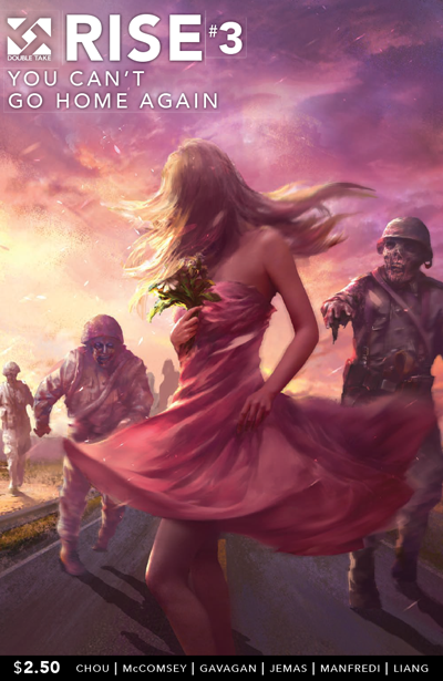
I’m going to take a stab in the dark and say that our covers that seem out of left field compared to the story, may in fact be foreshadowing the future. We know that the Double Take Universe is going to jump into the future at some point and there will be super heroes. My guess, the deputy is going to be one of those heroes… and I can’t wait.  I will also say that I find that formula brilliant. The problem with new superhero universes is that they don’t have the history to pull from like the big two. Well if you look at the now falling second company, you’ll see that an extensive history is important and Double Take has found an inventive way to manufacture a history for its world. I respect and enjoy the hell out of that.

There’s not a lot of dialogue in this issue. Frankly there doesn’t need to be. A lot of it is visual and what little we get is important to the story and the world. I like the mystery at the moment. It’s very thick and begging for a reveal, but for now, three issues in it works. If we hit five and it’s this thick then we might have a problem, but for now it’s just right. I want to know more and that brings me back to the series and the shared universe.

There’s three artists on the book so I’m not going to talk about any one artist since they’re basically an art team trying to make a fluid style. For the most part they’re successful and the book maintains a consistent look. I loved the layouts for the opening with Fred as he woke up in the bag. It’s all from his POV and it was very creative. There was another great scene that was something out of Serial Mom with blood on a TV that was great as well. Overall the art design is solid. Double Take is clearly more focused on artwork that tells a story and a unified look to their universe rather than highlighting artists and embracing their style. It’s interesting because comics usually are the other way around, but right now it works. The art supports the story and drives the narrative without narration or dialogue to support it. While it may not be the flashiest art, its very strong at telling the story and that's important in this medium.

We’re still learning how to read Double Take books. That’s something I mentioned in my previous reviews because the editorial team and the creative team are not trying to pump out what’s become the norm for comics. They really are experimenting with new storytelling techniques and I welcome it because it shows how amazing this medium is. What helps it though is that you have ten issues supporting one another. I really don’t see how anyone could be satisfied just following one series and while it seems crazy to read all ten, I find it incredibly enjoyable to do so. Imagine reading an entire comic universe step by step all in one week? Well you can and it’s a formula that I support. That isn't to say you couldn't just read each series on it's own, but its so much better with the other nine.


Score: 4/5


Honor #3 – “Blood Brigade” Story: Bill Jemas Script: Bill Jemas, Frank Ortega Layouts: Julian Rowe, Stan Chou Pencils: Jose Luis, Julian Rowe, Brent Peeples Colorist: Carlos Lopez Publisher: Double Take Comics Price: $2.50 Release Date: 2/24/16 Format: Ongoing; Print/Digital

LINE WEBTOON ANNOUNCES DYSTOPIAN YA COMIC SERIES ‘DENTS’ FROM ACTRESS BETH BEHRS

LINE Webtoon (http://www.webtoons.com), the popular digital comics publisher pioneering the development and distribution of comics worldwide, today announced that one of television’s leading ladies, Beth Behrs (Two Broke Girls) and actor/musician Matt Doyle (The Book of Mormon, Gossip Girl) are launching a new comic series entitled Dents. Launching this March exclusively on LINE Webtoon, Dents is an apocalyptic journey to the year 2111, where more than half of the world’s population has been wiped out by an ancient plague released by the melting polar ice caps due to global warming. Co-created and co-written by Behrs and Doyle, the series is told through the voice of an unapologetic 14-year-old girl named Eleanor. After a vaccination is developed, there is a massive increase in the birth of identical twins possessing extraordinary powers. What was first seen as a blessing to repopulate the Earth quickly turns to chaos as these powers manifest in mysterious – and often dangerous - ways. The twins, known in society as “Dents,” are ordered to be executed and aborted. Following an incident at school, Eleanor learns that she herself is a Dent, separated from her twin at birth, and she is quickly swept into an underground society made up of other Dents just trying to survive.

DENTS-Cover (1)"Matt and I have been best friends since childhood and I have to give him all the credit for introducing me to the comic book world. We are so excited to be writing this together and working with LINE Webtoon. Much of the story takes place in a post-apocalyptic version of the San Francisco Bay Area where Matt and I grew up. Our heroine, Eleanor, is a strong, young, powerful, complicated girl and we are incredibly excited to share her journey with the world. We are thrilled to be joining the LINE Webtoon family with Dents."

"Dents is something Beth and I have been passionate about creating for years. We honestly couldn't think of a better way to debut this story than with LINE Webtoon. Bringing Eleanor and this wild world to life with this incredible company is a thrilling opportunity,” said co-creator Matt Doyle.

“With the popularity of stories such as The Hunger Games, Divergent, and Maze Runner, the desire for quality Young Adult storytelling is at an all-time high,” said JunKoo Kim, Founder and Head of LINE Webtoon. “When Beth and Matt brought us the unique and thrilling tale of Dents, we knew that it would be the perfect series for that audience. The content they have created tells a dark and captivating story that we know readers will love.”

With 50% female readership, LINE Webtoon is dedicated to working with female creators, such as Behrs, and making it possible for creators without traditional comic backgrounds to take their fresh ideas and bring them to the masses.

Beth Behrs currently stars in the CBS hit comedy series 2 Broke Girls which is currently in its 5th season and appears in the indie comedy “Hello, My Name is Doris” which will be released by Roadside Attractions on March 11.  Behrs has also performed at the Geffen Playhouse and appeared on stage with the New York Philharmonic for their New Year’s Eve performance One Singular Sensation: Celebrating Marvin Hamlisch.

Matt Doyle is an American actor and singer-songwriter, best known for his work on Broadway in starring roles in The Book of Mormon, Spring Awakening, and War Horse. He also appeared in Gossip Girl on The CW. His debut pop album, Uncontrolled, written with Sony ATV/Publishing, will be released February 29th.

In support of this announcement, Beth Behrs will be a panelist on LINE Webtoon’s “Women in Digital Comics” panel at SXSW on Friday, March 18th at 12:30pm at the Austin Convention Center.

To download the official LINE Webtoon app, visit the Apple App Store and Google Play.

CBMFP 222: Like A Pastor's Collar

Stan Lee's retiring from Canada! Whatever that means. DC is rebooting, but they won't admit it... again. And Image isn't pulling any punches. This and some movie news. Books covered on this episode:

  • Huck #4
  • G.I. Joe vs Street Fighter #1
  • Sunflower #1-4
  • Clean Room

CBMFP-222-Full

Previously on the CBMFP...

Us Versus Movies: He Never Died

Say what? That's right we're doing this shit on the reg! Today Dustin, Kevin and Erin take a look at He Never Died. The film is starring Henry Rollins and written and directed by Jason Krawczyk. If you want to check out the film its available via a lot of on-demand options and such and we encourage you to check it out and join the conversation. We've gotten a few suggestions of movies to cover next, but we're always open to suggestions. Thanks as always for listening. UVM-He-Never-Died-Full

Previously on Us Versus Movies...

Monster & Wine: Episode 70 - A Lot From A Little

There is a lot of exciting soccer stuff going on these days and M&W are right there in the thick of it, recounting the matches that tickled their buttholes with a feather. Monster, always snacking (even though his body advises against it), has two new reviews for the people. First, the Quesalupa from Taco Bell, and the new Sweet & Sour Skittles...from any store that sells Skittles. Apparently (and obviously)...

Read More

IndieGoGo: Master of the Lords by Old Skull Comics

I felt like putting this one on the site because it's coming from Mexico which is cool, but also because it looks fun. The premise is pretty simple and the text below or the video above will tell you all you need to know.

IndieGoGo Link!

I bet you remember those magical 80's cartoons: Thundercats, Teenage Mutant Ninja Turtles, He-Man, Silverhawks, the list goes on. I bet you remember the toys as well, they all had a special vehicle, a lair, a playset. I bet you remember the smell of your warm TV screen, of your plastic action figures, of your favorite worn out comic book. That is the feeling MASTER OF THE LORDS is going after, the smell of your childhood, even if you didn't grow up in the 80's.

Imagine there was another cartoon, another comic, another toyline you knew nothing about, but it combined all the cheesyness and awesomeness of all the cartoons you love, even if it was just a ploy to sell toys, who cares? It had Rapping Astronaut Dinosaurs, Borderline Offensively Dressed Barbarians, Street Tough Extreme Sports Aficionado Mutants, and a Planet full of Ninjas!

Master of the Lords

WagakkiBand Announce SXSW 2016 Showcase Details

Japan's hottest export, WagakkiBand announced details for their appearance at Austin's SXSW 2016 festival where they will perform at the The Des Moines Embassy (Red River & 6th street) on March 18 at midnight run by Live Nation. As already announced, they will be stopping in New York City to perform at Irving Plaza March 14, 2016, headlining the night, “WagakkiBandLive in N.Y. – AKATSUKI". "Akatsuki" is the lead track from their newest album and means “Dawn" or “New Beginning”. Tickets for the Irving Plaza show are available for general public via Ticketmaster. WagakkiBand is an 8-piece band that fuses Shigin, poetry recitation rooted in Japanese traditional performing arts, Wagakki, traditional Japanese musical instruments, and rock music to bring a fresh and yet authentically Japanese live show. Their YouTube smash hit,“Senbonzakura” has over 34 million views and counting and their latest single, “Hangeki no Yaiba” is the theme song for the dTV original series of mega multimedia hit, “Attack on Titan.”

mainprofile

The band played to a sold out Club Nokia L.A. Live crowd as part of the Anime Expo in July 2015 and performed on Good Day L.A. They have been making waves with their mix of classical Japanese musical tradition and modern rock reaching #1 on the Japanese charts with their September 2015 sophomore LP, YASOUEMAKI, as MTV Japan named them an Artist To Watch. YASOUEMAKI is available in the US at iTunes, Spotify and other online stores.

Front woman Yuko Suzuhana is in fact the champion of a nationwide Shigin contest. Backing Suzuhana are 7 members playing traditional instruments including Shakuhachi (bamboo flute), Shamisen (3 string guitar like instrument), Koto (Japanese Harp), and Taiko (Japanese drum). They released their debut album Vocalo Zanmai in 2014, which hit Top 10 twice during a 22-week stay in the Top 100 of Japan's Oricon weekly charts while their video for "Senbonzakura" hit 10 million views within a few months of release. The video now boasts over 34 million views.

Review: I Hate Fairyland #5

I’m not sure what more I can say about Skottie Young’s I Hate Fairyland that would adequately convey just how much I’ve enjoyed this series. In a current industry climate that drips with saccharine positivity, it’s a real treat to see a book presented in an all-ages style that simultaneously rips the genre a new asshole. At times, even literally. Now imbued with the accumulated powers of Fairyland’s dark underbelly, Gertrude finally throws down with her would-be bubbly replacement, the appropriately-named Happy; herself awhirl with weaponized rainbows, unicorns and gum drops. And thanks to the illustrative machinations of both Young and colorist Jean-Francois Beaulieu, it is a spectacle to behold. In fact, Fairyland has probably the best gore this side of Luther Strode. Despite what you might think, given his widely popular cutesy covers, Young is an exceptional (and exceptionally gratuitous) bloodshed peddler. And I salute him for it.

I-Hate-Fairyland-#5-1Amidst pages-upon-pages of monster disembowelments, solar eviscerations, and your sundry flayings and blood baths, this issue wraps up as decisively as the series began. At the same time, perhaps surprisingly, it sets up well what promises to be an intriguing follow-up series, which I cannot wait to binge on later this year.

As simple as this book has been in its conceit, its characters and its storytelling, it is also driven by a creative team that is clearly bringing its A-game. Young really puts the “harm” in “charming” with this series, both in the way he flirts creatively with a profane dialogue, and in how he expresses that lost innocence visually on the page. He also sets up a legitimately interesting world here, with its jelly seas, syrup orcs and pancake caves. I would honestly play this as a video game or Candy Land-meets-Cards Against Humanity board game. Mother fluffer, how fun would THAT be!?

As I mentioned before, Beaulieu gives everything a slick, neon-candy sheen that makes devouring each panel that much more delicious. Letterer Nate Piekos, meanwhile, brings some of the most dynamic lettering I’ve seen since the halcyon days of he 90s,  when folks like Chris Eliopoulos would allow words to break free of their balloons with explosive vigor. Piekos affects a similar visual here, but makes everything fluffy and rounded, such that his letters are integral to the look of the book itself, rather than just a byproduct of its fabric.

I Hate Fairyland is that rare thing these days: a “cute” comic that doesn’t pull punches and is actually able to elicit some very real laughs. Missing it is not an option.


Score: 4/5


I Hate Fairyland #5 (of 5) Writer/Artist: Skottie Young Colorist: Jean-Francois Beaulieu Letterer: Nate Piekos Publisher: Image Comics Price: $3.50 Release Date: 2/18/16 Format: Mini-Series; Print/Digital

Review: Citizen Jack #4

Planned or not, the timing of Citizen Jack is brilliant. Releasing it during perhaps America’s most circus-like election cycle? A stroke of goddamn genius. Call it life-imitates-art, call it a happy coincidence, call it what you will, but the fact remains that Citizen Jack, especially in its fourth issue, is perhaps the most topical comic book today. At the core of proceedings this time is a political debate, which hosts all kinds of crazy; be it in the talking dolphin moderator, the rabidly idiotic audience, or in the titular Jack himself, whose presidential run is already a bad parody of itself. Sound familiar, America? On either side of this debate debacle is the story of a nobody who is desperate to be somebody. Jack is hungry to prove that he is not a joke, by any means necessary; and while that doesn’t make him necessarily “bad,” it does make him dangerous. It doesn’t help, of course, that he has fallen in with a fallen angel.

The best part of this issue, in fact, surrounds those two characters: Jack, and the demon Marlinspike, as we get closer to the nougaty center of what makes each tick, and the straits that have brought them together. I suspect that they are actually a lot more alike than either of them - or the reader - is willing to admit at this point. But seeing Jack’s lifelong tragedy set beside Marlinspike’s mystery has provided a strong and steady workhorse of a title.

Citizen-Jack-#4-1
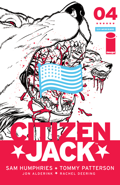
Somewhat surprisingly, given how it echoes the devils of real-world politics at the moment, Citizen Jack has quietly been chugging along, but I think it could turn a corner any moment into what could be an affecting supernatural tragedy. I won’t go so far as to call it “Shakespearean,” but the elements are there.

Tommy Patterson’s art style reminds me in a lot of ways of Nick Pitarra’s. It is cartoonish, even buffoonish, but it is also so stylized as to appear grotesque, and can definitely get creepy when a given scene so demands. Whether it’s in a hidden gun tucked within a waistband, fingers suddenly sprouting worm-like horns, or fresh blood on a white snout, Patterson and colorist Jon Alderink turn up the chills this issue.

I’ve been hard on Alderink’s colors in previous issues, noting how its consistency wavered, often between panels. And while that remains true here, he also applies some interesting veneers in the flashback and more hallucinatory scenes. Still, a more consistently measured approach to color wouldn’t go amiss when things get serious. But man, that page where we get a close-up of Jack’s beleaguered face? That thing is firing on all cylinders.

I hope political fatigue isn’t (ironically) hurting the allure of Citizen Jack, because it remains a very enjoyable book. It has a lot to say, not necessarily on the state of American politics, but on that of the American Dream, the destinies we hope are ours and what we’re willing to do to make both come true. Oh, and hell. Also hell.


Score: 3/5


Citizen Jack #4 Writer: Sam Humphries Artist: Tommy Patterson Colorist: Jon Alderink Letterer: Rachel Deering Publisher: Image Comics Release Date: 2/17/16 Price: $3.99 Format: Mini-Series; Print/Digital

Review: Freelance Blues #1

A book with the word "Blues" in the title sets a mood. I get a sad feeling from the word. Unfortunately that’s the same feeling I got after reading this comic. Freelance Blues is the newest title from independent publisher Alterna Comics. I admit I wasn’t familiar with the publishing imprint before I read this book but any place that gives indie writers and artists a platform is a friend of mine. The best piece of artwork in this book is the cover. Cover artist Michael De Mundo uses right splashes of eerie greens and smoky shadows. This is the only glimpse color we get during the issue.

Because I’ve read a lot of indie books I know that more often than not black and white artwork is a budgetary choice more than it is a creative one. In this story the artwork looks very amateurish and unfinished. From start to finish the drawings look like they belong in a comic strip where quality isn’t as a large a factor. There is clearly potential here in artist Vicki Tierney. Each character has a very expressive face when speaking. Unfortunately the background characters are not given that level of detail.

Freelance Blues #1The credit of writer is split between two: Ian Daffern and Mike Leone. On a positive note the concept here is fun. Lance, a young man is struggling to find steady employment in a number of temp jobs. What stops him from doing so is the strange appearances of vicious monsters. Lucky for Lance he’s prepared to fight these monsters with abilities that are not entirely explained. He seems to be a monster hunter... a freelance monster hunter. I did have a little fun during Lance’s first job as a telemarketer. Who can’t relate to having a mundane job at some point in their lives? The fun dwindles we are taken through a day in this mundane life call after call after pointless and unfunny call. It wasn’t even shown in real time and still the day felt like it went on too long. Scenes where Lance is going through banter with friend/co-worker Leon seem to drag for far too long. The dialogue is really cliché here making the scene feel unnecessary.

Speaking of dialogue, the lettering in this book was simply sloppy. This is another instance where creativity comes into play. Some writers prefer to hand-letter their books instead of digitally and I’m all for that when it is done carefully. Some of the dialogue was not even legible. Speech bubbles are filled with awkwardly aligned text through the entire book.

Monsters do show up several times in the book. Although the designs aren’t entirely original it is through the creature scenes that the art is at its best. I only wish more pages were dedicated to action scenes rather than the work scenes. I can’t help but notice plot holes in the action such as a group of men in intimidating suits that show up to Lance’ second job and are never seen again. A mysterious tape of no particular origin is handed to Lance and never hinted again. These breaks in the main story seem to distract rather than contribute. The cliffhanger is another point of confusion. It seems to come from nowhere and barely references anything previously seen in the book.

For any comic book creator a first issue is a make or break time period. Every page has to be used to push the story forward and leave the reader wanting more. I’m not sure what level these writers and artist are at in their careers but the fact that the comic was composed in a fairly decent structure is an achievement. It’s the flaws in both the dialogue and artwork that make this achievement invisible. Out of the outpour of recent indie titles this one just does not stand out.


Score: 1/5


Freelance Blues #1 Writer: Ian Daffern and Mike Leone Artist: Vicki Tierney Publisher: Alterna Comics Price: $2.99 Release Date: 2/17/16 Format: Mini-Series; Print/Digital


Trailer Time: The Adventures of Archer & Armstrong

I'm looking forward to the monthly return of Archer & Armstrong. I've enjoyed the teasers and this trailer, but enough is enough... give me the book already Valiant. At any rate, we'll just have to have this trailer hold us over.

In advance of the 10th Annual ComicsPRO Membership Meeting in Portland, OR, Valiant is proud to debut the official animated trailer and an extended look inside for A&A: THE ADVENTURES OF ARCHER & ARMSTRONG #1 – the FIRST ISSUE of the ALL-NEW ONGOING SERIES from red-hot writer Rafer Roberts (Plastic Farm, Shutter) and Valiant-exclusive superstar David Lafuente (Ultimate Spider-Man)! On March 16th, get smashed or be smashed when Valiant's award-winning adventurers go "IN THE BAG" for an insane rescue mission pitting Archer into the mind-bending maze of lost treasures and historical oddities that awaits inside Armstrong’s magical satchel!  (Oh yeah, and there are some ninja-nuns, a talking fish-man, and a Greek god with a thirst for revenge too... It's starting to get pretty rowdy in there!)

Review: The Twilight Zone: 1959

Not all television series translate into comics successfully. As a fan of The Twilight Zone I come to the comics with an expectation for nostalgia and enjoyment. Rod Sterling’s (the creator of the Twilight Zone) voice serenades me as I open up the first page. This special 48 page one-shot is broken up into three short stories and runs under the subtitle: 1959. All three stories are written by three different pairs of writers and artists. The cover is definitely an attention grabber showing a young modern day kid walking by a subway car filled with skeleton passengers. It’s a haunting image to say the least and upon closer inspection the clothing details of the passengers such as tobacco pipes and hats put them in an alternative time period. This time period is 1959. It’s also the setting of each of the three short stories.

The first short story is called, “The Laughing matter.” It begins with a short introduction of bank president Coddington Buckley III scolding his son Coddy for not completing a foreclosure assignment. The classic opening narration gives us insight into this cruel man’s fate in true Twilight Zone fashion. As the story progresses we see Coddington do everything to humiliate his son going as far as to reveal his crush on a female co-worker who he doesn’t approve of. Harsh.

TZ1959-Cov-A-LauWriter Tom Peyer paints Coddington as a larger than life stereotype of the big bad business man bully. Donald Trump comes to mind. His bullying is so over the top that it makes the character really hard to take seriously. Donald Trump comes to mind. His son Coddy has an interest in drawing and his drawings play a large part in the supernatural twist. The artwork in this story is somewhat skewed with everything looking just a little off. The shapes of the characters are rough with no one character conforming to a realistic body type. The perspectives of the scenes are draw slightly sideways. This gives an overall feeling that in spite of the bright, vibrant colors that something is wrong in this world.

There’s nothing really here except for the date on the calendar that sticks this story in the time period of the 1950’s. The dialogue is pretty modern as is the fashion. Several scenes of gore and violent acts made me question if this should’ve been a Twilight Zone title. By the end of the story justice is served but there’s little to take away morally from the story. Good people are hurt. Bad people are punished. That’s about as deep as it gets here.

The second short story is a coming of age tale called, “Initiation”. Two boys are begged by a new comer to join their “club.” The boys take advantage of the boy. They tell him to repeatedly go into his house and do things to offend his unseen mother. Each test results in an off-panel beating that neither we nor the boys see. For some reason each time the boy comes back he is just as cheerful as ever, doodling an off-putting portrait of his mother on an etch-e-sketch. Echoes of the 1950’s are more apparent in this tale, reflected in the dialogue, costumes and Atom bomb videos screened in a classroom scene. Colton Worley handles the artwork here masterfully. He sketched and colored it with heavy detail. The rich greens of the trees bring a calm feeling of childhood. Everything is a little hazy in texture like it comes from a memory. There are hints of Stand by Me in the way the kids interact with each other. It is however, really stifling after finishing this one. The predictable plot is complicated by a twist. It may require several re-reads.

The last story, “Comic Code” left me secretly jealous for one reason. In the 1950’s comic books were 10 cents! This story brings us into a fictional 1950’s era where a Stan Lee look alike, Dr. Richard Fredrickson leads a crusade to banish all comics from the populous. He is successful at this, turning comics into a dying medium. At surface level his reasons draw parallels to the very real comic code enforced in the golden age of comics in our world but as the story progresses his personal agenda is revealed and leads him to put his stamp of approval on a line of comics from a mysterious business partner in return for half of the profits. As a comic fan it’s hard not to want this guy to get what’s coming to him and he does. In a twist coming straight from the War of the Worlds the artwork explodes in the last few pages as gruesome alien creatures appear to serve bloody justice on Dr. Richard Fredrickson.

Overall each story serves the purpose of entertainment but the heavier content makes it hard to accept as a Twilight Zone title. These stories all lack subtlety and feel rushed to the climax. No room for mystery or build up. It’s almost like the writers don’t realize how hard it is to creep out comic book readers. The morals of these tales aren’t exactly clear either. The guilty are punished seems to be the running theme throughout the one-shot. The banner and the narration are all that make these stories feel like they come out of the Twilight Zone. Now if they were X-Files then I’d be more a little more fan friendly, but they aren’t and I’m not.


Score: 3/5


Twilight Zone: 1959 Writer: Tom Peyer, Mark Rahner, John Layman Artist: Randy Valiente, Colton Worley Colorist: Salvatore Aiala Studos Publisher: Dynamite Entertainment Price: $5.99 Release Date: 2/17/16 Format: One-Shot; Print/Digital

Review: Huck #4

To say that this series has been amazing is a bit of an understatement as Mark Millar and Rafael Albuquerque have delivered four issues that honestly put everything else being published… to shame. There is a line of dialogue in this fourth issue that I so want to spoil for you. I can’t even tell you what I yelled out loud after reading it because that too might spoil it. The delivery and emotion all come from the team as a collective which again shows how amazing and once in a lifetime this collaboration is. The story starts off with a writing device that I hate. I hate it because it’s overdone and rarely done in the way it was meant to be used. The reason it works here is because Millar is just giving you a peak at a flashback rather than having the actual story lead to what the opening shows. That’s the device, the “look at the future of this very issue you’re holding in hand.”

We start off by seeing Huck’s mother escaping her Russian captors and it’s fantastic. The reason it works as the opening is that once we’re clear from there, Huck’s brother tells us all about the mom. As he talks, we see the mother again, but when he gets to the escape Millar jumps over the action of said escape. The reason being that if you told that part of the story as a character in the story you wouldn’t be believable. It’s a cheat of sorts, but it works because the opening tells us that everything about the mother will be revealed. And it is.

Huck and his brother Bob decide to head out and find their mother. Huck says that it’s not that simple and that he needs a name or a picture in order to find someone. Bob provides her full name and they get going. Discreetly. Well as discreetly as Huck can be as he is still Huck and he stops for every emergency he encounters along the way.

Huck-#4-1That is something that Millar has done incredibly well throughout this entire series. Kept Huck consistent. It’s very easy and typical for any story to present their character how they want them to be seen and then through the course of running them through the story they lose that character. A lot of writer’s pretend that this is just the “character’s journey”, but really it’s faulty writing. Millar even teases that with the previous issue when it looked like Huck had lost his way. Millar did in one issue what other creators do in twelve.

Huck has never been more excited than to find his mom, but he’s still himself and needs to help others. His core personality trait is putting others before himself and so there’s no surprise when he stops to help ducks cross the road. Instead you just smile and say, “that’s Huck.” Or as his bother says:

“You really are something special, you know that?”

“No.”

“That’s why you’re special…”

I almost feel bad for Albuquerque. I mean the range of locations, people and things that he has to illustrate is just amazing. This series and in particular this issue, crosses the world. And he does it all in this comic book version of Norman Rockwell’s style. Hands down if he doesn’t win all or at least most of the top awards in the industry then we as a collective comic book whole are blind. Albuquerque is not only delivering his best work, but he’s delivering THE best work in the comic industry.

With that said you have to talk about the last two members of this collaboration. Dave McCaig makes Albuquerque’s art look beautiful. If you’re going to do muted and flat color tones, do it this way. I’ve read at least five comics this week that were attempting for the same style of coloring, but it’s nowhere as good as McCaig’s because his remains vibrant. Albuquerque may be illustrating in the Rockwell style, but McCaig is the one making it look 100% like it.

The unsung hero of this book is Nate Piekos of Blambot. Piekos is the letterer and designer of the series and I haven’t given him enough credit. Well it’s due. Piekos brings Millar’s words and Albuquerque’s art to life. He adds the voice and the dynamic to the words to match the artwork. The way he letterers yelling is perfect. It gives you the stern emotion behind the words without being comical looking. I’ve seen some yelling in comics that deflate the scene. If you don’t notice the lettering then I don’t blame you, when it’s done this well you should notice it, but it really is in command of your reading experience so be thankful that someone so talented it behind it.

Huck is a comic like no other. Frankly I don’t know or care if anyone else likes it because it’s their loss if they don’t. For me, this is the comic I run to read. This is the comic that reminds me why I love this medium and it’s the first book in the longest time to give me those butterflies in my stomach when I pick up the issue. Simply put, it’s the best goddamn comic out there.


Score: 5/5


Huck #4 Writer: Mark Millar Artist: Rafael Albuquerque Colorist: Dave McCaig Letterer & Design: Nate Piekos of Blambot Publisher: Image Comics Price: $3.50 Release Date: 2/17/16 Format: Print/Digital

Review: Adventure Time: Ice King #2

What’s cooler than being cool?  Ice KING!  Welcome back to the pediatric perversion that is the world of Pendleton Ward.  This six issue series is dedicated to the peculiarities that define our Ice King, hopefully providing some insight into why he’s such a princess snatching old coot.  Through what seems like innocuous run-ins with various denizens and princess’ we are deceived into legitimate character building! Adventure-Time---Ice-King-#2-1The Ice King is hunting for his ironically kidnapped penguin but needs the help of a super-cool and super-secret wizard gang to get him back.  And thus ensues a series of seemingly random encounters that, upon reflection, managed to successfully give us a peek under the royal robes to find a reluctantly helpful but also not helpful monarch.  It’s easy to write off these interactions as trivial and insignificant but by the time I finished the last page I was surprised at the quality of the sum of these character building moments.

But alas, the King needs to be cool and, as anyone with half a brain knows, if you want that cool and indifferent je ne ce quoi, you seek out vampires.  And unlike those twinkle toed pussies in Twilight these vamps got scary swag.  The search for cool takes us to some fun places and to some fun extremes, making this issue a weird cross between Adventure Time and Clueless.

What I enjoy about this series so far is how light and easy it is.  It’s silly and simple but don’t let that disarm you!  When I sat down to write this review all these ridiculous interactions between burger people and vamps and cool wizards accumulated to make a good character foundation.  It’s easy to almost forget that the Ice King’s ultimate goal is to recover his kidnapped penguin Gunter because it’s only lightly mentioned, but this remains a well plotted out book that will generate more than just a few chuckles.


Score: 4/5


Adventure Time: Ice King #2 Story: Emily Partridge Writer: Pranas Naujokaitis Artist: Natalie Andrewson Publisher: BOOM!/KaBOOM Price: $3.99 Release Date: 2/17/16 Format: Mini-Series; Print/Digital

Review: Dragon Age: Magekiller #3

For the first time DA: Magekiller is running into the major problem of cross media integration. Issue three opens with a well illustrated action beat to allow for some pretty heavy-handed expository narration. See, you need some knowledge regarding the activity taking place on the periphery of Dragon Age: Inquisition's main narrative to make sense of this issue's sudden and seemingly abrupt plot progression. But, writer Greg Rucka can't just expect every reader to retain basic plot details from another medium. So, issue three of Magekiller kind of races along, stumbling as it pukes exposition because the crux of this issue's action is tied to a specific pre-existing story. Once you wade through that pool of exposition (and a well illustrated action beat) this issue is a very low-key character piece. Dragon-Age---Magekiller-#3-1Speaking of which -- I appreciate Rucka's restrained use of action. It features heavily at the front of the book then exits altogether, giving way to some nicely written, clever banter. You get your sword-swinging and explosions out of the way early here. If that’s what you’re into.

Tessa gets her brief time in the spotlight while Marius shows his vulnerability by stepping into the background. Well, collapsing into the background. Previous issues may have made Tessa seem competent, but more of a sidekick to a skilled master. This issue confirms her position as the gifted people person of our mage killing duo. Here, DA: Magekiller makes it clear that the world has changed, becoming a far more dangerous place in between issues. Similarly, Tessa's role becomes more prominent as our dashing roguish leads transition into true heroes. Instead of running from assassins, our protagonists are spending time -- and, crucially, hard earned money -- on the collective well being of less competent civilians. And their heroics have gotten someone's attention.

Priority and responsibility seem to be central themes of this issue. Faced with the potential end of the world, our protagonists easily slip into the roles of heroes. As a result not much happens in issue three of Magekiller. Tessa gets fleshed out nicely. And the closing panels set up a major change to our heroes' motivation and direction. It’s a good momentum-sustaining issue.


Score: 3/5


Dragon Age: Magekiller #3 Writer: Greg Rucka Artists: Carmen Carnero and Terry Pallot Colorist: Michael Atiyeh Publisher: Dark Horse Comics Price: $3.99 Release Date: 2/17/2016 Format: Mini-Series; Print/Digital

Review: Kingdom Bum #3

This is an issue of chasing.  Chasing a dream?  No, not really.  It’s just really thumbless bums chasing thumb-ed bums for some dumb reason.  Ok, not really a dumb reason, it just sounded too good to not include that.  Consider Kingdom Bum #3 the politics issue.  Though we’ve had politickin’ before, this issue is saturated with it and, while it’s intriguing, the story does seem to slow down noticeably. Kingdom Bum #3Another one bites the dust.  Another bum death that has nothing to do with the story ushers us into the, um… story.  But the sporadic bum deaths are nothing to panic over when compared to the thumb chopping maniacs threatening the entire community’s way of life.  Masked in the unending scheming and planning comes an actual act of war but character motivations are still murky.  Sure we know people don’t want to die and want to keep both their thumbs but those seem like general human problems, not driving forces for story progression.

This murkiness I speak of manages to find its way into other areas of the story as well and even the artwork.  For example: a thumbless bum who was just the subject of a thumbless joke magically appears to have both thumbs a page later or even the assertion that too many rules and regulations inside the bum society would turn their world into the world of the home’d and job’d, implying that their homelessness was a conscious choice.  I know this story isn’t supposed to be taken seriously despite the dramatic events, but some of these inconsistencies stood out enough to separate themselves from the story itself.

This is a significantly slower issue than the previous ones.  It’s much more political and attempts to stir the intrigue pot with plotting and organization but never quite fully realizes that potential.  Despite that, the penultimate issue does setup a dramatic finish that should be a worthy romp to close out a fun story.


Score: 3/5


Kingdom Bum #3 Writers: Adam Wollet, Rick Marshall Artist: Jon Reed Publisher: Action Lab/Danger Zone Price: $3.99 Release Date: 2/17/16 Format: Mini-Series; Print/Digital