Review: Cobra #9

It’s not often that I review a licensed book from a franchise started during my childhood, but I’m actually enjoying G.I. Joe for the first time since Hawk was crippled during Devil’s Due’s stint with the license. The strange thing is that we’ve inadvertently covered the new “Cobra Command” storyline from the beginning. You may Eric’s review of the conclusion of the new Cobra Commander and then last week Carl’s review of Snake Eyes. Well this is part three and I may even go back and review part one so that we’re all caught up. This is the first series I’ve read that wasn’t written by Chuck Dixon, which is probably why I enjoyed it a bit more. Mike Costa concludes the battle between the Avatar/Aliens machines and Snakes Eyes with this issue. Frankly I tend to like stories that literally run from one issue of a series into another. After Snakes Eye’s and the white-haired chick bring down the fleet they skedaddle on out of there. This leaves Cobra to look at the surveillance videos of their newest tech being destroyed by one “blind man with a sword.” Bludd is full of great lines as he bashes on Cobra and their operations that is until the Baroness kicks him out of the room.

Cobra #9 CoverI can’t say that I have a good feel for the new Cobra Commander and having no idea how the original was acting prior to being dethroned, I can’t say if he’s cooler or not. I will say that he comes across a lot like the Devil’s Due Commander was, which was no-nonsense and all business all of the time. I think that’s what has always being jacked up with the Joes, everyone thinks of the bumbling Cobra Commander from the cartoon that had to lose every week in order to continue being appropriate for children. Now with the comics, everyone wants Cobra to be the dominating force and they make them too big and too strong.

Right now Costa and IDW have a good balance. Cobra seems strong, but sort of like Hydra was in Secret Warriors. They have this large hidden infrastructure, but all it takes is the Joe’s getting organized and kicking their ass to win. Costa does a great job with the dialog, everyone is pretty sharp with their tongues but not in an annoying way. Also it’s important that every not sound the same and Costa manages that. My only grip is that there is really no sense of the voice for the new Cobra Commander. Left to my own imagination I just pictured him sounding like a British guy from Star Wars… why not right?

The book looks good for the most part; there are a few hiccups in art department but nothing major. There is something actually entertaining about this book. It’s mindless and full of one-liners and explosions, but is still pretty good. At the very least it’s better than that shitty trailer for the second movie coming out this year. Lastly, you don’t really need to have read the first two parts to know what’s going on, but it would probably help in the long run of the story line.

Score: 3/5

Writer: Mike Costa Artist: Alex Cal Publisher: IDW Publishing Price: $3.99 Release Date: 1/18/12

Review: Dead Man's Run #1

If you missed the concept behind Dead Man’s Run then allow me to paraphrase for you. Hell is a prison, the worst and most dangerous prison in the world and someone needs to breakout. If you missed the zero issue of the series then I highly encourage you to check out our review or pick it up as a back issue at your shop. It was one of the best zero issues I’ve ever read since it actually did something for the story rather than just act as a giant ad for the series. The first issue picks up right where the zero issue left off which was a bit surprising. Captain Romero is laying half dead on the ground buried under a crate of gold bars. His men attempt to save his life, but he calls them off knowing that it’s too late. With his final breath he tells them to send him Tinker. Sam Tinker also works at the most dangerous prison on the planet, which is not surprisingly located in California. News of Romero’s death spreads quickly and soon Sam’s sister Juniper is in town to take him away. She’s worried about his safety, but she’s the reason he works at the prison in the first place. Her gesture is kind, but ultimately in vain as their car is hit by a truck killing them both.

00b_DMR1-01-CMYKcrop_1Sam wakes up in prison aka hell, completely confused as to why he’s there. He’s dragged to a cell kicking and screaming for his sister. Once there a ghostly woman steals his jacket because she’s cold, confused Sam yells out at here. This catches the attention of the guards and they come over and eat the soul of the woman. At this point Sam meets the others on his cell block including Morazzi who threatens his life for getting the woman (his best thief) killed. The really story kicks off when Romero and Tinker come face to face.

The story is great, it’s fast paced and intense and really keeps you turning the pages quickly. I probably read the entire thing in five minutes. Greg Pak’s writing just pushes forward and really doesn’t give you a chance to slow down and breathe, which works really well with the type of story it is. There is actually a lot of character development for Sam in the issue which was surprising due to the nature of the story, but the scenes with his sister and a later scene really give you a feel for what type of person Sam is. It does make you wonder why he’s in hell; it’s explained but the explanation more than like is just a cover to play into the story later on. That’s probably the best thing about this issue as Pak has placed hints of plot points within this first issue that are sure to come into play in future issues.

Let’s talk art! Tony Parker, Tony Parker! The art is of the highest quality and honestly I’ve come to expect no less from Aspen’s titles. The benefit of good art in this book is that does the great story the justice it deserves. Parker’s has this mixture of classic comic style with modern design. He gives each character a ton of personality with simple facial expressions that end up saying as much as the dialog. Parker’s art keeps up with Pak’s fast paced story and because of that the two elements are well-balanced.

I’m not surprised by how good this issue was since I enjoyed the zero issue so much. It has a lot going for it: plot and concept working together in harmony, great writing and fantastic art. Will Sam make it out of Hell? I have no idea, but I’m hooked on this book until I find out and that's why it's so damn good.

Score: 5/5

Writer: Greg Pak Artist: Tony Parker Publisher: Aspen Comics Price: $3.50 Release Date: 1/18/12

Review: Hack/Slash #12

I’m sure at this point Tim Seeley is probably tired of me reviewing his work each week, but frankly I’ve had nothing but praise lately. That’s not to say that I won’t always, but for now he is producing some of his best work. Hack/Slash is a book that I’ve followed near the beginning of its creation and eventually when it restarted at Image I grew pretty tired of it. Something about this week told me to give it another chance and I’ll say that I’m glad that I did. The issue opens with Cassie, Samhain and Cat Curio on a charter boat-plane over the Caribbean. They’re heading to an Island that may house the cure for the Slasher disease. As they land Cat tells the group about her research into the island and the movie studio that has led them there. This is the part that gets cool, because they talk about the possibility of their being giant monsters. Hold the fucking phone that is awesome! Really this is probably the coolest concept introduced into the comic since the idea that Slashers are caused by a disease.

Hack Slash #12I won’t go into too much about the movie studio and all of Cat’s research because there is something really charming about the dialog. The gist is that every “B” monster movie creature from yesterdays may in fact be real and very dangerous.

I really enjoyed the writing and story for this issue. I think the fact that the amount of supporting cast characters being toned down helps a lot. Then there is the fact that this is venturing out of the norm for our characters which pushes them into situations that you can’t simple guess the ending to. I also enjoyed the fact that Vlad was missing from the series. He’s a great character and he and Cassie have wonderful chemistry, but it again mixes it up by not having each other to rely on.

The art is as good as I remember it and really this book seems to be hitting a new stride that’s refreshing. If like me you gave up on this series or just fell out of love with it, then I recommend giving this issue a shot. The concept of the monsters alone is worth the price of the purchase. I for one will be back next month to continue the adventure and looking forward to what awaits.

Score: 3/5 

Writer: Tim Seeley Artist: Daniel Leister Publisher: Image Comics

Review: Danger Girl - Revolver #1

Remember when comic book series Danger Girl was hot shit? It was a huge hit with the comic community, mostly due to the sweet-ass art of J. Scott Campbell portraying super sexy sassy girls! Well that roller coaster of a good time is back in 2012 thanks to IDW! Since I didn’t read it the first time around, I’m going to give it a go for its return. In Venice, Italy the DG team consisting of Abby, Sydney, and Valerie (she’s not on the mission, she’s on Deuces’ boat) and Johnny and sit in their respected positions to execute operation: wedding crasher. Within seconds the operation is a success and the team thwarts the actions of a thief and recovers a valuable Peruvian ring.

DangerGirl_Revolver_01Back at Deuce’s boat, the team reconvenes to meet a guest by the name of Veronica Fox. Along with her is a mummified corpse covered in a shroud of mystery? Fox explains that the answers will be found in the casket country of origin, Peru. All the team has to do is meet up with Mrs. Fox's contact. The catch, Abby has some serious history with him! Then Abby cocks a gun and poses.

Aww yeah dawg! Danger Girl is back! Is that a good thing? I’m not sure. It’s a pretty campy read. From the dialog to the way the characters carry themselves. Action wise, it’s very over the top and tends to be a bit too ridiculous. But that’s okay. I understand that it is supposed to be a romp of a good time, so I’m angry and left shaking my head calling B.S. It has a cheesy summer action movie feel that has nothing but beautiful white people in all of the roles no matter if it makes sense for the story. Yet again it seems natural for this book. The art and colors fit the look and feel of the book, even though it teeters on the cartoony side but damn-it this kind of high jinks that works in the overall package that is Danger Girl: Revolver.

Like I said, I missed the Danger Girl extravaganza back in the day and this is my first time really digging in with the book and you know what? It wasn’t too bad and it looks like I’m ready to check out issue two, three and four. But that’s it, because it’s only going to four. Unless this sells like a mofo!

Score: 3/5

Writer: Andy Hartnell Artist: Chris Madden Publisher: IDW Publishing Price: $3.99 Release Date: 1/29/12

Review: Transformers - Autocracy #1

Transformers, growing up were the most coveted toys and one of the biggest series every boy watched in the 80's. Now some of us have been pretty disappointed in the recent things coming out: TV, movies, toys and comics. I believe this is a glimmer of hope to maybe bring “the spark” back to Transformers. Autocracy is going to be a bi-weekly 8 page digital comic put out by IDW. Cybertron before the War, he is being built for a purpose. Feeling better than before, but his spark feels dimmed. Orion Pax has one purpose: to up hold the law and end the epidemic of... terror. Torus City, Orion follows a lead with his other officers; Bumblebee, Ironhide, Prowl and Hound to a weapons dealer who has been selling to Megatron. There Orion and the other bust in on Swindle and his operation to arrest him and take him to trial. A battle breaks out and so does the smashing, crashing, fist flying and all ends in a big explosion. But somebody is watching.

Transformers_Autocracy_1_Cover_1377721115Okay, I’m going straight to the art and say you can judge this book by its cover. Its defining and captures the mood of the story. It’s gritty and makes it feel that you are on the wrong side of town and Orion looks powerful which he should. The characters are recognizable even though they are in their Cybertron form. You can see and feel the destruction of the battle. The art is just awesome and what Transformers needs.

The story is rather capturing and dark in ways. Orion Pax is powerful and just made for one purpose to uphold the law. The Autobots are shown as a ruling class that has oppressed others to uphold order. It just shows a different side of the Autobots/Decepticon story and how it progresses to the war. The story set the mood before all out war and clashing that is about to come.

This is the story that has so much potential to bring back the old fans that have disappeared. It doesn’t feel watered down. The art goes well and sets up mood, grittiness and power. This is a good start in the right direction after Hollywood took over. It’s even better because it doesn’t take place with the other two books releasing. I would definitely read the first issue but its digital so you won’t find it at your local shop. Let’s hope this stays strong and finishes as well as it starts.

Score: 4/5

Writers: Chris Metzen and Flint Dille Artist: Livio Ramondelli Publisher: IDW Publishing Price: $.99 Release: January 18, 2012

Review: Memorial #2

Dustin reviewed issue one, and I usurped his power to review number two because this is one of the best comic books to come along in some time. I am pleased to discover a comic where the creative team knows how to tell a story, incorporate visual storytelling, and not blast me with panel after panel of superfluous dialogue. I have read a great deal of fantasy literature, and I respect what Chris Roberson does in his world building effort in Memorial. Issue two follows Em, fresh from fleeing the Dragon’s Teeth statues sent by Hook. Schrodinger the Cat (nice nod to quantum mechanics) mentors Em on the goings on of the fantastic intersecting worlds. The explication moves well, and it doesn’t bog down the story the way such explanations do.

Meanwhile, Hook enters the Shadow Court and enlists the reluctant Oberon and Titania to help find Em. When he finds her, Hook chases the young woman because she wields a key to open a door to different dimensions. A shadow boy intervenes and saves Em. Or does he damn her to a fate worse than Hook? Only the ensuing issues will reveal.

Memorial2coverRoberson blends established fairy tale worlds with enough surprise that I never once rolled my eyes at some of the allusions depicted in the book. So much mystery has been interwoven that I did not know what to expect, and I loved the element of surprise that permeated the issue. For instance, the Land of Maybe has a castle with a gryphon flying overhead, fairies in the shrubs, and two robots running amidst the foreground. My mind is racing with the possibilities that could derive from adventures in such an environment. This book made the familiar unfamiliar.

Em is not a helpless maiden, nor is she the Sarah Connor butch, over-the-top female savior. Instead, Em links the reader to the story with the same desire to unlock the secrets of these intersecting worlds. She’s inquisitive, vulnerable, and grounded: a perfect liminal character.

The artwork is an interesting balance of Daniel Clowes and Art Adams. While not being cartoonish, the illustrations give the impression of architectural drawings depicting proposed buildings from a theme park expansion. The artwork maintains a Grimm’s Fairy Tales styling.

So the three things I walked away with from this book were clever and intelligent storytelling, the sense of possibility that existed from the structuring of plot elements, and a selection of artwork that complimented the nature of the book instead of conflicting it.

I finished Memorial #2 with the same felling I did when I first saw The Chronicles of Narnia: The Lion, The Witch, and The Wardrobe in theaters: elation. As goofy as that sounds, I had that warm feeling inside from experiencing an adventure into a fun place and time.

I’m not a huge fan of comics that depict everyday life. Those books are brilliant in their commentaries. For me, a comic needs to be a departure from the life we experience everyday. When a comic allows such a suspension of disbelief through a sensibly constructed work, the book becomes literary. Memorial is literary, artistic, and engaging. That’s great storytelling.

It’s been too long since I had fun reading a comic book. Memorial reminded me of why I enjoy this medium.

Score: 4/5

Writer: Chris Roberson Artist: Rich Ellis Publisher: IDW Publishing Price: $3.99 Release Date: 1/18/12

Review: Prophet #21

I’m sure that I’m not alone when I say that I’ve never read a single issue of Prophet before this issue. I have no idea what happened in the previous twenty issues and I’m sure when they come to print in trade paperback Image will sell quite a few to people just like me. Although I wonder if I’m lining Rob Liefeld’s pockets once again, I can’t help but enjoy and recommend this book. The story is weird to say the least. We open in the future as a pod that resembles something out of the TMNT cartoon, digs its way up through the ground and out pops John Prophet who instantly pukes. He then activates his implants, which is good because he’s going to need to fight off a hungry creature with a Predator style mouth. His implants kick in and he boots the creature off of him and whips out a machete looking blade. He makes short work of the creature and begins gutting it for food. He explores the contents of its stomach and the scene resembles something out of Fallout, only instead of a reward of supplies it’s mostly fingers and a hand.

Prophet #21 CoverJohn takes off towards his mission and continues running into new and dangerous animals looking to eat him, but nothing is a match for his implants and machete. He comes across a small town functioning as an Oonaka meat farm. Basically monkeys are the new cattle as they’re slaughtered for meat and milked. John continues on his mission as he spots a crashing ship heading to Jell City. There he will find more information on his mission and key inventory that he’s still missing.

Ever read a book that you didn’t quite understand where it was going and overall it was just weird? That is this book to a "T". It was strange and yet not in bad way, it kept me interested from beginning to end and I couldn’t wait to see what the next page held for me. I will say even the page that alluded to freaky alien sex wasn’t enough to scare me off. This is one of those stories that could only exist in comic book form and shows why the medium is so special. This could be a number one selling book, but it would never be adapted into a movie or any other medium due to the strangeness of the story.

I don’t know if writer Brandon Graham worked on the series before and frankly I don’t want to know. I would much rather continue the belief that he simple picked up the reins and continued the story. Graham has a wonderful narration that does the heavy lifting of the issue. The bits of dialog that does exist is very good, but the narration gives information that adds to the weirdness of the story. I didn’t know this character before the story began, but afterwards I have a sense and look forward to reading and learning more about the world of Prophet.

The art really steals the show. The story is weird for sure, but without Simon Roy’s pencils and Richard Ballermann’s colors… I’m not sure this would be the same book. Roy creates an unbelievable world and then makes it believable. The designs of some of the creatures are almost repulsive, but stop short of turning your eyes away. Ballermann’s colors give this strange book a tone and feel that is unique to itself and do Roy’s pencil’s the justice they deserve. Without this art team, this book’s quality would sink considerably.

I’m sure that there are a lot of comic readers today like myself that never got into the Extreme line of books and only remember Captain American Fighting American. Though I hate Liefeld’s art if he really played a hand in creating this world than hey… good for us right? Good in the way that someone else saw its potential and delivered a fantastic story which is probably one of the best of the week. So give Liefeld some money because this is actually worth it.

Score: 4/5

Writer: Brandon Graham Artist: Simon Roy Colorist: Richard Ballermann Publisher: Image Comics Price: $2.99 Release Date: 1/18/12

Review: Charismagic #4

On a whim I picked this up to read it. It was a surprise and quite interesting. I'm not to big into the magic scene and where stories can lead, but this one has two true sides of the coin and the battle between them. To get where we are magical beings are on earth and the humans are in the void, we find that Samsun and his force of witches are facing the wizard Kon. The witches bind Kon and wait for his allies so Samsun can seek his revenge. Outside in the jungles of Costa Rica Sudana and Hank seek out Kon. On their path they run into the Guardians of Kon and find out that have been over powered by Smasun and his allies. Sudana being a druid can see all magic, but the witches have cast a spell to make her blind to their movement and plan.

CHARISMAGIC-04a-RandolphIn the void Hector and Alle have arrived to their destination the flies were taking them to. They find a shaman named Serke who has noticed Hector's tricks and has perceived them as magic. With Hector's fancy talking he convinces Serke to open a portal to Kon but without a thing of Kon he can’t, but they open a portal to Hank. When the portal is open Sudana is speaking to Hank on how he can do more than he can imagine and he is the answer to Samsun.

The story was actually quite interesting in the point that it pits different sides of magic against each other. It is a little predictable but it still presented well and may seem a little long if it keeps moving at this pace. This book builds toward the climax of the story and sets the conflict in full force but starts showing the way out.

The art is very vivid in colors and easily sets the good and evil characters apart. The art is very crisp and clean which I noticed in Aspen titles. The detail is really good too; in the first panel you may recognize a wizard of Lord of Rings fame. Each character flows with each other and interacts well. You see the emotion and power in each character.

This book may not be a game changer but it’s refreshing to what’s out there. A definite recommendation if you enjoy these types of stories. I enjoyed see that its magic set against magic with humans in the middle and not magic against humans. If anything if you enjoy comic art take a look it pretty darn good.

Score: 3/5

Writer: Vince Hernandez Artist: Khary Randolph Publisher: Aspen Comics Price: $2.99 Release: 1/18/2012

Review: Ghostbusters #5

Ducks quack. Dogs bark. Porn stars fuck. Ghostbusters bust ghosts. But not in this issue.

This is the first Ghostbusters book that I get the chance to review. I have a soft spot in my heart for this franchise because the 1984 film got me hooked on movies and ghosts. I looked forward to loving this comic.

But I didn’t.

GB5CoverOkay, instead of blasting this comic book the way I heckle kindergarten plays for sucking like they always do, I want to offer suggestions as to how to make this comic great.

Don’t have the Ghostbusters meandering all issue. Set up a spooky scenario and have the guys interact with the ghost in the issue. This book is nothing more than a set-up to the next issue. And that’s a cheat to fans.

A Pennywise from It looking clown at an amusement park goes nuts and spews spectral bats from his mouth. What. The. fuck. Meanwhile, Egon and Peter babble about how terrible it is to be under the direction of EPA dickless wonder, Walter Peck. And Ray tries to find a legal way around Peck’s control.

I understand the plot point of having the Ghostbusters answer to Peck; it has the potential to lead to a build-up when the guys triumph over him. It’s a basic plot device to put the heroes under the sway of the enemy. But it seems so illogical that in the movie Peck wanted to shut the Ghostbusters down, and now he keeps them running. I’ll give that one more time to play itself out and see if this is going somewhere.

Nevertheless, the guys only gear up at the end of the comic with a ‘to be continued’ fuck you to the readers conclusion just when the book gets some momentum. Please, creative team, if the title is Ghostbusters, bust one ghost somewhere in the issue. The comedy falls flat, and the dialogue is excessive.

The artwork takes some time to get used to, but I will give it a pass. The styling is something akin to Japanimation cartoons. No biggie—it is what it is.

But in the closing pages of the book there’s something fun and exciting. Some of the design sketches are batshit scary, and the bio page on “Sam” Hain was creepy cool. I usually ignore these pages in other books, but the concept sketches mesmerized me. I hope these drafts will work themselves into future issues.

This is a great licensed product, and the potential to be a hybrid horror/comedy product is there. This filler issue just fails to deliver. I will give this book a few more issues to find its place. But if it keeps up this way, I’m jumping ship for some other 80s license like Caddyshack.

Score: 2/5

Writer: Erik Burnham Artist: Dan Schoening Publisher: IDW Publishing Price: $3.99 Release Date: 1/18/12

WTF: These Are Creepy As Hell

I found this on the interweb and it scared me. What scared me more was there were Marvel employees talking about how cute the Red Skull is. That's great Marvel, way to make a super Nazi cute... just what the world needed. I don't understand why these exist and frankly if I see one in the wild I'll probably fucking shoot it on sight. Also, what the hell is everyone's obsession with movie Loki? It's strange and I don't like it... or these toy things. Terrible. Freaky+Ass+Marvel+Toys

Bastard Banter: Episode 1 - Astonishing X-Men Motion Comic - Chapter 1

Something that Kevin and I have always talked about doing is our very own "Riff Trax" style of recording. Well we finally did it and you are about to bear witness to it. If you're unfamiliar with the art of "riffing", then Google it since it'll take me a long time to explain it to you. I will tell you that you'll need a copy of the Astonishing X-Men Motion Comic from Marvel Comics which you can get on NetflixHulu or Best Buy(that's my favorite I want to see your dedication to these five minutes of terrible entertainment). We'll tell you when to sync the two and then you can enjoy listening to us, watching the terrible thing that is known as a motion comic and making fun of it. If you enjoy this then leave a comment and we'll do the rest. 928947

Review: Animal Man #4

Review by Connor Russell This is a series that I am happy to admit I read. Just when I thought that hero comics were dead, this came along. Its bizarre story and artwork is what has kept me going. And because of it I wanna get my hands on some Sweet Tooth. I shall say now, get this. But now I shall get onto the review, that is what you wish to read.

So Buddy Baker (aka Animal Man) and his daughter Maxine have gone to The Red. The web of life that connects animal life. Turns out Maxine is the avatar of The Red and Buddy was only a pawn. They have been hunted by creatures of The Rot (basically screwed up life forms) and do battle with them. Whilst this is happening Buddy's wife and son are trying to get somewhere safe and little do they know the detective escorting them is the last creature of The Rot.

animal+man+4Jeff Lemire continues to write this series, which has been my introduction to the character. I find that his story telling to be very intriguing. He has pulled me into a world of crazy and I don't want it to end. The idea of The Red being a place and Buddy not being all that special, The Rot. It feels like there is gonna be something big going down soon because the suspense is building high. He seems to writing up an entire mythology surrounding The Red and Animal Man, so that gains my interest even more.

The pacing in this issue, like all of the previous ones is superb. The movement through the pages is fluid. Lemire is able to combine drama, action and almost horror very well. Switching between one of these three before you get bored with one.

Going onto the art, it is again done by Travel Foreman. His art is just as twisted as Lemire's writing. Being able to bring the crazy to life mustn’t be easy but I am always blown away by his art. He is not overly detailed (unless it's the creatures in The Red and Rot). I found myself taking my time to take in the monstrosities and everything else.

I pretty much gave you my conclusion in the intro but I'll try to be different. Its both the writing and the art that really sets this comic apart. Lemire will certainly have you enthralled with this story that he has brewing and Foreman's art brings it to life. I truly recommend this and if you have not yet got it, then please do so. You are doing yourself a favour and you will not regret it.

Score: 4/5

Writer: Jeff Lemire Artist: Travel Foreman Publisher: DC Comics Price: $2.99

Shit Comic Book Nerds Say

http://www.youtube.com/watch?v=APUZbSlAN6M This video made me chuckle so I figured I'd share it all with you. It's pretty damn accurate as well, but really should have been titled, "Shit DC/Marvel Fanboys Say." That would have been more accurate since Atomic Robo is the only Indie book in the video and it's not even acknowledged. At any rate, it's still pretty good.

Episode 12: Comics On Your TV... Kinda

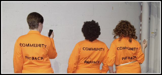
This week Dustin and I chat about comics, mostly of the indie variety like Rachel Rising and such. Then the conversation turns to the television show The Misfits (on E4 and I think I said channel 4 on the PC, whatever) and the new Blade cartoon/Anime ( remember the live action Blade that lasted 5 seconds?) that's on G4! So if you're not up to date on either show be warned!  Even if you are up to date, be warned. So just sit back, enjoy and let us take you away... community_blowback_by_ccpcosplaygallery-d3d7xbo

Review: Nix Comics Quarterly #4

Hey it didn’t take me forever and a day to get back to reviewing the newest issue of Nix! Really have to say that I enjoyed this issue the most thus far and it has me looking forward once again to the next issue. Nix continues meshing the world of music and comics in this issue that is stocked heavily with comedy. If you missed the review for the first three issues you should check it out as well.

There are seven short stories in this issue and only two reoccurring characters that include: Bus Stop Ned and our band of Vampire killers. The first story follows Eddie and Squid, two biker gang looking dudes that just robbed store. They reflect on what happens in the afterlife, after nearly losing their lives in the robbery. One of them recounts the tale of his mother’s out of body experience and the trumpets and golden light waiting for her. The other man calls bullshit on the story and the two get into a fight that ends much differently than you would expect.

Nix Comics #4 CoverThe next story Mono-Nomicon is goofy. There is no other way to describe it, but it’s a very fun story. Two boys buy a psychedelic Sumerian incantation rock LP and play it backwards to summon demons to assist them. What ends up happening is that the incantation they speak brings two mummies back to life with startling results.

The Bus Stop Ned stories were as usual, very funny. I particularly liked the one about Ned making an “app.” All of the stories were very good in this issue and read very quickly. There was the continued theme of vampires, rock music and the devil in the book which gives the different issues one unifying connection.

The writing and art continue to be unique, stylized and interesting. I enjoy seeing the different styles for the art and especially on Bus Stop Ned. The different takes on the character are always fun and gives each story a bit of quirkiness that keeps it from being the same each time. In general this series is very unique and continues the tradition of music and comic books that I spoke so highly of in my first review. I can’t wait to see what happens in the next issue and hope that more people find the series and become inspired by it to do their own “music comic books.”

Score: 3/5

Writer: Ken Eppstein (Main writer) and Rachel Deering Artists: Andy Bennett, Glen Ostrander, Ryan Brinkerhoff, Bob Ray Starker, Donovan Roth, Matt Wyatt, Darren Merinuk Publisher: Nix Comics Price: $5.00 Release Date: 12/11

Review: Superman: The Man of Steel #18

December of 1992 saw Youngblood 1 & 2 being sold for $5 from American Comics and Entertainment (remember their ads that usually took up two pages in a standard ish?). X-Men rebooted under the pencils of current DC Overlord Jim Lee. And Todd McFarlane was well into Spawn after leaving Marvel and Spiderman at the altar. Every comic book or event was marked with a trading card set (even Ghostrider had sets, one with glow in the dark chase cards—go figure!). And DC utilized a diamond countdown on the front of each book to make continuity as confusing as Algebra II.

In the real world, William Jefferson Clinton was elected president, Hurricane Andrew blew the South, and Charles and Diana split. No wonder why I read so many comics and ignored the news.

SupcoverDC began a plot to kill their flagship character, Superman. The Kryptonian villain Doomsday marched through the DC Universe starting with a cameo in Superman, Man of Steel #17. Issue 18 marked the first full appearance.

Superman: Man of Steel #18 starts with Doomsday wreaking havoc and crushing small woodland creatures. At this point the villain has just broken out of his prison and appears in bindings that make him look like a steampunk surgeon.

Issue 18 focused on a young boy named Keith wanting to get Superman’s attention, so Kal-El would save the boy’s missing mother from some monsters in the sewers. Those monsters are the Underworlders who want to steal Metropolis’ electricity. Superman dispatches the bad guys with ease while Doomsday’s wrath increases.

Fuck you, angry birds.

The book is standard fare in the way comic books go, yet the whole story arc marks the zenith of the comic book, action figure, and trading card bubble of the 90s. This was the time that spawned gatefold, prismatic, die-cut, and holographic alternative covers. With the surplus of overpriced, poor quality comics, the appreciation for the medium bottomed out, and so did the collect-ibility of comics.

Superman 75 was the conclusion to the story arc and period of comic book dominance. From that ish we get the iconic image of Lois Lane holding a broken and battered Superman. How poignant and truly heartbreaking.

What I find interesting about the story arc was the decision to coincide the number of panels with the chapter of the story. Here are the books in the “Death of Superman” storyline and the breakdown of panels:

Book

Issue

Chapter

Panels per page

Superman: Man of Steel

18

1

About 5

Superman

74

2

About 5

Adventures of Superman

497

3

4

Action Comics

684

4

3

Superman: Man of Steel

19

5

2

Superman

75

6

1

Sup Panel“World Without A Superman” and “The Return of Superman” storylines were meandering and ponderous. (Remember Superman Blue/Superman Red?) One highlight from the series came from Lois speaking with a grieving Martha Kent. Martha could share her sorrow with no one else, for she never wanted to betray her son’s secret life. Again, that was a phenomenal touch to an otherwise terrible story arc.

Nevertheless, Superman: Man of Steel #18 was the story that had Superman and comic books the talk of the nightly national news. Maybe it was metafiction (the book reflecting the real world) because Doomsday signaled both the end of The Man of Steel and the comic book bubble of the 90s.

The run, naturally, has been collected in a trade paperback. Nevertheless, there’s something nostalgic and wonderful about owning the series of actual comic books, including the black, poly-bagged #75 with all the goodies intact inside.

Although Superman: Man of Steel #18 isn’t Golden Age, vintage, or comics-code breaking, it does hearken back to a most recent time when comic books were culturally more important than they are now.

Having a copy of this book is the equivalent of having a piece of the Berlin Wall.

Writer: Louise Simonson Artist: Jon Bogdanove Publisher: DC Comics Price: $1.25 (2012 price $3-$6) Release Date: December 1992

Review: Black Fire (OGN)

Since I became a comic reviewer I’ve rarely had time to sit down and finish a graphic novel. I look at the page count and think about how much else I need to get done and it instantly goes to the back burner. It’s something I’m trying to fix since I’m sitting on way too many trades to review. I took a random chance on Black Fire from Archaia Entertainment, I wasn’t really given any advanced notice about the book other than the synopsis and the fact that it was created, written and drawn by one man: Hernan Rodriguez. The book is set during the Napoleonic wars and opens on an intense action sequence. A soldier is running, but from whom or what it is unknown as the page slowly zooms in on the fleeing man. Instantly we get the sense of danger and intensity from the first page of the story. The next page shows the same man getting his head taken off by someone else on horseback, only to be shot off the horse by another French soldier. A foot battle breaks out as the man is still alive and it ends up taking the help of two more French soldiers to kill the unmounted man. After taking a moment to rest, one of the men listens to the ground and can hear the gallops of more horses coming straight for them. Tired and bloody, they begin running for the forest clearing at the bottom of the hill they’re on. One of the men takes a bullet through the shoulder, but they all manage to make it to the tree line where their pursuers stop short of.

Black+Fire+CoverThey make camp of the night, not worrying for the moment why the Cossack’s didn’t kill them when they had the chance. During the night one of the men, Ducasse, has an intense dream about a creature feasting on the corpses of dead soldiers. He yells out at the beast to stop, but it doesn’t listen. He’s joined in his dream by the soldier that was shot. He’s now a ghostly white apparition with a head that is on fire and tells his friends that he’s dead, but also that he’s better off than him since he’s fucked. The next morning the two living men Ducasse and Serpierre cover the dead man in snow and begin looking for protection from the cold.

They come across a town that looks run down and deserted. They begin exploring until they come across a well in front of a church. Feeling a sense of relief they run to the well until someone calls out to them to put their guns down. They duck for cover as they call out that their Napoleon’s men. After a short exchange their brought into the church and introduced to a random batch of survivors all huddled around a fire. There’s people from all walks of life in the group: thieves, other French soldiers, a Portuguese soldier, an ex-prostitute turned army cook and a man so sickly that he’s locked in another room. He’s a sickly sight and the key to all the trouble that is about to begin for the camp of refugees.

At first the story seems like a period war story, but soon after the sickly man dies it turns into horror/thriller story in which an ancient evil begins killing the group off one by one. After each murder it uses the soul of the previous victim to trick another victim into falling into its trap. Soon the group is at each other’s throats and yet forced to rely on each other in order to survive and figure out what they’re up against.

The concept of the story can really be summoned up as such: John Carpenter’s The Thing mixed with Event Horizon set in the Napoleon War. I know reading that you’re going to think that I’m full of shit, but really that’s what it is and it works. There are several slow parts, mostly the pages in which we're forced to hear everyone’s sob story of how they got there. It’s not terribly interesting and it usually comes right before they die in order to give you some sense of loss when it happens. It’s successfully executed with a few of the characters, but otherwise falls short. The rest of the time you’re reading intense action sequences like I described at the opening of the book or horrific scenes that will truly creep you out. One scene in particular shows the evil entity tricking another man into eating his dead friend that he’s masking himself as. It’s disgusting and yet adds to the intensity of the story.

Creator Hernan Rodriguez crafts a great story full of intrigue and violence that should capture the attention of any comic fan. His story is very different from most horror stories. His characters are mostly unlikeable and yet you root for them due to the terrible circumstance they find themselves in. I also enjoyed the way he didn’t pull punches with the characters. Due to the cold environment they find themselves in, most of them are victims of frostbite and have lost fingers and toes. Yet they persevere and it makes them stronger characters for the most part.

What Rodriguez does right with his horror/thriller story is that his characters act realistically in the situation that they’re in. They don’t instantly become heroes and take on this great evil, they want to get the hell out of the town and never look back again. Also the world surrounding them is also very real, even if there is a supernatural aspect to their struggles. The frostbite, the food shortage, they are constantly forced to deal with real events that affect them as much as the evil trying to kill them. In particular I enjoyed the fact that they were all weak from being cold and hungry and didn’t look like supermodels. One character’s eye is constantly red from exposure to the cold and trauma and these little details make the horror all the more real when it happens.

More than the story I enjoyed Rodriguez’s art style. It felt Japanese inspired with the uncombed hair and yet maintained a European style for the most part. I can tell that this comic was not created with the American standard for comic books. It breaks panels with dialog and has several movie inspired scenes that give the book a feel of actually moving. The only place that the art struggles is in the character designs. Granted most of the characters are French soldiers wearing similar uniforms based on their rank, but a few of them look almost exactly alike. At one point I thought one of the main characters were killed until I re-read the page and corrected myself. Even still just turning the page of the book my eye’s told me it was one of the main characters. In general though the art style is very good and hopefully we see a lot more of Rodriguez’s style and fantastic coloring abilities.

You may think to yourself that this book sounds weird and creepy and frankly it is. I don’t think I could compare this book to any other comic I’ve ever read. I could easily find other artists to compare the style too, but not the story. It’s very strange and yet interesting. Additionally, I wouldn’t be surprised if Hollywood tries to make this into a movie since the formatting is basically done for them already. The bottom line is that I enjoyed it a lot; I went in knowing nothing and expecting the same. I ended up with a great original graphic novel that excited me to read more.

Score: 4/5

Writer/Artist: Hernan Rodriguez Letterer: Troy Peteri Script Translation: Anna Rosen Guercio Publisher: Archaia Entertainment Price: $24.95 Release Date: 12/28/11

Review: Maken-Ki Battling - Vol. 1

I've been watching a shit ton of Anime lately and thought, "you know what? I should share this info with others." That is what we do here, share info and opinions and such. With that said, I'll be picking an Anime each week that I'm either watching or have just finished watching and telling you about it. It's not a review, more of a spotlight or some crap. This week is Maken-Ki! But if you search for it in America you better add "Battling Venus" to the end of the title. Funimation apparently feels that American audiences won't understand the title if they don't add "Fight", "Samurai" or "Boobs" at the end of it. I found the program on Hulu, although I'm sure there are several Anime outlets such as Crunchroll or even the Anime Network that you can also find the show on.

makenki-1024x730

The gist of the show isn't 100% original, but it made me laugh and entertained me. I call this genre, "Average boy with too many girl suitors." The story begins with a boy named Takeru attending his first day at a new school. He's enrolled at the school because it's just opened up as co-ed. He figures there won't be as many boys at the school so he'll be knee deep in pussy. He's reunited with his childhood friend who happens to be a mega-babe that wears black stockings with her school uniform. The basic trend of this show is that all of the girls skirts are too short and the camera angle is always pointed up their skirt. Takeru is the typical clueless male, his clueless nature is the viewers gateway into the world. Essentially, as he learns about the world so does the viewer.

The thing that I found different about Maken-Ki was the fact that Takeru is a major pervert. Usually in the "Average guy with too many girl suitors" genre the guy is extremely nice and never takes the opportunities present to him. With Takeru, he too doesn't take the obvious opportunities, but he chases glimpses of boobs and the magic "V" constantly. In fact he meets his first male friend while peeking at the girls taking their physicals. Sure when women throw themselves at him he does nothing, but he's throw into daily situations in which he walks in on women changing or half naked. This is of course due to the fact that he lives with three female classmates.

Yup, pretty much.

makenki

There is also a very dark side to the story that really is barely touched up on in the first twelve episodes and to be honest the comic book was much better. Even still I really liked the show and basically watched the entire thing in two days. I will say that if you watch it on Hulu, strap in for the commercials. The first six episodes I was forced to watch three commercials each break. If you're familiar with Japanese cartoons then you know that after the opening there's a break so you're basically stuck watching five commercials off the bat. Who watches the opening each time, no one.

There you have, my Anime pic of the week. Got something you think I should watch? Let me know in the comments. Until next week-- Space Cowboys.

Score: 4/5

Review: Grimm Fairy Tales: Myths & Legends #11

I have a bitter-sweet relationship with Myths & Legends, I want to like it… but usually don’t. When the second story line kicked off for the series I had already checked out. In fact I didn’t stick around to figure out how the first story line even ended. But after being stuck on a plane for several hours I was desperate to read anything and thus I gave a lot of titles that I usually don’t read a chance. I can only describe this story arc as The Little Mermaid with a superhero godmother. I’m not sure who the character is, but she’s dressed like a superhero and she’s hot on Esmeralda’s trail. Unfortunately, when she dives under the sea (pun intended) she’s on Esmeralda’s turf. After being captured she’s privy to the secret origin of Esmeralda. Once she was a human that fell in love with the god of the sea. They raised a family, but then one day her husband’s true wife came and killed her children and cursed her to her octopus form.

GFMAL+11+CoverThe story was entertaining and even though I came in on the last issue of the story arc, I didn’t feel that lost. Sure I don’t know who this superhero chick is, or why Ariel was trying to kill her birth parents, but I enjoyed it never the less. Esmeralda’s back story was interesting and different. It was also very tragic which makes you feel for the character rather than just writing her off as a typical villain. Raven Gregory’s writing for the issue was very good and in general his storytelling has improved over the past year.

What was truly impressive about this book was the interior art. Sure Zenescope is known for its amazing covers, but a lot of the times the interior was nothing to brag about. Lately though, they’ve found some up and coming talent for their titles. A sexy octo-lady is not exactly something you have on your list to see, but you might want to add after looking at this book. There was a large art team on this book with probably helped the book come out on time, but all three artists keep a very consistent style. For the most part it looks like one artist, with the exception of the close-ups on the characters.

It may sound strange to recommend the end of a story arc, but that’s what I’m going to do. I really can’t say that it’s important to read every issue since you can more than likely read just the first issue and last. I didn’t get the impression that a lot happened in-between. The next story arc is “Beauty and the Beast” which looked more like a follow-up to Red Riding Hood than anything else. At the very least I’ll check it out on good faith from this issue though.

Score: 3/5

Story: Raven Gregory, Joe Brusha and Ralph Tedesco Artist: Matt Triano, Marlin Shoop and Ca Gutierrez Publisher: Zenescope Entertainment Price: $2.99 Release Date: 1/4/12

Real Talk: Fuck SOPA!

Not to damper your comic book Wednesday life but in case you guys didn't notice this, the SOPA ( Stop Online Piracy Act) & PIPA bills are trying to pass and that can change the way the internet is viewed forever. It will effect a lot of things we all enjoy on the web. Not to mention jobs, security and censorship. It will effect what we here at Comic Bastards love to do--which is to share the world of comic books with all of you. So if you can please take the time out to click a couple of links and  truly understand what this is about and make your voice heard! Then tell'em to get FUCKED! There is tons of info out there but I gave you a few to start with.

Get educated here!  and here

FUCK SOPA here!

http://www.youtube.com/watch?v=ahvmFL5Ra68