Bolland, McMahon, Gibbons & O'Neill Return to 2000 AD for 2,000th issue

Comic book superstars Brian Bolland, Mick McMahon,  Dave Gibbons, and Kevin O’Neill are set to return to the pages of the legendary 2000 AD for its 2,000th issue! Europe’s longest running sci-fi action comic reaches its landmark 2,000th issue on 28 September and some of the most prominent creators ever to grace its pages have returned for a 48-page celebration bonanza.

Bolland (Batman: The Killing Joke), McMahon (The Last American),  Gibbons (Watchmen), and O’Neill (League of Extraordinary Gentlemen) are just some of the incredible talent to return – this issue will feature the first sequential comics work by Bolland for 2000 AD since 1987, as well as a brand new series by Peter Milligan (X-Statix, Hellblazer) and a poster featuring specially commissioned artwork.

First hitting the racks in 1977, the cult UK sci-fi anthology title quickly became a globally influential bestseller, launching the careers of some of the industry’s most famous talents and proving instrumental in shaping contemporary comics.

Prog 2000 will be available with three variant covers – newsstand customers will be able to choose between covers by Cliff Robinson and Chris Burnham, while a special Glenn Fabry wraparound cover will be exclusively available through comic book stores via Diamond Distribution.

Comic book stores using Diamond will also be able to take advantage of a buy-one-get-one-free offer to double their offering for what will be a highly sought after issue.

The incredible line-up for Prog 2000 includes:

  • A special one-off Judge Dredd story from creators John Wagner and Carlos Ezquerra
  • Pat Mills and Kevin O’Neill reunite for a special Nemesis the Warlock story
  • Psi-Judge Anderson has another psychic case from Alan Grant and David Roach
  • Sinister Dexter hit the road, courtesy of Dan Abnett and Mark Sexton
  • A mysterious prisoner has a tale to tell in Rogue Trooper: Ghosts of Nu Earth by Gordon Rennie and Richard Elson
  • Brand-new identity-theft thriller Counterfeit Girl by Peter Milligan and Rufus Dayglo debuts.
  • Plus, interlude pages from Brian Bolland, Mick McMahon, Dave Gibbons, Robin Smith, and more.

2000 AD Prog 2000 will be available from UK comic book stores and newsagents on 28 September, as well as from North American comic book stores via Diamond Distribution, and in print and digital from the 2000 AD online shop and apps.

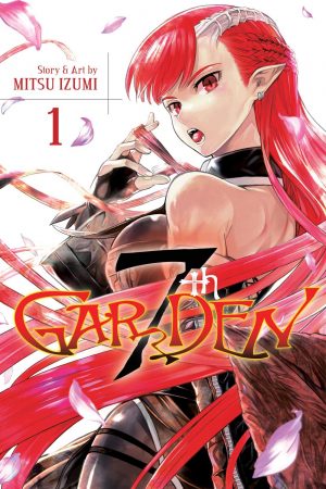
7th Garden Launches This Summer From Viz

You can actually check out my review for the first volume of 7th Garden already! From Viz:

VIZ Media, LLC (VIZ Media), a premier company in the field of publishing, animation distribution, and global entertainment licensing, delivers a brand new supernatural action series with the launch of 7thGARDEN on July 5th.

The manga series, created by Mitsu Izumi, will be published in print and digitally under the Shonen Jump imprint with a rating of ‘T+’ for Older Teens. Print volumes will carry an MSRP of $9.99 U.S. / $12.99 CAN. 7thGARDEN launches digitally on July 5th on VIZManga.com and also will be available via the VIZ Manga App, as well as from the Nook, Kobo, Kindle, iBooks, comiXology, and Google Play stores. Future volumes of the ongoing series will be published in English on a quarterly basis.

7th Garden #1Awyn Gardner will do anything to protect the beautiful mistress of the equally beautiful estate gardens he lovingly tends – even enslave himself to an also beautiful demon bent on world domination! The high-pitched battle is on between powerful angels, sexy demons and innocent people to dominate a world rife with political intrigue…and to win the heart of one hapless human man!

“Sexy demons, powerful angels, and handsome humans take center stage in this action- and humor-packed new series that’s rife with political intrigue” says Annette Roman, Editor. “We invite readers to spice up their summer manga reading with this hot new title!”

Mysterious manga artist / creator Mitsu Izumi is also the creator of the manga adaptation of Anohana: The Flower We Saw That Day, which was originally serialized in Japan in Jump SQ.

For additional information on 7thGARDEN and other manga titles published in-print and digitally by VIZ Media, please visit www.VIZ.com.

'Black Clover' Debuts As Its Own Print/Digital Series This Summer

VIZ Media, LLC (VIZ Media), a premiere company in the field of publishing, animation distribution, and global entertainment licensing, delivers a brand new fantasy action adventure about a young boy’s quest to master his newly-gained magical powers with the launch of the manga series, BLACK CLOVER. Created by Yuki Tabata, BLACK CLOVER has been thrilling readers in the pages of WEEKLY SHONEN JUMP since 2015 and is available in print and digital editions under the Shonen Jump imprint with a rating of ‘T’ for Teens. Print editions carry an MSRP of $9.99 U.S. / $12.99 CAN. BLACK CLOVER digital volumes are available via VIZManga.com and the VIZ Manga App, as well as from the Nook, Kobo, Kindle, iBooks, comiXology and Google Play. Future volumes of the ongoing series will be published in English on a bi-monthly basis.

Black-Clover-Volume-1-CoverIn BLACK CLOVER, Asta is a young boy who dreams of becoming the greatest mage in the kingdom. Only one problem–he can't use any magic! Luckily for Asta, he receives the incredibly rare five-leaf clover grimoire that gives him the power of anti-magic. Can someone who can't use magic really become the Wizard King? One thing's for sure–Asta will never give up!

“BLACK CLOVER offers an exciting story packed with magic, adventure and a cast of memorable characters that manga readers are going to love,” says Alexis Kirsch, Editor. “Born without any magical abilities, Asta is a hero readers will root for as he fights against the odds to fulfill his dreams.”

Manga creator Yuki Tabata received his big break in the 2011 Shonen Jump Golden Future Cup with his winning entry, Hungry Joker. He began the magical fantasy series BLACK CLOVER in 2015.

For additional information on BLACK CLOVER and other manga titles published by VIZ Media, please visit www.VIZ.com.

SuBLime Debuts New Yaoi Manga Series 'DON'T BE CRUEL'

I have to say that the little underwear on the front is hilarious to me. I read some Yaoi so don't be surprised if this gets reviewed. Via SuBLime:

SuBLime, the leading global English-language yaoi manga (graphic novel) publisher, announces the launch of adored creator Yonezou Nekota’s series DON’T BE CRUEL.

This newest title to join the SuBLime catalog is rated ‘M’ for Mature Readers and is now available as a 2-in-1 omnibus edition in print and digital. The print edition carriesan MSRP of $16.99 U.S. / $19.99 CAN. The digital version will carry an MSRP of $7.99 U.S. and offers readers two methods of digital access to the volume on SuBLimeManga.com – a DRM-free downloadable PDF that is viewable on any enabled eReader device and computer as well as via the online manga viewer found on the SuBLime website.

Dont Be CruelIn DON’T BE CRUEL, playboy Maya catches studious Nemugasa cheating on a test and, to ensure his silence, blackmails him into doing whatever Maya wants. Twice a week, Nemugasa must go to Maya’s room for some steamy action, but as dense and oblivious as Nemugasa is, he fails to notice Maya’s true feelings for him. With college entrance exams around the corner, Nemugasa must focus on his studies, but Maya won’t stop distracting him, causing him to finally snap! Can a relationship built on blackmail ever become something more?

“Yonezou Nekota enjoys a dedicated fan base that has looked forward to the release of DON’T BE CRUEL in English, and we are very happy to launch this highly requested series in expanded 2-in-1 omnibus editions,” says SuBLime Editor, Jennifer LeBlanc. “What begins as a case of emotional extortion quickly escalates, and readers will enjoy all of the torrid drama that ensues.”

DON’T BE CRUEL is Yonezou Nekota’s first English-language release, but she is already renowned in yaoi fan circles for her title Mousou Elektel. She is also a prolific doujinshi (independent comics) creator. Fans can find out more about Yonezou Nekota at her website, http://komeya.sub.jp/, or her Twitter page, @yonekozoh.

For up-to-date news and release information, please visit the SuBLime website at www.SuBLimeManga.com, or follow SuBLime on Twitter at @SuBLimeManga, on Facebook at facebook.com/SuBLimeManga, and on Tumblr at sublimemanga.tumblr.com/.

Titan Is Turning The Raid Into A Comic

I love Raid and Raid 2. They're great martial arts/action movies. They have a little bit of every action genre and that's what makes the great. They do not have great stories. The story is very simple and generic. There were massive improvements for the second film, but nothing that I would shit my pants to see in a comic book. I'm not excited about this. It will all depend on the art, but for the most part what makes Raid work is that it's a movie. I don't know why Titan is only going for licensed properties lately, but it's really not appealing to me anymore. From Titan Comics:

Titan Comics are thrilled to announce that The Raid is punching its way into comic books, in late 2016. Titan is working closely with the director Gareth Evans (The Raid, The Raid 2) and XYZ Films to develop all-new stories featuring characters from the series.

Premiering in 2011, Indonesian martial-arts movie The Raid (also known as The Raid: Redemption) sent pulses racing at the Toronto International Film Festival and secured unanimous critical praise, rocketing to cult film status across the world. 

Serbuan-maut-The-Raid-Redemption-Redada-asesinaThe movie captured audiences with its boundary-pushing, inventive choreography and piston-pumping narrative where a lone, isolated SWAT team are trapped by a ruthless mobster and his army of killers and thugs inside a tenement block, and they have to fight through to the top.

Directed by Gareth Evans and produced by PT. Merantau Films and XYZ Films, the high-octane franchise has garnered great success since its release. The first film had 10 nominations at the 2012 Maya Awards. It was followed, in 2014, by The Raid 2, which featured the character of Rama returning to battle against corruption in his own police force.

“At Titan we’re thrilled to be publishing The Raid comic books,” said editor Martin Eden. “Gareth is a visionary and a huge talent. It’s a pleasure to work with him on developing his characters for the comic book page. We promise to deliver the same thrilling, fifth-gear adrenaline that fans have come to expect from the franchise.”

Titan’s The Raid comics are set to debut soon. Look out for more announcements about the creative team shortly.

Review: Dark Night: A True Batman Story

If you listened to the CBMFP this week, then you don’t even need to read this review. You’re probably already sold on the book because I definitely didn’t under sell it. If you're like a lot of our listeners, you didn’t even know that this book existed then this review is for you. For whatever reason this book didn’t get any attention from DC/Vertigo, which is a shame because I’m about to make a bold ass statement. This is my original graphic novel of the year.

Yeah. It’s June and I just locked in my end of the year selection because every other graphic novel out there has a hell of a job of knocking Paul Dini’s autobiographical graphic novel out of the top spot. I mean sure it could happen, but this book is really, really, really (could keep going, but I won’t) good. Good enough to be my end of the year pick… in June.

What’s it about? You’re probably wondering that since like a lot of comic fans, you might not even know what this is. Well, it’s about a time in writer Paul Dini’s life. The time in which he was working on Batman: The Animated Series. You know, the cartoon that basically became the definitive version of the Bat-verse for an entire generation of kids. In fact, you can tell which Batman readers are too young to have been groomed by the series because they probably like the New 52 Batman.

Dark NightBut I digress. We’re here to talk about a very personal story about a time in which Paul Dini found himself mugged and beaten to the point of needing reconstructive surgery. That is in part what this story is about, but really that’s the event to talk about Dini’s history of low self-esteem and dare I say depression.

For an autobiographical story, it doesn’t read like one. At least it doesn’t read like the stories that have become the norm for the genre. Things like Jeffery Brown and the work from his peers reads vastly different from Dark Night. Dini is a storyteller after all and he delivers a master class in storytelling with the way he presents his story. Frankly put, good storytellers can tell any stories, but great storytellers can get into your heart and mind.

Accompanying Dini is Eduardo Risso on artwork. This might shock the comic community, but I’ve never been a big fan of Risso’s work. There are times I enjoy it, but mostly it’s not for me. I am very glad he illustrated Dark Night because he was the perfect fit. I may not like his Joker, but he too puts on a master class in storytelling and accomplishes something that few other artists have in comics. He creates a fictional world on top of the real world. By that I mean that Dini describes the way he thinks as having an overactive imagination. In which he often talks to the characters he writes or enjoys. They interact with his life and so it’s a bit like Who Framed Roger Rabbit. The catch, of course, being that this is a comic and it’s impossible to show that, right? Now with Risso’s artwork. He truly makes it look like Dini’s imagination is running wild, but fits it into the world.

This story doesn’t work without the lettering. Todd Klein, if you pay attention to lettering, is at the top of his field. I forget how many times I’ve seen his name. The reason this only works with the right lettering is because of the aforementioned imagination. See Dini in the story is interacting with the characters while interacting with the real world and it’s the lettering the acknowledges this shift. Without that it would just look like a crazy person walking around talking to themselves without anyone acknowledging them. Klein is the piece that makes the entire story work.

Put aside for a moment that this is about Paul Dini. Also put aside the fact that it’s about a time in his life working on a cartoon that is beloved by millions. At its core, this story is about a man who has everything he wants, but nothing that he needs. Without spoiling too much I will just say that there’s probably not a single comic book reader out there that can’t relate to some aspect of Dini’s story. It is the epitome of the emotional journey that practically all comic book readers face. It captures the reason why we read comics about superheroes that can do more, that can be better, that are strong in the ways that we are weak. Simply put, Dark Night not only captures the reason we read comics, but in the very same way is the reason we read comics.

[su_box title="Score: 4/5" style="glass" box_color="#8955ab" radius="6"]

Dark Night: A True Batman Story
Writer: Paul Dini
Artist: Eduardo Risso
Letterer: Todd Klein
Publisher: Vertigo Comics
Price: $22.99
Release Date: 6/21/16
Format: Hardcover; Print

[/su_box]


Unboxing: Loot Crate - June 2016

Welcome back to another ComicBastards.com Loot Crate unboxing video! This time we have June's Dystopian Future box along with the LvLUp addition. Finally the stars aligned and we were able to make just one video for you viewing pleasure. Watch before reading the rest or it won't make sense. I'll be straight up with you all, this month's box sucked. So did the LvLUp bag that I usually enjoy. There was one good pair of socks. The Star Trek ones turned out to be for women which is cool for them, but not for me and my big ass feet. The shirts were... not good. The Ghostbuster one sucked and is way too thick. The District 9 one is fine, but it really seems obscure like they were just looking for something and the Robocop one is cool, but I'm already getting annoying comments about it being from Loot Crate. Meaning I'm going to rarely wear it if ever.

Oh and the Matrix Puzzle... no one wanted that. Couldn't give it away unlike Loot Crate who did.

Here's some pictures as well.

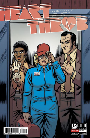
Review: Heartthrob #3

Callie had a problem, she fixed it getting a new heart and finding a new lover in Mercer; both of those mutually inclusive. She spent her summer learning how to con, grift, steal, and cheat people from him and Callie has loved every second of it. Now comes her biggest score: steal back from the insurance company that took so much more than money from her.

I’ve almost fallen completely in love with this series. The relationship between Callie and Mercer has that truly horrifying air of brand new and still going through its honeymoon stage, one in which they both know exactly what the other one is feeling. I almost fall for it as well if not for the troubling fragments of a flashforward Sebela has shown at the end of every issue. It gives me a Dog Day Afternoon feel and makes me more interested about finding out how Callie and Mercer get there, and how will they get out? How can you dump someone when they’re actually attached to HEARTTHROB-#3-MARKETING_Preview-1whatever you do? These are the questions this issue poises by showing some trouble in literal paradise as well as pick at the craving Callie already has for her new life of crime. While I love the constant use of Fleetwood Mac’s Rumours album while robbing the bank, I would like more references to it, the progression of the story and Mercer’s attitude had don’t stop thinking about tomorrow chorus running through my head, so more direct quotes and references would be fun to add into this issue. Three issue in, I feel like this story will flow more consistently as a trade paperback. As fun as it is to read it month to month, reading four to five issues in a row without skipping a beat will carry a lot more power to it, as the progression from issue to issue carries more continuity than most monthly titles.

Working in a comic book store, I not only get to review this titles online but I also have the opportunity to pitch new series to the Wednesday crowds and help them pick up a new title. Heartthrob being one of those I put in as many hands as I could when it came out, one of the most interesting things I found was how polarizing Robert Wilson IV’s art was to people, while some dug it and gave the series a shot (many of whom are now subscribers to it), some just couldn’t dig into the pages because of the art. While I think it’s a fantastic and unique style that mixed with Filardi’s coloring which sets the story right along that new generation of 70s filmmakers who pushed the boundaries of topics and visuals. Days that feel out of Easy Rider, escapes that hit like Butch and Sundance, subversive sexual visuals that hint at their life the way The Graduate did. All the visual elements are there for a perfect period piece.

Heartthrob shows you what Callie is capable of, how she’s able to take control and command a situation when needed, yet there’s that inherent fragility that comes with her past and makes one care so much about her.

[su_box title="Score: 4/5" style="glass" box_color="#8955ab" radius="6"]

Heartthrob
Writer: Christopher Sebela
Artist: Robert Wilson IV
Colorist: Nick Filardi
Publisher: Oni Press
Price: $3.99
Release Date: 6/22/16
Format: Print/Digital

[/su_box]

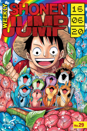
Review: Weekly Shonen Jump #29

Fair warning: I used to keep spoilers out of my Weekly Shonen Jump reviews: I'm not doing that anymore.  If you aren't caught up with the titles I usually talk about and are hyper-sensitive to spoilers, make sure you catch up before you read.

My Hero Academia has cemented its place as the flagship young series of the current WSJ lineup.  It was always sort of implicit that All Might didn't just figuratively pass on his power to Midoriya: he literally passed the power on, and in a complete sort of way.  Finally, it seems that the battle with All For One has sapped him of the last flickers of One For All.  The battle with All For One was something the series was obviously going to build towards, but how quickly it got there was pretty striking.  Horikoshi had no intention of making that a final showdown; instead, he treated it as a means of passing the torch and putting the weight of the series squarely on the shoulders of the Shigaraki-Midoriya generation of villains and heroes.

I can't say enough good things about what Horikoshi has done with this series over the past few months.  The ambush to kidnap Bakugo was probably his most intensely and consistently excellently rendered series of pages yet.  Getting to depict all of the life-or-death action in the dark forest brought out the best in Horikoshi's dramatic inking abilities.  Through all of it, his detailed lines never lost a step, and his layouts remained varied.

Wsj29_coverRescuing Bakugo proved to be a much shorter set of chapters, but therein lies quite a bit of what makes Horikoshi such a capable storyteller.  He is willing to front-end-load a lot of the drama and intrigue of a major plot arc so that simple but massively dramatic confrontations can take place in a way that allows his art to shine.  In other words, Horikoshi had an opportunity that I think many others would have taken to really stretch out and put a lot of time into the All Might vs. All For One confrontation; instead, he made it equally about the kids and the generations who came before, all by chipping away at these plot threads in the arcs leading up to this massive battle.  All Might has become so iconic for the series' readers that his final moments of heroism in his super muscle-y form carried as much weight for us as they did for the onlookers.  Something has been lost for this series, and the amount of pressure that is now on Midoriya will bring his saga to new heights.  The fact that others now know he carries One For All means that all that pressure will be coupled with (hopefully) a lot of invaluable support from his peers.  Seeing everybody rise to bear the hero torch of their generation makes this series an absolute must-read for fans of the hero genre of comics.

The crazy thing about reviewing Jump right now is that I want to spend ages on Academia for how outstanding this last arc has been.  It's not that often that you get to witness a story this early on reach such a critical moment in its existence.  Food Wars has taken a similar pivotal turn in that Erina has embraced her leadership role and is going to put the "divine tongue" to use in bettering the first-years.  While this is also a big deal for this series, it just doesn't feel as dramatic or important as the turn Academia has taken.  Some of this obviously owes to Food Wars' more levity-laden tone and the fact that the fate of restaurants in Japan is a markedly less dramatic end result compared to villains killing the shit out of a bunch of people.  At the same time, though, it points to the fact that Food Wars has really been dragging things out.  While Academia steadily foreshadowed things and then quickly crescendo'd to the series' biggest moment, Food Wars had a lot more heavy-handed foreshadowing and flashback use, and for a longer period of time.

Black Clover is also at a critical juncture, but it's all action.  This week's chapter was one of the more clever little fight sequences in awhile, as the Eye of the Midnight Sun goons continue to tear apart the Black Bulls.  We get to see the always-morphing Grey's true form, which was a great gag to end the chapter on; but, we also get to see Grey use her transformation powers in a really clever way.  Tabata continues to show he is unafraid to inject humor into dire situations, and goodness gracious is he good at putting together some brutal fight sequences.

Finally, in One Piece, as we all sort of figured, Big Mom's true nature is revealed.  As has been a theme from the very beginning of this series, the thing that separates the truly villainous figures from everyone else is their complete disloyalty and disrespect for the people who trust them.  It's a constant lesson that Oda teaches us over and over.  Each circumstance is so unique and strange in a way that only Oda could give us, though, so it never really gets old (or at least, it hasn't yet for me).  When an emperor of the sea has a sweet tooth and the power to straight-up consume someone's lifespan (not to mention her willingness to consume an entire section of her own capital), things are looking at least as scary as they were against Doffy, if not even more so.

[su_box title="Score: 5/5" style="glass" box_color="#8955ab" radius="6"]

Weekly Shonen Jump #29
Writers: Various
Artists: Various
Publisher: Viz Media
Price: $0.99
Release Date: 6/20/16
Format: Anthology; Digital
[/su_box]

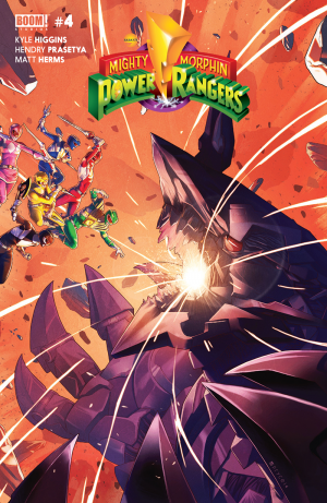
Review: Mighty Morphin Power Rangers #4

Scorpina has taken over the Dragonzord, the team can’t fully trust Tommy in the field, Tommy can’t trust his own mind, and they better figure themselves out quickly or Angel Grove is done for. Might Morphin Power Rangers #4 has set the stage for a blowoff battle of epic proportions.

Some major shake-ups to the fighting formula were done to this issue. A decent amount of time spent fighting with the separate Dinozords, and Rita really shook things up by sending not one, but three monsters at the same time. To her defense she was asleep for 10,000 years, hadn’t had her coffee yet. This issue is what the preview promised and us Ranger fans had been clamoring for in the previous three issues. From the start we have imminent danger and our Rangers have no time to think and only time to morph. A refreshing aspect of this issue was the culmination of what I feared could just turn into The Green Ranger Show feat. the rest of the team maybe if there’s space left. The Green Ranger storyline not only wraps up for the most part, but transitions  well into a new threat the team will have to deal with as a whole.

PowerRangers_004_A_MainHendry Prasetya and Matt Herms have been to Power Rangers what Fiona Staples and Veronica Fish were to Archie comics. It’s a franchise that looks revitalized by the looks of the team, updating their outfits and playing with their civilian wardrobes while maintaining the character traits that makes each one recognizable. From the beginning of this issue, all the art elements shine right through. A impactful opening panel of the Dragonzord rising from the depths of the ocean and showing in great detail the sizeable danger that cruise ship is in. There are some shots and interactions of the team without their suits. As good as Prasetya and Herms are at showing character reactions to the possible disaster they’re facing, they are that much better with a fully morphed Power Rangers. Details on the suits are never lost between panels, as well as the actions taken by all the Zords and monsters.

Mighty Morphin Power Rangers #4 is action packed to the gills and has brought me back dying to know what happens next.

[su_box title="Score: 4/5" style="glass" box_color="#8955ab" radius="6"]

Mighty Morphin Power Rangers #4
Writer: Kyle Higgins
Artist: Hendry Prasetya
Colorist: Matt Herms
Publisher: BOOM! Studios
Price: $3.99
Release Date: 6/22/16
Format: Ongoing; Print/Digital

[/su_box]

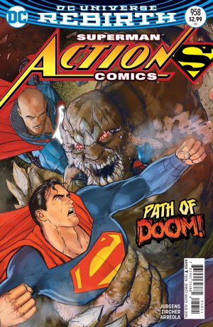
Review: Action Comics #958

Superman is fighting Doomsday. Lex Luthor is also fighting Doomsday. Luthor is helping the innocent bystanders. Clark Kent and Jimmy Olson are right there watching and giving commentary. Lois and Jon are watching it on TV and giving commentary. That is the plot of this issue, sure there’s a lot of questions, a mysterious cloaked figure making cryptic comments, but this is a fight issue through and through. At some point Doomsday uses strategy and it is very effective. Also in this issue Lois Lane is talking to her son and says “This is wrong, Jon. It all feels VERY wrong.” Rarely has a character summed up my thoughts on a comic so well. This entire issues feels wrong. Not because Clark Kent is watching Superman from another timeline/world fight Doomsday, that’s just comics, weird stuff happens, but because how Superman is acting.

AC_Cv958_dsSuperman narrates at the beginning that he had to stop Luthor from claiming to be Superman. Thus far all Luthor has done is defeat bad guys and say “with Superman dead I will save the city.” The literal worst thing he has done is claim to be the new Superman. When Superman died back in the old universe, four guys claimed to be Superman, this timeline only has one. Superman has little to complain about.

During the fight, Luthor steps in to save Superman and comes up with a plan to get Doomsday away from the crowd of innocents. While Luthor goes about executing the plan, putting his life in danger, Superman just punches Doomsday and says he can handle this all on his own because he’s the REAL Superman. No communication otherwise, we have no proof that Luthor wasn’t holding his own nor that his plan was crap. Just sheer “I am Superman, leave it to me.” When SUPERMAN’s plan fails, and two innocents are about to meet their doom, Luthor saves them. When Superman saves a train full of people, he tells Luthor to take the train he is literally holding, because only SUPERMAN can save the day.

I…sigh, I just can’t get behind this Superman. I don’t know if Man of Steel has infected Superman, or if Superman has been a jerk all along. Reading this comic makes me believe Lex Luthor is a greater and better hero than Superman. He saves more lives, he tries to work with others more, and seems more willing to work for the greater good. Superman comes off as a petulant child, and that is not my Superman. I’m sure the point of this issue was to show Luthor isn’t cut out to be a hero and only old school Superman can save the day, but that isn’t how they wrote it. The fight scenes aren’t even that great; it is a lot of random destruction, but at least one of the two Supermen actually saves people, it just isn’t the Son of Krpyton, and that makes me sad.

[su_box title="Score: 2/5" style="glass" box_color="#8955ab" radius="6"]

Action Comics #958
Writer: Dan Jurgens
Artist: Patrick Zircher
Publisher: DC Comics
Price: $2.99
Release Date: 6/22/16
Format: Ongoing; Print/Digital

[/su_box]


Review: Action Man #1

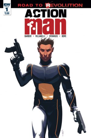
Let's play a game. Let's see how long our American readers can keep their interest in the premise of IDW's latest nostalgic comic property. Based on the British licensed copy of the GI Joe dolls-- Well, that was fast. Yeah, British nostalgia is to blame for this newest addition to the 'it existed, let's do a comic about it' pile that IDW has decided to hang their whole publishing house on, this one feeling especially thin conceptually. I barely understand the lasting appeal of 'G.I. Joe' much less its British translation, a multi-talented spy guy who couldn't keep a cartoon series afloat for more than two seasons. This means to many American readers 'Action Man' has to prove himself as a character on the strength of this series alone, a primer in childhood fantasy from across the pond. Who knows? People still unironically debate the merits of stories told about characters named Major Bludd and Snow Job, maybe there is something in here that could appeal to the vinyl-loving doll collectors of America.

The comic begins with Action Man dying. Good start. Flawless square-jawed, ultra-human Action Man sacrifices himself to save the world, his final words being...a reference to the Action Man line from Bowie's 'Ashes to Ashes.' Jesus Christ. Not only is the line distractingly hilarious in this serious context, I couldn't help but think back to the same gag being used on the 'Venture Brothers'.

https://www.youtube.com/watch?v=-aqvIU1dkD8

Despite being the Perfect Man, apparently the Action Man mantle can be passed down to the next guy in line, in this case Action Man's Action Buddy Ian, now the younger, less experienced, less perfect Action Man. Think Dick Grayson taking over the Batman mantle after 'Batman R.I.P.' only without the gravitas, character history, and competence. When he isn't taking shit from all sides from his team and superiors for not being the Real Action Man, he's secretly obsessively hunting for Doctor X, the original Action Man's arch nemesis who seemingly perished in the same event that killed said Action Man. No one but Ian and the readers thinks Doctor X is alive, forcing Ian to pursue leads while handling his daily diet of bomb disarmament, hostage rescue, and generic heroing.

ActionMan01-coverIDW's 'Action Man' is your standard issue soft reboot, passing the torch to a new generation while retaining the formula of the original, and formula it is. It's corny, it's supposed to be, but it doesn't really have the charisma, humor, or imagination to really make anything out of it. It feels as if there is an awareness that 'Action Man' is inherently ridiculous but is never pushed far enough to benefit from this insight. For the most part it's played straight when something more akin to 'Danger Girl's' campy exaggeration would be more appropriate. Nothing here is terrible, but nothing here is fun either.

The art isn't awful. Glossy smooth linework, at best recalling a very, very faint resemblance to Immonen/Grawbadger, occasionally feeling intentionally so. The facial expressions are stiff, and the inks look blandly digital at times, but some of the compositions are nice and the action is at least easy to understand. The real issue seems to be more the coloring. When not set in dark locals that can take advantage of the heavy black fills, the colors have a very basic primary colors feel, where the choices seem derived from what crayons tell you the color should be. This is what skin tone looks like. Use it everywhere. With a stronger color job the book could have looked more overall professional, but the end result is squarely mediocre.

Will this convert Joe fans? I couldn't tell you. I understand persistent adult love for G.I. Joe about as much as I understand adults who want R-rated Power Rangers movies; I can't entirely judge but I can't relate. If you are already a fan of the character this will probably be basically serviceable to your needs. As an American, I feel like you'd really need a British person's childhood to squeeze enthusiasm for the pages of people arguing about who deserves to carry on the legacy of this toy. Love it. Hate it. Feel indifferent about it. It's all nostalgically relative. All that is certain is it isn't as lazy as it could be, and for IDW, that's unfortunately saying something.

Cover Gallery!!!!!!!!!!!!!!

[su_custom_gallery source="media: 134207,134209,134210,134211" link="lightbox" width="230" height="340"]

[su_box title="Score: 1/5" style="glass" box_color="#8955ab" radius="6"]

Action Man #1
Writer: John Barber
Artist: Paolo Villanelli
Publisher: IDW Publishing
Price: $3.99
Release date: 6/22/16
Format: Ongoing; Print/Digital

[/su_box]

Review: Satan’s Hollow #4

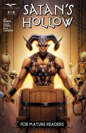
The townsfolk of Blue Ash, Ohio have some serious work to do to improve their travel and tourism.  It seems that the only one interested in visiting this sleepy town is Satan, and he’s not there to pitch a tent and sing old spirituals around the fire.  Nope.  He wants to skin the residents, take their flesh, and enter this plane of existence. The only human who knows of Old Scratch’s desires would be Sandra, a lovely young woman who can do nothing but wear tight-fitting clothes and watch helplessly as the Devil comes a knockin’.  Her significant other does odd things like stare longingly into a fire pit—in the middle of the day.  Yeah, he’s a little possessed, and I don’t mean by things like why are Cleveland fans cheering Lebron’s victory when they were burning his jersey when King James went to Miami?

Also, a silver-haired kid has been drawing kinky pictures of Sandra in bondage with some demons watching.  And his legal guardian didn’t seek counseling for the deviant artist or post the images on a social network for perverts to enjoy.

Satan's-Hollow-#4-1The story is compelling and in tune with the elements of good horror.  Readers will feel a sense of true helplessness as the events unravel regarding the last sacrifice and a stunning secret that relates to Sandra’s past.

I’m a bit back and forth on the artwork.  Little touches like the shadows of the branches forming the silhouettes of thorny binds on Sandra in the bedroom work effectively.  So does the gruesome reveal at the climax of the issue.  One demon, however, looks a bit too much like the Succubus from World of Warcraft.  One thing I will rave about is the color pallet.  The choices of hues and shades that predominate the pages reflect well the tone of the scene.  For instance, the opening pages utilize a yellow reflective of the Chief’s discover of a carcass.  Great work, Fran Gamboa and J.C. Ruiz on your choices.

Satan’s Hollow cleverly builds suspense and tension, and the book feels well plotted.  The fact that there are six issues shows that some planning went into crafting this project.  Now if only this series would have ended in October rather August.

[su_box title="Score: 4/5" style="glass" box_color="#8955ab" radius="6"]

Satan’s Hollow #4 (of 6) Writer: Joe Brusha Artist: Allan Otero Publisher: Zenescope Entertainment Price: $3.99 Release Date: 6/29/16 Format: Mini-Series; Print/Digital

[/su_box]

Review: James Bond #7

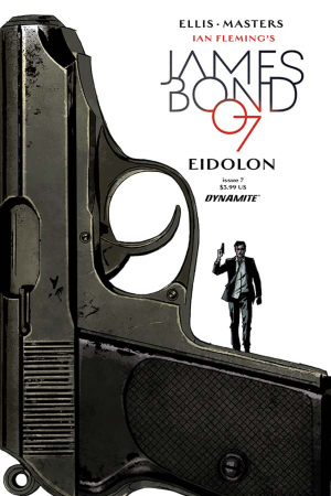
I'm afraid this may be less a review than a mea culpa. James Bond is not a good comic. I really wanted it to be a good comic. I reviewed a bunch of issues (in retrospect more generously than they deserved), and held out hope that the problems I had with it were simply growing pains for a creative team finding their niche. But no, as the starting point to a new arc--for me a jumping off point--James Bond #7 highlights all the problems I had with the first series. Honestly, it's not even within the top five books Warren Ellis has written about espionage (Global Frequency, Secret Avengers, RED, Desolation Jones, and Injection, if you're curious).  So without further ado, I am going to note all that is wrong with James Bond by Ellis and Masters and then abandon it for greener pastures. The first problem is the art. Ellis scripts are dull to be sure, and I'll get to that, but Bond is, by nature cinematic, despite being a novel originally. There needs to be a sense of spectacle or at least visual interest that Masters seems entirely incapable of providing. The linework is thin and scratchy, and everything looks oddly sparse and generic, like high-grade clip art. The characters are stiff, awkward, and, most unfortunately, forgettable. As I noted in my initial review, Bond himself has no distinct visual charisma beyond a passing resemblance to Sterling Archer. I don't mean to be cruel, but there's simply very little to recommend the book visually.

JamesBond07-Cov-A-ReardonAs if in an unfortunate race to outdo the art, the script for James Bond #7 is dry as unbuttered toast with pages of boring bureaucratic mumbo-jumbo with nary a quip in sight. The issue opens up with the latest Bond villain (scarred and deformed as per usual) ominously talking about his plan which apparently involves international banking (I may have zoned out at this point). He then performs the most cliched villain trick in the book and kills his own henchman violently. Ellis then switches gears and gives two pages of unrelated, boring government wonks discussing gun control and covert policy. At this point, before good ol' JB has even shown his handsome mug, I started looking at other books I could review instead of this one, but alas, nothing much is coming out this week.

It will surprise no one to learn that Bond shows up shortly, quips a bit, rescues a girl, quips some more, and gets into a shootout.  The running joke about Bond not being allowed to have a gun becomes a plot point which would likely be clever if the previous six issues had not already wasted so much time talking about it. Frankly, I am not sure quite what Ellis is going for. I think perhaps there's a black-comedy aspect to Bond from the original Flemming novels that I am incapable of recognizing that would make the plot here seem more appropriate, but as it stands, it's still a really dull story that seems intent on focusing on unimportant details.

I could keep going about details in this issue that don't work such as the stiff action sequences, the pointlessly dull back-and-forth with the new love interest, and the discussion of LA traffic. It all adds up to a Bond issue that has low stakes and no sense of spectacle.

[su_box title="Score: 2/5" style="glass" box_color="#8955ab" radius="6"]

James Bond #7 Writer:  Warren Ellis Artist: James Masters Publisher: Dynamite Entertainment Price: $3.99 Release Date: 6/22/16 Format: Ongoing; Print/Digital

[/su_box]

Review: Death Force #2

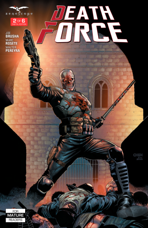
I wish I had gotten to read the first issue of Death Force, but I have a feeling that I’m actually okay starting with this issue. This is the issue in which all the “Death Forcing” happens and the recap on the back of the front cover caught me up quickly. Rather than my new synopsis thing, I’m going to describe what the book reminds me of, because it is heavily influenced by other comics. It’s a part Punisher, it’s a part Spawn and it’s a little X as well. Even if you didn’t know that and read the book you would still see it all over the pages.

It’s Punisher in that our main character is hitting a crime organization, Spawn because he’s working for hell to get revenge for himself, and X because of the way the city is set up and our supporting female character looking to crack it all open.

Death-Force-#2-1The story isn’t bad actually. There’s some generic scenes between all the corrupt people running and ruining the city that was just exposition to let you know there were bad guys. The hell-scape was okay, but the narration was trying really hard to describe hell differently than any comic before. This was met with varying success. The dialogue was just okay, but definitely some of the best I’ve read from Joe Brusha.

What sold me on it was the art and the design. I was disappointed to see that the mask was actually a mask and not the result of the dude’s face being rebuilt in hell. That would have been way cooler, but it works the way it is. The action was easy to follow, but they gave too many panels/pages to the reporter running away and not enough to Death Force beating the shit out of people in his riot gear. That and it’s actually cool to see that this now former cop wasn’t given magical skills, but instead is relying on what he knows to beat the bad guys. I don’t understand why the female reporter is wearing a midriff and artist Marc Rosete seemed to struggle with its inclusion at parts. The hell-scape was actually pretty good and I enjoyed seeing DF’s skin meet and him walk around like a skeleton. It was very metal.

The main thing I appreciate about this book is that it steps away from the norm of Zenescope. I don’t know if Brusha would have written, yet alone published, something like this five years ago and so it’s nice to see them take some chances. It’s not perfect, but it’s definitely one of the better books from the publisher. That and it’s fun. Sometimes fun wins over everything else.

[su_box title="Score: 3/5" style="glass" box_color="#8955ab" radius="6"]

Death Force #2
Writer: Joe Brusha
Artist: Marc Rosete
Publisher: Zenescope Entertainment
Price” $3.99
Release Date: 6/22/16
Format: Mini-Series; Print/Digital

[/su_box]

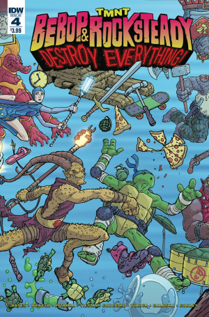
Review: TMNT: Bebop & Rocksteady Destroy Everything #4

Guys, this mini-series is about love. I just figured that out. Specifically, it's a story about codependency rendered in extreme. And after the initial weirdness of a homicidal warthog being soul-mated to a purported war veteran rhino, you start to root for these two crazy kids to stick together. If only sticking together didn't also mean mindless destruction and countless deaths. Some people express their love in unhealthy ways, I guess. There's a cute running gag about time-displaced Bebop and past Bebop grating on each other's nerves in an almost literal case of self-loathing. But that gag exists as a counterpoint to past and present Rocksteady sharing a seemingly aching need for acceptance and direction, regardless of the source of said validation. The Rocksteady pair end the issue with a genuinely heartwarming (if a little troubling if you think about it) admission that really cements this as a platonic love story.

TMNT_B&R04_cvrUnfortunately, art is all over the place again. And while the hodgepodge of rendering styles does reflect the jumbled nature of the time-travel adventure, it doesn't make for a comfortable read. The styles aren't different enough to stand apart. But they blend together in a way that makes their differences fit awkwardly in a single issue essentially following two characters.

By now, the story is so tangled, the script doesn't even attempt to keep track of or explain the causal damage being done by our protagonists. It's fun and all, but the result feels a tad shallow. It's hard to care about what's going on when I feel certain some miracle will wipe away the story's events. The only potentially enduring effect of the mini-series will be the strengthening of the Bebop and Rocksteady partnership in the eyes of the readers. I don't know if it counts as spoiling a surprise to go into detail in this regard.  It should suffice to say when the title says "Destroy Everything", and the plot has made great effort to introduce many versions of our deadly duo, you should expect a mounting sense of confusion from the characters. The turtles are only just barely in this issue, relegated to a brief cameo appearance. Their reaction to the actual magnitude of events is pretty priceless.

With most of the development and exploration I've been hoping for, issue four is a good, character-driven chunk of story before the mini-series comes to a close.

[su_box title="Score: 4/5" style="glass" box_color="#8955ab" radius="6"]

TMNT: Bebop & Rocksteady Destroy Everything #4
Writers: Ben Bates, Dustin Weaver
Artists: Dustin Weaver, Damian Couceiro, Nick Pitarra, Ben Tiesma, Pablo Tunica, Tadd Galusha, Aaron Conley, Ryan Browne
Colorists: Bill Crabtree, Michael Garland, Jean-Francois Beaulieu
Publisher: IDW Publishing
Price: $3.99
Release Date: 6/22/16
Format:  Mini-Series; Print/Digital

[/su_box]


Review: Thorus: Lord of the Super Gods #1

By Ben Boruff

When Bob Dylan released Modern Times, his ambitious 2006 album that features songs like “Thunder On The Mountain” and “When the Deal Goes Down,” fans of the musically fluid troubadour experienced collective cognitive dissonance. Many fans and critics appreciated the folk-style lyrics that, when paired with Dylan’s signature blend of blues and rockabilly, offered a series of heartfelt insights into the complexities of romance, pain, and Alicia Keys. Others, however, were troubled by Dylan’s uncredited and arguably liberal use of lines from other artists, namely Henry Timrod, a little-known 19th century Confederate poet. As a group—and even as individuals—fans were conflicted. As a creative work, Thorus: Lord of the Super Gods is nowhere near any Dylan creation—on any scale—but the concern felt by Dylan fans in 2006 is similar to the concern I felt while reading the first issue of Jay Piscopo’s comic. Both works borrow from other artists. While Moderns Times remains a well-received staple of Dylan’s iconic discography, however, Thorus: Lord of the Super Gods is unoriginal to the point that I hesitate to call it art. For those who value originality, reading Thorus: Lord of the Super Gods is a frustrating experience. Thorus, the feebly characterized protagonist of the comic, is a thinly veiled combination of Hawkman and Thor. The comic’s villain, a motiveless brute who speaks like the teenage antagonist of an after-school PBS sketch about bullying, is a clear blend of Thanos and Galactus. Even the comic’s henchmen are derivative: they look like characters from Gargoyles, the animated television show from the 90s, and their modus operandi is reminiscent of the Chitauri from Joss Whedon’s first Avengers film.

Some reviewers have praised Piscopo’s style, arguing that Thorus: Lord of the Super Gods is a refreshing imitation of the storytelling techniques of comic titans like Jack Kirby and the animators at Hanna-Barbera, but those reviewers—many of whom seem blinded by nostalgia—fail to discuss the quality of the reproduction. Borrowing from other artists is common—even natural, to some degree—but the forgeries must be both minimal and deliberate. Thorus: Lord of the Super Gods is a muddled, tasteless cocktail of superhero clichés. Even if one can justify the inclusion of some of those clichés, few can argue that they are integrated effectively into the story. The first issue of Thorus: Lord of the Super Gods is filled with ineffective characterization and banal dialogue.

Jay Piscopo is capable of better work. As an artist and a writer, Piscopo has created some inspired stories, but Thorus: Lord of the Super Gods is not one of them. Aside from the visual counterfeits, the artwork—thick, paintbrush-like lines and solid colors that pop from the page—has a simple charm, but it is not enough to overshadow the narrative and visual deficiencies of the comic.

Intentionally or unintentionally, Piscopo plagiarized to the extent that the comic toes the line between problematic art and unapologetic kitsch. The comic’s copyright page houses this disclaimer: “No similarity without satiric purpose of any living or dead person, product or institution is intended. Any similarity that may exist is purely coincidental.” Assuming that Marvel’s Thor and DC’s Hawkman are “products,” I call bullshit. Some may argue that such comics are meant to be fun, not original. I disagree. But even if that is the case, I still hesitate to recommend this comic. Find fun elsewhere—there are plenty of comics that do it better.

Score: 1/5

Thorus: Lord of the Super Gods #1
Writer/Artist: Jay Piscopo
Publisher: Nemo Publishing Group

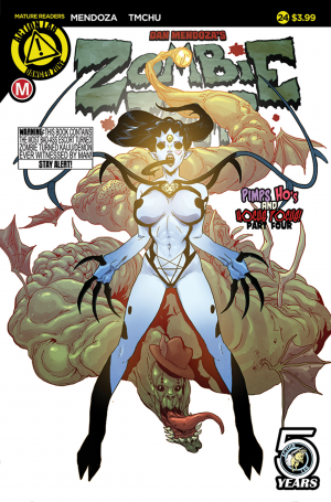
Review: Zombie Tramp #24

This is probably one of the most satisfying arc conclusions on Zombie Tramp. The main reason being that something happens, something is resolved and there’s a ton of questions left unanswered. There’s so much left unanswered that it could take an entire year to resolve everything and that’s how you set up a monthly series to continue. [su_quote]Synopsis: The Kaiju Queen makes her appearance… do you need more than that? Look at the fucking cover, you don’t need more than that. There’s a showdown between The Kaiju Queen and Agga Yappa.[/su_quote]

I know from reading online that a lot of people blow off this book because of the title. Which is just a damn shame because Dan Mendoza gives a prime example of how empowering his female protagonist is with this issue. Janey’s speech as she’s beating the shit out of Agga is why the book is great. She not only takes no shit from anyone, especially men, but she’s out to get revenge and justice for all the women like her. You may not like the name, but until you read the story you’ll never understand why it’s called that. Again, Mendoza also sets up several storylines for the series to follow which is another thing the book hasn’t done in a while. This arc has been teased for a while, but now there’s actually meaningful things for Janey to do going forward.

ZombieTramp_cover_24ATMChu is the only other artist I’ve really enjoyed on this series. It’s been a treat to watch as his art grows and develops. He basically proves that if you give an artist a chance at a book, they’ll grow with each issue. Point in case this issue which has lush backgrounds when needed, a focus on the action when there should be and just the right amount of sex appeal without it dominating the story. That’s the way you make a “cheesecake” story, have the sex appeal just be a part of the world, but not overpower everything else. Zombie Tramp manages that each and every month.

And while I don’t have anything new to say about the coloring, I still want to point out that Marcelo Costa is a great fit for TMChu and for the series in general.

Usually I skip arc conclusions because you can’t ever really say that much about them, but in this case I at least wanted to say that the series is heading in the right direction. If you fell off the series because it was too much of the same each issue, well then you need to jump back on. If only for the fact that we’re yet to see what other transformations Janey and Xula can make or just more Kaiju Queen because that’s awesome as well.

[su_box title="Score: 4/5" style="glass" box_color="#8955ab" radius="6"]

Zombie Tramp #24 Writer: Dan Mendoza Artist: TMChu Colorist: Marcelo Costa Publisher: Action Lab/Danger Zone Price: $3.99/$4.99 Release Date: 6/22/16 Format: Ongoing; Print/Digital

[/su_box]

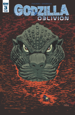
Review: Godzilla: Oblivion #4

I am usurping this review from fellow Bastard Chris Smith so that I can return to my love-hate relationship with IDW’s take on Godzilla.  He’s done a fine job in reviewing this series, and I will build upon that great work by saying that this series is so middle-of-the-road with its story arc. Let me first point out that we see in this series a pastiche of elements done in previous comics and movies.  First off, there is a whole fleet of the Kiryu MechaGodzilla that come to slow down Big G’s advance.  Readers would have remembered hints of this plot point from previous IDW comic tales.

Next, the humans construct a black hole device to suck Godzilla into another dimension.  Any G-Fan who remembers Godzilla vs. Megaguiras can see how familiar this feels.

Next, we get a reconstruction of King Ghidorah into Mecha King Ghodorah.  This design and plot element (minus the time travel and Dorats) comes straight out of 1991’s Godzilla vs. King Ghidorah.

GODZILLA_Obilvion_04-cvrYou are now thinking that I will be tanking this issue because of its lack or originality.  Not at all.  This book does well something that most IDW Godzilla stories fail: establish pacing.  The story opens with a Godzilla fight, continues with minimal story interactions from the humans, and goes right back into kaiju battling.  Even the scene with Godzilla attacking King Ghidorah’s hanger had a tense moment added in for fun.  Best of all, the cliffhanger sells the next issue well.

While we get retreaded ideas, we do get Joashua Fialkov’s adept use of Godzilla.  Overall, any Godzilla fan—or comic book fan for that matter—will enjoy this book’s design.  As Chris Smith stated in a previous review, IDW has the option to explore real what if scenarios with Godzilla, but they tend to always play it safe.  And that is seen here quite clearly.   Also, keep in mind that the artwork leans towards the more cartoonish; nevertheless, that doesn’t hinder the story one bit.

Simply stated, this book is great read while sitting on the beach soaking up some rays and wishing that the waters would part and a giant kaiju would emerge.

[su_box title="Score: 3/5" style="glass" box_color="#8955ab" radius="6"]

Godzilla Oblivion #4 Writer: Joshua Hale Fialkov Artist: Brian Churilla Publisher: IDW Publishing Price: $3.99 Release Date: 6/22/16 Format: Mini-Series; Print/Digital

[/su_box]

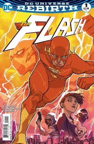
Review: The Flash #1

DC doesn’t need me to gush over this book. Hell, they probably don’t need any review to like this book or any other Rebirth titles. For the most part I accept that as a reviewer I’m affecting a very small percentage of comic readers out there and that’s okay. Hell, often times I wonder who these reviews are for? Creators hate them, most fans don’t want them unless the reviewer is saying, “everything is great, there’s no problems in comics” and publishers really just want something with the title broadcasted on said website. I know, I’m being all melodramatic, but it brings me to my point. Who is this review for?

The obvious answer is you. The person taking the time to read it. The person that’s on the fence wondering if you should bother with another Flash reboot/restart/relaunch/whatever we want to call it. This review is for you and the answer to that last question is, yeah maybe.

We all have different tastes, which was apparent on the group review we did on the site for The Flash: Rebirth #1. An issue I loved, but surprisingly to me, not a lot of other readers did. So if this reboot/relaunch/restart of The Flash is for you depends on what you want to get out of the series.

It’s going to tell you the Flash’s origin again, but this time there’s some retconning as we add someone to the event. Someone that was there that we didn’t know about or maybe they were already added in the last series. There’s very little that’s new in the world of the Flash in this issue. Hell, there’s even one painful scene that’s practically ripped from the TV show, which made me cringe.

But the reason the story works for me and is enjoyable… is because of the art.

FLS_Cv1_dsDon’t get me wrong, Joshua Williamson is doing a great job on the writing, but this issue is everything a typical superhero comic first issue is. To the “T”. It’s just that he gets it right and uses the formula in a successful way. But the only reason it works is because of Carmine Di Giandomenico’s artwork.

Giandomenico’s artwork is by far the best art I’ve seen on The Flash since Manapul (who really petered out at the end of his art run). It reminds me of studio that did Aeon Flux and Phantom 2040 and something about that really fucking works. And it’s not just the Flash stuff, it’s the Barry Allen parts as well and that’s always been my problem with Flash books. When it’s not all Flash, it’s usually boring and out of place visually. Giandomenico’s art is a great fit for the Flash because it makes it look a little like the future. It’s not the Flash in our world, it’s us in his. We’re visiting the Flash and it’s great.

The art is dynamic and the coloring is vibrant and beautiful. This is a beautiful book to look at. Ivan Plascencia is wearing the belt for the best colorist at DC Comics. His coloring makes the Flash and Giandomenico’s artwork look amazing. Especially the transformation scene… I can’t tell you how much I loved that and if it came from Williamson’s head then it just shows how perfect this creative team is together.

And I feel the need to mention that letterer Steve Wands makes the story work. The lettering is perfect for this story and how much it bounces around. I was never lost and it was never distracting. Not a lot to say, but good lettering should be praised!

What do you want out of the first issue of a new Flash series? Do you want it to skip the origin? It’s going to. Do you want it to not mention Rebirth and live in a bubble? It’s going to do that too. Do you want it to make The Flash feel new and exciting and create a city with personality for the first time since Rebirth that brought Barry Allen back? It’s going to do that.

Just as a reminder: DC doesn’t need this review. The fans that have already decided don’t need this review. If you follow the site, though, you need my review. You need more score. That’s why you’re here and so when you see the score… well just know that this creative team got me to continue reading one superhero book. One book from an entire publisher that I haven’t consistently read it three years. I’m still not reading the other guys so if anything, that’s an amazing feat in and of itself.

[su_box title="Score: 4/5" style="glass" box_color="#8955ab" radius="6"]

The Flash #1
Writer: Joshua Williamson
Artist: Carmine Di Giandomenico
Colorist: Ivan Plascencia
Publisher: DC Comics
Price: $2.99
Release Date: 6/22/16
Format: Ongoing; Print/Digital

[/su_box]