Review: TMNT: Rocksteady & Bebop Destroy Everything #5

Donatello and Raphael have an early exchange that sums up the whole Rocksteady/Bebop relationship. Essentially, they agree that at the core of these hateful monstrosities, there's a genuinely touching pairing. I'm not into shipping, so I don't think there's any romantic subtext to be built upon. No, Bebop and Rocksteady have the same kind of love shared among the TMNT quartet. It's a rarely explored aspect of villainous groups. They are people, after all. Kind of. So why shouldn't they -- even in the midst of a caper -- be motivated by their emotional entanglements? The pull of fidelity that keeps tethering these two together seems to be woven into the fabric of time. That they are separated across time and physical space, only to be reunited, speaks volumes about their need for one another. TMNT_B&R05_cvrThis issue continues to shove a lot of explanation through the narrow aperture of the script's actual capacity to give a damn about causality. Characters frantically shout warnings and concerns regarding the damage being done to time while Renet and the turtles keep seemingly making the dire situation worse. Our title characters don't get a lot of on-panel time in this issue. Their roles are as props to be moved about by the typically front-and-center turtles. Their dialog isn’t especially insightful this time around, so I understand why the script is better served by focusing on the turtles and Renet.

There's a pleasant sense of closure that doesn't negate the possibility of future consequence and adventure. This mini succeeds as a mini because it pulls elements of the past into a complete story that looks to the future. I don't expect this to be a crucial read for fans obsessed with canon. But as a supplement to the turtle-focused adventures you're most accustomed to, Destroy Everything gets the job done. It’s funny and surprisingly touching when you consider it’s about a pair of dangerous, time-displaced lunatic freaks.

[su_box title="Score: 4/5" style="glass" box_color="#8955ab" radius="6"]

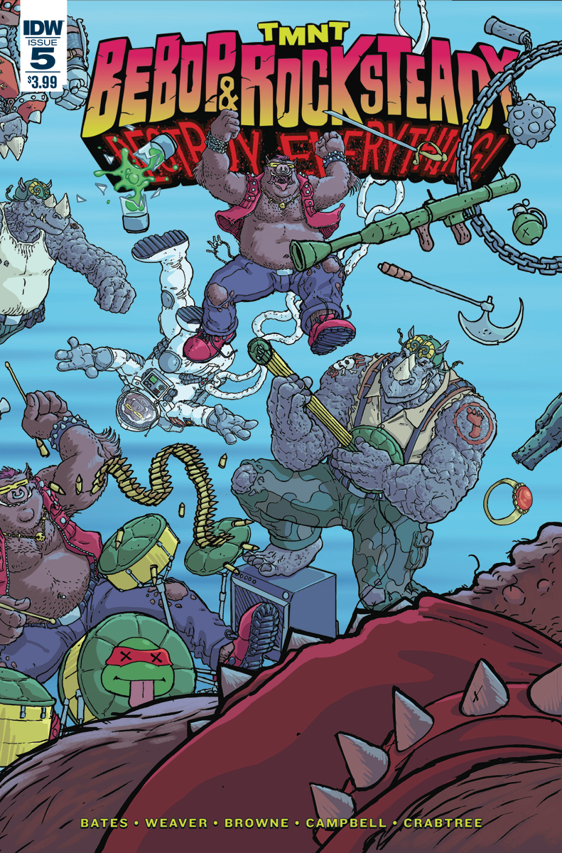
TMNT: Rocksteady & Bebop Destroy Everything #5 Writer: Ben Bates, Dustin Weaver Artist: Ryan Browne, Sophie Campbell, Dustin Weaver, Ben Bates Colorist: Bill Crabtree Publisher: IDW Publishing Price: $3.99 Format:  Mini-Series; Print/Digital

[/su_box]

Review: 4 Kids Walk Into A Bank #2

Four nerds met some evil adults. Such adults won’t leave them alone, it’s time to make them. If they can (sort of) take on their stupid bullies, they can go against a convicted criminal or four. 4 Kids Walk Into A Bank #2 has the Paige, Berger, Stretch, and Walter orbiting back into the lives of horrible people they can’t seem to get rid of by conventional means.

Tyler is in full command of his craft with this book, he seems to be aware of every corner of his panels and use them to fully express what happens page to page. His style allows me to stop on every one of the panels rather than having one immediately transition into the next one, with conventional layouts of paneling for the most part, this comic would run the risk of becoming stoic from page to page. Instead, Boss shows the quality of his craft and finds the perfect moment that can be depicted on each panel to make each stop most enjoyable. A kid trying to mess with Paige and 4 Kids Walk Into A Bank 2her gang gets exactly what he’s been asking for and Boss’ clear joy to depict that is transmitted through the page only to be accentuated by Rosenberg’s clear understanding of the dialogs from each character.

Rosenberg’s command of characters has been put to the test for two issues now. Reading issue #1, I was scared of the two pages filled with talking heads, fearing that he might just go into a full Bendis territory with a lot of words and little to say. Instead, it proved to be a delightful read resulting in audible laughter in public places. Every line serves the purpose to further the story or accentuate a character and grow the attachment to them. He charmed his way into my heart the same way watching The Sandlot or Stand By Me did in their time.

Boss’ design chops are also showcased in this issue as well. The changes in layouts for some sequences that serve as a tell for a well studied person on the likes of Chris Ware and shifting for other into more cartoon-like influences for other. This is an artist who’s shown up to serve the story.

4 Kids Walk Into A Bank #2 has a very unique charm that’s uncommon in comics of recent, thus becoming another assured hit from Black Mask Studios as one of the best singles this week, and one of their best series overall.

Note: I personally know both Tyler Boss and Matthew Rosemberg.

[su_box title="Score: 5/5" style="glass" box_color="#8955ab" radius="6"]

4 Kids Walk Into A Bank #2
Writer: Matthew Rosenberg
Artist: Tyler Boss
Publisher: Black Mask Studios
Price: $3.99
Format: Mini-Series; Print

[/su_box]

Review: Penny Dreadful #2

What do you know of the Demimonde? Based on the hit TV show and popular periodicals of Victorian England, Penny Dreadful from Titan Comics brings its own dark magic from beyond...

Written by the original creators of the show, this book tries hard not to stray too far from it’s source material.  Our gothic medium Vanessa is attempting to save the soul of her once dear friend Mina, collecting numerous allies in her fateful journey through the darkness that surrounds her.  Sir Malcolm is present in all his Timothy Dalton like glory, as is his servant and sidekick, Sembene, with whom he shares a deep, dark past.  Our group is united in their purpose, to find Sir Malcolm’s daughter, and Vanessa’s dearest childhood friend Mina after an entity known only as “The Master” has laid claim to her soul.

As joyous as it is to see some of my favourite gothic TV heroes brought to life in vivid ink and colour, Krysty Wilson-Cairns might be clinging just a little tightly to the source material for some.  Let’s not be too unkind though, this book clearly declares itself as a prequel to the TV show, not a spin-off.  If I was being picky, the dialogue and lettering could be a little stronger to really help the story take root.

Penny_Dreadful_2_Cover_ABut you know what?  None of that matters...and do you know why?

The art.

My god, I just adore the art in this book.  Louise De Martinis has outdone himself here, incorporating deep, midnight reds and vibrant, twilight blues to astonishing effect, it so perfectly reflects the gothic noir setting of this story.  There’s even little fine details to be found around the panels themselves: scratchings, blood smears and mysterious arcane symbols surround the action at every turn, as if this comic was plucked directly from the dark void itself.  The effect is nothing short of breathtaking, something you definitely don’t see every day in comics.

The imagery in this book is powerful and the tension palpable as you flick from one gore soaked page to the next.  Demons might await around every corner but that won’t stop me from picking up the next installment...

Mina?  Mina is that you?

[su_box title="Score: 4/5" style="glass" box_color="#8955ab" radius="6"]

Penny Dreadful #2
Writer: Krysty Wilson-Cairns
Artist: Louie De Martinis
Letterer: Rob Steen
Publisher:  Titan Comics
Price: $3.99
Format: Ongoing; Print/Digital

[/su_box]


Review: X-O Manowar #47

Some of the most memorable heroes become so due to the challenge that the villains of the series provide.  X-O Manowar now rivals titles like The Flash for dominant rogue’s galleries.  In issue #47, creatures from the Vine’s ancient past step out of legend and into reality when they attack Aric and the Visigoth refugees. Joe Bennett and colorist Marcio Loerzer deserve due credit for the outstanding illustrations of this new X-O foe.  Picture beings as giant as small buildings.  Their forms are humanoid gateways to another dimension, for their skin has no texture save for the look of interstellar space.  As these massive creatures attack, they consume all in their path.  Those unfortunate ones who fall to these creatures do not die; instead, the shift into the universe connected to these beings.

XO_047_VARIANT_SANDOVALAric mounts a counterattack.  Based on the nature of these new enemies, one could easily guess as the outcome of this issue.

In many past reviews, I would examine the intricate steps writer Robert Venditti would take to generate a most effective story.  This time, I need to take a step from plot and examine character.  These enemies have a frightening presence unlike any type of comic book villain prior.  Imagine an adversary that simply deposits you into an alternate universe, never to return.  In one swift motion these creatures snatch up Vine soldiers, assimilate their knowledge, and deposit the poor creatures into another galaxy.

Swift.  Effective.  Irreversible.

These creatures pose a threat on an all-new scale to Aric.  He cannot simply punch his way out of this problem.  No weapon seems to work.  To stop these creatures, the Visigoth king will need to use a swift masterstroke.  Let’s hope the price to protect his loved ones doesn’t end up costing Aric a hefty price.

[su_box title="Score: 4/5" style="glass" box_color="#8955ab" radius="6"]

X-O Manowar #47
Writer: Robert Venditti
Artist: Joe Bennett
Publisher: Valiant Comics
Price: $3.99
Release Date: 6/29/16
Format: Ongoing; Print/Digital

[/su_box]

Review: Indoctrination #1

[su_quote]“I’ve got my finger on the trigger and tonight faith just ain’t enough when I look inside my heart there’s just devils and dust.”[/su_quote]

Bruce Springsteen, ‘Devils and Dust’

Indoctrination opens with these immortal words and asks the question, How do you kill an idea?

And let me tell you, when it comes to this book, you can’t.  I was hooked from the very first page by the art from Matt Battaglia, which was moody, scratchy but textured.  This man certainly knows how to use shadows to create an almost ethereal atmosphere as we see the gorgeous sunset skies of the United States draw out before us.

And in this most stunning of settings we have placed before us a murder, a ritual killing with similarities to other atrocities committed across the country.

Can it be the work of just one man?   

If not then how are the crimes so similar?  

Indoctrination-#1-1Michael Moreci’s writing is nothing short of superb, it grips you right away, it feels grown up, sophisticated and nuanced.  This is beautifully demonstrated just a few pages into the story, as we are presented with a harrowing speech from a man behind bars with links to the terrorist.

The creators have worked together to create something truly powerful as they explore the ideas of terrorism and indoctrination.

What will a man do with the right push?

What madness can he inflict on himself and the rest of the world?  

I don’t know the answer but my god I want to find out.

A few classic, crime fighting cliches might creep in around the edges of our two investigating FBI agents but I’m being overly critical here.  The pacing of the story is excellent, there’s never a dull moment and events unfold without the need for clunky exposition.

It’s been a long time since I was so instantly grabbed by a book.  Yet for all its grounded elements and gritty realism, this story almost has a touch of Neil Gaiman about it.  The book is punctuated by breathtaking panels with an almost otherworldly feel about them, showing us the darkness that lies beneath.

I don’t mean to sound sycophantic here, but this is a book of note and indeed worthy of praise.  In fact, it makes me feel quite guilty for not having heard of Z2 Comics before today.  The final pages will leave you wanting more, forcing you to question -  what’s happening here, who’s behind it, and more insidiously, could this ever happen to me?

Even if political books are not your cup of tea, I urge you to check this one out, you’ll be glad you did.  I know I am.

[su_box title="Score: 4/5" style="glass" box_color="#8955ab" radius="6"]

Indoctrination #1
Writer: Michael Moreci
Artist: Matt Battaglia
Colorist: Jim Campbell
Publisher:  Z2 Comics
Price: $1.99
Format: Ongoing; Print/Digital

[/su_box]

Review: Clarence Quest #1

Not every cartoon is made to be translated into comic form. After successfully adapting properties like Adventure Time and Bravest Warriors (especially the latter) onto the printed page, I had considerable praise to throw BOOM!'s way. Their use of diverse indie cartoon talent from their variant covers to interiors, giving small artists a shot at mainstream publication, is especially admirable. Even when a book failed, you could at least be slightly happy that a cartoonist who probably deserved it was getting a paycheck. Clarence Quest doesn't break any of these trends, but doesn't quite provide a compelling argument for the suitability of the series to be translated into panel form, despite not doing anything largely wrong. The characters are written identically to their television counterparts, there are some nice beats of humor, and the art is unique enough while also capturing the visual feel of the show. But something is missing.

Clarence_Quest_A_MainBeing a fan, I noticed immediately how important the art of animation itself is to the style of the show. Unlike Adventure Time, Regular Show, and Steven Universe, Clarence is largely grounded in mundane reality, drawing its charm from its precise observational detail to the minutia of being a gross, dumb, happy kid. Removing those almost reflexive animated details that could only be captured in animation, not to mention the memorably unique work of the voice cast, takes away a good part of why I enjoyed the property in the first place. Perhaps that is more representative of my specific needs as an audience member rather than a technical criticism, but at the very least it considerably affected my experience with this title.

One unusual choice was splitting the artwork between two artists. The comic tells one story from beginning to end, not containing the Boom signature backup story one usually expects, but still has two different artists on hand to illustrate the title. What is odd is the duties aren't split down the middle, but rather one part of the story just hands over to the new artist and then returns back to the original at the conclusion. It isn't too terribly jarring, but it does come off as a strange choice, one that didn't have any real useful impact on the story being told.

Clarence fans don't have any reason to worry about this book. It's respectful to the property, as well-written as you could expect a Clarence comic to be, and professionally, if not memorably, illustrated. However, at the very least for me, the comic failed to capture the ineffable quality that makes Clarence the thoroughly watchable show that it is, something that likely can't be captured exactly on the static comic page.

[su_box title="Score: 2/5" style="glass" box_color="#8955ab" radius="6"]

Clarence Quest #1
Writer: Nick Cron-DeVico
Artists: Matt Smigiel, Meg Omac
Publisher: BOOM! Studios
Price: $3.99
Format: Mini-Series; Print/Digital

[/su_box]

Review: Cryptocracy #1

[su_service title="Cryptocracy" icon="icon: bookmark"]

NOUN
(PLURAL CRYPTOCRACIES)
A FORM OF GOVERNMENT WHERE THE REAL LEADERS ARE HIDDEN OR MERELY UNKNOWN.

[/su_service]

An Illuminati story?  Really?  Not the freshest of fresh ideas…

The first splash page presents you with a brief overview, “Nine families rule the world.  Each adheres to a strict organizational structure.”  Before proceeding to tell you about the ‘nine circles,’ which represent how deep you are inside the Cryptocracy.  It’s a nice overview, but heavy exposition so early on in a book doesn’t tend to bode well.

Cryptocracy #1I flipped to the next page and didn’t like it very much.  Pete Woods’ pencil work here is not a style I usually enjoy but that could just be personal taste.  I was ready to give a big proverbial thumbs down to this book but then, something happened…

…I became interested; I began to smile.  Conspiracy clichés abound but thanks to the writing of Van Jensen this book also has a penchant for self-deprecation.  The author knows he’s writing “yet another conspiracy story” but makes it up to us through quippy dialogue and enjoyable oddities such as a giant talking bear sidekick and an alien that telepathically wipes people’s brain over a Pepsi, I love it!  Sure the conspiracy references to Roswell, J.F.K., and secret bunkers might make your eyes roll, but on the next page there’s a little nugget to force a smirk from even the most humourless comic book reader.

The colours in Cryptocracy are strong, and beautifully convey this clandestine (and somewhat sci-fiey) world.  This is further enhanced through dialogue and subtle pop culture references that all help bring the world to life.

I’m sure you can imagine the basis of the plot, the Cryptocracy/Illuminati have been steering human development throughout the ages and even those involved don’t know just how deep the rabbit hole goes.  Where things get interesting is towards the end of the book when we learn that now the families of the Cryptocracy are being hunted.  But by whom?  Classic cliffhanger stuff here, folks, and it made me curious to find out who’s behind it all.  That’s what a conspiracy story is supposed to do.

Is this book perfect?  Absolutely not, it’s positively eye-roll worthy at times.  I read the first couple of pages and wanted to hate it, but like a fine wine it improved with time.  I don’t know if this trend will continue in the future and I’ve certainly read stronger first issues, but is it OK for me to just want to see more of the huge talking bear and pop guzzling alien?  I think so but you’ll have to decide for yourselves.

[su_box title="Score: 3/5" style="glass" box_color="#8955ab" radius="6"]

Cryptocracy #1
Writer: Van Jensen
Artist: Pete Woods
Publisher:  Dark Horse Comics
Price: $3.99
Release Date: 6/29/16
Format: Ongoing; Print/Digital

[/su_box]

Review: The Revisionist #1

I’ve gone back and forth with AfterShock titles. I’ll find one I like, one I don’t. The Revisionist falls in the middle. If you couldn’t guess from the cover and the title, it’s a story about time travel, which is a genre that I’ve read a lot lately and have lost interest in. I’m seeing the same glimmers of influence from the movie Primer, over and over again. That isn’t to say that you won’t enjoy The Revisionist, but that it wasn’t for me and did very little to win me over. [su_quote]Synopsis: We’re in the future and a dude is killing targets. Now we’re in the past and the same dude is in prison. He’s about to get out though because he’s a model prisoner. Too bad his female guard friend is killed in front of him for being a rat and he has to fish a gift out of the trash that his crazy dad sent him. Cue the time travel music and stuff.[/su_quote]

That’s really all that happens in this first issue. I wish I enjoyed it, but I didn’t. The death of the guard was so painfully obvious in the exposition dialogue that she shared with the main character that I wondered why both characters weren’t looking over their shoulders more. The opening was for shock and awe for the series because it’s never mentioned or addressed in the rest of the issue. That’s a pretty common comic device but not one I’m willing to compliment. It’s like opening an episode of a police procedural with a dead body. You mean they’re going to solve a crime this episode? Gasp.

The Revisionist #1The dialogue was mostly exposition. There was so little that wasn’t that it’s probably safe to say that all the characters are just telling you what you need to know rather than letting you figure any of it out. No one is likable and really you don’t get a sense of anyone. Not the main character, not his crazy dad, no one. They’re just people in a time travel story.

The art is gritty and with thick line work. Not a lot of facial details and what I can only describe as too much and too little detail. Things are detailed, but aspects of them are unfinished and overall it wasn’t pleasant to the eye. The faces were all over the place. On the same page the characters could look completely different and several pages look rushed compared to the rest of the book. The coloring does what it can, but it’s flat and muted. I don’t know if that was at the request of the creators, but it makes the book look dull. The coloring looks like a bad fit for the style and nothing about it or the artwork in general screams “Sci-Fi.”

If you like time travel stories then you might dig this one. I didn’t. Maybe I’ve seen and read too many lately to get interested in this one or maybe it just didn’t have anything interesting about it. I can see others really liking this book though, I don’t know why they would, but that’s not for me to decide. It’s pretty average in every column and that’s what I’ll pass along to you before you pick it up for a read.

[su_box title="Score: 3/5" style="glass" box_color="#8955ab" radius="6"]

The Revisionist #1
Writer: Frank Barbiere
Artist: Garry Brown
Publisher: AfterShock Comics
Price: $3.99
Format: Mini-Series; Print/Digital

[/su_box]


Review: Zoe Dare vs. The Disasteroid #1

Created from a successful Kickstarter campaign, this quirky new comic follows the adventures of a stunt-woman following in her famous father’s footsteps.  Along for the show are Zoe’s sister, Danni, and the two comic relief robot sidekicks, V.IC.T.O.R. and JJ. In this series opener, Zoe gets a visit from a government agent.  A strange asteroid, later renamed a Disasteroid by Danni, heads for Earth.  Only those qualified in zero gravity training can help with a plan to stop the planet’s destruction.  One setback for a daredevil who never shies away from a challenge is the addition to the rescue team of a rival daredevil and hated adversary.

Zoe must swallow her rivalry in order to save humanity from this catastrophic event.

Zoe Dare #1The pros of the book start with a strong female lead that feels human, flawed, but believable.  Zoe stands out due to the pressures of living up to the reputation her father created.  Readers will see that Zoe’s dedication to her family motivates her to overcome that legacy while remaining faithful to her family.

Another pro of the book comes from the mantra that the team utilizes: “Lung fo mo shi!”  Roughly translated, the statement means power on top of power.  The theme frames the story and the character of Zoe so well.

The cons, unfortunately, outweigh the pros.  One of the major low points of the book is the cliché dialogue taken from popular films.  Films from Die Hard to Star Wars have had their lines of uninspiring dialogue cherry picked for the sake of humor.  Where Zoe Dare could have been unique and inspiring in its own theme and time in the vein of The Rocketeer, the book falls into a comedic repetitiveness that has been overly abused in popular television shows like Family Guy.

Where Zoe shines as a protagonist, the blue alien invaders fall flat.  Their lame antics and lack of true character make them the flattest antagonists when compared with Zoe.

The last con that I wish to address stems from the book’s rehashing of common tropes.  For instance, the comic relief duo of two robots took zero effort to construct.  And the scene at NASA’s mission control drips with the influence of Armageddon.

I commend Brockton McKinney for assembling this book and getting it to print, a feat so few can do.  However, he needs to be more Brockton McKinney and less everyone else.  There’s a great potential and future for Zoe Dare if she can be written as herself and not the summation of pop culture references.

[su_box title="Score: 2/5" style="glass" box_color="#8955ab" radius="6"]

Zoe Dare vs. The Disasteroid #1
Writer: Brockton McKinney
Artist: Andrew Herman
Publisher: Action Lab Entertainment
Price: $3.99
Format: Mini-Series; Print/Digital

[/su_box]

Review: Bolts #1

To read the official synopsis and to look at the cover you would say that Bolts is a Frankenstein horror western. That alone is interesting and something I can get behind. I mean, Frankenstein hasn’t been done to death in comics lately and horror western is something I’m always interested in so let’s go, let’s give this a shot. I was instantly confused. You see… I didn’t know what it was supposed to be. To be very honest, I rarely, if ever, read the synopsis of anything. I want to go into a story knowing nothing about it. The reason being is that if I know what it’s supposed to be then that influences what I get out of the story.

The Frankenstein aspect isn’t even touched on. Instead we just see that he can’t really die and can be put back together… I can’t think of a single other comic book character like that… nothing is coming to mind. Hold on, hold on… no… no one. Sure we see A bolt a couple of times, but I’ll save that for the art aspect of this review.

Bolts #1What was even worse is that the character doesn’t know what the hell is going on. So I was confused. They were confused and the only explanation comes in a two-page splash with some crazy old man doing his best Claremont impersonation spouting off a lot of exposition. Even more painfully was the fact that I was still groggy on the story because the exposition is intentionally vague.

Then Mario shows up in the story. Yes, Mario Mario from the Nintendo games. He’s not named because that would be a lawsuit, but even in the back the creator is like “he’s Mario.” Part of me was like, “What the fuck is Mario doing in this story?” and the other part of me was like, “Hey, Mario is in this story.” Neither half could figure out why Mario was in the story though.

The writing is rough. There’s several intentional jumps in the story that break whatever narrative was happening. The exposition never really stops and our protagonist, while confused and in a hellscape, has deus ex machinas dropped left and right along with what can only be called convenient story aspects. There’s no sense of who this character is, where he came from and only a vague concept of what he’s there to do.

The art is interesting. I didn’t hate it, but it isn’t strong in the visual storytelling department. The panel layouts are clumsy, the splash pages are unnecessary, and the designs are inconsistent. It’s also only in three colors: black, white and red. While I’m a huge fan of this style, you have to remember to keep it clean enough for the details to pop out. There’s too much detail. Too much black to gray ink and so much of the art is just lost in the details. The red doesn’t pop from the page because there’s simply too much black and too much blood.

The strange thing is that I didn’t hate this book. I didn’t love it, but I’ve read much worse. There was something that was entertaining about it, perhaps in a “B” movie way. I don’t know if I’ll pick up the next issue though. This wasn’t a smooth ride by any means and in a lot of ways comes off like someone’s first draft making it all the way to the printer. It could use some more polish, but it’s not terrible.

[su_box title="Score: 2/5" style="glass" box_color="#8955ab" radius="6"]

Bolts #1
Creator: James Whynot
Publisher: Action Lab/Danger Zone
Price: $3.99
Format: Mini-Series; Print/Digital

[/su_box]

Review: Lobster Johnson Metal Monsters of Midtown #2

Get ready for some wall-to-wall exposition. Though, to its credit, the book seems to understand it needs to quickly shove you through the pages of expository dialog. But to its detriment, the book feels a bit too hurried. You're yanked from location to location, squirted with a thick stream of exposition before you're shoved ahead to the next bit of explanation. While I appreciate the dive into how and why the premise has taken place, I feel this issue would be better served by exploring its characters. Granted, the Hellboy mythos thrives on obscurity. But issue two here feels like filler without much in the way of personality. At times the script can feel like a series of moments that have to happen, but cannot be neatly and organically fit together. One conversation needs to lead to this action, which in turn needs to lead to this revelation. You get my meaning? It's like looking at the bones, but not the skeleton.

Lobster Johnson Metal Monsters of Midtown #2The issue's greatest strength is that, in spite of the brisk pace, all the pieces come together to form a coherent and engaging whole. I never feel the issue is missing anything. The tale of how theses rampaging robots came to be is an interesting one. It's just a tale presenting itself in such a coldly efficient manner that I don't especially care about the people. And without that connection, what am I reading for? To be fair, this seems consistent with early Twentieth Century weird fiction. However, Hellboy and the like have typically risen above the influence of their predecessors to modernize their methods of story-telling. It's a shame this mini-series is so laser-focused on plot, but your enjoyment may not be hurt by that at all, depending on your preferences.

It remains to be seen how the mini will wrap itself up, but I'm unconvinced the destination will suddenly become worth the journey. I can't help but feel the issues could work much better as a single, judiciously edited-down, double-sized issue. As it is, Metal Monsters of Midtown is entertaining, but frustratingly paced.

[su_box title="Score: 3/5" style="glass" box_color="#8955ab" radius="6"]

Lobster Johnson Metal Monsters of Midtown #2
Writer: John Arcudi and Mike Mignola
Artist: Tonci Zonjic
Colorist: Dave Stewart
Publisher: Dark Horse Comics
Price: $3.50
Format: Mini-Series; Print/Digital

[/su_box]

VIZ Media Expands WEEKLY SHONEN JUMP Manga Content & Global Reach

VIZ Media, LLC (VIZ Media), a premiere company in the fields of publishing, animation distribution, and global entertainment licensing, has announced the launch today of special FREE digital manga chapters available exclusively on the WEEKLY SHONEN JUMP website, VIZ.com/shonenjump. The free content section will exist alongside the paid subscription model and will be available to fans in current WEEKLY SHONEN JUMP territories as well as the new territories of the Philippines, India and Singapore.

Manga readers are invited to dive into a dynamic array of exciting free content straight from the pages of VIZ Media’s and WEEKLY SHONEN JUMP’s most popular, as well as upcoming, hit manga series. New chapters will be posted daily with additional new series to be added on a regular basis.

ShonenJump-Website-FreeContentSectionManga series featured in the first month of launch include:

  • BLUE EXORCIST
  • BORUTO: NARUTO NEXT GENERATION
  • BOYS OVER FLOWERS SEASON 2
  • DRAGON BALL SUPER
  • THE EMPEROR AND I
  • HAIKYU!!
  • JOJO'S BIZARRE ADVENTURE: PART 1 PHANTOM BLOOD
  • KUROKO'S BASKETBALL
  • NARUTO: CHIBI SASUKE'S SHARINGAN LEGEND
  • NARUTO: THE PATH LIT BY THE FULL MOON
  • ONE-PUNCH MAN
  • TOKYO GHOUL [JACK]

“This is an important new international initiative that will give English manga readers in territories around the world a variety of fun and free reasons to visit every day for the latest new content,” says Hisashi Sasaki, VP, Global Shonen Jump. “From the exciting new generation of ninja adventures in BORUTO to the knockout action of the bestselling ONE-PUNCH MAN, this new portal will help showcase the unique content of WEEKLY SHONEN JUMP to a substantial new international audience.”

In addition to reaching readers across North America, this content will be available for FREE to fans across key international territories where WEEKLY SHONEN JUMP is distributed digitally, including the United Kingdom, Ireland, Australia, New Zealand and South Africa. Free and paid WEEKLY SHONEN JUMP content is now also available for the first time in the Philippines, India and Singapore.

WEEKLY SHONEN JUMP is published digitally every week by VIZ Media and features the latest chapters of a wide variety of serialized fan favorite manga titles presented in English and released on the same day as the magazine’s general print release in Japan.

North American WEEKLY SHONEN JUMP annual members receive 48 weekly digital issues as well as special premiums such as Yu-Gi-Oh! Collectible Trading Cards, rare one-shot manga releases, digital-only promotions, and access to additional subscriber-only content including creator interviews and more. Current subscribers can also access their accounts via VIZ.com, the VIZ Manga App, or with the WEEKLY SHONEN JUMP App on iOS and Android devices.

For more information on WEEKLY SHONEN JUMP and exclusive subscriber offers, please visit VIZ.com/shonenjump.

For more information on VIZ Media manga titles, please visit VIZ.com.

Do Want: Mondo's Ramona Flowers Figure

I'm a huge mark for Scott Pilgrim and I've actually previously already talked about this figure, but now it's here with pictures and that's something I can't pass up talking about again. I mean it has interchangeable accessories! I would actually open the box for this one and put it on display. Ideally by the graphic novels themselves, but then a small child would pick it up and drop it every day like he attempts to do with said graphic novels. It's $50 bucks for the regular and $55 for the Mondo exclusive so that's what anyone can get me for my birthday. Just saying.

[su_carousel source="media: 136559,136560,136561,136562,136563,136564,136565,136566,136567,136568,136569,136570,136571,136572,136573" link="lightbox" width="620" height="620" responsive="no" items="1" pages="yes" autoplay="3000" speed="500"]

Ramona Flowers Collectible Figure – $50

Ramona Flowers Collectible Figure (Mondo Exclusive) – $55

An American expatriate, ninja delivery girl, and traverser of subspace, Ramona Flowers is also the object of Scott Pilgrim’s love. Too bad she’s got 7 evil exes he must defeat.

The Ramona Flowers Collectible Figure, from the Scott Pilgrim comic series, is based on the art of creator Bryan Lee O’Malley, features 7 points of articulation, and has interchangeable accessories.

The Mondo Exclusive version which includes an interchangeable Scott Pilgrim in Subspace Suitcase accessory. Available for 72 hours from Tuesday (6/28) at 12PM CST through Friday (7/1) at 12PM CST.

Accessories Include: Titanium Baseball Bat (+1 Against Blondes) Large Hammer (+2 Against Girls) Subspace Suitcase & Strap (Storage Capacity: Unknown) 2 x Interchangeable Right Arms

Mondo Exclusive Accessory: Interchangeable Scott Pilgrim in Subspace Suitcase

Source

Bethesda Softworks and Dark Horse to Publish ‘The Art of Dishonored 2’

Dark Horse proudly announces The Art of Dishonored® 2, the newest video game art book in its long line of best-selling, award-winning titles in partnership with Bethesda Softworks. Chronicling the development of Dishonored 2 and featuring hundreds of pieces and exclusive, never-before-seen concept art from the game’s distinctive world design, The Art of Dishonored 2 is a must-have item for art fans and gamers alike! In addition, Dark Horse and Bethesda are excited to announce the #drawDishonored Fan Art Contest where fans of series will have the chance to have their illustrations featured in The Art of Dishonored 2. Starting Tuesday, June 28, fans can submit their art for consideration by using the #drawDishonored hashtag. For rules on how to participate visit: Bethesda.net.

The Art of DisHonored 2The Art of Dishonored 2 will be available in stores November 22, 2016. Preorder your copy today at your local comic shop or through retailers such as Amazon, Barnes and Noble and IndieBound.

Reprise your role as a supernatural assassin in Dishonored® 2, the highly-anticipated first-person action game from Arkane® Studios, when it is release worldwide on Friday, November 11, 2016 for the Xbox One, PlayStation® 4 computer entertainment system and PC. Dishonored 2 is the next chapter in the series from the creators of the 2012 ‘Game of the Year’, Dishonored®. For more information on Dishonored 2, visit: www.dishonored.com.

IDW Announces Star Trek Anthology

I was going to give this a hard pass until I saw the name "Donny Cates." Now I will check it out and hope for the best. From IDW Publishing:

To celebrate 50 years of STAR TREK, IDW Publishing, under license by CBS Consumer Products, will boldly launch a new series in September which honors the legacy of the various Starfleet crews which have inhabited the Star Trek universe over the past five decades.

From Captain Kirk to Archer, and everyone in between, each issue of Star Trek: Waypoint will feature brand-new stories starring fan-favorite characters written and drawn by some of today’s top talents. The debut issue will feature contributions by Donny Cates (The Paybacks, Interceptor), Mack Chater (The Fuse), and Sandra Lanz (Prophet) with more exciting stories by all-star creators to be announced soon!

Cates and Chater will team on the lead story set during Star Trek: The Next Generation era which sees Geordi La Forge and Data put their scientific minds together to decipher a mysterious ship’s coded message. Their discovery may alter the course of scientific human history as we know it!

Lanz will write and illustrate the back up taking place during Star Trek: The Original Seriesand shines a spotlight on Uhura as she navigates a strange planet. Stranded, she attempts to make contact with a bizarre alien creature.

Star Trek: Waypoint will feature cover art by acclaimed artists Marc Laming (Planet Hulk) and Mark Buckingham (Fables) with future variant covers planned featuring Star Trek artists from the last 50 years of Trek comics. Set a course for your local comic shop and prepare to engage this September when issue one of this thrilling new series arrives!

Black of Heart on Kickstarter -- The Last Kickstarter

First we have some business to attend to. I've been burnt out on posting kickstarters because we've gotten so many in the past that it's hard to say what's good and what's bad and all that jazz. That and at one point we were getting more kickstarters than review submissions which was mind blowing. Lately, to help friends and creators that have been great to the site I've broke my rule and hey... maybe in the future I will again. It's not that I don't want to help, its that I simply can't. We weren't moving the needle on anyone's projects and that was a real bummer. When we're not actually helping then what's the point of spending the time writing something for it to be completely ignored by our audience? Basically, the audience spoke and I listened. [su_button url="https://www.kickstarter.com/projects/boh2/black-of-heart-graphic-novel?ref=project_link" target="blank" style="3d" background="#50f84c" color="#111010" size="10" center="yes" icon="icon: chain" icon_color="#111010" rel="nofollow"]Kickstarter Link[/su_button]

But I like Black of Heart. I read the first three issues and really enjoyed it. You can read my reviews if you'd like: Issue #1Issue #2 and Issue #3. I also like the creators. They're super supportive of Comic Bastards and so I want to help them with their final four days of their kickstarter. They're so close that they can taste it so give them a push. I'm taking the time to tell you because I want to help this kickstarter, just like the last few I've put on the site. I'm breaking my rule because I feel they're worth promoting so take a look and if you're not interested then at least tweet it and give someone else a shot. I'm sure the current supporters are really excited about it making it's goal so every little bit helps.

[su_quote url="https://www.kickstarter.com/projects/boh2/black-of-heart-graphic-novel?ref=project_link"]1949 New York City, Detective Drake Harper hunts the serial killer known as “The Vulture” while battling his own personal demons.[/su_quote]

BOOM!'s Sombra To Be Published in Spanish

It's about time! I have said for years that publishers need to make their books available in multiple languages on the first day. This is a step in the right direction for the entire industry and I hope that other publishers will embrace it and do that same!

From BOOM! Studios:

To reach a wider audience for its upcoming limited series Sombra, BOOM! Studios announced it will publish a Spanish-language version day and date alongside the English-language version.

In addition, BOOM! has partnered with publisher Editorial Kamite to publish Spanish-language editions of the Sombra limited series in Mexico day and date.

In Sombra, writer Justin Jordan (John Flood, Spread) tackles a provocative topic—the violent drug cartels of Mexico—partnering with artist Raúl Treviño, who lives in Mexico and is drawing on his first-hand experiences to inform the story. A DEA agent who disappeared in Mexico years ago and presumed dead has resurfaced and is now out-brutalizing some of the cartels he was sent to investigate. His daughter—also a DEA agent—has been tasked with stopping him…by any means necessary. Sombra is perfect for fans of Scalped, the novels Heart of Darkness and Savages, or the film Apocalypse Now.

Sombra #1 (of 4) arrives in comic shops on July 20th with a main cover by internationally renowned illustrator Jilipollo for the price of $3.99 under Diamond order code MAY161222. The Spanish-language version features a cover illustrated by series artist Raúl Treviño and bears Diamond code MAY168415. Also available is an Final Order Cutoff (FOC) incentive cover by Chris Brunner (Southern Bastards) (Diamond code MAY168414) that can be ordered in any quantity.

Readers interested in reserving a copy of issue #1 should contact their nearest comic retailer. The FOC deadline for retailers is June 27th. Not sure where to find your nearest comic retailer? Use comicshoplocator.com or findacomicshop.com to find one!

Pilot Studios Announces Two Adult Coloring Books By Jeff Johnson

Coloring books are not just for kids anymore! Adult coloring books have become a wonderful way for fans to interact with art from amazing artists and fandom such as The Walking Dead, Game of Thrones, DC, and Marvel comics. Jeff Johnson has been a professional artist since the 1990’s.  In that time he has drawn such classic comic characters as Superman, Wonder Woman, Spider- Man, Batman, Wolverine and many more.

He has also worked on popular cartoons such as Spectacular Spider-Man, Brave and the Bold, Young Justice, Transformers: Prime, and Boondocks.

The Art of Jeff Johnson: A Pilot Studios Coloring Book Vol. 1 & 2 are perfect for fans of comic art that love to color and more advanced artists who want to work on their craft as a comic colorist.             Each volume has over 30 Jeff Johnson illustrations on separate pages to avoid bleeding through. Volume 1 & 2 are both available on Amazon.com.

Pilot Studios and Jeff Johnson encourage everyone who purchases The Art of Jeff Johnson: A Pilot Studios Coloring Book Vol. 1 or Vol.2 to scan in your finished art and post it to the Jeff Johnson Archive on Facebook.

Check out Pilot Studios on Facebook for more information on this and all of our comic and coloring books.

Pilot Studios is a company dedicated to putting out and promoting quality comics and other works from a variety of creators.

[su_custom_gallery source="media: 136097,136096,136095,136094,136093" link="lightbox" width="230" height="340"]

Danger Zone Announces Blood & Dust: The Life & Undeath of Judd Glenny

Remember when vampires were something you were scared of and didn’t fall in love with? Michael R. Martin & Adam Orndorf, Co-Creators and Writers of Blood & Dust: The Life & Undeath of Judd Glenny do, and had one focus when writing this story. Create a world with vampires like no one had ever seen, and make them terrifying again.

With the illustrations of Roy Allan Martinez, colors of Raymund Lee, letters by Kel Nuttall and main covers by Brett Weldele, they brought together the perfect team to bring this terrifying family to life.

For 40 years Judd Glenny has hidden in the swamps of Boggy Depot, Oklahoma, a town too terrified to ever bother him or his family. Keeping his granddaughter Ruth chained up in the attic, too insane to care for her kids, Zeke 10, Saul 8, and Baby Hazel 6, Judd is waiting out eternity in his own self-imposed Hell, babysitting the never growing, never maturing, and never aging mistakes he made those 40 years ago.

But then comes a knock on the door…

Now available for pre-order through Diamond Distribution in two covers, one by Brett Weldele and the variant by Roy Allan Martinez, which is limited to 1500 copies!