Review: Teenage Mutant Ninja Turtles #61

I write comic reviews because I personally find it fun. I analyze stories and comics and movies in my spare time anyway and honestly, the people around me are sick of hearing it. Funneling this into written reviews is good, and I honestly look forward to it. So why did I have to drag my way through TMNT #61? I even have fun analyzing bad fiction, as the unique things that can make a story bad can be at least interesting to talk about, but I read Turtles #61 two days before starting this review, I didn’t like it then, and it’s only settled on my memory worse as the hours passed by. Don’t tell my editor it took me two days to get here. I mean it didn’t. I only got to it now. Because of time stress. Obviously. Don’t fire me.

TMNT61_cvrAI had to drag my way through #61 because it’s the worst kind of continuation issue: a boring, overly-wordy re-establishment of the status quo. They’re neither interesting to read nor are they interesting to talk about. The act of reading Turtles #61 reminds me of how it must feel to be the parent of a young child or my girlfriend, being told useless facts about comic minutia ad nauseum with none of the excitement of actually experiencing the work itself.

I’ve been put on record saying that comics are often better when they allow their "in-between" issues to stretch their legs and allow for the comic as a whole to feel more cohesive and well thought out, rather than panicking to make each and every issue an exciting series of climactic events in order to justify its entry fee.

The problem is, however, that this theoretical leg stretching should exist at the service of the plot, in order to give room to the individual moments that are important for feel or atmosphere. There’s not a person on Earth who genuinely wants the famous knight in the archetypal "saving the princess" story to skip over the journey to the dragon’s lair just so we can see the big fight with the dragon. Atmosphere is important. However, one of the most difficult tasks for any writer is to balance the acts of exposition and atmosphere because the two concepts are almost completely incompatible.

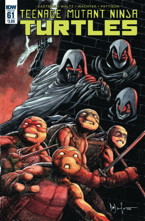
So answer me this: when an issue has exactly _ continuity points that it needs to exposit before moving on to bigger events, there’s a new gang in town, Alopex is missing, the world is becoming more dangerous, and Mikey is unhappy with how events are unfolding; why on Earth would you spend this much time expositing these things through dialogue? Michelangelo himself comments that the meeting that takes up the vast majority of the issue feels like ‘a stupid war counsel’ and I couldn’t help but agree. The "planning" scene of any war movie is usually very short for the same reason that heist movies usually overlay the monologue of the heist planning over the heist’s execution. Explaining a series of events that is going to come to pass so that you can be informed about them again as they’re happening is very, very boring.

What small bits of character development and recuperation from previous events we receive feels token and unnecessary. The Purple Dragon characters are as boring as they’ve ever been, much like the ancestral God characters, dragging the story and events down with them with their somber, dire attitudes. Master Splinter takes entirely too long to explain to Casey Jones the extremely simple concept of ‘you are going to be very important in coming events.' It’s a complete wash of an issue and the very definition of filler. The ending cliffhanger, the new gang kidnaps a new character who could be dangerous in some vague way, was completely token and served not even to excite readers into buying the next issue, but to in some way resemble other comics that are trying to do that.

There’s a new gang of techno-thugs. Michelangelo’s unhappy. Life is hard. You’re now completely ready for issue #62. Skip this one.

[su_box title="Score: 1/5" style="glass" box_color="#8955ab" radius="6"]

Teenage Mutant Ninja Turtles #61 Writer: Tom Waltz Artist: David Wachter Colorist: Ronda Pattison Publisher: IDW Publishing Price: $3.99 Format: Ongoing; Print/Digital

[/su_box]

Review: Beyond the Western Deep

I grew up on fantasy series: Tolkien, Stephen Donaldson, Terry Brooks, and Brian Jacques were among my favorites. Jacques, in particular, had a special charm for his earthy depictions of anthropomorphic animals in the quasi-medieval Redwall series, which contrasted with so much of the “high fantasy” I was surrounded by as a child. Animals formed their own distinct societies, but there was a common humanity in those stories as well. Beyond the Western Deep hits a few those of same good feelings, and the first collected volume of this webcomic introduces a surprisingly deep world that evokes some of the goodness of Redwall.

The Four Kingdoms are a landmass home to four different nation-states: Sunsgrove, Navran, Kishar, and Aisling. After two centuries of peace, the fragile truce between them is failing as the Canids face war with the Ermehn, whose land they originally seized. Sunsgrove, home to the Lutren and the Tamians, is obliged by treaty to assist the Canids, and the story focuses on a young Tamian captain of the guard named Quinlan.

BTWD-00-ffa2b

For somebody who doesn’t read very many webcomics, the format of this book takes a bit of getting used to. Individual pages don’t have a great deal of dialogue on them, so it’s a break from the text heavy comics that I’m used to. That isn’t to say that the comic is light on substance: there are seven races, four kingdoms, and multiple characters to keep track of just in this first chapter, and I have a feeling it’s going to become more complicated as time goes on. However, the pacing is very different from a typical twenty-four page comic, as there’s no particular rush to introduce everybody and everything all at once.

When it comes to substance, this book does well. I’ll admit that I’m a sucker for the geopolitical in any story, and that’s what you get here. Power politics are at the root of this story, and while it does seem to be closely anchored to Quin and his friends, it’s thus far about their place within this order. Whether they can shape it at, all is another question entirely. It also raises the complicated kinds of questions I like: should Sunsgrove help the Canids even if they’re fighting people whose land they stole? What happens if they refuse? The inclusion of the Ermehn’s perspective is also good, though it does get a bit less attention compared to Quin. There are divisions on their side as well about the wisdom of provoking a war or of using deception to unite the tribes.

Overall, I had a good time reading this book. There were a few issues, however, mostly related to form. The book feels very short, and while it does pack a lot of context in, the action is comparably much smaller. I’d like the second chapter to introduce characters beyond Quin and Hardin in greater depth, who were the only two I felt like I had a real grasp of. And the generally slow pace of webcomics does mean that the second chapter (not yet collected as far as I know) took a year and a half to finish. Burdened as I am with A Song of Ice and Fire, I almost hesitate to adopt another fantasy series that will resolve itself slowly. Still, I’m nothing if not an addict, and I’m currently reading chapter two of the series, so I guess it’s hooked me.

[su_box title="Score: 4/5" style="glass" box_color="#8955ab" radius="6"]

Beyond the Western Deep Volume Writer: Alex Kain Artist: Rachel Bennet Publisher: Action Lab Comics Price: $9.99 Format: Ongoing; Print/Digital

[/su_box]

Review: Sick in the Head

With a title like Sick in the Head in the indie submission folder, it could only be one of two things: either a bad exploitation-knobbing horror comic with "extreme" content or a really bad exploitation-knobbing horror comic with "extreme" content. Fortunately for me, it was the former. This review will be short; there isn't much to say about this kind of thing for me. This book will have its audience, but they probably aren't regular readers of the site. Look in the comment section of Bloody Disgusting if you want to meet some. Let's get this over with. Sick in the Head fits in a weirdly common niche of exploitation media: extreme cartoon horror. Taking inspiration from the style and tone of animators like Tex Avery and John Kricfalusi, the genre combines the manic personality and exaggerated visual style of hot-blooded American cartoons and jammed them together with the gratuitous violence, leering sexuality, and barely there plotting of 70's and 80's horror movies. Sometimes you get fun stuff like Angora Napkin and sometimes you get The Haunted World of El Superbeasto. More often than not you get Sick in the Head, which reads very much like something someone had fun writing and illustrating and which serves that purpose admirably. Boobs and gore. Dick jokes. Titty fucking jokes. Meta jokes. It's a comic made with personal passion, but the mistake was submitting it to be pseudo-professionally evaluated when its only redeeming merits are it having been a fun guilty pleasure for the person who made it.

Sick in the HeadThis book isn't irritatingly bad if you've read other stuff in this vein. There's worse out there. There's sort of a plot, some of the cartoon art looks passable some of the time, I never decided to give up and just stop reading it. However, the audience for this kind of thing is pretty slim, not because it's too daring and edgy for normies, but because there is a certain audience that wants to feel daring and edgy for reading stuff like this. If I want politically incorrect acid-tripping bile puked behind my eyelids, I can read the more creatively and richly illustrated The Auteur (which shares a surprising amount of ideas with this book). If I want cartoons getting eviscerated in ironically over the top ways I can read Archie Vs. Predator. If I want cartoon boobs...well, I've got the width and breadth of the Internet for that. The audience for a book like this is small, because it's either people who don't know these other things exist and somehow came across Sick in the Head first, or they are showing up more because they like the idea that somebody is putting themselves out there to draw politically incorrect carnage regardless of the quality of the result. It's the comic equivalent of the movies you see direct-to-DVD distributors like Brain Damage Films or Troma Entertainment release, passion projects of genre fans that result in low-res pastiches of extremely well-worn influences.

The reason I'm not harsher with this book is I think it's really a hobby comic. Something somebody drew because they wanted to tribute their favorite things in comic form rather than necessarily try to create the next hot ticket property for syndication and a toy line. I'm not saying that makes it admirable; it just makes it less obnoxious. That and Sick in the Head isn't as annoying or poorly written as other books I've read with the same DNA, despite this needing to edit out at least ten to twenty unnecessary filler pages minimum. It's fine that this exists. However, when you submit a piece of media to be evaluated critically, you put yourself in competition with everything that critic has ever come across, essentially requesting that your work be positioned on the spectrum of their experience as an audience member. Here at Bastards, we read a lot of comics. We read a lot of comics like this. We read enough that we end up talking in our reviews, not about the details of said comic, but in generalities, about the overall genre the book unremarkably contributes another title too. Make comics. Hell, even sell comics. However, I'm not sure this comic needs to be reviewed, or will likely develop into something that will later need to be reviewed, at least outside of its own niche market. I'm game for extreme, bawdy, ridiculous, and trashy, but for what I wish was the last time, you also need to try to do something new.

[su_box title="Score: 1/5" style="glass" box_color="#8955ab" radius="6"]

Sick in the Head Creator: Alexander Gustafsson Self-Published Price: $8.20

[/su_box]

Review: Croak #1

Disclaimer: The reviewer, Wilson Taylor, is also published under the Alterna Comics label. These opinions are solely the opinion of the reviewer and do not represent the creators of The Croak or of Alterna Comics. I love horror comics because of the tight limitations that they're placed under, they must haunt, spook, and terrify all without the viscera of true-to-life effects, without the reaction-wrenching effect of loud sounds and they must be written and composed well enough to get the reader interested enough to be taken on its horrific ride. A movie can startle and spook without trying because of the human body, not necessarily the mind, reacts to active stimuli such as sound and images they psychologically connect to their own body. Without doing so, the primitive man would have never known to run away from the thing that just turned his buddy into gore-paste.

Croak #1That said, horror comics are hard. Many horror comics rely on pulp aesthetics to add vintage appeal to their core premise, and I often find myself turned off by the approach. Give me a comic that's confident enough in its premise and its story and art to actually try scaring me. So does Croak deliver?

Croak plays a risky gambit, and I'm very happy to announce that, yeah, for the most part, it delivers, though not without some imperfections. The aforementioned risky gambit is to begin with a wholly unoriginal setup and reveal its cards as being a twist on established formula by the end. The setup and you can feel free to sing along with me if you know the words, is that three teenagers go off into the woods for a camping trip, and a spooky something is hunting them and plotting their demise.

Without spoiling the ending, the ending is exactly what an indie comic issue #1 needs to be these days: a promise. My major problem with, say, High Noon Rising was that no matter how well executed its story, art, and conveyance, it gave me no reason to come back, no question that needed to be answered. The implications of Croak's ending are both surprising in the moment and laid the groundwork for what could hopefully be an extremely interesting comic that takes a swift, immediate left turn from standard horror.

If they stay with the established characters that is.

I find myself worried about this comic's future just slightly, as it's a premise that is only interesting if followed through on. Again, doing my best not to spoil, what happens to the main characters is something unlike standard horror-thrillers. The problem is that if we focus on the being/beast that did this to them, rather than the characters that are already afflicted, then the story will, in reality, be mimicking the horror it's subverting to the "T." We need to see the consequences of this horrific act, we need to see how this plays out, and that means not using this issue as solely a proof that the monster is something horrific and must be avoided by new, uninformed characters, but rather as the first step in a long series of atrocities and twists. I cannot stress enough what a letdown it would be to see this strange beast turn into another boilerplate "bump in the night."

There's nothing in Croak that hints at the idea of starting over from scratch with a new cast in issue #2, but it's a dance I've seen too many times to not be worried about. My other complaints begin and end with occasionally stiff art, dialogue that can lean on empty witticisms and argument and the rare hiccup in scene conveyance. As competent as the writer and artist are, however, special attention should be paid to colorist Chris O'Halloran who imbues each scene with an eerie presence that is consistently creepy while never crossing into overly dark or dull.

As comics are short, and each first issue must be treated as a promise, consider me highly intrigued. This is a promise that gets me excited, and it's tough to get me excited when we live in a world where each comic is so desperate for an issue #2 sale that it forgets to make its issue #1 an exciting, well-balanced ride on its own. So yeah, consider this an indie comic recommendation. I've been looking to make one ever since I joined Comic Bastards.

[su_box title="Score: 4/5" style="glass" box_color="#8955ab" radius="6"]

Croak #1 Writer: Cody Andrew Sousa Artist: Francesco Iaquinta Colorist: Chris O'Halloran Publisher: Alterna Comics Price: $2.99 Format: Ongoing; Digital

[/su_box]

Review: Deathstroke #1

This issue essentially picks up right where the last issue left us. This issue progressed the story of the Clock King further. We find him holding a prisoner; the prisoner is one of the men that hired Deathstroke to kill the Clock King. There are a lot of threats and talk between the Clock King and the prisoner in regards to how he shouldn’t have tried to hire someone to kill him. Throw in a half-naked fight flashback between Deathstroke and his ex-wife along with some pretty stellar action scenes and you’ve got yourself a solid comic. The flashback was interesting because it wasn’t Deathstroke’s flashback, it was one of his longtime friend’s flashbacks because he walked in on them as they were finishing their crazy fight, sex party. This flashback did give us a sense of who exactly Deathstroke's wife was. She was the one that trained him to become an assassin; she was, in fact, kicking his butt pretty good in the fight scenes. His ex-wife is clearly jealous that he gets to go out and fight while she is stuck at home doing laundry and other chores.

DS_Cv1_dsConfronting the Clock King is no easy task because he is on a delay essentially, so any image you see of him is a hologram because it is in the past. Given Deathstroke's abilities and top notch fighting skills, he can stop the Clock King in this issue, but it is hard to say if this is the last we will see of the Clock King. I think there are many more opportunities to use him even if just for flashback purposes to give us more ideas as to how Slade became the world's most deadly assassin.

Overall, Priest does an excellent job; his writing is good quality, fast paced, detailed enough without becoming overwhelming to the reader. The story progression from the first one-shot issue was pretty solid. Details that were a little cloudy were cleared up a bit more, such as the Clock King's plan and his real power. This isn’t by any means the best writing ever, but I enjoyed it, and Priest gives you just the right amount of story to satisfy the reader by the end of the issue. There was excellent usage of the pages, giving flashbacks leading into more background for certain characters, possibly even hinting at a new assassin joining the game, Slade's ex-wife.

As the same from the last issue, the art has been excellent. Fantastic character details and the environments are clean, and you can clearly tell where the character is. The movement of characters is captured very well, especially in the half-naked fight scene. Overall this was a good read, might be worth the three dollar price tag, but honestly could probably go down to two dollars. If you are a fan of Slade Wilson as Deathstroke, then definitely pick this issue up. I think the creative team behind this series is doing Slade justice and giving the readers a well-paced, action-packed comic series that can compete with being some of the better writing out of the other DC Rebirth titles.

[su_box title="Score: 3/5" style="glass" box_color="#8955ab" radius="6"]

Deathstroke #1 Writer: Priest Artist: Carlo Pagulayan, Jason Paz, Jeromy Cox Publisher: DC Entertainment Price: $2.99 Format: Ongoing; Print/Digital

[/su_box]

Review: Lake of Fire #1

I want to try something for a moment: I want you to go to your closet/room/office and dig out a box from your comic collection. Now, I want you to randomly pull three single issues from that box, open them up and turn to the title page; if Nathan Fairbairn’s name isn’t on at least one of them…I owe you a Coke. Seriously, though, the guy has coloured everything from Scott Pilgrim to Batman to Young Avengers; the list goes on and on. He’s a long-time favourite of mine, so when Lake of Fire came up for review I was quick to jump on it; I couldn’t wait to see for myself what Fairbairn had in store for us as he took his first crack at creator-owned titles! If I am being honest though and keeping in mind that I possess the utmost respect for him as a colourist, he came up short as this was just a complete and total miss for me. The story begins in the year 1220 AD, at the height of the Albigensian Crusade (*a campaign erected by Pope Innocent III to eliminate Catharism in the south of France). In the middle of the night, a sleeping shepherd is awakened by his frightened flock; he rises confused and half asleep. Upon leaving his hut to investigate their urgent calls, he looks up in the sky and sees a giant (emphasis on giant) spaceship streaking across the sky just moments before it crash lands in the foothills of the Pyrenees Mountains. He investigates the wreckage of the ship and is almost immediately Lake of Fire #1thereafter killed by a huge alien-cockroach (think the first MIB film). Elsewhere in the Languedoc, a fresh young knight is looking to swear fealty and become a soldier of God – the only problem is he's also the son of a Lord! A fool's errand campaign is erected to quell the newly knighted Sir Hugh's crusading aspirations, and a rag-tag bunch of Crusaders are sent to "root out heretics" along the borderlands - only instead of finding heretics, they find alien bugs!

At its core, this feels very much like a classic oddball-hero story; you know the kind I mean: rags to riches, underdog, Bad News Bears-esque type hero story. Ever-present, however, is a very dry, serious undercurrent that makes reading Lake of Fire at times feel analogous to those horribly boring young-adult novels your teachers made you read in grade school. I also had a really hard time coming to terms with the story; it just seemed like there were two separate competing plotlines, neither of which was very strong or interesting to begin with. The fault can be attributed to an overall purveying sense of detachment from both the script and the characters; there was very little substance to keep me reading when the writing got murky, which unfortunately was more often than not. Also, for such a weirdly specific plot setting/era of time, Fairbairn offers up little to no personal insights or clues as to why he chose to tell this story. It literally reads as if he fell asleep with an old history volume, was awakened from a dream and proclaimed "do you know what would have made studying the Crusades more exciting? ALIENS!"

Before there is any confusion, let me set something straight: Lake of Fire is not a bad book, it just hasn't figured out what it wants to be quite yet. There are brief moments of redemption, but largely it seems as if Fairbairn is still in the midst of a "feeling-out" process with his story and characters, unsure of exactly where he wants to take them or how he wants to get there. The good news is Fairbairn is a seasoned veteran with a multitude of talent; he has all the tools to turn this around. The best comics are often a marathon rather than a sprint, and I am confident that Lake of Fire will be the proverbial tortoise that slews the hare. It's either that or he's going to have an Indiana Jones and the Crystal Skull-type situation on his hands, and we all know that there is no coming back from that kind of carnage.


[su_box title="Score: 2/5" style="glass" box_color="#8955ab" radius="6"]

Lake of Fire #1 Writer: Nathan Fairbairn Artist: Matt Smith Publisher: Image Comics Price: $3.99 Format: Ongoing; Print/Digital

[/su_box]

Review: Generation Zero #1

New York Time’s best-selling writer Fred Van Lente delivers a mysterious, heart pounding comic series. Generation Zero as the series is called is also the name of a group of modified human beings grown in a secret lab. These individuals are supposed to be a myth, but as it turns out they are very much so real. Generation Zero if they find you worthy, and desperate enough, they will come to your aid and help you with whatever problem you have. As for the comic series main character, Keisha, she wants to know the mystery behind her boyfriend's sudden death. Picture a very high-tech, best of the best equipment, with essentially no anguish and that is the setting for this comic. Rook, Michigan used to be a worn down city with severe poverty, and now they are one of the most advanced cities in the entire world. Nobody is poor, everyone has jobs, people can afford to buy pretty much everything they need. Even with this fair distribution of wealth and the best technology, there is still a gap between citizens but in the form of popularity.

GENZERO_001_COVER-A_MOONEYKeisha is an outcast amongst her school, along with a few other students and her boyfriend, Stephen. Stephen was a very intuitive guy, always questioning the status quo. This is likely what got him “killed” in the first place. When Keisha finds out about her boyfriend's passing, she turns to the only thing she thinks can help her, Generation Zero. Generation Zero is a very secretive group; they almost seem like a spy agency like in Mission Impossible. Keisha is contacted by Generation Zero who tells her that they will be in touch with her soon and for her to act normal.

At school, everyone is way more attentive to Keisha then normal. They invite her to a huge party, which is in memory of Stephen. Before heading to this party, Keisha receives a letter from Stephen which he mailed to her before he died. He told her he was onto something big and that she couldn’t trust anyone, not even her father. At the party, Keisha runs into a group of new kids she hadn’t met before. They said they were new to town, and they were starting school the next day. One of the new students Keisha finds to be a perfect male specimen with stunning looks. After being creeped out by one of the students, Keisha wanders off towards a lake where she is attacked by some faceless alien like creatures. Guess who comes to her rescue... Generation Zero.

Wow, I cannot wait for the next issues of this series. I don’t think I have ever actually read a story like this. Van Lente has done a great job creating a unique story line that actually leaves you wanting more pages at the end of this issue. This is definitely the kind of story I would binge read all day. You are really cheating yourself if you don’t read this comic. I loved the pacing, the backstory for characters was solid, and the change from internal dialogue to external was excellent. It is honestly a challenge finding anything I didn’t like about this issue. We have a solid main character and then we are introduced to a rather mysterious group that calls themselves Generation Zero, and the whole time you are just dying on the inside to know what this group is going to do to help out the main character. I hate the fact that I have to wait a few weeks to read the next issue.

On top of a fantastic, creative story, the art was done by Francis Portela, stands on its own as being incredible. A wide range of bright colors used to show detailed environments and also capture the raw emotion in the character’s faces. Same as the writing, there is nothing major wrong anywhere in this issue. If this duo of Francis and Fred keep up the level of work they put into this issue, there is no reason this can’t be one of the top standout comics of August. I look forward to reading more issues of Generation Zero, and I highly suggest everyone else gets on board with this series.

[su_box title="Score: 5/5" style="glass" box_color="#8955ab" radius="6"]

Generation Zero #1 Writer: Fred Van Lente Artist: Francis Portela Publisher: Valiant Comics Price: $3.99 Format: Ongoing; Print/Digital

[/su_box]

Review: The Tick - Pilot

Amazon Pilot Season is here! What does that mean and why the hell should I care? It appears to be Amazon’s slightly weasely means of getting out of putting its weight and money behind a variety of shows catering to different interests by backing the pilot episodes of three different shows and letting the public decide which show is worth the most money. In my opinion, the other two shows look just awful, so The Tick gets my vote for simply being the most immediately clever and colorful show. For perspective’s sake, I liked the old cartoon show, did not like the old live-action show, and I never read the comics. The Tick, as a character, is best not when engaging in visual gags like his contemporaries Freakazoid! or Earthworm Jim, characters known for their engaging encounters with their villains but in exchanging wacky, almost-mundane dialogue with his sidekick Arthur. This is probably the reason that the original live-action show seemed like a solid idea. Which it was. I just take extremely petty issue with their execution.

So how’s the pilot to the new Tick? God help me I have no idea. I understand what a risky thing this is to say for a reviewer, but hear me out.

The Tick, again, in contrast to Freakazoid, The Mask, or Earthworm Jim, has always been a parody: every aspect of it is ingrained in being a twist on the conventional formula. The Tick himself being an idiot is a joke on both the ridiculous degrees of heroism displayed by normal superheroes and something of a performance gag based on his ludicrously muscular appearance. The Terror being geriatric is a gag based on the concept of the elder space-villain, and his age having an effect on his performance as a villain is consistently funny. Arthur being both a mockery and kind of a dweeb is a play on the sidekick’s usual resignation to "the brains" to the hero’s "brawn." Freakazoid’s a freak because being a freak is funny, but the joke doesn’t rely on pre-established knowledge like The Tick does.

Tick_Landing_page_750x375._V282759396_That being established, I cannot tell, for the life of me, how much of this new Tick is a joke. A shocking amount of time is given to the character of Arthur and his tragic backstory: spaceship lands on his father and the superheroes inside are blinded by space-syphilis and shot to death. Attempting to play that angle straight to any degree seems like a joke in itself, but lo and behold, characters take genuine pity on him and his sister takes a deeply personal interest in making sure that her brother is healthy. These scenes are played with equal parts silence and somber music. The degree to which it appears to be sincere is difficult to explain because explaining it sounds like the show is trying to be funny about it.

I’m not convinced that it is trying to be funny about it, though. It’s as if this show is literally trying to make my job harder on me.

The Tick himself takes up about 30% of the screen-time in this pilot and what I can say is that his presence is a genuine delight. Save for the dodgy CGI that surrounds his scenes and a suit that’s not totally visually appealing; The Tick is written as masterfully as he ever was and Peter Serafinowicz is a phenomenal actor, doing an amazing job with the part. The Tick's pilot would have been served much better by not focusing on Arthur's development before becoming a superhero but rather his development as a superhero. I understand this to be a pilot, and its efforts are in making sure everything is in place, but this pilot is also trying to sell the show as a whole to both its producers and audience. Spending so much time away from the show's main draw was always going to be risky, and I don't think it paid off this time.

This review is tough because while 30% of the show is funny and compelling, I can't tell how much the other 70% of the show is. If it isn't kidding, then the makers aren't phenomenal at character building and can only advise that they spend as much time on The Tick as possible, whether in or out of his suit a la Deadpool. If it is, I advise they spend more of their time on better, funnier jokes in the future.

This is assuming The Tick has a future. I will say I genuinely hope it does if nothing but to see what little character development we are given pay off and to see "average" fulfill its promises of being "good."

[su_box title="Score: 3/5" style="glass" box_color="#8955ab" radius="6"]

The Tick - Pilot Director: Wally Pfister Writer: Ben Edlund Studio: Amazon Studios

[/su_box]

Review: Justice League #3

Bryan Hitch’s current run on the Justice League is a story that’s been gradually getting better in ticks when it needs to be improving by bounds. The ominous red-dialogue mob has now stacked atop each other to make giants that now possibly threaten the world. If this run has done one visually interesting thing, it’s through how it’s constantly evolved the visual design of the villain, always building a different type of intrigue and doom with each iteration.  The brainwashed civilians collapse into each other to create colossi across the globe; each glows a specific color in the Lantern spectrum but why?

Yet the real mark of improvement comes to a stark direction towards the characters. Most of the Justice League is still forgotten, but with the introduction and recruitment of this new Superman from another world, there’s a glimpse into what this story could be about. Batman and the League need a Superman to go to the center of the Earth, and though he’s already accepted, Superman goes to his farmhouse in Kansas to tell Lois what he’s going to do.

JUSTL_Cv3_dsTheir relationship and this interaction are hands down the most engaging part of the story. Lois argues with him, tells him this plan is stupid and dangerous. She doesn’t want to lose her husband, and though Clark tries to ease her nerves and remind her of the other times he’s come back to life, they both know he still might die.

This was the first human moment—the first actual conversation in these entire three issues but unfortunately only takes up three pages. When Superman is teleported to the molten core, the art conveys how overwhelming and desperate the situation is. Superman is engulfed by the intense heat, blinded and struggling but as the issue closes here, I couldn’t stop wanting to go back to that conversation, to stay in it a bit longer.

Why couldn’t Superman get to say a real goodbye to his son? Why didn’t Lois chew out Batman and Cyborg? We don’t even get to see the conversation teased at the end of issue #2 where Batman tells this unfamiliar Superman their plan that could take his life.

The Justice League #3 falls into the same traps as the other issues of the series. There are glimpses—glimpses of themes, glimpses of character moments that you can just see ready to peek out and claim the story, but then they’re gone all too soon. Just as Lois White, Superman’s wife has a moment to react to that interminable silence that is the wait until her husband either comes home or dies an explosion happens.

Just as there’s a moment for Batman to acknowledge this extension of trust to someone who looks exactly like his dead friend, exposition drools out instead. Instead of a human and engaging story about these characters, these strange and contrasting personalities that find common ground, the pages so far have been an elaborate action sequence and all sound and fury signifying nothing.

Theming in a superhero story is almost always determined by the source of conflict, yet the villains here are kept so vague, so cloudy and indeterminate what their origins and interests are—that I can’t even tell you what this story is meant to be about.

There are earthquakes, I guess? Big glowing dudes are stomping around and maybe are doing something bad? There are strange bug monsters that are somehow related? I’ve read the first three issues of this story—now sixty pages of this story—and I feel like I have no better grasp on what’s going on than when I read the first five pages of issue one.

This might be harsh, but this story isn’t unsalvageable. It only needs to remember why readers come to see tent pole superheroes in the first place. It’s not because we’re interested in seeing an action sequence or their super power or the villain of the week—we’ve come for the characters we remember and love.

We want to see stories about them, not stories that they happen to inhabit.

[su_box title="Score: 2/5" style="glass" box_color="#8955ab" radius="6"]

Justice League #3 Writer: Bryan Hitch Artist: Tony S. Daniel Colorist: Tomey Morey Publisher: DC Comics Price: $2.99 Format: Ongoing; Print/Digital

[/su_box]

Review: Atomic Robo: The Hell and Lightning Collection

Going into Atomic Robo: Hell and Lightning I was playing catch up. Blame it on the irregular publishing schedule, or, more likely, my employment at a startup two years ago, but either way I had not read an Atomic Robo comic in quite some time. It was just one of those good comics that somehow slips through your fingers. But I’m glad to say that after reading Hell and Lightning, not only am I caught up, but I feel great about it. Hell and Lightning is a great collection. Its greatness primarily comes from the great stories. The Flying She-Devils of the Pacific, The Savage Sword of Dr. Dinosaur, and The Knights of the AtomicRoboHellLightningCollection-CoverGolden Circle are all collected in this volume. And throughout each arc, there is not one subpar comic among them. There are better issues, even better arcs. In my opinion, Savage Sword is the best of the bunch and Knights is the weakest, but even so, each issue still held that same mix of adventure, humor, and high-stakes that make Atomic Robo one of the best comics around.

As for the additional content, Hell and Lightning contains 3 free comic book day issues from 2013 – 2015, a notes section about the lives of the characters portrayed in The Knights of the Golden Circle (in it, Robo heads back to the old west Marty McFly style), and a few sketches from Scott Wegener. The free comic book day issues are excellent one-shots. The standout among them being The Trial of Dr. Dinosaur (something about Robo vs. Dr. Dinosaur just tickles me the right way). The notes are an excellent addition, not just because I love essays in comics, but because while most readers will have heard of Dr. Holiday, most will probably not have heard of U.S. Marshal Bass Reeves who was just as much of an old west badass. The sketchbook isn’t anything extraordinary, but it does show off some of Wegener’s stylistic range. It’s always good to see a sketchbook that really illuminates some of the artist’s process.

All in all, this is just a really good collection. The core stories are great, the fact that they included the free comic book day issues is also an excellent choice on the part of the publishers/creators. Especially considering how much Atomic Robo has become associated with the event. If you haven’t picked up the trades or are looking to get back into some Robo action, this is the collection for you.

[su_box title="Score: 4/5" style="glass" box_color="#8955ab" radius="6"]

Atomic Robo: The Hell and Lightning Collection Writer: Brian Clevinger Artist: Scott Wegener Publisher: IDW Publishing Price: $29.99 Format: TPB; Print/Digital

[/su_box]

Review: Death Force #4

I usually don’t start off two reviews for the same series the same way, but this is going to be a short review. Death Force doesn’t fight the Dragon dude. They square off for a minute, but then when it’s clear that fucking bullets do nothing, they get the hell out of town. That and the Dragon dude starts a fire that he can’t see through… which was weird. I mean, it’s your fire? We also learn that the cops basically know what’s up and that one beat cop can track a van leaving a warehouse and no other cop can. Also, Death Force takes his mask off, and he’s an average Death Force #4looking dude. We do learn why he’s invincible which was the only cool thing going for this book at this point. It’s a real conflict of character, but it will likely never be expanded nor will the story take a moment to let the character deal with it the way an average person in that situation would.

This comic isn’t bad. It isn’t good either, though. Its biggest fault is that it’s playing it safe by using other aspects from stories. There’s nothing new about this story. Not from the Dragon, not from the dead guy back for revenge, not from the plan to bomb the city. Everything in here is something you’ve seen somewhere else, but thrown together. The problem is, it’s not doing it better. It’s not doing it well even; it’s just average. I’m not even mad at it because it doesn’t invoke enough emotion out of me. I do want to like it more, but I can’t. This issue also chipped away the one cool thing it had going for the character, and that was his helmet, which would have been ten times cooler if it was his face. It came across as a possible loophole for the film version. “Look, the main character shows his face naturally within the story.”

It’s a comic. That much is for sure. There’s a slight chance that I’ll read the remaining two issues, but unless it finds something original to do, I won’t be reviewing them. As it is right now, this series is utterly forgettable, and that’s a damn shame. It had the potential, but the execution is severely lacking. When you shoot for inoffensive and average, that’s exactly what you’ll get.

[su_box title="Score: 2/5" style="glass" box_color="#8955ab" radius="6"]

Death Force #4 Writer: Joe Brusha Artist: Marc Rosete Publisher: Zenescope Entertainment Price: $3.99 Format: Mini-Series; Print/Digital

[/su_box]

Review: Godzilla: Rage Across Time #1 (2 of 2)

Editor's Note: Wires were crossed. We ended up with two reviews, so we posted them both. At once a menace and protector, Godzilla can fulfill a reader's power fantasy. As a destructive force of nature and a nationalistic point of pride, the mutant lizard has served writers as a powerful and poignant metaphor of Japan's collective anxiety. In Godzilla: Rage Across Time #1 the creature is an unwanted ally against Mongol invaders. It's perhaps no coincidence that Godzilla's dorsal plates are rendered in the same way as the tumultuous waters where he rules. He, as a chaotic force, has no allegiance and is fickle in choosing his targets. Like the sea, Godzilla is unpredictable. And this issue does a good job driving that notion home.

GODZILLA_RAT_01_CovIt is sadly common for audiences to criticize Godzilla stories for focusing on human drama more than goofy monster fights. Here, the balance is just right, letting the two human leads have enough personality to believably guide their actions and simultaneously tying their plight to the theme of uniting in Japan's defense. The characters are very broadly written, not offering much in the way of depth. They serve the plot more than anything else. And once the monster battle begins, you've already forgotten the people.

Visually this book successfully evokes a vaguely ukiyo-e art style that, while anachronistic for the issue's too early time period, is recognizably Japanese. Some readers are going to be turned off by the heavily stylized renditions of four classic kaiju. The end result of this approach, however, is a book overflowing with intense line work. Curls of smoke are rendered as actual curls, clumped together in giant masses hovering over invading hordes. Godzilla's signature radiation breath blast has never looked more eerily beautiful.

Where will the atomic gorilla whale show up next? Will these stories be confined to Japan? When will he pilot a mech in space? No matter. I'm excited to follow the further adventures of this accidentally heroic monstrosity, wherever they lead him.

[su_box title="Score: 2/5" style="glass" box_color="#8955ab" radius="6"]

Godzilla: Rage Across Time #1 Writer: Jeremy Robinson Artist: Matt Frank Colorist: Paul Hanley and Gonҫalo Lopes Publisher: IDW Publishing Price: $3.99 Format:  Mini-Series; Print/Digital

[/su_box]

Review: Godzilla: Rage Across Time #1 (1 of 2)

Editor's Note: Wires were crossed. We ended up with two reviews, so we posted them both. I don't entirely understand the point of Godzilla comics. In his original appearance in the 1954 Japanese film, he was a symbol of the raw horror of the nuclear destruction of Hiroshima and Nagasaki. Godzilla was an incomprehensible force of nature, destroying a city with the uncaring power of a hurricane. But in the last sixty years, the giant radioactive lizard became a franchise, and as is not unusual, people ran out of ideas of what to do with him. Some mileage was gotten out of using him as an intelligent and perhaps even sympathetic creature (see James Stokoe's excellent Half Century War series). And other takes have simply placed him in as many random circumstances as possible. We've had recently Godzilla going to Hell, Godzilla traveling dimensions, and Godzilla trying online dating (ok, I made that last one up, but it would probably make for an interesting book). While there's nothing inherently wrong with trying different concepts under the Godzilla brand, without a strong central hook, they can feel more than a little pointless. Enter Godzilla: Rage Across Time, one of the most disposable comics one will ever come across.

GODZILLA_RAT_01_CovThe concept for Rage Across Time is, as far as I can tell, to tell stories about Godzilla set in different time periods with a modern day framing device. Issue one, for example, follows an archeologist as he speculates about the role of Godzilla in defending Japan from invasion in the 1200s. Ignoring for the moment that if any of these stories are true, it will make for a very different history, there are a few specific qualities this book would need to work. Firstly, each story would have to be compelling and fully realized and, since there is a framing device, some sort of an overall arc would need to occur. Sadly, Godzilla: RAT does not manage to establish interesting characters or a compelling story in either time period. The modern set bits feel like an afterthought, added to tie the chapters together. Meanwhile, the period set pieces are muddled and dull, never establishing the setting or characters enough for the story to have stakes.

I like the concept of Godzilla having a mythos that stretches back through the centuries, and I think something interesting could be done with it, but the first issue is too anxious to mash its elements together, instead of letting anything happen subtly or organically. We are given two warriors, then are shown an army of invaders who for some reason have two kaiju, then are sent on a quest to recruit another kaiju, and finally awake Godzilla who accidentally solves the problem. It's too much for one issue, especially since much of it could be safely cut and replaced with a few interesting characters or at least a slightly more developed historical setting. We never get a feeling for how this world works, making the addition of giant monsters feels rather insignificant.

A glimpse of what a better version of the book might look like comes through the art of Matt Frank who draws the flashback portions in the manner of ancient Japanese ink drawings. This style is carried off extremely well and coupled with some subtle colors to make a stylish, lavish looking issue. The art even implies that perhaps the story is supposed to be an ancient myth (in the manner of many Hellboy stories) which is not successfully suggested by the script. The only downside is that with all the detail packed into every page, the layouts can become a little muddled, though frankly, that's a small price to pay for art so good.

Die-hard fans of Godzilla may find something to enjoy in Rage Across Time, at least in terms of the art, and it's never a truly bad book. But in all the places where it should be exciting and creative, it feels dull and contained. I'll be interested in checking out future issues to see what other art styles are implemented, but with boring ongoing arc and an inconsequential first issue, there's very little else to be interested in.

[su_box title="Score: 2/5" style="glass" box_color="#8955ab" radius="6"]

Godzilla: Rage Across Time #1 Writer: Jeremy Robinson Artist: Matt Frank Colorist: Paul Hanley and Gonҫalo Lopes Publisher: IDW Publishing Price: $3.99 Format:  Mini-Series; Print/Digital

[/su_box]

Review: Sixpack and Dogwelder: Hard Travelin’ Heroz #1

There are, in my humble opinion, comic properties that should live and die in their era of creation. Not every character is timeless. Nor is there the need to bring everything back again and again. Enter Sixpack and Dogwelder: Hard Travelin’ Heroz, from the same publisher that brought us Before Watchmen. I say that never having read Before Watchmen, but also as a comic reader that never hears about anyone giving two shits about it either. Usually, I like Garth Ennis. Usually. There is no other way to say this, but I hated this book.

It is not for me. It is for anyone that enjoyed Hitman and read that like the Holy Bible of 90s comics. That’s not a bad thing either, but we’re far removed from the 90s and DC as a publisher is far removed from anything resembling their dominance of the decade as well.

Get ready to gasp.

I’ve never read Hitman. Now, I never will read Hitman.

SixPdogW_Cv1_dsIf this book is any indication of what to expect from Hitman, then I’m past the point that I could read it and enjoy it. It’s kind of like watching Animal House after you’ve already watched everything inspired by Animal House and just being able to appreciate where the gags came from, but not enjoying the gags themselves.

I’m reviewing this book from the standpoint of a new reader. Someone who walked into the shop and saw a new first issue from Ennis and DC and it looks ridiculous and fun. If you’re already a fan of this book, if you knew well before reading it that you were going to love it then save your comment. This review isn’t for you. We’re not going to agree, and I don’t need to hear your history lesson on Garth Ennis’ writing. That and shit like that doesn’t matter. What is important is in the book. And what’s there, isn’t inviting to new readers, nor is it polished in the sense that it even reads like a first issue.

Other than all the cameos that were forced and senseless, there’s not a lot that makes sense in this “first” issue. Dogwelder spies on his family… I assume. He tried to weld dogs to his kid’s faces… I assume. There’s a lot of “you’re a great new dad to them” talk, and then we’re off to a bar. At the bar, Sixpack talks. He talks a lot. Something about needing a job and not getting the respect of the other teams in the DCU. The Spectre shows up making what’s possibly his first Post 52 appearance. Constantine is hinted at. Jokes from the 90s that have been reused, redone and abandoned run rampant throughout the issue, and if I were the sensitive type, I would say that a lot of politically incorrect jokes were made. I’m not, so I’ll say that a lot of dated and weak jokes were attempted.

The art is… there. It’s inoffensive. It looks as if it’s trying to match a style it shouldn’t. It looks dated at times, but then not. It’s strange, to say the least. I didn’t like it, but I didn’t hate it. It clearly has a personality of its own, but not one that I would personally seek out again.

This issue and possibly this storyline, feel like something pulled out of the drawer. Something abandoned because of low sales or an event that would make it fit awkwardly with whatever else DC had going on at the time. It looks and feels like the old DCU, but not in a way that makes you miss it. Instead, it kind of reminds you that the New 52, for all its faults and lack of history, cleaned up a lot of turds floating around. This story could have worked, but it needed to do a lot more than just embrace the current costume designs of its characters. That and books starring the supporting cast of a popular character always suck. While I don’t need to say this, I want to: I won’t be back for the remaining five issues.

[su_box title="Score: WTF" style="glass" box_color="#8955ab" radius="6"]

Sixpack and Dogwelder: Hard Travelin’ Heroz #1 Writer: Garth Ennis Artist: Russ Braun Publisher: DC Comics Price: $3.99 Format: Mini-Series; Print/Digital

[/su_box]

Review: Batgirl #2

A really great second issue in mainstream comics is typically hard to come by. There’s neither the exciting newness introduced by the story change-ups of a first issue, and it’s always too early in a story for there to be significant and exciting moments or revelations. We’re at the lowest point in the rising action mountain climb so while Batgirl #2 doesn’t completely shake off those pitfalls, it does damn good job with what it's got.

BG_Cv2_dsThis issue is all about taking the time and easing us fully into its premise set by the first issue. Barbara Gordon is taking a vacation across eastern Asia and in the process embroiled herself in conspiracy, a blossoming love affair, and the local mixed martial arts scene.

The story here is all about juggling—juxtaposing Barbara’s time sneaking out and fighting in the MMA scene against the romantic getaways with Kai. The sequential art does a lot of work here by paralleling the two, divided world’s she inhabits but unfortunately my interest couldn’t help lean towards the MMA side of the story.

This part of the comic has beautifully drawn fight scenes, plays towards the investigative heart of the Batbooks and transplants us into a new type of setting filled with intriguing characters. The alternate story with Kai is there to ground Babs with something relatable but hasn’t made a good case for their relationship so far.

Narratively, I don’t trust Kai, and luckily neither does Barbara. They grew up together in Gotham where he was in constant trouble and, now that they’re a decade and several continents away, things still look sketchy. As he’s presented, however, he’s a bit dry. I could see this story work if Barbara was using their relationship as her sub-vacation. Even though she’s not in Burnside or Gotham, she’s still acting like Batgirl and if she can’t take a break from being that then at least she can have some fun. Instead, though, she’s having these internal monologues about how her double life means their relationship can never work, and there’s not much of a sense of why she even wants a relationship in the first place. There’s not a ton of character to Kai right now, and their romantic scenes together play out like two separate characters in a different narrative.

For the time being, Kai’s a little too passive for the larger comic arc going on here, and while that doesn’t sink the ship, it definitely rocks it. The creative team behind this book has brought about some exciting elements and now that they have them all laid out and running, I hope to see them find some steadier footing.

[su_box title="Score: 4/5" style="glass" box_color="#8955ab" radius="6"]

Batgirl #2
Writer: Hope Larson
Artist: Rafael Albuquerque
Publisher: DC Comics
Price: $2.99
Format: Ongoing; Print/Digital

[/su_box]

Review: Snotgirl #2

Eventually, I will get over the fear of Bryan Lee O’Malley publishing a bad issue, but if 2015 comics taught me anything, it’s to live in fear of the second issue going terribly wrong. Not the case here, though there are some quirks to this issue keep it from being perfect. The story does not pick up where the first issue left off. That is okay with me. It added to the drama of “did it really happen”? Now, I assume that if you’re reading a review for the second issue you bothered to read the first issue and with that, I will announce a spoiler from said first issue. Why? Because it is important to the plot. Ready? Okay, Coolgirl is dead.

That’s where we pick up, with Lottie panicking about what to do about turning herself into the police. She knows she should, that it’s the right thing to do, but she doesn’t. She’s a flawed character that's scared and has gone through something very traumatic and isn’t talking to anyone about it. You have to understand that; you have to put yourself in Lottie’s shoes and though it’s easy to say, “I would turn myself in” how many times on the news do you hear or see a person being arrested because they didn’t want to do that? How many Dateline’s and documentaries about people that could have avoided trouble by turning themselves in that didn’t? I point this out because it might come across as a mere excuse to continue the story, but I think that it’s an important detail that makes up Lottie’s character.

Snotgirl #2There're two other major events in this issue. One I will tell you about because it’s major in that it changes the landscape, but doesn’t spoil anything and the other I will vaguely talk about by bringing up another story it reminded me of. For it to be a spoiler, you would have to have knowledge of the story, so be careful.

The first is that Lottie has an intern, and she reveals that Lottie had a former intern that’s dating her ex-boyfriend. This simple little scene leads us down a rabbit hole that may or may not be inspired by Perfect Blue. If it is, then O’Malley has won me over, and I will be onboard forever. If it’s not… who am I kidding? I’ll still be here, but I’ll still be trying to figure it all out. I want to elaborate more, but it’s too early into the series, and it would just make this a spoiler review and I don’t want that.

What’s strange about this issue is that the use of social media is almost entirely removed when you compare it to the first issue. It’s weird because this issue would have been completed before the first issue was released and so no feedback from the public would have changed it. Granted, it’s not particularly needed, but it was one of the quirks of the first issue that worked. O’Malley and Leslie Hung understood the social media they were mimicking and used it tastefully.

A stumble on the story side comes near the end when a new character is introduced, and we’re given just too much about this character, too quickly. That and it’s at the end of the issue, so it feels awkwardly placed. It would have been a great start to the next issue, but as it stands, it fits with the rest of the issue but is clumsy.

The art from Hung is still very enjoyable. The use of pink has never been better in a comic book, and the fashion that is modern and not a throwback to the fucking 70s or 80s is just awe inspiring. My biggest complaint about comic is that the hair always sucks. Thankfully Snotgirl is here to change that. That parts that were weird for me involved Cutegirl. There are times when she doesn’t fit in with the rest of the world. When Cutegirl and Lottie are spying on the ex-intern, her legs and feet look floaty and strange. Her dress cut also look way too high as if she’s missing a torso. The dress itself is intriguing, but it looked too flowy. It’s minor, but when a book looks this damn good, it’s hard not to notice the little things that stand out.

Snotgirl isn’t likely to win over superhero readers the way Scott Pilgrim once did, but for those of us reading it, it is a unique comic experience. Never before have I read a comic about fashion, blogging, with a mix of murder and sordid love affair. If you read comics because of stories and for stories that you’d never see anywhere else, then Snotgirl is absolutely a comic book you should check out. It could surprise you; it could also hurt your eyes with just how damn good it looks.

[su_box title="Score: 4/5" style="glass" box_color="#8955ab" radius="6"]

Snotgirl #2 Writer: Bryan Lee O’Malley Artist: Leslie Hung Publisher: Image Comics Price: $2.99 Format: Ongoing; Print/Digital

[/su_box]

Review: Grimm Tales of Terror vol. 2 #11

SHOCKING! TERRIFYING! BLOODY HELL! This week, I’ve decided to review Zenescope Entertainment’s Grim Tales of Terror Volume 2 #11. This title caught my eye for two reasons. For one, I like horror titles; I like seeing what’s on the market and how other people make horror comics. The second reason was that a friend of mine had drawn stories for this title previously and from the quality of his work, I thought this book would be ace… I might have picked the wrong issue to review here, ha-ha.

This issue’s story has a well-trodden trope; you should guess that from the story’s title, “Vanishing Hitchhiker.” Ghost of a hitchhiker haunting a road, looking for the person who killed them. Done. I’ve seen this story done across various forms of media a few times, so it would’ve had to have done something really special to impress me. I think this is the first comic I’ve seen in a long time that has someone who came up with the story and someone who’s written it credited to two different people… Joe Brusha came up with the story, and Marco Lopez has written the issue (I think this is the first time I’ve encountered anyone on this title’s work.)

Grimm Tales of Terror v2 #11It’s a pretty bog-standard tale, and I’m sure it could have been done in far fewer pages. Some of the dialogue is pretty stilted and Marco… he… really like using those ellipses. The main character is like a less charismatic Captain Kirk, who happens to be a home security salesman and also, a really cheap bastard.

The artist for this issue did alright I guess. Though Roger Bonet’s art at times is a bit hit and miss, there are some nice panels in here; it’s just a shame that there’s some duffers in there too because it drags down the rest of the art in the book. The color work is lovely throughout from Sonia Moruno, though, even on the panels that aren’t drawn particularly well. So well done, Sonia!

There’s not much else I can really say about the story in this issue. It wasn’t really scary or horrific in any way. There was some gore and some swearing. Overall, a pretty disappointing introduction to the series for me. The variants are probably the highlight for me. I have a guy who buys a lot of Zenescope titles from my shop who I’m pretty sure doesn’t even read them, ha-ha. He just buys all the covers. So keep doing the variants, Zenescope. I have a customer who loves them…

If you collect the series, I’d like to know what you thought about the issue in the comments section. And if you do collect the title, tell me about previous issues for that matter. Maybe I just picked a bad issue, eh?

[su_box title="Score: 2/5" style="glass" box_color="#8955ab" radius="6"]

Grim Tales of Terror v2 #11 Writer: Marco Lopez Artist: Roger Bonet Colorist: Sonia Moruno Publisher: Zenescope Entertainment Price: $3.99 Format: Ongoing; Print/Digital[/su_box]

[/su_box]

Review: Kim and Kim #2

With a cleverly written narrative that opens the issue as the group descends down an alien ocean, Kim and Kim continue the stylistic, flashy, and fun tone established in the first book.  Also, a great running gag reappears that will catch readers off guard but elicit a smile, for sure.  Needless to say, the quality of this comic has not dwindled in the sophomore offering. Kim and Kim 2Kim and Kim are now in possession of the tendril bounty.  But the duo feels sending him back to his natural dimension would be the best treatment.  So what do the Kim’s figure to be the best means of returning him home?  Witchcraft.  That’s right.  The futuristic story once again breaks boundaries by summoning up a little horror.

The key to this will be a woman named Lady Babylon.  The problem is that she’s not easy to find.  What that means for readers is a madcap adventure featuring fighting with guitars and battling monsters with machine guns.

Overall, the manga-influenced artwork conveys the story quite well.  Missing from this issue was the interesting futuristic designs seen in the previous issue.  What reader get instead is a myriad of different locations with some cool little elements to them.  Anyone want to take a dip in a hallucinogenic laden ocean?  How about a summoning circle in the back of an intergalactic Volkswagen van?   You get the picture.

Kim and Kim remembers to do the one thing that so many comics forget: be fun.

[su_box title="Score: 4/5" style="glass" box_color="#8955ab" radius="6"]

Kim and Kim #2 Writer: Magdalene Visaggio Artist: Eva Cabrera Publisher: Black Mask Studios Price: $3.99 Format: Mini-series; Print/Digital

[/su_box]

Review: Rom #2

Rom now has an ally, and they’re on the run. The Dire Wraiths are everywhere, and they are relentless. Rom can only resist for so long, and as he desperately flees, the elements set up in the first issue finally converge. Looking back on my review of the first issue of IDW’s Rom relaunch, I don’t want to say that I was too kind but rather I want to be more up-front about what interests me with this new series. Bill Mantlo’s original run of Rom Spaceknight from the 1980's is partly defined by it's interesting and intrinsic relationship to the Marvel universe and the finality that existed for the series.

To see Rom brought back forty years later and in a different comic book, the universe has caused me to lean in close and see how it justifies its existence. This isn’t a sequel series. This is a reimagining and in some way feels like if in forty years someone remade Brian K. Vaughn’s Saga with the same lead characters but in a different setting.

Rom02_cvrSUB-AThis book will almost be a lesson in what happens when you remake something that feels like such a unique and finished property. This happens with movies all the time but for comics is relatively new.

As a story in a vacuum, I can't help feel that Rom #2 is on uneasy ground this time.

This issue felt like a retread of the same beats the first issue ended on. Rom now has a new ally in Darby Mason, and she readjusts to her new strange reality with her family dead and replaced by Dire Wraiths. However, little do they have time to rest and process this information when the Dire Wraiths strike again.

The original Rom Spaceknight was never a series that slowed down. Rom was on a rampage, but that type of story only worked because of the hyper-condensed style of the comic writing indicative of the 80's.

This time around that I want for Rom and Darby hide out in her home and stay there for a little longer, and so I could more clearly see the type of story intended on being told here and trajectory of these characters.

Still, as a longtime fan of the character, I can't help notice all the subtle little twists to the original formula. This team behind IDW’s Rom comic has such a clear passion for the original story and have thought critically about the tiny aspects of the original that when changed shift the potential of that story dramatically.

These twists reveal themselves in the last few pages of the issue so I won’t spoil them here, but as someone who read the previous series, they made sit up. Gage and Ryall have managed to preserve and respect the character of Rom while revamping his story for a new century.

Mantlo’s original Rom Spaceknight was far from a series built on a few issues, and it’s easy to see the ways this new series can come into its own and tell a story as weird and engaging as Rom ever was.

[su_box title="Score: 3/5" style="glass" box_color="#8955ab" radius="6"]

Rom #2 Writer: Chris Ryall Artists: David Messina and Michele Pasta Publisher: IDW Publishing Price: $4.99 Format: Ongoing; Print/Digital

[/su_box]

Review: Alena

Why do the Swedes seem to love stories about darkness and alienation so much? As an American, I’m hardly in a good position to throw stones or criticize anybody else, and I personally am drawn to melancholic and dark stories. This blows the doors off of that, though. Alena is a dark look at teenaged life, with a girl being alternatively protected and haunted by her dead best friend and lover.

It’s been a year since Alena’s best friend Josephine took her own life, leaving Alena alone. Victimized by bullies at school, in particular by a girl named Philippa, the ghost of Josephine is giving Alena advice on how to stand up to them. Yet Josephine’s motives are far from pure, and when Alena starts to get too close to somebody else, she starts lashing out at him as well. Alena is caught in the middle of this, trying to protect herself and deal with her grief from Josephine’s death.

The art has a willfully grotesque character to it. Not grotesque in the typical comic book sense, with violence and blood splatters, but in people’s facial expressions. At first, I thought that they were mistakes or little flubs because some of the characters take on such unnatural expressions, but I realized I was wrong after a while. Remember all of the ugly sneers you saw when you’re in high school? They’re all here, and it’s like they’re under a magnifying glass. They’re exaggerated to an almost horrifying degree, page after page of cruelly leering faces.

31143

It’s tempting to compare this to Let The Right One In (in part because my knowledge of Swedish films and literature consists of Bergman, Stieg Larsson, and the Wallander series), and there are some familiar beats there. If we accept that Josephine is a ghost, she fills the same role that Eli did in that other story: a friend, but an ambiguous one, pulling the other toward a darker place. Their protection comes the only way that they know how, which is destructive.

But I think this story should stand apart from its admittedly excellent counterpart, in part because of the subtlety in the horror narrative. Like The Shining, we’re never given a real clue whether what Alena is experiencing is the supernatural or just madness. Every time Josephine strikes, it could just as easily be Alena; there isn’t a moment where it’s indisputably Josephine doing anything. Indeed, I walked away from the book thinking that madness was the better explanation because this is a story where guilt is at the root of Alena’s psyche. She wronged her friend, and now her friend seems to be showing up as a nagging reminder of both how strong Josephine was, but also how destructively attached she was to Alena.

Coming back to the art, that’s the other level at which it works so well. People in the midst of a psychotic break occasionally feel like everybody is out to get them, or that the people around them are suddenly sinister and unfamiliar. The only time that the art isn’t conveying that is when Alena is flashing back to her and Josephine on the bridge. It makes madness seem more plausible

It would be easy to just dismiss Philippa’s arc as ego and vanity, but there are at least a couple of hints that it’s more complicated than it initially suggests. Philippa seems to be experiencing her own narcissistic and paranoid delusions; why does she interpret the boots as such a grave insult? Why does she lie about the Paris trip, which was obviously much, much worse than she makes it out to be? It was interesting to suggest that three of the characters, Philippa, Alena, and Josephine, all are violent, territorial, and paranoid about other people. Are Josephine and Philippa all that different? Both lose somebody and start lashing out violently.

I will say that the story left one thread dangling that was never resolved in a satisfying way. The school guidance counselor is important for the first half or two-thirds of the story but then disappears, not even reappearing for the dramatic conclusion. I couldn’t say what her purpose in the story was because we don’t learn much about Alena when she talks to her. At best, she’s a symbol of how ineffective adults are when trying to deal with how cruel teenagers are, but that was no reason to omit her at the end.

This is a violent and uncomfortable story, one that I’m not sure I’d want to pick up again because its depiction of teenage life is so uncomfortable. But it’s still a good and compellingly dark read. It’s clever and nuanced, and even if you can only read it once because it’s so disturbing, you should do it.

[su_box title="Score: 5/5" style="glass" box_color="#8955ab" radius="6"]

Alena Writer/Artist: Kim W. Andersson Publisher: Dark Horse Comics Price: $17.99 Format: TPB; Print/Digital

[/su_box]