This wouldn’t normally be a difficult review, Day and Soul #1 isn’t horrible despite its clearly amateur origins. I’ve seen messier art styles and worse writing, the ideas at play are clever enough and I’ve got a soft spot for comics that are clearly works of personal interest and passion. Normally I wouldn’t be struggling so much with Day and Soul.
However, Day and Soul strikes so many of my own extremely specific pet peeves that I was infuriated reading it, pulling at my hair as I worked my way through its 20 page length. Day and Soul reads like a laundry list of the mistakes you’ll inevitably make on your first comic. Day and Soul, its writer and its artist, are clearly trying and I hold nothing against them, in fact I wish them a bright future.
These, however, are the mistakes that talented creators work out of their system on their way to developing their talent and becoming better than they were. Mistakes born of enthusiasm and a desire to break the mold, and honestly, Day and Soul #1 is a fascinating enough case study in amateur writing that it may in fact be worth the purchase. Though these mistakes are damning enough to where I wouldn’t recommend that our readers pick it up otherwise, keep an eye on Roy Smith and SJ Costello in the future as we work our way through:
 The 6 Mistakes You Meet On Your Way to Comics Greatness
- Presumption In Character Building
Working our way through my petty complaints chronologically, the story opens up on our main character, Edgar, who is trapped in a darkened room for God knows why facing an unknown, unseen conflict. This conflict is inherently interesting in its lack of explanation and potential incompatibility with reality. It actually makes the character seem consequently interesting, in that we, as readers, would like to know what is special about the character who would force him and us as readers into this oddball scenario.
However, within four pages, our protagonist is already soliloquizing his regrets about beating his wife and neglecting his family to the reader in flashback format. It seems, on the surface, to be a classy move; a writer dedicated to fleshing out his characters, but it’s steeped in a sort of impatience and misrepresentation of the readers desires.
Character is something we can always get to later; characters make conflict more interesting, but they can also, subsequently, distract from drama. Spending so much of the first five pages, one fourth of the intro comic’s length, title page included, telling us about a character we yet have no stake in is a mistake steeped in a desire to genuinely make a good comic without yet knowing how.
- Argument As Drama
Argument is drama, in fact it’s the basest form of drama. Two people have personal problems with another person or an idea, so two or more characters come to verbal blows. It’s Drama 101. However, it’s the rare occasion that argument can be a source of effective or compelling drama. If argument in itself was interesting, comment sections would provide all of humanity all of the entertainment it would ever need ten times over.
Argument also rarely manifests the way writers would like it to, as it relies on both parties having an equal amount of power, whether physical or social or structural, and both having compelling points with enough complexity in the stated issue to allow for two sides to be both understandable and worth fighting for in their own right.
When our main character starts barking out at the mysterious, inhuman woman who’s keeping him captive, he shouts at her as though he’s got a leg to stand on. He bargains with the mysterious woman like a man trained in high-stakes conflict resolution, rather than the blue-collar worker he turns out to be. He speaks with a level tone that no one in his situation would have. He criticizes the woman keeping him captive as if unraveling her character will get him free quicker (“How transparent you are. Your superiority complex is probably because you lack control of your life.”). None of these long-winded forms of conflict are either realistic or interesting and I found myself waiting for the moment where the gravity of his situation would hit him and was left cold.
If the tensest moment of your drama is an argument, I urge all up-and-coming writers to check their sources and make sure that the argument is both natural and accurately reflects the stakes at play for all of your characters.
- Dream Sequences Lack Consequence
The dream sequence is an extremely fragile tool, but is often the one used quickest by writers of all disciplines and skill levels because they are far more interesting to write than they are to read. Dream sequences are tricky, as they allow the writer to conjure up fascinating images and strange occurrences while never being forced to break the reality of the world they’ve created, unless of course you’re writing Dream Gang.
However, in a sequence completely devoid of consequence, the lack of movement or weight will inevitably be felt by the audience as they work their way through the visual rambling of a writer more interested in narrative spectacle than movement of events or drama. A perfect dream sequence is one that either informs the reader of events, character, drastic change, or actually moves the plot along in some stranger, more abstract means than could be achieved in the story’s reality.
A game of giant’s chess is played. Two of the pieces transform into the main character’s parents. White humanoids emerge from the ground to terrorize our protagonist. Faceless bodies rain down from a featureless black sky. At the end of the sequence, however, nothing is gained or lost from this series of events and our character doesn’t even seem to react to anything too harshly or with too much panic or denial of reality. If the dream sequence doesn’t mean anything to the story and doesn’t mean anything to the character and even especially doesn’t mean anything to the person conjuring these horrific images up (“Don’t get so attached. They’re merely mannequins […]”), then why on Earth should these images mean anything to the reader?
- Demons Don’t Work That Way For A Reason
I’m placing a spoiler alert right here for anyone still interested in checking out Day and Soul. At the end of the issue, our protagonist Edgar makes a deal with the tempter-character, receiving the assurance of his son’s safety, but also receiving intimate knowledge of the date of his death and an inability to kill himself before then. This is actually the story’s strongest suit, the idea of knowing your death’s date, having a ticking clock constantly hanging over the main character and watching events fall into place before that inevitable moment could make for an interesting story in later issues.
However, after waking up in his office, our protagonist also learns that he was screwed out of his soul in the deal. Only after making the deal.
That’s bonkers. This is the closest thing that Day and Soul has to a genuinely stupid mistake. The idea of giving away one’s soul is rooted in the concept of the Sin Play, where a person trades away their salvation for some gain on Earth. However, these characters always gave away their salvation knowingly because it is their actions that will ultimately damn them to hell.
The idea that a person can accidentally go to hell completely negates the purpose of hell existing in a story. Hell is punishment and damnation, not something someone can be tricked into. If the characters exist in a world where a person can go to hell accidentally, then morality is meaningless, God is a horrible trickster with no love for his subjects and all that awaits humanity after death is a roll of the dice as to whether they receive their just rewards or an eternity in hell. If you’re going to make that your story’s world, you had better be writing a nihilistic piece of fiction where there isn’t a single action or character who genuinely matters. This is, of course, in a story where the function of the justice-driven afterlife exists, not in a story with an atheistic approach to the afterlife or a more obscured notion of life after death. The specific function of the story’s afterlife serving no purpose but to act as additional cheap drama nullifies the story’s actions as having no great consequence or meaning to any character whatsoever.
- If Your Character Is Going To Do Something, Don’t Waste Time Explaining It
At several points Edgar takes a moment of thought to plan out his next action. However, this isn’t communicated by the character taking a moment of visual silence or mumbling to himself, this is dialogue that ensures that the audience understands that there is a reason for the action he’s about to take. When a character needs to remain calm, then this can be communicated in one of several ways: taking a moment of silence, taking a deep breath, repeating a mantra, in extreme cases of poor conveyance, a character can repeat “I need to remain calm.” In this scenario, however, just to make sure the audience is queued into the main character’s job as a therapist, Edgar repeats to himself: “This doesn’t look good. She’s showing signs of narcissistic behavior, and it is really getting underneath my skin. I can’t let her get the best of me. I need to try and remain calm.”
We know that this doesn’t look good. The character he’s referring to has already showed signs of narcissistic behavior. We can tell by Edgar’s actions that he’s annoyed. We’re aware that her getting the best of him would be bad. The only new information given is that he desires to remain calm.
Being a writer means deeply considering your words. The medium of a writer is words, obviously, so it should be equally obvious to a writer when not to use words as much as when to use them or more to the point, which words don’t need to be said.
- Conveyance Must Trump Style
The art in Day and Soul isn’t as bad as it is unclear. The style seems to consistently get in the way of making the picture being displayed as clearly as it needs to be. For the purpose of being as constructive as I can in my criticism here, I consulted an artist for a deeper understanding of how to improve on the clarity of the drawing in Day and Soul.
She, wishing to remain anonymous, consulted me on the concept that adding more than the singular gray that Day and Soul uses would add a large amount of depth to the proceedings. Currently, the only thing differentiating between absolute-white and featureless-black is a single shade of gray. Here, (protected under fair use due to its function as assisting in criticism, cough cough) are two panels from Day and Soul.

Here is the same picture, edited slightly by said anonymous artist:

The same image is given greater depth and clarity by its addition of a lighter and darker shade of gray. Sticking with a three-color palette, as shown in the former, may seem stylish, but in reality only works to muddy and obfuscate the more complex drawings. Black and white newspaper comics use large, easy-to-recognize, cartoon-y figures for a reason and the person who uses strictly black and white to convey dark, smoky noir-esque rooms is also the same person who has been practicing to make their images as clear as possible using those two colors for a long, long time.
These are the mistakes that drive me up the wall because they’re both heinous and innocent. None of these mistakes are the fault of disregard for the medium or laziness, but because artistic talent takes time to develop. I can’t, in all good consciousness, recommend that any reader pay any amount of money to read Day and Soul, but I can say that this is the kind of indie tag team that, given the right consideration of criticism, has the drive and potential to be great.
Best of luck, Smith and Costello, may your next offering be both unique and polished.
[su_box title="Score: 2/5" style="glass" box_color="#8955ab" radius="6"]
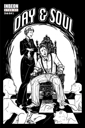
Day and Soul #1
Writer: Roy Smith
Artist: SJ Costello
Publisher: Inbeon Studios
Price: $0.99
Format: Ongoing; Digital
[/su_box]

 “Telling stories isn’t easy for me,” said W. Maxwell Prince. “I often find myself really interested in one thing, but then boring of that quickly and moving on to something completely different. This book allowed me to embrace that attention deficit while simultaneously building something with a solid center. The end result, I think, is really fun. It doesn’t move in the ways that comics usually do, but it’s still identifiably a comic book. Except for when it’s not, of course.”


 More seriously, the way that the story is told is just bothersome. The passengers that you pick up along the way talk as you travel between stations, but that happens at the same time that you’re doing the maintenance tasks necessary to keep the train running. The train is big enough that it would be possible to miss the dialogue bubbles entirely, and given the obliqueness of the writing, catching half of what is said still leaves you entirely in the dark. Similarly, you can read synopses of where you’re going on a console, but you have to do so at the same time as those maintenance tasks AND the dialogue.