Group Review: Doom Patrol #1

Get out your glow sticks, because Gerard Way’s DC imprint, Young Animal is launching this week with Doom Patrol. Each participating reviewer will give their score and their reason for the score, kind of like a regular review but with more people. No recap of the issue, let’s jump in.


dpa_cv1_ASA: 4/5

Doom Patrol #1 is at once entirely absurd, incomprehensible, and more than a little charming. I normally would have a more negative reaction to such a crazy, hard to follow read, but frankly, Doom Patrol is a franchise where crazy and incomprehensible is sort of the goal. I may feel less charitable towards this issue if, when all is said and done, it turns out none of these details make sense, but for the moment, I enjoyed it a lot. Gerard Way's dialogue is super sharp (“I find your vigor for life highly irritating”) and his plotting is, while as I said, random and strange, instantly funny.

But the real hero of this issue is Nick Derington, an artist I am not at all familiar with whose work here is charismatic and expressive. It reminds me a little of Emmi Lennox with its warmly stylized character designs, but there's no sense of sketchiness to Derington's line. Everything is precise, detailed, and (I fear overusing the word) charming. I would defy anyone not to fall in love with the image of Casey wearing Robotman's ridiculous coat, and the book has no shortage of small, indelible moments.  The use of colored pencil interlude to show another world (it makes sense in context...or more aptly it doesn't) is also a nice touch.

All in all, it's a weird book that I hope forms something greater out of its weird parts over the next few months. As is, I am fully on board.


dpa_cv1_bolland_varCHRIS: 2/5

Alright, so I just read it. I haven’t talked to anyone else about it (I did try to explain Danny the Street to my girlfriend, however. She told me to shut the fuck up being weird.) The first thing I’ll say about this book is I’m not entirely sold on the artwork. It’s pretty bog-standard stuff, and I wanted more than that. There wasn’t anything that stood out visually for me, which was disappointing. The story itself has a few bits that made me raise my eyebrows, but overall it wasn’t all that great. It seemed very jerky, too. Like flipping through TV channels late at night and not really giving a shit what’s on because you stopped paying attention half an hour earlier. It nails the weirdness that needs to be there for this book, but at times it felt like it over shot it and was just being weird for weird’s sake and not really adding anything to the story.

This might be a case of me being a bit too excited for the return of Doom Patrol to monthly comic books, expecting too much from it and being bitterly disappointed. I don’t think I was expecting too much, though. I just think this book was bad. I was expecting something weird and dark… Fun but in a creepy sort of way. This is the sort of book that needs to be reviewed by CB. This book will sell a shit ton because Gerard Way is attached to it. Not because it’s any good, purely due to the fact a lot of people know his name and want to see what he writes like. To those people: If you’ve never bought a comic before in your life, stay away from this one. Buy something decent instead.

I’m interested to hear what everyone else thinks. I rarely give up on a book after only one issue, but I don’t think I’ll be carrying on with it after this.


dpa_cv1_greene_varDUSTIN: 5/5

Let’s get something out of the way real quick like. I have never read anything Doom Patrol. Nothing. I probably won’t either because I’ve seen it overanalyzed to the point that I lost interest. This was my first experience with Doom Patrol, and while I had no idea who was who and what was what, I loved it. I loved being confused, but interested. This is how you do that. You can throw me the fuck into the story, but you better make sure it’s goddamn fun, and this was.

I worried about with Gerard Way we would get; would it be Umbrella Academy or Killjoys? Because I sure as shit didn’t want Killjoys to show up. Thankfully, this is something new. It’s neither, but still really fucking good (I’m swearing a lot because this is a group review and it’s the perfect place to run my mouth, deal with it).

The art was fantastic. It was detailed, it was different, but it didn’t feel out of place in a DC book. I hope that Nick Derington is giving every opportunity to keep going and that the schedule won’t bring on another artist for a while.

This is what DC needed. Not that I give two actual shits about what they do, but if you’re going to be different from Marvel, do what made you special in the first place, and it’s having stuff like this, having a billion imprints and giving readers different books to read. Don’t make them a “DC reader” make them a “Young Animal" reader or a “Vertigo Reader” and hell even a “Wild Storm” reader. Because money is money and if someone wants a line of books that’s run a certain way, does a particular thing, then why do you care if “DC” is the biggest logo on the book? I loved this. Confused as fuck, but I loved this and can’t wait for more Doom Patrol, but more so I can’t wait to see what else Young Animal has to offer.


dpa_cv1_hernandez_varPATRICK: 4/5

Grant Morrison’s comics were my gateway into the DC universe. They were this exemplary amalgam of what made superhero comics great as it balanced abstract and new ideas with bluntly made heroes tackling impossible scenarios. They took risks and portrayed things you couldn’t find in any other medium.

Relaunching the Doom Patrol in the same vein as Morrison’s run is a daunting task and one the comic succeeds at meeting. The new Doom Patrol is weird. It captures that essential weirdness of its predecessor but manages to adapt the style to feel wholly modern.

This is a controlled weirdness. Never does the comic feel like it is throwing things at a wall and seeing what sticks. Everything here feels deliberately constructed even if I can’t what it’s building. It’s grounded in a lead character in such a way I never knew I wanted from a Doom Patrol book with crisp dialog between characters that felt relatable. Yet Doom Patrol #1 still seamlessly shifts between genre, art styles, and realities, delivering nods to Morrison’s run while introducing a new, weird and intriguing threat.

Doom Patrol #1 is a book that’s guaranteed to alienate some readers. There was even this creeping sense of “so what?” as I reached the end of the issue.  There seems to an absence of a forward momentum that’ll lead the comic down a united narrative path. Yet at the same time, this resonated as the type of comic weirdness that got me here in the first place and executed in a way that other comics just aren’t doing. To put it shortly, I’m in Doom Patrol. Now show me where we’re going with this.


[su_box title="Doom Patrol #1" style="glass" box_color="#8955ab" radius="6"]

Writer: Gerard Way Artist: Nick Derington Colorist: Tamra Bonvillian Publisher: DC/Young Animal Price: $3.99 Format: Ongoing; Print/Digital

[/su_box]

Group Review: Seven To Eternity #1

Not only do we have a group review, which is pretty damn special in general, but it's also an advanced review! That's right, the participating writers will each give their score and thoughts about Image's newest title from Rick Remender and Jerome Opeña. [su_quote url="https://imagecomics.com/comics/releases/seven-to-eternity-1"]The God of Whispers has spread an omnipresent paranoia to every corner of the kingdom of Zhal; his spies hide in every hall spreading mistrust and fear. Adam Osidis, a dying knight from a disgraced house, must choose between joining a hopeless band of magic users in their desperate bid to free their world of the evil God, or accepting his promise to give Adam everything his heart desires. Writer RICK REMENDER reteams with collaborators JEROME OPEÑA (Uncanny X-Force, Fear Agent) and MATT HOLLINGSWORTH (TOKYO GHOST, WYTCHES) to take you on a hard road through the strange fantasy world of Zhal. All men have surrendered their freedom for fear. Now, one last free man must choose.[/su_quote]


JORDAN: 5/5


I think everyone at one point in their life has heard the dusty old proverb “you can’t judge a book by its cover” (though I’m not sure if that’s true in the world of comics?). You can, however, judge a book by its author, so here is a nickel’s worth of free advice: if said author happens to be Rick Remender, do yourself a favor – buy that book.

This was a fantastic read! RR has proven yet again that he is the undisputed king of comic book science-fiction by delivering a most original, imaginative work that’s sure to be an instant classic. The character development occurs instantaneously and flawlessly. With just the first few panels Remender is able to expertly forge a lasting bond with his reading audience that makes reading Seven to Eternity a totally immersive experience.

seven-to-eternity-1
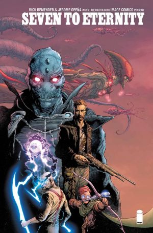
If the writing alone weren’t enough (which it is), Seven to Eternity has got to be the most visually stunning, incredibly beautiful, jaw-dropping, eye-achingly gorgeous book of the entire year. Jerome Opeña has literally blown my mind wide-open: his panels boast some of the craziest, most wildly awesome art that I have ever seen – period. Of course, I would be doing an incredible disservice if I made no mention at all of the brilliant mad-colour-scientist, Matt Hollingsworth, whose signature electric pallet is the artistic climax of the entire issue.

I can’t say enough good things about seven to Eternity; it’s Remender, Opeña, and Hollingsworth at their best (Rus Wooton too of course). Enjoy this one, for this is what comic dreams are made of.


ZEB: 3/5


As much as I love Rick Remender, this series didn’t grab me as forcefully as, say, Black Science did in its inaugural issue. Part of the problem is that the narration starts to flag in the second half. At the beginning, it deals with relatively familiar issues, like a refusal to compromise with evil or the desire to protect one’s family. Those are all strong emotions to tap into, good for narrative worldbuilding. But the references to lost temples and whatever a Mosak pushes the reader away because we don’t have the context to appreciate them. Adam spends so much time talking about the world, but none of it is really explanatory. What are the different factions? Are the races united, or separated? I finished this and felt really confused.

I will say though that Rick Remender’s worldbuilding pairs beautifully with Jerome Opeña and Matt Hollingsworth’s art. Fantasy series should never be dull to look at, but this is gorgeous to look at by anybody’s standards. Everything has a grungy sort of feel to it, like the beasts in this world are infected with something; it’s apropos in a world where one of the most dangerous beings is known as the “Mud King.” This is not the neat and tidy high fantasy you might see elsewhere; it’s as if a few centuries of pollution ruined Middle Earth.

I don’t doubt that this could be an engaging series in time, but it’s clearly going to take some time. It certainly looks beautiful, but I’m not sure whether the story is going to draw me in. I need to know more about this world, and given that the central tension (will Adam accept the deal) is going to be answered in the second issue, I’m wondering what further hook will sustain this.


ASA: 2/5


Rick Remender has always struck me as an undisciplined writer. His work rambles, rages, and recalibrates, often becoming a mire of overwrought narration, gory violence, and stream of consciousness adventure. While Seven to Eternity avoids the lowest rung of Remender books (Devolution, sigh, Devolution...), it still encapsulates many of his worst qualities with very few redeeming ones. Here his vast fantasy world is lost in the constant babble of exposition and angsty posturing. The world is given a grand total of four pages to be established before things jump right into the epic plot, meaning we have no understanding of the stakes of the world once things get going. The characters are painfully dull, and the story itself feels like every recent Remender book mashed together (guilty fathers, angry children, monstrous monsters, lots of shouting, etc.). It's not good.

And yet, with all this going on, you simply cannot ignore the work of Jerome Opeña who delivers visuals that deserve to be paired with a much better script. For my Money, Opeña's evocative pencils are the best in the business, and a break from the big two allows him to play on a larger canvass. He draws grand vistas, horrifyingly gigantic monsters, and haunting alien cities and somehow retains his talent for subtle, distinctive character work. I don't want to read more Seven to Eternity, but I can't recommend the art enough.


DUSTIN: 2/5

Hi there. If you follow the site or listened to this week's podcast you're probably wondering what the hell I'm doing on a Rick Remender comic review. Possibly because I've never hidden the fact that I've only enjoyed one, maybe a few issues in the entirety of the man's career. I'm not a "Remender Guy" to put it plainly. I found his latest dystopian future setting to wear its influences on its sleeves. That aside though it's okay. It's not without some interesting aspects, but it just so very Remender.

For some, that's a positive but for me, it's like reading the same book over and over again with a different setting. Sure the "We're all fucked" message shifts ever so slightly. You can describe ever series he does the exact same way and yet when you describe them they all kind of feel the same. "What about Deadly Class" some of you are screaming, sure it's not dystopian but it is very Remender. The end all be all is that the story is okay, but I'm so very burnt out on reading anything by Remender. You may not be able to nail his twists and sure his character development will be solid, but at the end of the day, you know the feeling of everything he's going to do. It never feels any different. "We're all fucked" is pretty much the message and I guess I just don't care for that to be the only outlook in his comics anymore.

I cover the art on the podcast pretty thoroughly so if you want to hear why I find Opeña's art style boring, then go listen to the podcast and be outraged alongside Steve. I know plenty of people will like this, but Remender books are like Marvel movies to me; here comes another one, yup, it's another one.

[su_box title="Seven To Eternity #1" style="glass" box_color="#8955ab" radius="6"]

Writer: Rick Remender Artist: Jerome Opeña Publisher: Image Comics Price: $3.99 Format: Ongoing; Print/Digital

[/su_box]

Group Review: Harley Quinn #1

DC timed it’s “Suicide Squad” books to their movie release so we have not one, but two group reviews for you in the same vein. Each reviewer will give their thoughts on the issue and their score. [su_quote]Comic Bastards Synopsis: Get ready for a lot of talking and everything you every needed to know about the title character! Oh, and a recycled Marvel storyline via Skrull Kill Krew.[/su_quote]


PATRICK: 1/5

For a long time, I had trouble figuring out what made Harley Quinn such a fan favorite character. The positive reception always seemed to me as being in spite of the creators and writers behind her. I mean, this is a character that was written as sleeping her way through an education by her creators. A character whose publishers asked for people to draw her committing suicide in a bath tub. A character that was written to sleep with an entire convention floor of Joker cosplayers. Harley Quinn and writing has always seemed to be a very contemptuous relationship.

Now that I’ve read this issue, however, I realize that Harley Quinn has really just become DC’s version of Deadpool.

While that’s not bad in concept, the whole thing reads like an identity crisis. It starts with Harley Quinn and Poison Ivy having a spa day—making you think the series might be a day-in-life super hero book—before switching to a lot of exposition then switching to a cut-away gag, and then switching to a full-on zombie apocalypse. The tone is all over the place and every page looks like a warzone between the word bubbles and art for domination of page space.

There are a few cute gags involving one of Harley’s side characters speaking in power tools instead of word balloons and an alien who shape shifts into a cow but the pace is overwhelming. The book asks us to read so much text and take in so much information but without ever giving much in way characterization or story and instead serving a stream of dropped jokes. Maybe issue #2 will have a good explanation for why it’s telling a goofy zombie story in 2016 but this one sure didn’t.


HARLEY Cv1_dsJORDAN: 1/5

So, before I say what I’m about to say, I suppose it’s fair to note that I personally know little-to-nothing about Harley Quinn outside of Batman: The Animated Series. I don’t pretend to boast an expansive knowledge of her history as it relates to the comics, so maybe I am a tad misinformed when I say this but Harley Quinn #1 is the most terrible comic I have read all year. I didn’t have the first clue what was going on! The whole time I struggled not to pull away/fall asleep as I begrudgingly read one of the most messy, stupid, and just plain BAD scripts in recent memory (distant memory too for that matter). Its obvious innuendos and derogatory metaphors are missed attempts at comic relief; they aim for a laugh, but only end up making the reader feel more and more uncomfortable as the story drags on (and on). It was ludicrous, ridiculous; I actually don’t have enough adjectives right now to really voice my feelings. Harley Quinn is fantastical to the point of being absurd; I’m not saying that comics can’t be fun but this is something else entirely. I’ve been disappointed by Rebirth titles in the past but there hasn’t been one yet that I would flat-out say "DON’T READ" – that has now changed. Don’t read Harley Quinn.


DUSTIN: 1/5

I’m going to echo what Patrick said a little. I already know that Harley Quinn was just the DC Deadpool, I could tell that from the abundance of cosplay. What I didn’t realize was to what extent it went to. There’s Z-List characters created just for the series and cheap jokes. Sex jokes that feel as if a juvenile wrote them. Oh,and exposition, exposition… exposition. My god is there a lot of exposition.

The art is non-offensive which is probably the only thing I can say about it. There was never a chance for it to shine and basically everyone looked the same.

There’s more I could say, but overall I regret even giving this a chance. I knew it wasn’t for me and so it was foolish to even bother with it. The fact that this is doing well shows I guess how out of touch I am with superhero comics.


KALEB: 5/5

DC Rebirth first issues have been some of the most impressive pieces of comic writing as of late. Harley Quinn #1 is no exception to this. One word, Zombies!!! Yes, Harley Quinn takes on a hoard of zombies created from an alien who crashed landed on Earth and imitated a cow who was slaughtered. Anyone who ate the alien meat became a rage filled, brain-mauling, flesh-eating zombie. Amanda Conner and Jimmy Palmiotti start there Harley Quinn story with a reunion between Poison Ivy and Harley. There’s no better place to have a girl’s day than the spa where they get pampered. During this time, we find out a bit about Harley, she owns a business along with two buildings, and she is basically trying to reinvent herself.

After the spa we get some pre-Harley Quinn backstory, rebel child, strong desire to study the insane at Arkham Asylum. She becomes a doctor of Psychology and ends up going under cover at Arkham to gain the trust of one particular inmate in order to learn more about him. Who is this inmate, you can probably guess but I’ll tell you anyways, The Joker. The Joker, cruel, smart and sadistic, knows Harley is a doctor right away. When the only person who knew Harley was undercover was killed, she was legitimately entered into the system as an inmate at Arkham with only one choice, to escape. Harley and the Joker managed to escape but at a cost, The Joker pushed Harley into a chemical bath permanently bleaching her skin. They eventually split up which sends Harley down a path to reinvent herself after being completely heartbroken. She has a party at Coney Island where most of her friends are made up in her mind, then all hell breaks loose. The horde of zombie’s attacks. There is quite an intense fight scene that takes place that puts Harley right in the middle of kicking zombie butt. After one of the characters are bit, Harley decides it’s a good idea to send him airmail to the closest hospital via a catapult.

There really isn’t much negative feedback to give this issue. The writing was flawless, there was a perfect amount of humor which is something I would expect from a Harley Quinn series. Sarcasm is perfectly displayed in the art and writing. This is a Harley that I will love reading about every time an issue comes out. The dialogue is mostly between at least two characters, not much internal dialogue. A great aspect of this issue is that you do not need any previous knowledge of who Harley Quinn is in order to understand her character. Every detail you would need to know is given to the reader in this issue. The dialogue flows smoothly from panel to panel, and sadly the issue just flies by. Besides the beginning of the issue I was 100% focused on the story and nothing else, this is just how gripping the story becomes and how action packed it is. Just when things get serious it takes a turn towards humor and gives a lighter feeling to the issue.

Chad Hardin and Alex Sinclair tag team the art and colors. This is a very colorful issue. Seems like they were trying to hit every color in the visible light spectrum. Every panel is in your face, popping out of the page at you. If had to choose some of my favorite art from recent comics, I would definitely say this is the best art thus far. You could literally make the story yourself without the dialogue just based on the images given. If the art and dialogue continue to be like this issues, then this may become one of my favorite series.

[su_box title="Harley Quinn #1" style="glass" box_color="#8955ab" radius="6"]

Writers: Amanda Conner, Jimmy Palmiotti
Artist: Chad Hardin
Publisher: DC Comics
Price: $2.99
Format: Ongoing; Print/Digital

[/su_box]

Group Review: Justice League: Rebirth #1

Welcome to our group review for Justice League: Rebirth #1. This is that one-shot setting the stage for the new series that will continue apparently where Bryan Hitch left off. [su_quote]Sysnopsis: Get ready for talking and Starro! But like the Ultimate version of Starro because Bryan Hitch. Also will old Superman join new JL? You won't get that question answered, but it'll get asked a lot.[/su_quote]

DUSTIN: 1/5

Remember when Bryan Hitch's art was something special? When it defined an entire line of books? What happened? This book mostly looks good. Hitch's citys and civilians are par for the course and his Starro redesign is actually pretty cool and modern. Though I prefer the goofy ass one, this one matches his style. The Justice League all look like asshats. Flash stretches his legs impossibly far, to the point that he's not really running or looking like he's running, but instead lunging strangely. Aquaman's head changes proportions a lot and only once did they fit his body... the one time Hitch forgot to illustrate facial hair. Batman's face is a trace of Christian Bale's Batman which is the worst possible movie Batman to trace. Don't get me started on Lois, not only did she fail to look the same way twice, but she never looked like any version of Lois Lane ever. Basically while the backgrounds, cities and villain of the book looked really good, the Justice League looked like a deformed versions of the Ultimates.

As for the writing... why the fuck is Bryan Hitch writing this? The story is beyond generic. The opening feels like its been lifted from a hundred other Justice League stories and not in a good way. Not in a "yeah you're capturing the magic of the series way", but in a "haven't I read this word for word somewhere else?" kind of way. The jokes are terrible and aside from the forced references to the events that have happened in the shared universe, this book feels like it's in a bubble of it's own. What's worse is that it feels terribly dated. Each character practically takes a turn telling Starro hive mind to get off Earth and don't ya come back ya hear. Then there's the most positive news reporter ever giving us a recap of what we read and praising the Justice League who happened to dump thousand of infected civilians in New Jersey... because I guess we're not in Metropolis or something.

This book doesn't resemble or feel like anything that DC has done with Rebirth. I have not liked or loved all of the Rebirth titles, but I will say that up until this point they have felt similar. They have like the same universe. This feels like they wanted a Bryan Hitch book and so they just let him shit the bed and smiled as he did it. I may not love everything that DC is doing, but I at least JUSTLREB_Cv1_dsliked they effort, I liked that they seemed like they cared about what they were doing rather than just trying to keep a popular artist that's clearly lost his knack for illustrating actual heroes and as a writer has no idea how to write for his own strengths. Simply put, Bryan Hitch isn't that fucking good anymore and shouldn't be allowed to run amok. Let him go back to writing his not movie Avengers/definitely the movie Avengers story at Image that no one liked. I will turn a blind eye to this series ever having happened and hope that it will be cancelled due to poor sales when readers open their fucking eyes to the mess that is this series.

CARL: 4/5

Amidst a massive insect attacking the Earth, the alternative dimension Superman debates with his wife Lois whether he should intervene.  Without a Superman, the Justice League can’t seem to beat the big beetle.  Even with the assistance of the Green Lantern twins, the League doesn’t seem to have the needed firepower.  Here’s where the opportunity for a critical reading comes in.  Empathize with this version of Superman.  In a different time and place, he fell to Doomsday.  Having found the simple life with his family, this Superman knows full well that the moment he commits to the Justice League, he pledges himself fully to the cause.  As the old adage states, you cannot put toothpaste back into the tube.  This Superman realizes that his participation means a decision that cannot be undone.  Put yourself into this character’s mindset and think about the risk.  That’s a great, cathartic moment.

In the end, we know what Superman would do.  The nature of his character has been so forged that there would be no fear of spoiling the ending of this comic.  However, I will say that Superman’s aid against the insect Reaper felt minimal and insignificant.  I did find that the way he saved the day could and should have been determined by another League member.  What his actions do, though, prove that the League needs a Superman.  Despite that one setback I feel that this Rebirth issue gives readers one of those moments that make the medium so rewarding.  Delving into a character as he debates a major decision gives one food for thought.  And that’s what good comics should do.

JUSTIN: 1/5

We still have Rebirth #1's coming out, and DC is shaking things up by making Aquaman the best new thing I've read from their line and Justice League the worst. What an exciting new direction! Never read anything written by superstar artist Bryan Hitch before and now feel like that was for the better. The characters are written like cardboard cutouts of themselves, the threat is comicly cliched and uninspired (as is the limp dick hyperbole thrown behind the threat), and not one word suggests a lick of insight into these characters developed from years of illustrating them.

When I was in my early twenties I swore by Bryan Hitch's art. The scale of The Ultimates 1 and 2 is still the pinnacle of theatrical blockbuster action art for me to this day and his largely forgotten run on Fantastic Four was a lesser but memorable joy. That said, something is definitely lacking in his art in Justice League, feeling weirdly rushed and small compared to his usual dominating hand of dazzling grandeur, especially considering the stature of the team. I will say I can't tell for sure if it's entirely just Hitch's line work or if it's obscured by the awful color job. Whatever flaws the art work itself has, they are intensified tenfold by the coloring, rushed looking and lacking subtly. In one panel, a straight line defines the edge between Clark Kent's hair and forehead, while the line art shows a completely different hairline above it. Throw some vague textures over certain surfaces and some mottled undefined shadows over your flats layer and you've got some unmistakably unacceptable color work for a book of this publishing level.

It looks bad, it drags the shittiest conflicts from other books into it as its dramatic fodder, and talks big while delivering nothing. I'd rather read anything else from DC right now. Or, you know, not even that.

[su_box title="Justice League: Rebirth #1" style="glass" box_color="#8955ab" radius="6"]

Writer/Artist: Bryan Hitch
Publisher: DC Comics Price: $2.99 Format: One-Shot; Print/Digital

[/su_box]