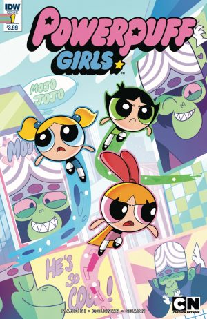
So, Powerpuff Girls has been rebooted on Cartoon Network to the pleasure of nobody. Starring the cast of the original show except, conspicuously, the leads, loading up the humor with memes, and replacing the hand drawn Craig McCracken guided animation with dinky Flash, Powerpuff Girls is a show reimagined for a new generation that already has better cartoons to enjoy. Because everything gets a comic now (look for Brickleberry #1 on comic shelves next Wednesday for some goddamn reason), the reboot got it's obligatory ongoing this week. While technically a comic for the new show, save for one panel of the girl's new smartphone, there really isn't much here that specifically calls out the show's new direction, letting readers decide if they want to pretend to be reading a comic based on the original cartoon instead, hearing Cavadini, Strong, and Daily in their heads when they read the word bubbles. Not that it matters much, this comic is terrible.
 I've said it before, it's really hard to make stories that are usually told in animation work as well in comic form. Beats and timing of humor work differently in different mediums and a lot of unsuccessful animation property comics just feel like storyboards instead of comic paneling. The story here isn't awful, but it is supremely forgettable in this format, with most of the humor feeling lifeless and static. Maybe it's the writing, but I'm more inclined to blame it on the art.
This is one terrible looking book. Technically, it's on model nearly the entire time, but that means nothing when you're adapting a property. The art mimics the style of the show without any deviation or originality, no personal touch, no perspective. Thin, unimpressive linework, ugly composition, jumbled backgrounds, passionless energy, nothing feels deliberate or respectful. Last week Sonic Megadrive showed how joyous unique and vibrant art could make a familiar property. Here we get the dark mirror, what happens when you rely entirely on looking like the art of the original while transposing it to a medium not suited for it. But this is IDW, not Boom, so maybe I should have been more prepared for this. After all, the only art they really wanted to pay for were the six variants you can buy for this title.
This is our industry. A dirge of worthless pulp flowing over comic art stands. I wish variants didn't own my local shop, so I didn't have to see people shelling out $20 for something like Scooby Apocalypse, but such is publishing and we'll keep feeding the beast. Whatever. I pay my dues as a critic. But at the end of the day I'll settle down with a copy of Dark Night or Angora Napkin and remember that there is still real care put into art in certain wings of this industry. Just not in the books with double digit variants.
[su_box title="Score: 1/5" style="glass" box_color="#8955ab" radius="6"]
[/su_box]
