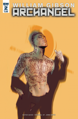
A lot of comics outside the big two feel a little bit too much like extended TV pilots. A lot of books, specifically those from Image, rely on a big conceptual hook to get readers and tend to let all else come second. This isn't inherently a problem since many great books benefit from a great hook, but it feels like in many cases the concept is all there is leading to an elevator pitch spread too thin. I don't mean to pick on any books in particular, but it's not hard to think of a number of recent series that have very little going on beyond "cowboys in space", "pandemic that makes you pretty" or "John Carpenter's The Thing meets Walking Dead." The best high-concept books are the ones that shrug off the concept right off the bat by jumping right into a story with interesting characters and enough depth that it can't accurately be summed up in a line of text. That's why it's refreshing to find Archangel which can be described as "Time travelers in World War II" finding its feet so quickly.
 Issue two focuses on the displaced soldier as he escapes, with the help of a robotic fly and some emergency rations, from allied custody and seeks out Naomi, the British scientist who is starting to piece together what's going on. This is escape is, however, noticed by the other faction of travelers who seek to recapture the escapee by any means necessary. As an outline, this sounds like fairly typical comic book fair, but in practice Gibson and Guice have infused the book with a sharpness and specificity, allowing it to dodge a number of tired clichés. One of the things I am most tired of in these types of books is how long it takes characters to catch on to the odd things going on (every fantasy and sci-fi book that has a character protest that x-thing is impossible makes me wince). But Naomi is smart enough to notice the escaped, invisible soldier by an indentation on a leather seat. Similarly, her friend Captain Matthews does something clever enough at the end of the issue that I won't spoil it despite it not being a major plot point.
The art style is one I don't always care for--mostly realistic but shadowed enough to not be too detailed in the manner of Michael Lark or Sean Phillips--but Butch Guice and colorist Diego Rodriguez manage to keep things from ever becoming dull to look at. Guice nails facial expression which are often the downfall of books like this (a downfall into the uncanny valley actually), making each character distinct and sympathetic. Meanwhile Rodriguez chooses not to take the Vertigo palette of brown and grey, and instead render a subtle world of muted blues, purples and greens. While I would like a few less panels that are just static images of people standing and talking, the art is extremely good and serves the story well.
Any book with as much new mythology to establish as Archangel should be in danger of collapsing under its own weight, but Gibson and Guice seem more than up to the challenge. The attempt to thwart an invasion by an alternate dimension could be too abstract and esoteric to have real stakes, but it's all grounded in a small cast that are easy to invest in. Also, small details, like a dimensional supply drop that leads to a pistol fusing with a metal table are strange and clever in the manner of all good science fiction. Two issues in, Archangel shows signs of being one of the year's best new series.
[su_box title="Score: 4/5" style="glass" box_color="#8955ab" radius="6"]
[/su_box]
